Category Archives: Posts

History and the Archive: Archival Activism

As I do not come from the field of DH but have done archival work in the field of critical prison, these week’s readings were valuable additions to my ongoing research. For my own work, I approach the archive as an activist tool deployed to contest discrimination, utilizing archival material as a primary data source to examine social justice issues and to address gaps in official traditional archives. In this context, community archives present important venues for empowerment, social justice and activism, challenging and even transforming traditional mainstream archival principles and practices. In this blog post from Witness.org, Yvonne Ng describes a number of community-centered digital archive initiatives that have emerged from the Black Lives Matter movement (for example the Preserve the Baltimore Uprising 2015 Archive Project and Documenting Ferguson), emphasizing that the projects share a “collaborative approach between traditional archives and archivists, community organizers, and concerned individuals.” Daut asserts that collaboration is an essential aspect of the multimodal approach to archiving, as demonstrated in her essay, “Haiti @ the Digital Crossroads: Archiving Black Sovereignty” in which she describes how collective work enriches her own research, but also emphasizes that “[c]ollaboration in service of access, translation, and transcription to promote international availability” is crucial to creating decolonial archives.  

Another keyword I associate with archival research is context: archival research is about context as the archive is itself constructed in a particular context. For another class, I recently read the article “Archives in Context and as Context” by archivist Kate Theimer, which I think is an interesting perspective from an archivist as she emphasizes “the need for greater communication between digital humanists and information the need for greater communication between digital humanists and information professionals, such as archivists, about the areas where our practices intersect”. As I read Daut’s essay, I also reflected on the importance of curation and about how digital archive projects “put obscure documents into specialized contexts through curation” and “provide the kind of context that we would not get from simply visiting the archive”. 

Visualizing the Quantity of Retail Food Stores Across Five NY Counties

My Map:

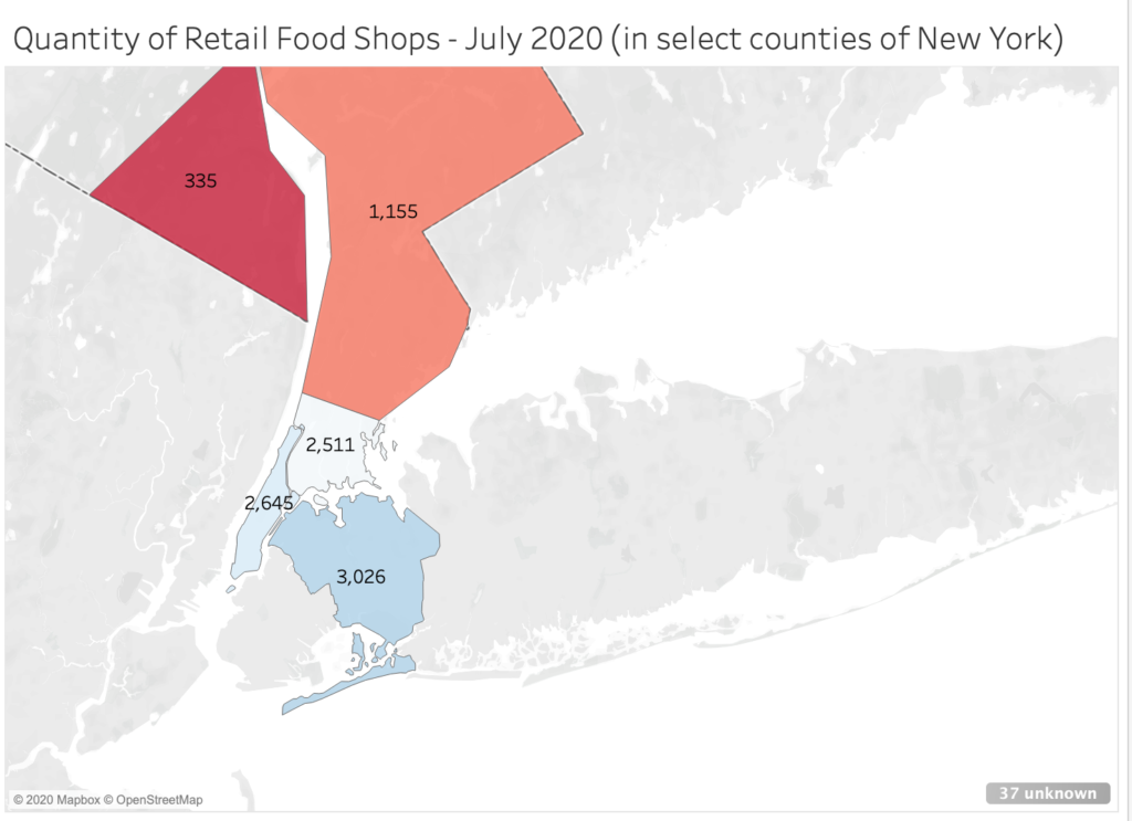
My map visualizes the quantity of retail food stores across select counties of New York (Bronx, Queens, New York, Rockland, and Westchester) using Tableau’s 14-day free-trial of the software. 

I decided to explore NYC’s 2020 Open Data projects database (via its website and GitHub) in the area of agriculture and markets due to the reliability of this information. Open access food-data, so to speak, is already regulated through The New York State Department of Agriculture and Markets (when pulling from Open Data), and the literature on the topic in the region is sizable, given the role of environment on food sources in the City. The reliability, presence of detailed information, and integrity of Open Data made mapping this topic viable for the purpose of the assignment.

What my map shows:

My map visualizes the quantity of food shops across five counties, which include supermarkets and small shoppes (delis) that can be indexed in the City and Department of Agriculture and Markets’ databases as of July 2020

I used a gradient to scale results: 

  • blue to cerulean: a high quantity of food shops;
  • white, orange, and light-red: moderate quantity of food shops;
  • red to crimson: lower quantity of food shops.

Queens (3,026) ranked first in this set for the most food shops, followed by New York (2,645), Bronx (2,511), Westchester (1,155), and Rockland (335) for this group.

A few technical errors appeared in my mapping process (disambiguated below) that prevented most counties from appearing when visualizing it as a map. After some modification, the counties of Bronx, Queens, New York, Rockland, and Westchester yielded information that required no reconciliation from me (the user).

Obstacles:

Limited open access data – The choice to examine the quantity of food stores for the specific counties mentioned came after a difficult attempt to plot subscription data, first through magazines and later, music applications, which required specific manipulation of multiple datasets to visualize as a map. With the purpose of the assignment in mind, I became more interested in the technical aspects of mapping datasets and decided to broaden my topic in service to that and the process.

Privacy – The dataset I used aggregated addresses across counties, but absented identitarian information (race, gender, sexuality, etc.). My thought was to restart my search, specifying for demographic details in New York’s agricultural and market datasets. However, our class discussions on decoloniality and surveillance made me reconsider disambiguation to limit the scope of my map. It’s a minor intervention, as this project is limited to our class, but I hope to contemplate more ways to decolonize my methods (if this can be considered a step) as a practitioner. 

Reconciling “unknown” items – I explored the “unknown” item(s) tab (bottom-right of screenshot), to which I later learned prevented me from mapping all counties featured in this set. Despite the accurate spelling of names, Tableau could not determine to map this information (e.g. Albany county was marked as “ambiguous”). I suspect an error may have occurred in my filtration methods in the ‘Data Source’ tab.

Conclusion:

Though I felt accomplished after trial and error, I felt limited by the availability of datasets (as it concerns my original topic), which is odd. The collection of big/small data is widely known, but retrieving and accessing databases for (clean) datasets, with proprietorship in mind, is a significant task that digital humanists and information professionals have to undertake in their methods. 

If conditions were otherwise, I would have worked with library and department staff to better unpack my questions, and explore the possibilities of creating my own datasets to stretch the potential of my novice. Overall, I value this assignment and I think there’s utility in my map as a very (very) preliminary start on how to deploy open access data that can inform decisions on a move/relocation, assessing resources in an environment, etc.

Mapping Sonny’s Blues

For my praxis assignment, I attempted to create a map of James Baldwin’s short story, Sonny’s Blues. I reread the short story in search of particular locations or any evidence of areas Sonny and his brother could have occupied or visited in Manhattan. Because Baldwin was only fully descriptive about one location, I was forced to do some digging into the histories of Harlem, Greenwich Village, and midtown in the 1950s. After many rabbit holes and Internet dives later, I thought, maybe this could be an opportunity for me to use my creative license, basic knowledge of the city I grew up in, educated guesses, and some internet searches to fill the gaps? Perhaps provide an “extended version” of Sonny’s Blues? Though I was excited about this potential, I immediately grew terrified by the notion that this kind of power lies in the hands of actual cartographers and others responsible for shaping geographies of anything/any place. I was also overcome by guilt, which echoed my discrepancies with Roland Barthes’, The Death of the Author. How dare I mess with such important, masterful work? But, I decided to move forward with the intention of interacting and engaging playfully with a piece of text that I love and respect immensely. 

Creating Locations:

In much of the scholarship I have read about Sonny’s Blues, the consensus seems to be that this story is not really about Sonny. But that it is, in fact, about the narrator of this piece—Sonny’s nameless, older brother. I found this to be true when attempting to pinpoint locations within this narrative. Of the handful of spaces I was able to pick out of the story, Sonny and his brother either occupied them together, and on one occasion Sonny was not present at all. 

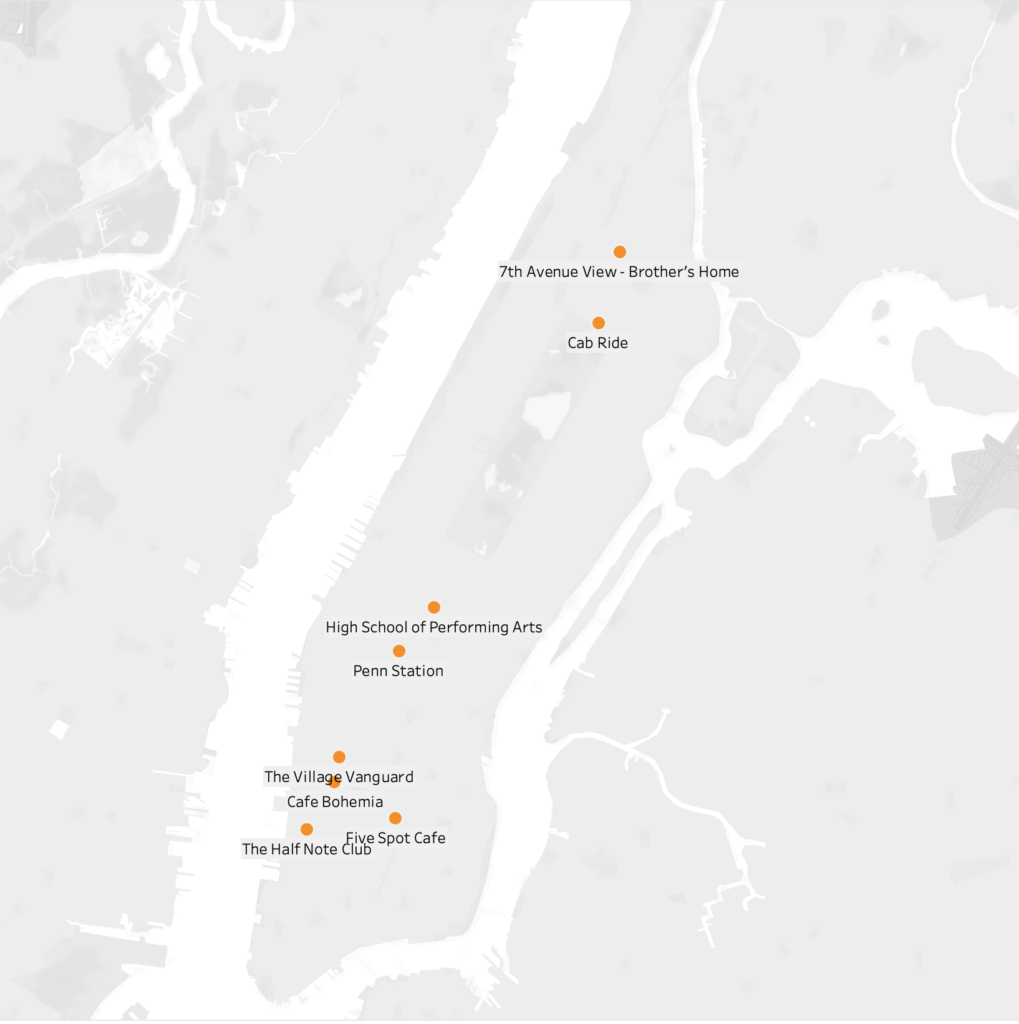
At the beginning of the narrative, after a train ride, we are introduced to our first location, the High School that Sonny’s brother taught in. Baldwin did not name this school or provide a location, but this is one of the places where I decided to do some educated guessing. In an interaction with one of Sonny’s friends outside of the High School, Sonny’s brother asks, “Did you come all the way down here to speak to me?” Clearly, this High School had to be somewhere below Harlem and far enough downtown to merit his confusion. This school should also exist within the decade this piece was written in. After doing a bit of research, the High School of Performing Arts on 120 W 46th Street popped up. The location of this school also fits the description of the surrounding area described in this scene. 

My next location assumption came from the scene where the brother meets Sonny and picks him up from a location downtown. Sonny had been out of state in a rehab facility. Penn Station became my guess for this location since it is one of the only places that is a central location for bus or train rides in and out of the city. Once the brothers were in a cab heading uptown to Harlem, Sonny asks for the driver to take the Westside of Central Park for a more scenic route. Baldwin then pin-points their turn on 110th and Lenox Avenue. Sonny then says, “We are almost there”, which leads me to believe that that their end location is at the heart of Harlem on 125th Street. In a following scene Sonny’s brother mentions looking out onto 7th Avenue from outside of his window. Because of this, I chose to locate the brother’s home on 125th street and 7th Ave. 

Lastly, in the final scene if this narrative, Sonny’s brother is watching him play in a Jazz joint somewhere in the village. This could have been any tiny nightclub location, but I wanted to map some possible Jazz clubs that existed in the village during that decade.  I found a map online and narrowed it down to four possibilities: Half Note Club on 289Hudson Street (1957-1972), Five Spot Café on 5 Cooper Square (1956-1962), Village Vanguard on 7th Ave. South (1935-present), and Café Bohemia on 15 Barrow Street (1955-1960). 

Again, this was mostly a guessing game, but I tried my best to use as much evidence within the piece as possible.

Mapping Software:

I am completely new to mapping or coding software, so I was immediately drawn to Tableau because of its beginner level accessibility. After downloading the software, I was still unsure of how to move forward, so I found a Tableau mapping tutorial on YouTube.  As suggested, I created an Excel sheet for the names, addresses, and coordinates for each location. I then downloaded the excel information into the software. But after dragging the longitudes and latitudes into the row and column sections, the software kept placing a single coordinate in Antarctica (a long way from Harlem). After about 45 minutes of trying to problem solve, I realized I had mistakenly flipped the coordinates on the excel sheet, longitudes were under the latitude column and vise versa. After making this correction, the coordinates moved into Manhattan. I was relieved when I was able to successfully map these points, but I quickly realized that perhaps this is not the best mapping software for this kind of project. I would like to have been able to obtain a more detailed map of New York City and Manhattan in particular. 

Conclusion:

The assignment made it even more obvious to me that our methodologies for collecting and disseminating data need to be set through humanistic and collaborative lenses. Also, though I am still uncomfortable with the software, it was nice to push through my fear and ground this practice in a text that it meaningful and important to me. I am not sure I’d be able to do it any other way.

Getting acquainted with QGIS

The mapping quest: 

What to map: I’m interested in the population density of school-aged children compared to per-household property tax contribution (let’s use Brooklyn, NYC). The reason it’s on my mind: a recent conversation I had with a friend who remarked that his school taxes were high (he felt) compared to the number of students in (his) area, and (he suggested) mismanagement and/or misappropriation of funds.  Who knows, on all counts.  Certainly, not I.  I am curious. 

How to map: Sticking with the basics for now, I only aspire to plot some data onto a static graphical streetmap. A good way to show this information might be to illustrate school-aged density on a map (with color saturation), then overlay an average $ amount of property tax assessments in the same location(s).  This does suggest the map would need to be interactive, but I plan to start with a static map due to my complete lack of experience with mapping.

Finding the data: I thought this information – child numbers and property tax figures – must surely be available in some form from NYC’s open data sets, so I set that aside for a moment and concentrated on the tools to eventually wield and display this data.  But to be on the safe side, I quickly peak in NYC OpenData. Ugh, this is going to be tougher than it looks. Tax with location information easier than child numbers. And child number with location data? ???

Acquiring the tools: Based on the summary of information in the “Finding the Right Tools for Mapping” article, I decided to try the QGIS application.  I believe in free, and I also have a Mac.  Having an older Mac, I found that I had to first download Python to use the version of QGIS available to me.  So I endeavored to install that. I had to choose an old Python too. Python told me me cheerily that its installation was successful, and I took it at its word.  I moved on to QGIS.  Because my OS is so old, I had to look for “previously released” installers, which I searched for by date, using a date in about the same timeframe as the Python version I just installed.  I settled on the “official” installer vs the “kyngchaos” installer, not knowing the difference.  And ‘kyng chaos’ is not a computer-install friendly name, in my opinion. 

Well, having downloaded an ancient (2018) version from the QGIS archive, I looked in the directory and opened the “read me” file, as I was bade. Besides a bunch of notes for people who know a lot more than me, of note is that the text was signed “William Kyngesburye”, so that’s kyngchaos and I don’t know, maybe he’s OK. I clicked over to his website (it’s not a virus) and he’s quoted Tarzan and brandishes a yin and yang symbol.  Admonishments duly noted, I proceeded to install.  After some typical “you’re not allowed unless you really want to” hijinx from my anxious computer settings, I proceeded to install buckets of software packages from kyngchaos. Once that was done, and becoming a bit nervous from ignoring several “Very Important” messages in large red text, I attempted to open the newly installed QGIS application. Well, it opened!  Amazed.

Learning QGIS: After I opened QGIS, of course I realized I had know idea how to use it.  I went off to find the training guide at the QGIS website.  … Some time later, I had a lovely export of a png map of the first training software exercise, using the provided test data (that I had to download separately – because old computer). The training set uses data about lakes on a map of Alaska. Of course I checked with the oracle, Google Maps, to confirm that these are actual lakes on an actual map of Alaska. 

Because my version of QGIS is necessarily older than the current one, using the training guide presents challenge, as I’m teaching myself to use an unfamiliar system with unfamiliar terms on a platform with not insignificant differences from the manual.  For example, project files are now saved in a zipped format, but in my version they are saved out uncompressed.  No big deal, but the file name they mention is different and for several minutes I searched and searched for something… that wasn’t there and wasn’t going to be.  Another example: the Navigation tool bar and Menu have been updated (in the manual and current version).  Disorienting, but OK. Another: the Layer properties inside some data types (notably the vector layer which used a .gml file) are different.  Well, I can pretty much guess… but you get the idea.  Builds character.

I decided I need to learn more about QGIS to do anything with it from any available open data source.  But do I appreciate more what people do when they start from zero and build a map? I do!

… Then I thought about commercial more WYSIWYG solutions… I watched the Tableau software ‘sizzle reel’/”see it in action” video.  Wow technology! 

Mapping Assignment: 2018 ICE Removals

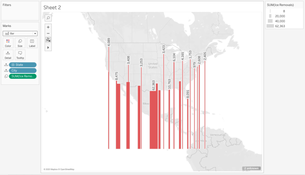
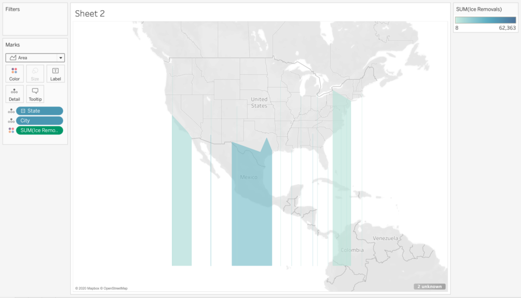
Because my experience in digital mapping and visualization is little to none, I used this assignment as primarily an opportunity to quickly experiment and play around with different ways to visualize simple data, as well as think about the ways in which my ineptitude may lead to results that are perhaps misleading, and thus revealing the subjective nature of maps/visualizations. I decided to download the free trial of Tableau, since it was noted as the easiest of the visualization programs talked about throughout the course. The large amount of documentation on Tableau added to my attraction to the program, though I ended up not using much of it.

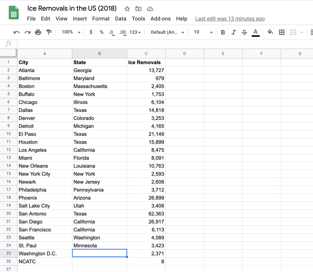
After thinking about it for a bit and scrolling through some public datasets, I decided I wanted to map ICE deportations in the United States. I initially wanted a dataset that would specifically note the racial demographics of deportations, since it was something I thought could be useful. However, there weren’t any readily-available datasets that provided such demographics, so I settled for basic datasets I found on the ICE webpage, for deportations in 2018, organized by month and “area of responsibility” (e.g. “Atlanta Area of Responsibility”). Because this is a mapping assignment, I assumed this data set would work easily if I just uploaded it to Tableau, but realized I need to manually input the state each “area of responsibility” was in (which was organized by city, generally) in order for it map on easily to Tableau’s system. So I put the data I needed into a Google Sheet.

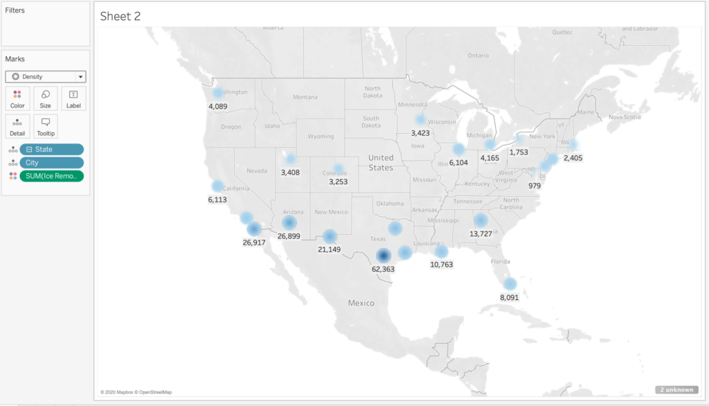
One issues I ran into when copy-pasting this data and inputting the states is that two areas of responsibility, Washington D.C. and the National Criminal Analysis and Targeting Center (NCATC) don’t have explicit states that they lie in (or at least that I know of). The way I could’ve offset this, I suppose, is getting coordinates of every area of responsibility, but I didn’t really know how to do that, so I ended up just not including these last two areas. This highlights the subjectivity of my resulting map, clearly noting this visualization as one of capta, in the words of Drucker.

Once I’d input the data into Tableau, I spent a lot of my time just playing around with different ways to visualize the limited data I had. Though the limitations were inevitable and predictable, I had a good time just playing around with how things looked when I tried using different colors, shapes, etc. At the end of the day, predictably, if I visualized the data certain way, it wouldn’t really communicate what the data was meant to portray, in the sense that it doesn’t align with the quantitative values in a way that is immediately obvious. However, I found it a fun exercise to think about how visualizations can be used in such a way to move against the grain of normative modes of visualization; in other words, visualizing the data in a way that doesn’t follow established principles or customs.

Additionally, notice that the map shows “2 unknown” on the bottom right of the screenshot, which indicates my failure to include the deportations conducted by the two areas of responsibility noted above.

Journey

I began this exercise by installing QGIS, which created some issues with my computer and was not the right tool for a person with no experience in mapping. I applied for both the Carto and a Tableau free student account, and began the free trial in Tableau desktop. In the end, I decided to use Tableau Public, because the interface was more simple and instructional videos were accessible to a novice like me. My original intention was to map a timeline for women’s right to vote globally, but given the difficulty in finding data (combined with my technical ignorance) I moved on to the area I am most comfortable with. I attempted to map out the timeline of women’s right to vote in Europe.

I wanted to move away from a simple timeline, which leaves out many important details and can be misleading about the real political and cultural position of women at the time. I wanted to keep the data as simple as possible, so I selected a list of countries with the dates when women were allowed to vote from womensuffrage.org. The list is not comprehensive, but it contains some detail on different forms of “voting rights.” I moved the data into a text file and attempted to find ways to incorporate details, such as the legal limitations based on education level, age, property that still prevented women from voting in many of these countries. One obvious error embedded in the data is the anachronism of listing Bosnia and Herzegovina in 1949; decades before the country existed.

I decided to leave this information in for the purposes of this assignment. Ultimately, I could not figure out how to include the additional data, and I ended up with different versions of the same timeline map I was trying to avoid. I would like to return to this project and figure out a way to incorporate the details I had to omit, such as which women could vote, or include places were women later lost the right to vote. I was thinking about Visualizing Sovereignty over the course of this experiment, not only because I faced many of the same problems, but because I think it would be interesting to map out how women’s right to vote in European powers interplays with women’s suffrage in the Caribbean. Here are a couple of visualizations from this map. 

My goal for this exercise was to build an understanding of visualization tools and the mapping process. I have wondered about the starting point for many of the visualizations we have seen in this course, especially those that require very large datasets. I felt completely lost about how to begin this project, but through the process of researching data and solving technical issues, l discovered a great volume of databases open and readily accessible online. There are tremendous governmental resources for spatial files, climate, economic, and demographic information readily available. I also found many technical resources, such as blogs with problem solving ideas, like easy ways to find latitude and longitude for a great number of data.

Map 2: NYC Poodles

I continued to explore what Tableau could do as practice, but also because I wanted to produce something lighthearted. It has been a very difficult and frightening time since RGB’s passing, and I was looking for some joy in this process. In my house a lot of happiness comes in the form of a 9 week old puppy (Kuma the sheepadoodle), so I decided to look for data on dogs in NYC. Years ago, I saw a map of the most popular dog breeds and names in NYC and I hoped to find different ways to present NYC canine data. While this process did not produce the political and interpretative challenges of the previous map, it taught me a lot about the technical issues, and reliability of data. 

I downloaded the NYC Dog Licensing Dataset from the NYC OpenData. I attempted to join a spatial file of NYC boroughs with the dog breed information, but failed every time. The troubleshooting process for this issue gave me the most in terms of technical understanding. I changed text to ‘string’, renamed and removed columns, learned to combine latitude and longitude to make a point, but there was one major issue with the dataset that was not workable: the zip codes were incorrect, or at least they were not exclusively NYC. This presents a challenge when trying to map out NYC dogs. See Map below. 

Ultimately I was able to visualize the data in a few ways. In the end I discovered that (if we’re to trust this viz) my zip code is tied for the largest number of poodle mixes in the city, although it is not the most popular breed. I could not figure out why the measure values show up this way, but the ratio of poodle mixes shown looks accurate.

Map of Reported LGBTQ Hate Crimes in Tennessee

I want to begin my post by admitting that this project was a bit challenging for me, specifically in terms of choosing and finding data for my map’s principle focus. For hours I racked my brain for focal topics, something that not only resonates with me but could also be converted into mappable data. Inspired by experiences of both myself and myriad close friends who grew up in my home state, I eventually landed on this topic: mapping recent LGBTQ hate crimes in the state of Tennessee. Tennessee along with many other states located in the Southeastern region of the United States pride themselves on a ubiquitous welcoming and hospitable culture that extends kindness to all. I’ve always appreciated this philosophy and find this mindset has positively affected my interactions with those around me. However, growing up as a queer person in rural Tennessee revealed to me at a young age that often this allegedly universal ‘Southern hospitality’ isn’t extended to every community. Whether bullying, verbal or physical assault, myself and countless others were not safe from the prejudice and discrimination rampant in my hometown. This is an issue that I ignored for years; after weathering slings and arrows for the majority of my childhood, I developed a dissonance from this ongoing issue, unconsciously attempting to separate myself from my community in order to protect myself. Now that I’m older, I’ve dealt with my past experiences and now hope to do more research on this topic with intentions of revelation and eradication of the intolerance that is so prominent in the South. Recently on social media, I have seen countless joking that the South is unfixable, it’s inherently corrupt and should be separated from the rest of the United States. However, joke or not, I find these statements extremely problematic, as they minimize the experience and plight of so many fighting for change. Queer people do exist in the South, innumerable members of the LGBTQ community are fighting passionately for positive change and safety in their own towns as well as recognition of the impact of queer Appalachia in the South.

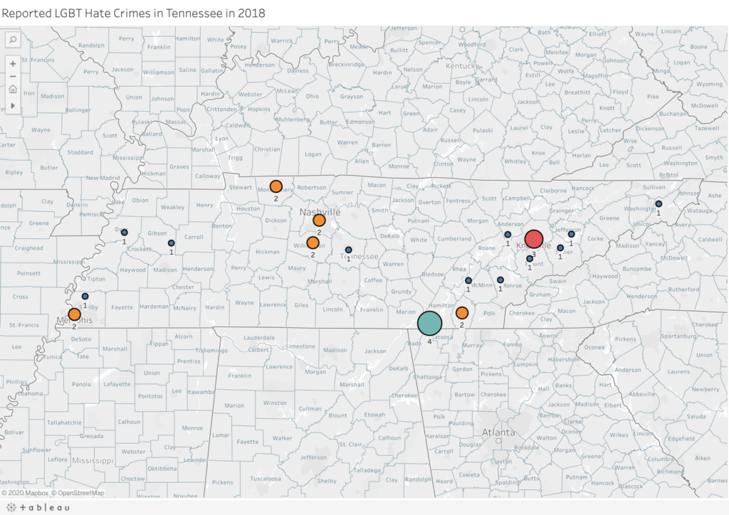
I found my data on the Tennessee Bureau of Investigation site, looking through reported hate crimes in the year 2018. This is the most recent year I was able to find this information readily available, so I do plan on doing further research to compare the numbers in both 2019 and 2020. I transferred the data from this site to an Excel sheet, separating them into categories of the county/city where the hate crimes were reported, the latitude and longitude and the number of hate crimes reported in each area listed. Initially, I was stuck on how to map out my data, but through helpful Youtube videos I was able to make progress. Notice that on the map, larger circles indicate which areas had multiple reported hate crimes in 2018. Moreover, the varying colors of the circles also reflect the amount of reported hate crimes. I’d like to point out that the hate crimes on the Tennessee Bureau of Investigation did have different forms of LGBTQ hate crimes separated into the following categories: Anti-Bisexual Bias, Anti-Gay Bias, Anti-Lesbian Bias, Anti-LGBT Mixed Group Bias, Anti-Transgender Bias and Anti-Gender Non-Conforming Bias. However, as this is my first mapping project, for this assignment I grouped all cases together as these categories can all be considered part of the LGBTQ community. I plan to continue this project with distinct separations that note the experiences of each allotted community. Additionally I’d like to note that this resource did not distinguish the race or ethnicity of the victims of these specific hate crimes. Therefore, I plan on doing further research focused on the percentage of individuals who have experienced LGBTQ hate crimes that are BIPOC, as homophobia and racism are undoubtedly linked and the discrimination experienced by white queer folks is much different than that of queer BIPOC.

I thoroughly enjoyed this assignment. I am aware that this is not the most informative or visually stimulating map, but I’m excited for future mapping projects where I can improve my visualization of datasets and add more layers of necessary information. Moreover, I’m looking forward to doing further research on the topic of the queer Appalachian experience and finding ways to visualize it using digital humanities tools.

Here is a link to the map on Tableau: https://public.tableau.com/profile/lane.vineyard#!/vizhome/Book4_16013334881130/Sheet2?publish=yes

StoryMap

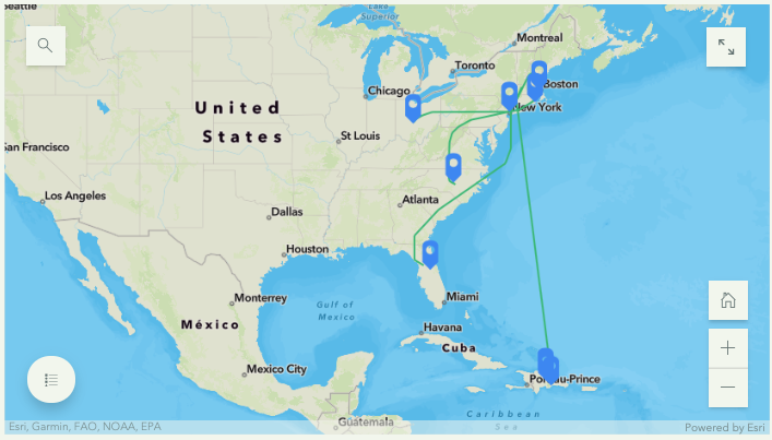
I never used mapping software before, so I wanted to keep this project simple. I decided to use this DH tool to help me trace my family’s journey from the Dominican Republic to the United States. I wanted to highlight not just the trajectory but also how my family scattered across the country. Though this was my main goal, during the process, I discovered an interesting pattern that I wanted to continue to explore but couldn’t find a way to do using the map provided. I was about to give up on Arcgis (powered by Esri) software when I noticed their Story Map tool

.

CLICK BELOW FOR INTERACTIVE STORYMAP

The Story Map tool allowed me to essentially, look at the story behind the map, the one I actually wanted to tell. While I was concern over the look and feel of the basemap and the layers (none that did the job I wanted ), I forgot about the bigger picture! The tool then so gave me the space I need it to tell my story and use the map more as supplemental material that supported my story and gave the audience a guided tour of the places and people mentioned. While creating the story I thought about Johanna Drucker, “Humanities Approaches to Graphical Display” and how to best add the human side to this data. I added photographs of my family members, where they were, and where they are now.

The first step was writing the story. My mother’s family started in a small rural area in the Dominican Republic called Jamo, La Vega. In the early 1960s, the family moved to the big city, Santo Domingo. My aunt subsequently came to the United States in the late 1960s and established a home in Washington Heights, New York City. Since then, the family hasn’t just grown but scattered to places like Columbus, Ohio, Boston, Massachusetts, and Orlando, Florida. When asked about why they either stayed in New York or left the city for more suburban and rural areas, they all mentioned an aspect of their home in Jamo and Santo Domingo. Both places hold many memories for each family member; they used this as a basis for their new homes here in the United States. While some want to maintain contact with their culture by staying near Washington Heights, others preferred to honor their live Dominican style by purchasing a home in Orlando and growing plantains and avocados, just like they did back in Jamo. My cousins in Jersey told me how much they missed having a backyard, space to host, and a large house to accommodate any family gathering similar to the home they had in Santo Domingo.

Once I wrote the story, I used the Express Map tool to add points and notes to the map. While I could pin a location and add a note, the difficulty came when using the line tool. I envisioned different colors the lines spreading from a single point (Washington Heights). However, the tool is limiting in that all points have the same color, and all the lines are of the same color as well, making it difficult to color-code each individual journey. The zoom in and out functions was also tricky and hard to control and focus making the process of adding the lines much more complicated.

The best part was adding the Guided Tour Map! I really enjoyed adding the photos that corresponded with each point of the journey/story. This tool, more than the Express Map one, gave the project a sophisticated look and added value to the points on the map; added faces to the points on the map. Overall, I feel more confident now to continue to use mapping software not just visualize stories, and journeys, but other data as well.

Currently, I’m using Inkarnate to create a fictional map for a fantasy story!


“Map a Timeline” Experiment

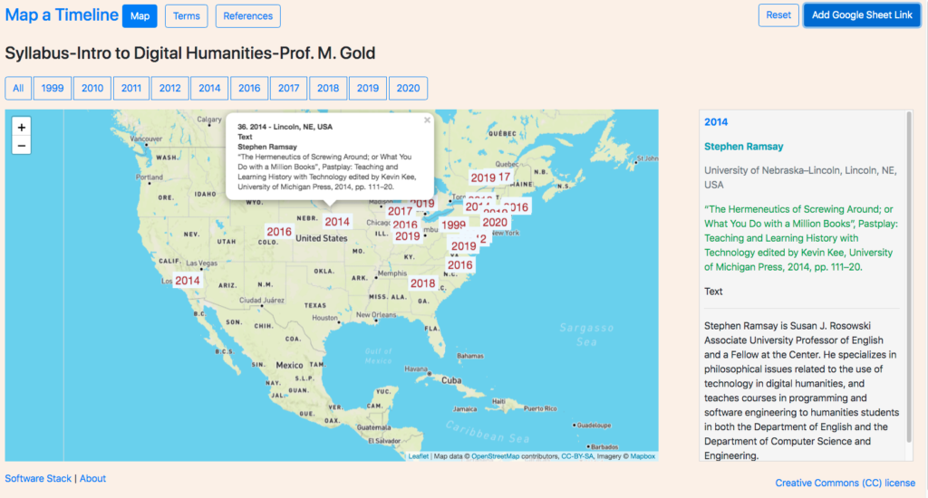
Image of a geographical map of data stored in a Google Sheet.

Image of a geographical map of data stored in a Google Sheet.

Map a Timeline is an experiment in three inter-related areas of digital humanities education:

1. Using visual maps to apprehend and elicit temporal and other relationships amongst a given series of events, texts, persons, or things which share a date as one attribute. The sample series for this experiment is a set of readings from a syllabus.

2. Constructing a map visualization which can serve as one of several pedagogical tools in a toolbox of supplemental open access utilities for instructors and learners. The principal technologies enabling this capability are the Javascript mapping library Leaflet, the reverse geocoding service Here, and Google Sheets as the data source for the mapping visualizations.

3. Incorporating critical inquiry of the data as a fundamental practice for the display of visualizations. The primary features enabling this critical inquiry are annotations for every item in the series and a listing of the provenance of the information technologies and data used.

Discussion

The work undertaken to construct the tool involved an iterative process of researching the Internet for example code for libraries, frameworks, and components; wiring them together using Javascript; and customizing them to address the three areas of assessment. As an experimental proof of concept, the effort set aside critical considerations, including: accessibility for people with disabilities (at least 16 issues were discovered by the WAVE Web Accessibility Evaluation Tool), rendering on mobile devices, the use of non-proprietary technologies and data sources, and compatibility with standard browsers and operating systems. Each decision carried a “social cost” related to the larger context of the the relationship between the use of technology and social responsibility, which could arguably be compared to and associated with notions of “technical” and “environmental” debt.

As the mapping library chosen for this experiment, Leaflet offers a free and simple programming interface following the software design of Google Maps and older mapping software and describes itself as “the leading open-source JavaScript library for mobile-friendly interactive maps”. In the same way that rendering libraries are made available at no cost while data services are offered for a fee, Leaflet promotes and integrates with the corporate-for-profit service Mapbox. Since Leaflet more easily integrates with services other than Mapbox, the library is more open than Google Maps. This serves as an example of the paradoxical entanglements of proprietary and open source technologies. For-profit corporations leverage non-profit labor, as is clearly demonstrated by the encouragement on Leaflet’s website to contribute to the open source project. These efforts benefit both for-profit and non-profit constituencies. The entanglement raises the question of how to evaluate the long and short term socio-political and socio-economic benefits and liabilities of “free” technologies and software.

In terms of using geographic maps to elicit relationships amongst works based on the place of work of the authors, the viewer can discern a general sense of the geographic scope of the series within the larger context of global and continental academic institutions, including regional dispersions and concentrations. The spacial placement together with the underlying geography offers the possibility of entering into comparisons of the authors and the texts that would not be as easily imaginable in a textual list. Spatial representations arguably provide an artificial mediation that “synthetically” animates relationships, perhaps along the lines of popular board games such as Risk, Monopoly, and Pandemic. Filtering by date displays contemporaneous readings as well as interactively elicits a chronology amongst the readings in the series. However, without additional visual controls, imagery, or cartographic features, the pedagogical benefits would seem to quickly run their course. A list of enhancements to further draw out the nature of relationships might include: a sliding control on a horizontal timeline displaying labels of “dates of interest” pulled from a combination of the readings, references, and online encyclopedias; arrowed lines connecting the place markers to indicate references amongst the readings; images in the marker popups associated with each item; using color and other visual codings to create sub groups. Problems of this approach include: the imposition of cartographically-based ideologies and associated iconographies onto the subject matter; inadvertent anachronisms resulting from applying a dynamic temporal perspective to a temporally static geography; for series which have weak temporal semantics, the association of temporality that is irrelevant to the relationships amongst the items.

In terms of map features that offer affordances for critical inquiry, the mouse overs on the markers that trigger textual annotations displayed next to the map would seem to point to opportunities. Interactive maps enable quick comparisons based on the content of the annotations, suggesting the use of maps as substitutes for a table of contents. Adding additional logic to interpret more data attributes opens avenues for more semantically rich and critically directed annotations. Spatial network maps would add supplemental visualizations of frequently used words in the readings along with networks maps of the works cited. Incorporating a list of technologies used to construct the utility offers an understanding of the social context of technology construction, that point to the potential for the explicit display of the supply chain of labor processes.

Challenges (to be resolved)

Challenges from a user experience (UX-visual and interaction design) perspective include: the placement of more than 2 markers in the same location; the placement of markers for works by multiple authors.

From a data relation and visualization perspective, a challenge is to identify relevant spatial attributes and effectively elaborate critical annotations that reveal assumptions about the data.

From a software development perspective, a challenge is the secure storage of API keys using Github Pages (github.io). The code for sites on Github Pages are generally stored in a public git repository. Storing API keys in a public git repository exposes the keys to the public.

Conclusion

The spatial placement of temporally categorized information offers a range of opportunities for exploring relationships and interdependencies. Effectiveness depends on both the kind of information and the incorporation of additional visual features. Experimenting with a syllabus of readings yields insights regarding the value and irrelevancy of chronologies and temporalities. In so far as this experiment fails to effectively address its areas of assessment or argues for the impracticality of spatial rendering of temporality for certain kinds of datasets, the effort may nevertheless offer value in terms of the limits of maps in the development of visualizations for new conceptualizations of critically informed web books and historical web atlases.

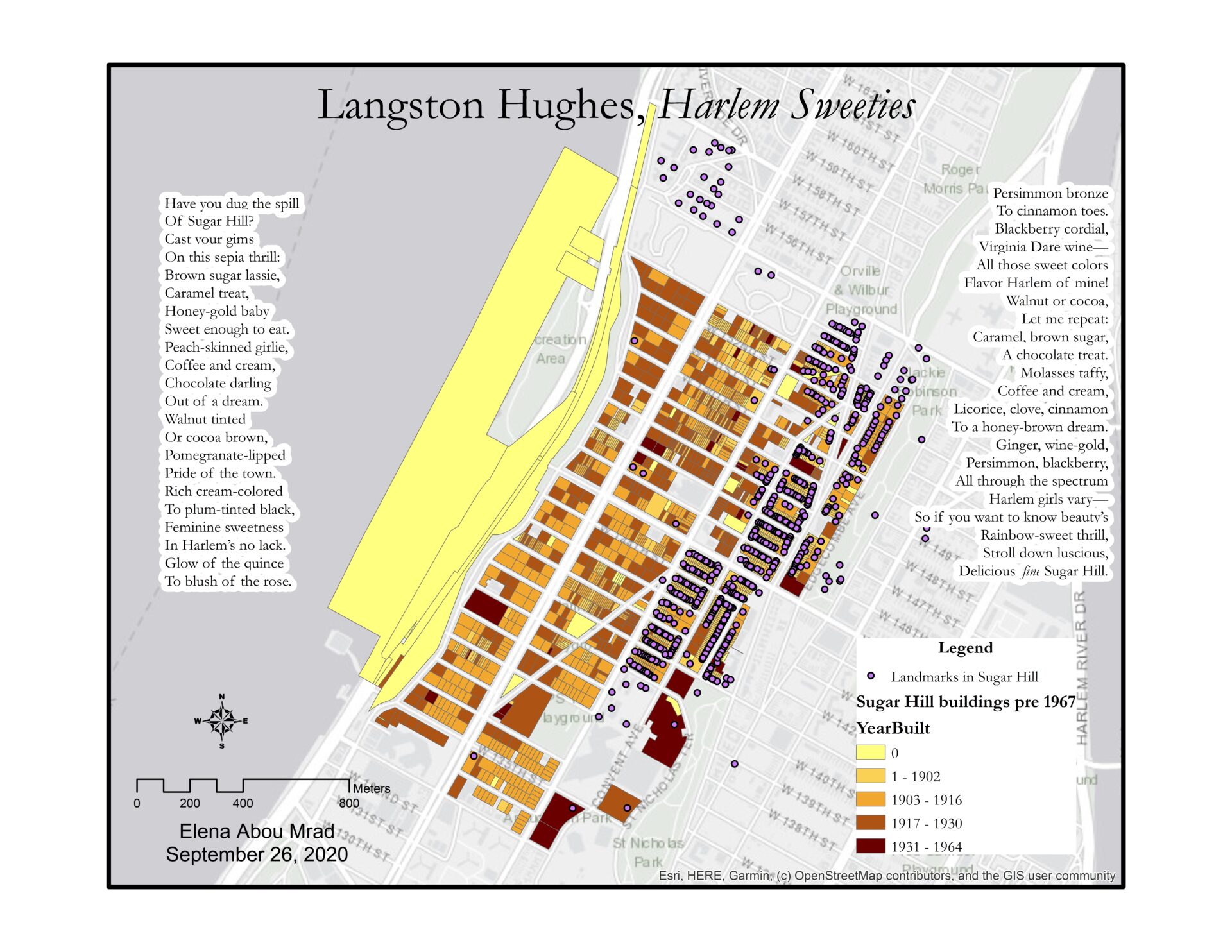
Map of Langston Hughes' poem Harlem Sweeties.

Map of Langston Hughes’ Harlem Sweeties

Map of the Sugar Hill Neighborhood in Harlem. Buildings are colored according to the year they were built and there are indications of NYC landmarks. Langston Hughes' poem, "Harlem Sweeties" is written on the right and left side of the map.
Map of Harlem Sweeties by Langston Hughes. To see the full-size image, click here

In 2018 I had the fortune of visiting Langston Hughes’ house in Harlem during a children’s program organized by the independent bookstore Revolution Books. In the brownstone’s living room, an actor read his favorite poems by Langston Hughes, including one that wasn’t exactly appropriate for children: Harlem Sweeties, an ode to the sensual beauty of the women of Harlem, whom he depicts as delicious desserts and candy. I really loved the poem, not only for its tongue-in-cheek tone, but because it perfectly described the great diversity of Sugar Hill, the neighborhood where I was living at the time.

While working on my map, I asked myself: what did Sugar Hill look like in Langston Hughes’ time? Therefore, I decided to create a map of the neighborhood that depicted the buildings before 1967, the year that Hughes passed. I used ArcGIS because I felt comfortable with the software and its tools. However, this choice came with its sets of problems, as I will describe later in the post.

Step-by-Step Process

  1. I selected a light gray basemap from ArcGIS’s options, to give a simple background to my map.
  2. I imported data from the MapPLUTO database, a dataset of land use and geographic data collected by NYC agencies.
  3. To draw a map of Sugar Hill, I selected the parts of the map that had the neighborhood’s ZIP code, 10031. (Select by Attributes)
  4. From this group, I selected only the buildings built before 1967. (Select by Attributes)
  5. I decided to indicate the age of the buildings with a color scale in the tones of beige and brown. The newer the building, the darker the color. I chose this color palette because it reminded me of the colors that Hughes mentions in Harlem Sweeties
  6. Sugar Hill is a Historic District, so I decided to import the Designated and Calendared Buildings and Sites dataset from NYC Open Data to show which Sugar Hill buildings are landmarks.
  7. I wrote the text of the poem on the map and changed the font to make it look nicer.
  8. I edited the layout of the map, adding a legend, a compass, and a scale indicator.
  9. I created JPEG and TIFF files of the map.

What you don’t see in the map, AKA problems

While working on my mapping assignment, I kept a little journal of my progress and lack thereof. I found this process very helpful when learning how to code in prof. Smyth’s Software design lab. Therefore, here’s a list of what you can’t see in the map, but was a part of the process:

  1. The hour I wasted pursuing other ideas and getting frustrated because I couldn’t get the data to display on the map the way I wanted. I tried to work on:
  2. The hour I wasted trying to georeference an old map of Williamsburg on ArcGIS.
  3. Every time ArcGIS crashed, or my computer crashed. Basically, every time I gave the software a command, it took 5 minutes to complete the work. I took a bunch of coffee breaks.

I decided to share the challenges I encountered while working on this project because, when we look at maps, we don’t usually think about the process behind them. Maps on the internet look great and present the information as a fact, and not as the product of many small and big decisions. I think my map looks pretty nice in its final form, but I think it’s useful to show not only the destination, but also the bumps in the road.