
Image of a geographical map of data stored in a Google Sheet.
Map a Timeline is an experiment in three inter-related areas of digital humanities education:
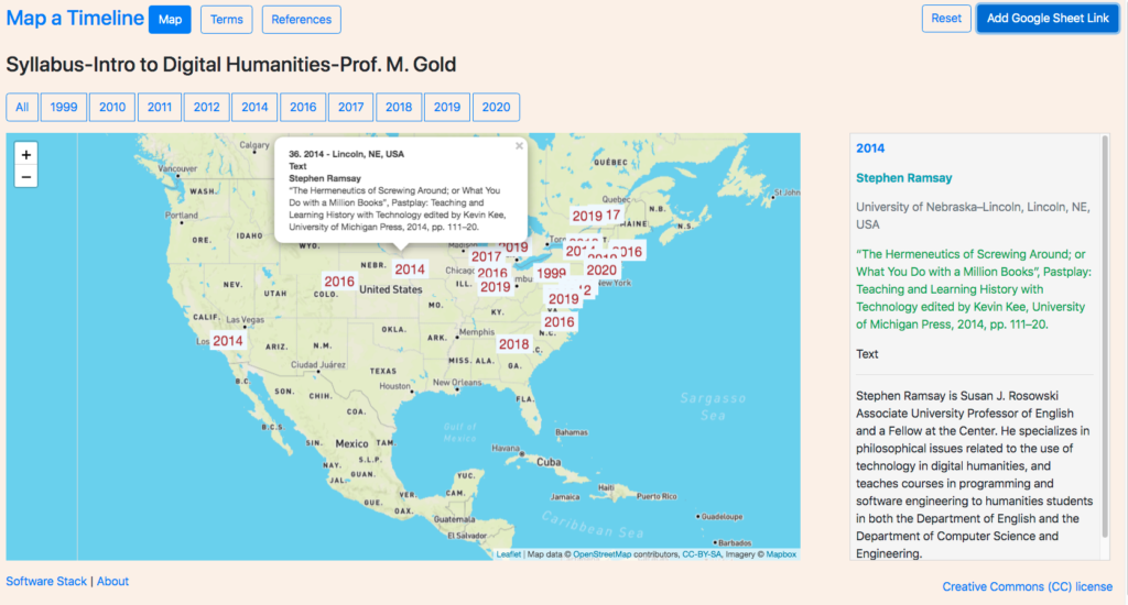
1. Using visual maps to apprehend and elicit temporal and other relationships amongst a given series of events, texts, persons, or things which share a date as one attribute. The sample series for this experiment is a set of readings from a syllabus.
2. Constructing a map visualization which can serve as one of several pedagogical tools in a toolbox of supplemental open access utilities for instructors and learners. The principal technologies enabling this capability are the Javascript mapping library Leaflet, the reverse geocoding service Here, and Google Sheets as the data source for the mapping visualizations.
3. Incorporating critical inquiry of the data as a fundamental practice for the display of visualizations. The primary features enabling this critical inquiry are annotations for every item in the series and a listing of the provenance of the information technologies and data used.
Discussion
The work undertaken to construct the tool involved an iterative process of researching the Internet for example code for libraries, frameworks, and components; wiring them together using Javascript; and customizing them to address the three areas of assessment. As an experimental proof of concept, the effort set aside critical considerations, including: accessibility for people with disabilities (at least 16 issues were discovered by the WAVE Web Accessibility Evaluation Tool), rendering on mobile devices, the use of non-proprietary technologies and data sources, and compatibility with standard browsers and operating systems. Each decision carried a “social cost” related to the larger context of the the relationship between the use of technology and social responsibility, which could arguably be compared to and associated with notions of “technical” and “environmental” debt.
As the mapping library chosen for this experiment, Leaflet offers a free and simple programming interface following the software design of Google Maps and older mapping software and describes itself as “the leading open-source JavaScript library for mobile-friendly interactive maps”. In the same way that rendering libraries are made available at no cost while data services are offered for a fee, Leaflet promotes and integrates with the corporate-for-profit service Mapbox. Since Leaflet more easily integrates with services other than Mapbox, the library is more open than Google Maps. This serves as an example of the paradoxical entanglements of proprietary and open source technologies. For-profit corporations leverage non-profit labor, as is clearly demonstrated by the encouragement on Leaflet’s website to contribute to the open source project. These efforts benefit both for-profit and non-profit constituencies. The entanglement raises the question of how to evaluate the long and short term socio-political and socio-economic benefits and liabilities of “free” technologies and software.
In terms of using geographic maps to elicit relationships amongst works based on the place of work of the authors, the viewer can discern a general sense of the geographic scope of the series within the larger context of global and continental academic institutions, including regional dispersions and concentrations. The spacial placement together with the underlying geography offers the possibility of entering into comparisons of the authors and the texts that would not be as easily imaginable in a textual list. Spatial representations arguably provide an artificial mediation that “synthetically” animates relationships, perhaps along the lines of popular board games such as Risk, Monopoly, and Pandemic. Filtering by date displays contemporaneous readings as well as interactively elicits a chronology amongst the readings in the series. However, without additional visual controls, imagery, or cartographic features, the pedagogical benefits would seem to quickly run their course. A list of enhancements to further draw out the nature of relationships might include: a sliding control on a horizontal timeline displaying labels of “dates of interest” pulled from a combination of the readings, references, and online encyclopedias; arrowed lines connecting the place markers to indicate references amongst the readings; images in the marker popups associated with each item; using color and other visual codings to create sub groups. Problems of this approach include: the imposition of cartographically-based ideologies and associated iconographies onto the subject matter; inadvertent anachronisms resulting from applying a dynamic temporal perspective to a temporally static geography; for series which have weak temporal semantics, the association of temporality that is irrelevant to the relationships amongst the items.
In terms of map features that offer affordances for critical inquiry, the mouse overs on the markers that trigger textual annotations displayed next to the map would seem to point to opportunities. Interactive maps enable quick comparisons based on the content of the annotations, suggesting the use of maps as substitutes for a table of contents. Adding additional logic to interpret more data attributes opens avenues for more semantically rich and critically directed annotations. Spatial network maps would add supplemental visualizations of frequently used words in the readings along with networks maps of the works cited. Incorporating a list of technologies used to construct the utility offers an understanding of the social context of technology construction, that point to the potential for the explicit display of the supply chain of labor processes.
Challenges (to be resolved)
Challenges from a user experience (UX-visual and interaction design) perspective include: the placement of more than 2 markers in the same location; the placement of markers for works by multiple authors.
From a data relation and visualization perspective, a challenge is to identify relevant spatial attributes and effectively elaborate critical annotations that reveal assumptions about the data.
From a software development perspective, a challenge is the secure storage of API keys using Github Pages (github.io). The code for sites on Github Pages are generally stored in a public git repository. Storing API keys in a public git repository exposes the keys to the public.
Conclusion
The spatial placement of temporally categorized information offers a range of opportunities for exploring relationships and interdependencies. Effectiveness depends on both the kind of information and the incorporation of additional visual features. Experimenting with a syllabus of readings yields insights regarding the value and irrelevancy of chronologies and temporalities. In so far as this experiment fails to effectively address its areas of assessment or argues for the impracticality of spatial rendering of temporality for certain kinds of datasets, the effort may nevertheless offer value in terms of the limits of maps in the development of visualizations for new conceptualizations of critically informed web books and historical web atlases.

This entry is licensed under a Creative Commons Attribution-NonCommercial-NoDerivatives 4.0 International license.