Author Archives: Elena Abou Mrad

drawing of a tree made of multicolored handprints and red cursive text saying "It takes a village"

It takes a village (to make a DH project)

When making the last edits to my final project, I realized how many people contributed to it. I contacted people from all corners of the Graduate Center, and they all have helped me with generosity and care. This post is a huge thank-you note to the wonderful community that supported me during this challenging semester.

To all my classmates: thank you for being you. I was excited to come to class to hear your opinions and learn from you. The discussions we had are invaluable, and I benefited from everyone’s feedback during my project presentation.

To Prof. Gold: thank you for creating a safe, supportive space that allowed everyone to contribute to the class in their own way. I really appreciated the way you conducted the lessons and constantly asked us to express our opinions about the class and its contents.

Micki Kaufman has been a shining light through this pandemic. Micki was always ready to give me guidance and practical advice about my academic life and my future projects. I’ve said it many times before, but if you have any questions or doubts, ask Micki!

I consulted with Stefano Morello and the DARC for technical details about archiving and had a wonderful conversation on how to develop trust when creating a community archive. It was to great to bounce ideas off of them: it gave me renewed energy to develop my project next semester.

I had a great session with Daniel Hengel of the Writing Center, who helped me make my Abstract section clearer and more understandable. Without him, there would still be crazy long sentences that make sense only in my bilingual mind.

Stephen Klein at the Mina Rees Library gave me precious advice about preserving digital projects…and talked me out of using Flask in my digital archive. It’s always good to have a reality check when writing a project!

Most of you don’t know this, but my parents in Italy got Covid in November, and my dad ended up in the hospital. They have since recovered and they’re fine, but I wanted to share this with you to express my gratitude for the beautiful atmosphere that everyone created in class. Coming to class and working on this project was a great way to feel present and connected to a wider community when things were really chaotic. I thought you all should know how much you contributed to make my life better during a challenging time.

Happy Holidays. Stay warm and safe, and I hope to see many of you in class next semester!

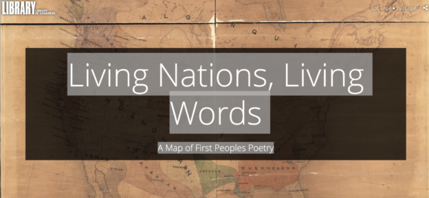
Screenshot of the opening page of the digital map "Living Nation, Living Words - A map of first people poetry". In the background, an ancient-looking map of the first Nations. In the foreground, the Title, contained in a darker-colored box

Too good not to share!!! Joy Harjo’s Map of First People Poetry

I just saw the news on the Unladylike newsletter: Joy Harjo was appointed to the 3rd term as a U.S. Poet Laureate! She is an amazing poet from the Muscogee Nation, and the first Native American to hold the role of Poet Laureate.

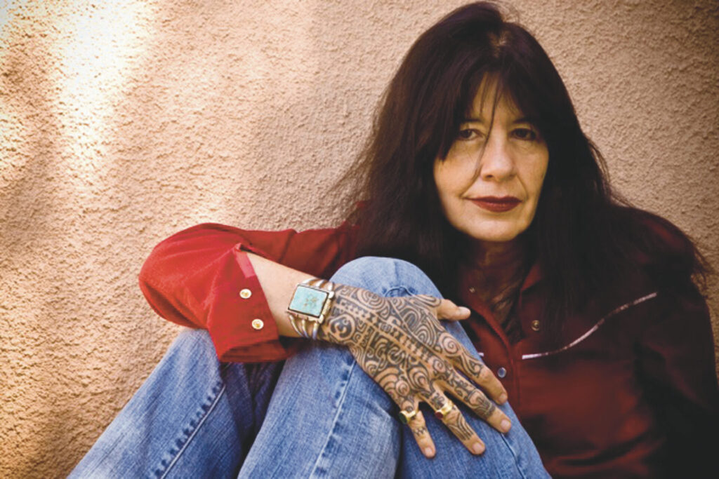
A photo of US Poet Laureate Joy Harjo. She is sitting against a wall and wrapping her right arm around her legs. She has long, brown hair and is wearing red lipstick. She is wearing a red shirt, blue jeans, a bracelet, and her right hand is entirely decorated with Native American tattoos.
A photo of Joy Harjo from the Poetry Foundation

I discovered her poetry this year thanks to the Bklyn Bookmatch Service of the Brooklyn Public Library – try it, librarians are awesome! – and it was a great source of comfort and wonder during these rough times.

But the reason I’m writing is because Joy Harjo just launched a beautiful DH project: Living Nations, Living Words – A Map of First Peoples Poetry, an interactive map of Native Nations poets and poems. There is also a collection of audio recordings of contemporary Native American poets reading and discussing poems. This projects connects to so many of our readings, that I couldn’t wait to share it with you all. Enjoy!

I wish you all a happy, safe Thanksgiving with your family – or your chosen family. Also, here’s a link to Joy Harjo’s poem An American Sunrise. November is National American Indian Heritage Month, so let’s celebrate it with poetry (and DH). 🙂

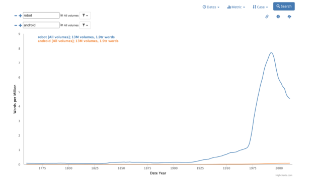
A graph showing the frequency of the use of the words "robot" and "android" in the HathiTrust corpus.

Exploring with Words: Working with HathiTrust data workshop

Yesterday I had the pleasure to attend the workshop about Working with HathiTrust data led by Digital Fellow Param Ajmera. In case you missed it, you can find an article about HathiTrust on the Digital Fellows Blog, Tagging the Tower.

HathiTrust is a huge digital library that contains over 17 million volumes, and for this reason it’s particularly good for large-scale text analysis. The advantage of using HathiTrust, as Param showed us, is that you can perform the text analysis on the website of the HathiTrust Research Center – HTRC, a Cloud computing infrastructure that allows us to parse a large amount of text without crashing our computers. And the best part – it’s free and you can create an account with your CUNY login.

Param gave us a live tutorial on how to select the texts we want from HathiTrust and create a collection that we can save and open on HTRC. He created a collection of public papers of American Presidents and used Topic Modeling to find the words that are most commonly used together in these texts. The result was a list of “topics”, groups of words that the algorithm gathered according to how often they appear together. This allowed us to make a comparison between different presidents according to the keywords in their public papers. The experience was very interesting – and with the perfect timing!

The part I enjoyed the most, however, was when Param taught us how to use Bookworm, a tool that creates visualizations of language trends over the entire corpus of HathiTrust. The result is very similar to the Google Ngram Viewer, but Bookworm has one advantage: when you click on a point on the line, you can see a list of the texts where the word appears.

Since topic modeling can take a long time (hours or even days) according to the volume of text you’re working with, I decided to experiment with Bookworm. Here’s my Ngrams:

  1. Being a sci-fi lover, I decided to check the frequency of the words “robot” and “android”. I was initially surprised when I saw that “android”, compared to “robot” had such a low curve. When I checked the texts that were used for the Ngram, I realized that the word “robot” appears in a lot of papers related to engineering, robotics, and information technology, while “android” is a term mostly used in sci-fi. If we look at the curve of “android” alone, we see that the word has a spike in the 1960s. Was it because of Philip Dick? Or Star Trek?
  2. Inspired by the Rocky Horror Picture Show and the TV show “Pose”, I decided to investigate the relative frequency of “transvestite”, “transsexual”, and “transgender” in the HathiTrust corpus. The first two terms sound pretty dated – and rightfully so, while the third one is the most commonly used now. As you can see from the graph, the use of the term “transgender” skyrockets starting in the mid-1980s, beating the other two at the end of the 1990s. Another thing I noticed is that, looking at the texts:
    1. “transvestite” is mostly used to describe a cultural phenomenon (for example in texts about literature, theater, cinema, or fashion)
    1. “transsexual” is used in medical contexts, for example in papers about gender dysphoria
    1. “transgender” is used in a medical context, beating “transsexual” at the end of the 1990s. However, it is also used in and institutional contexts like policies, guidelines, and social justice reforms.
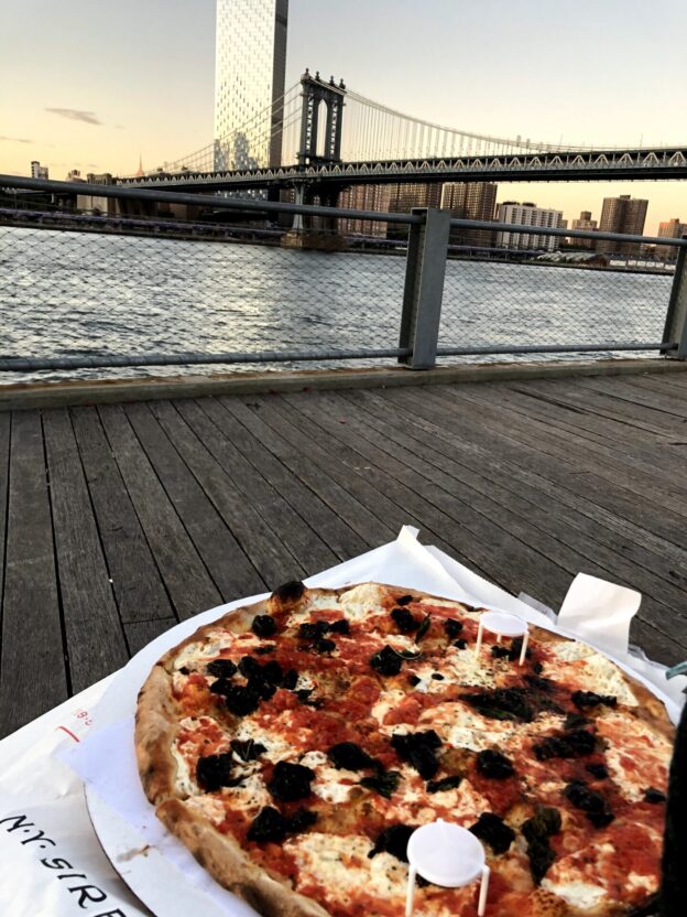
image of a large pizza margherita with olives. In the background, the Brooklyn Bridge at sunset.

Most Popular Cuisines in NYC Boroughs

One of the things I love the most about New York City is its diversity, which translates to the incredible variety of restaurants that we’re lucky to have at our disposal. I remember trying Vietnamese, Korean, and Ethiopian food for the first time in the city…Italy has great food, but not a lot of diversity!

I decided to use the dataset for the DOHMH New York City Restaurant Inspection Results, which I had downloaded in Spring 2020 for my Geospatial Humanities class. [1] I was hoping to make a map out of it, but I realized it was a little complicated with ArcGIS on my slow PC…however, this dataset worked very well for Data Visualization!

I was inspired by the work my classmates did for their Mapping assignment and decided to use Tableau for my data visualization. Thanks to a handy tutorial on the Tableau website, I was able to select the dimensions and measures I wanted to portray and explore different styles of visualization. I spent a morning just exploring the data on Tableau and trying to combine different fields to see if anything interesting came out. I experimented with Restaurant Grades and Scores, but then I decided to keep it simple and calculate the top 10 Cuisines for each borough. New Yorkers intuitively know that the best Chinese food is in Chinatown (Manhattan), Flushing (Queens), and Sunset Park (Brookyln). Or that you can find handmade mozzarella in Little Italy (the Bronx one!). And that there is a big Orthodox Jewish Community in South Williamsburg, so that’s the place to go if you are craving bagels, smoked fish, and chocolate babka. I wanted to see if the data reflected this empirical evidence.

I opted for a very simple bar chart showing the Top 10 Cuisines in each borough, which you can find here. I used a tutorial I found on Youtube to display the number of top cuisines for each borough, calculated as a percentage of the total. I decided to differentiate the cuisines by color for easy reference, but also for the aesthetical reason to portray the mosaic of NYC cuisines in my visualization.

As we can see from the visualization, American cuisine is the most prominent in each borough, with a spike in Manhattan. Chinese restaurants are the second most popular establishments in all boroughs except Staten Island, where they predictably get beaten by Italian restaurants. Italian food appears in the top 10 of Manhattan and Staten Island, but surprisingly not in the Bronx – where there is, however, a 7.7% rate for “Pizza” and a 2.7% rate for “Pizza/Italian”. Jewish/Kosher restaurants appear in the top 10 only in Brooklyn, which reflects my initial assumption. A thing I found interesting is that, despite there being a Koreatown in Manhattan, Korean cuisine makes it to the top 10 only in Queens.

In the end, this project left me with more questions than answers.

  1. According to the metadata of the DOHMH New York City Restaurant Inspection Results (the “Data Dictionary” spreadsheet), the “Cuisine Description” field is an “Optional field provided by provided by restaurant owner/manager”. The fact that there is a discreet number of categories makes me think that the owner/manager of a restaurant needs to choose from a list, which means that diversity is necessarily reduced. How do you classify the amazing Chino-Latino cuisine?
  2. What does “American Cuisine” mean? When I saw that field, I immediately assumed it meant burgers, BBQ joints, and steakhouses, but this is just my imagination (and my bias) filling the gap in the data. Soul food is definitely American, but it doesn’t fit neatly in the definition. I would love if there was an ulterior classification for American cuisine, or at least a more extensive description in the metadata.
  3. In the future, I would like to investigate the correlation of predominant cuisine and demographics in a ZIP code: for example, Manhattan’s Little Italy has a lot of touristy Italian restaurants, but I doubt that there are many Italians or Italian Americans living in the neighborhood. I’m looking forward to the release of the 2020 Census Data for this.
  4. How many restaurants have closed due to the Coronavirus crisis? Which cuisine was the most affected? I would need to interrogate the datasets for Spring 2020 and October 2020 to have a comparison.

I would greatly appreciate hearing your feedback on this project and how you would improve it. Stay safe and support your local restaurants!

P.S. The huge pizza in the image is from Juliana’s Pizza in Dumbo, Brooklyn and I highly recommend it!


[1] I’m mentioning the download timeframe because the data gets updated according to new inspections from the Department of Health. Here I’m presenting the data as it appeared in Spring 2020: this means that the dataset probably portrays restaurants that are now closed and doesn’t have data on new restaurants that might have opened since then.

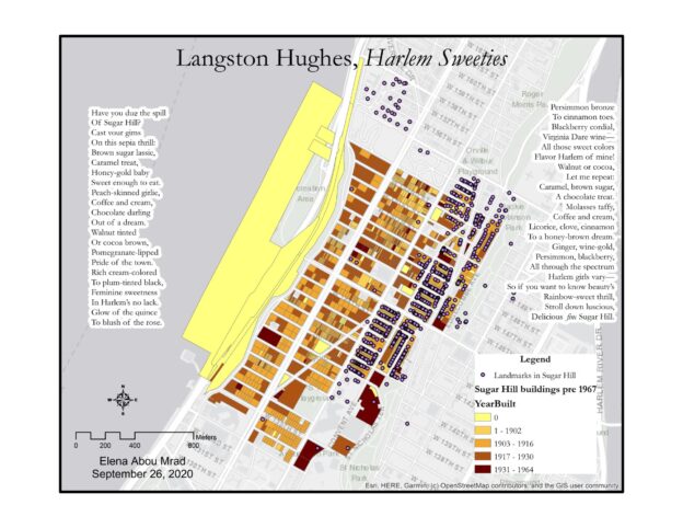
Map of Langston Hughes' poem Harlem Sweeties.

Map of Langston Hughes’ Harlem Sweeties

Map of the Sugar Hill Neighborhood in Harlem. Buildings are colored according to the year they were built and there are indications of NYC landmarks. Langston Hughes' poem, "Harlem Sweeties" is written on the right and left side of the map.
Map of Harlem Sweeties by Langston Hughes. To see the full-size image, click here

In 2018 I had the fortune of visiting Langston Hughes’ house in Harlem during a children’s program organized by the independent bookstore Revolution Books. In the brownstone’s living room, an actor read his favorite poems by Langston Hughes, including one that wasn’t exactly appropriate for children: Harlem Sweeties, an ode to the sensual beauty of the women of Harlem, whom he depicts as delicious desserts and candy. I really loved the poem, not only for its tongue-in-cheek tone, but because it perfectly described the great diversity of Sugar Hill, the neighborhood where I was living at the time.

While working on my map, I asked myself: what did Sugar Hill look like in Langston Hughes’ time? Therefore, I decided to create a map of the neighborhood that depicted the buildings before 1967, the year that Hughes passed. I used ArcGIS because I felt comfortable with the software and its tools. However, this choice came with its sets of problems, as I will describe later in the post.

Step-by-Step Process

  1. I selected a light gray basemap from ArcGIS’s options, to give a simple background to my map.
  2. I imported data from the MapPLUTO database, a dataset of land use and geographic data collected by NYC agencies.
  3. To draw a map of Sugar Hill, I selected the parts of the map that had the neighborhood’s ZIP code, 10031. (Select by Attributes)
  4. From this group, I selected only the buildings built before 1967. (Select by Attributes)
  5. I decided to indicate the age of the buildings with a color scale in the tones of beige and brown. The newer the building, the darker the color. I chose this color palette because it reminded me of the colors that Hughes mentions in Harlem Sweeties
  6. Sugar Hill is a Historic District, so I decided to import the Designated and Calendared Buildings and Sites dataset from NYC Open Data to show which Sugar Hill buildings are landmarks.
  7. I wrote the text of the poem on the map and changed the font to make it look nicer.
  8. I edited the layout of the map, adding a legend, a compass, and a scale indicator.
  9. I created JPEG and TIFF files of the map.

What you don’t see in the map, AKA problems

While working on my mapping assignment, I kept a little journal of my progress and lack thereof. I found this process very helpful when learning how to code in prof. Smyth’s Software design lab. Therefore, here’s a list of what you can’t see in the map, but was a part of the process:

  1. The hour I wasted pursuing other ideas and getting frustrated because I couldn’t get the data to display on the map the way I wanted. I tried to work on:
  2. The hour I wasted trying to georeference an old map of Williamsburg on ArcGIS.
  3. Every time ArcGIS crashed, or my computer crashed. Basically, every time I gave the software a command, it took 5 minutes to complete the work. I took a bunch of coffee breaks.

I decided to share the challenges I encountered while working on this project because, when we look at maps, we don’t usually think about the process behind them. Maps on the internet look great and present the information as a fact, and not as the product of many small and big decisions. I think my map looks pretty nice in its final form, but I think it’s useful to show not only the destination, but also the bumps in the road.

Digital Blackface, New Jim Code, and Black Future Month

Of all our readings from the past two weeks, the Introduction to the Digital Black Atlantic and Making a Case for the Black Digital Humanities really resonated with me, especially because they relate so well to things I’ve been reading and listening to lately. The more I study DH, the more I notice ramifications in the culture around me and the more I find connections between scholarship and articles, books, podcasts, and tv shows.

The Evolution of Digital Blackface

Cover of Wired from September 2020, with the title "The evolution of digital Blackface". In the balckground, close-up of a pink shirt with two gold chains.
Wired cover from September 2020

In this article from Wired, Jason Parham reflect on the phenomenon of Digital Blackface on TikTok and its consequences. The problem here is duplicitous: the platform not only fails to sanction racist behaviour, but ended up muting black creators for “hate speech” and aggressive behaviour when they decide to speak up against digital blackface. While reading the Introduction to the Digital Black Atlantic, it was a phrase in particular that made me think about this Wired article:

“There are few contemporary political spaces where the energies of love and imagination are understood and respected as powerful social forces”

Robin D.G. Kelley

In The Evolution of Digital Blackface, Parham reports on Black TikTok creators feeling betrayed by a platform that promised them a place of self-expression and joy.

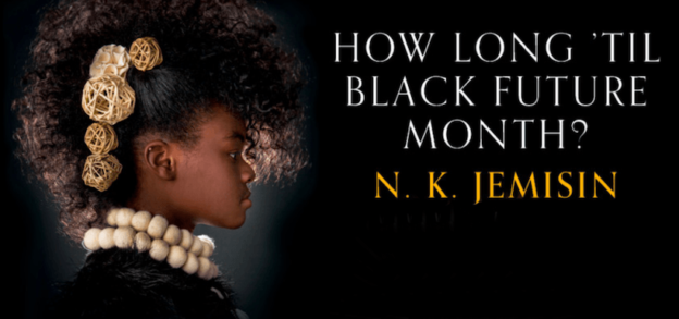
How long ’til black future month? by N.K. Jemisin.

A few months ago, I was listening to an episode of “LeVar Burton Reads” about Valedictorian, a short story from N.K. Jemisin.

LeVar Burton wearing headphones and holding a smartphone. The subtitles say "you gotta hear this"

The narrative really captivated me and, as soon as libraries reopened, I borrowed the short story collection How long ’til black future month?. When Kelly Baker Josephs and Roopika Risam talk about Afrofuturism, this book was the first one I thought about. As a fan of science fiction, reading Jemisin’s short stories was eye-opening. When reading the short story collection The Future is Female! I already noticed that sci-fi written by women has very different themes than male-written sci-fi, which is often focused on conquest, colonization, and war. In How long ’til black future month?, the exploration becomes even deeper, entering the realm of race, class, and social justice.

Technology and Race with Ruha Benjamin

This episode of Factually! With Adam Conover from last week ties in with many of the themes we’ve been discussing in DH. Scholar Ruha Benjamin explains how technology is not transparent, but reflects the society it’s produced in…and reproduces the mechanisms of oppression of said society. She coined the term “New Jim Code” to express how technology reproduces the racist assumptions of our society, harming people of color in the process. I recommend listening to this episode, it’s really interesting!

If you have more suggestions about books, articles, movies, tv shows, or podcasts that talk about the instersection of technology and race, please comment below. I would really appreciate some suggestions!

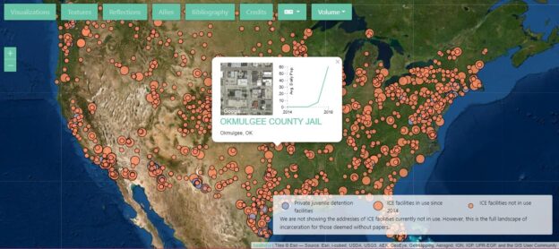
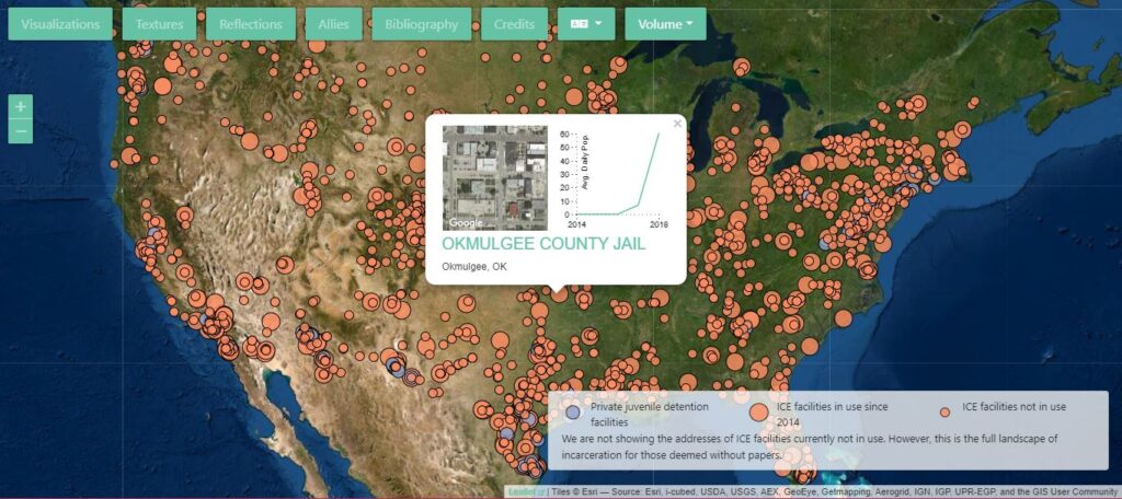
A map of the United States with indication of ICE detention centers.

From “Who’s in and Who’s Out” to “Who’s with us?” to “What can we do to help?”

When reading the introductions to the three editions of Debates in the Digital Humanities, I could see a trajectory emerge in the scope and purpose of the DH. In the 2012 edition, DH is an emergent field that needs to find its place in the galaxy of academia; part of the issue is determining who’s in and who’s out this “Big Tent” that encompasses so many disciplines and skills. In my opinion, the process at the of the publication might be the most innovative aspect of it: a semi-public peer-to-peer review website that encouraged scholars to view and comment each other’s work, therefore creating a more cohesive publication, but also fostering a sense of community. This type of process is reflected in Reviews in the DH, where a pool of reviewers examines DH projects that are submitted every month. Project directors who submit their work agree to become part of the review pool, therefore creating a sense of continuity and reciprocity.

The introduction to Debates in the Digital Humanities 2016 acknowledges that the growth of the field caused tensions and challenges, and that meaning can emerge from these points of friction. The paradigm of the “Big Tent” itself gets challenged in favor of a more open metaphor, like a trading post. This opening up to diversity in the DH is well represented by the Digital Black Atlantic and its mission of decolonizing the DH. A perfect example of this practice is the Early Caribbean Digital Archive, a digital archive that aggregates documentary materials related to the literary history of the Caribbean, which are mostly located in former colonial countries.

Torn Apart/Separados, Volume 1

The 2019 edition is the one that resonated the most with me, because of the feeling of urgency that underlies it. In these discouraging times, it is empowering to know that the DH can be a place of informed resistance, a powerful instrument for social justice. Torn Apart/Separados is the project that reflects this new, activist phase of the DH. In an interactive map that shows ICE detention centers across the US (Volume 1) and the funds awarded to ICE by congressional district (Volume 2) , Torn Apart/Separados makes it impossible to un-see the devastating impact of Trump’s “zero tolerance” immigration policy in 2018. Even with all its challenges and bumps in the road, the trajectory of the DH seems to be one of growing self-reflection and changemaking. The field has moved from trying to understand and justify itself, to opening to new disciplines, new communities, and new applications, finding meaning in the divergences, and new opportunities for resistance and resilience in a troubled world.

Bibliography

  • “Early Caribbean Digital Archive.” Early Caribbean Digital Archive, https://ecda.northeastern.edu/. Accessed 1 Sept. 2020.
  • Gold, Matthew K. “Introduction: The Digital Humanities Moment.” Debates in the Digital Humanities, 2012, https://dhdebates.gc.cuny.edu/read/untitled-88c11800-9446-469b-a3be-3fdb36bfbd1e/section/fcd2121c-0507-441b-8a01-dc35b8baeec6#intro.
  • Gold, Matthew K., and Lauren F. Klein. “Introduction: A DH That Matters.” Debates in the Digital Humanities, 2019, https://dhdebates.gc.cuny.edu/read/untitled-f2acf72c-a469-49d8-be35-67f9ac1e3a60/section/0cd11777-7d1b-4f2c-8fdf-4704e827c2c2#intro.
  • Klein, Lauren F., and Matthew K. Gold. “‘Digital Humanities: The Expanded Field | Lauren F. Klein and Matthew K. Gold.’” Debates in the Digital Humanities, 2016, https://dhdebates.gc.cuny.edu/read/untitled/section/14b686b2-bdda-417f-b603-96ae8fbbfd0f#intro.