Tag Archives: mapping

An End, but Mostly a Beginning

I really didn’t know what to expect when I joined our first Zoom class in August—a mere 4 months ago in calendar time and closer to 40 years ago in experienced time. How would I adjust to being in school after being so long away from it; how would grad school be different from college; how would remote learning even work? I was stumbling every time I even tried to describe what Digital Humanities (DH) was when people asked me what I was studying. “You know, like humanities, but digital.” Little did I know…

The vast scope of our readings, our care-full and engaging conversations, the most amazing and thoughtful and socially justice–minded project presentations everyone gave—I’m in awe of all of us and what we accomplished together. Thank you doesn’t fully cover it, but THANK YOU so much for everything. I can’t imagine a better introduction to the program, and I am beyond excited to start building our projects together next semester.

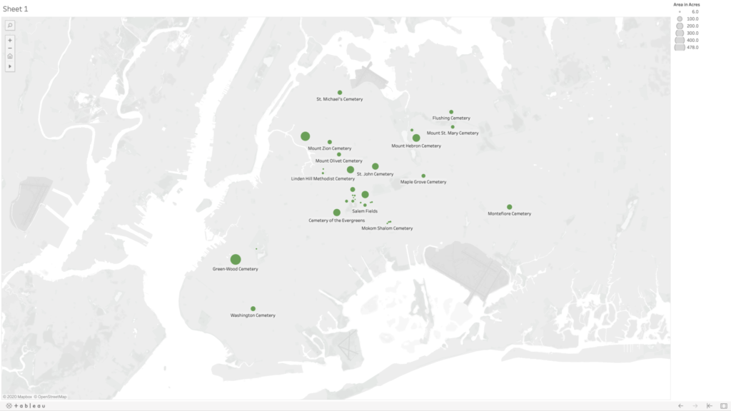
As others have mentioned, this final project felt very daunting. What do I know? I’m a little into the macabre, and I just wanted to map a few cemeteries, and I don’t even know that much about mapping. Am I really adding to the field at large? So I admit I called on my old friend procrastination, and I procrastinated. And then procrastinated a little more, for good measure. But even as I was putting off actually writing, ideas were stewing in my head.

And I’m so grateful to Prof. Gold for introducing me to a student further along in the program who is also interested in cemetery studies. She was so supportive and encouraging in our conversation, and she helped me realize there is indeed a place for my mapping idea in DH. And she led me to a recent anthropology dissertation from a Graduate Center alum about the historical deathscape of New York City from the colonial period onward. And that got me thinking, maybe it’s not too late, there really are a wealth of resources available within the GC. The mapping part of my mapping project was throwing me for a loop, and I remembered that Olivia Ildefonso led an intro to ArcGIS workshop, and as a digital fellow she offers consultations. And I’m so grateful to her for fitting me in last-minute at the end of the semester. She really helped me think about what my data set could look like and helped me reign in my scope creep. (At least I think she did; Matt, if scope creep is still an issue in my final proposal, just know that it was WAY worse in earlier drafts.)

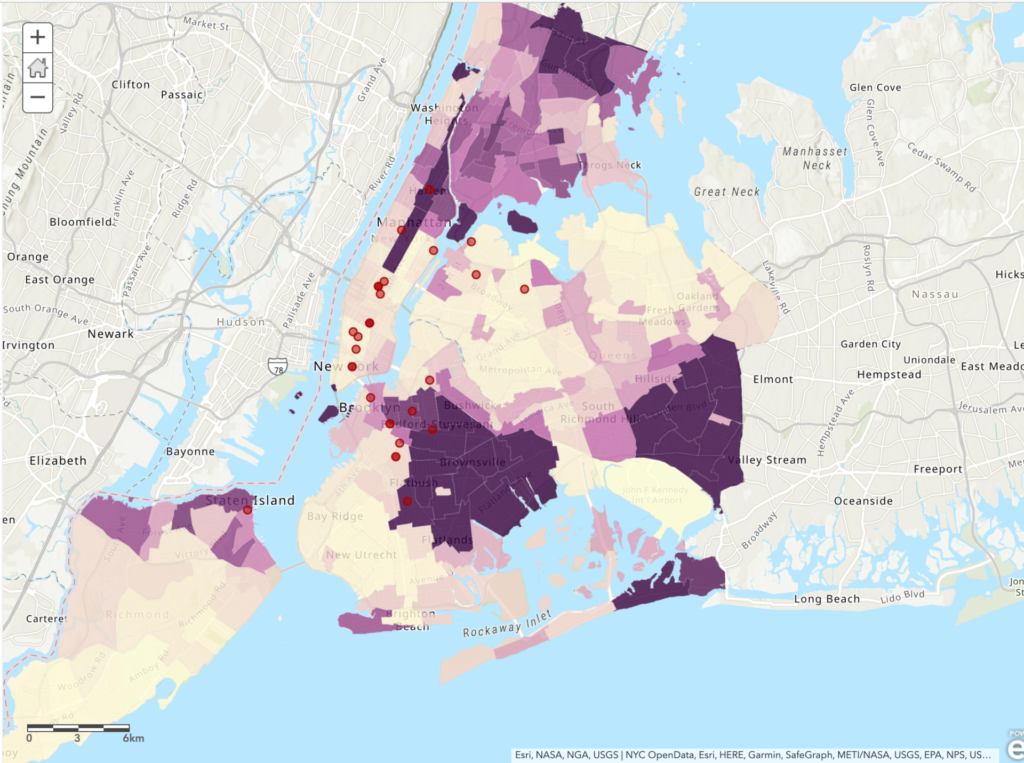
So my final proposal is about creating an ArcGIS StoryMap of the cemeteries in Manhattan in 1820 compared with 2020. I’m most interested in capturing the obliterated cemeteries—which are in all five boroughs, but the most documented ones are in Manhattan—as I find it very exciting to be mapping things that don’t quite exist anymore. In addition to providing great numerical symmetry, I think these years are also significant within the scope of my project. New York City was the largest city in the country by 1800 (then just Manhattan), and the population more than doubled between the 1800 and 1820 Census. And the most significant legislature on burial bans in Manhattan wasn’t passed until 1823 and after, so I think 1820 captures a time of great growth (and death), and it predates laws that greatly altered the deathscape. Many of these laws were passed in direct response to outbreaks (namely of cholera and yellow fever), and I think it will be very interesting to visualize how they affected the landscape of the city at a time when we’re still understanding how the COVID-19 pandemic is affecting us in the present (or very recent past, as the case will be next semester).

As I was working, I was so entrenched in reading about cemeteries and finding out how my project would relate to/expand on other work in this area that I almost completely forgot about our course readings. Matt’s sage advice on rereading the proposal prompt saved the day, and I had a mini breakthrough once I started thinking about the landscape of New York in relation to our readings on infrastructure. I knew that it bothered me that there has been so much cemetery obliteration—even as part of my brain thinks that it’s not an environmentally sustainable practice and I have many complicated and contradictory questions about it being the “best” use of space—and I knew that at least some of the obliteration was purposeful, and not just because of financial interests. There are power structures that made these choices, who have built up and altered the way we live in and experience this city. And this infrastructure necessarily limits those experiences as much as it may enable them. So in mapping what has been removed, I dare to hope that my project is both an act of care and of disobedience.

Again, thank you all. It has been an utmost privilege to be in this class with you and share this experience. See you next semester!

Interactive Mapping Workshop

Yesterday I had the opportunity to participate in the Intro to Making Interactive Maps workshop which was expertly led by Olivia Ildefonso. The workshop was targeted to those who are interested in creating interactive maps but have little to no experience with marrying multiple datasets, creating intricate layers and executing a map that informs its viewers by telling a story. As someone who has scarcely any mapping experience aside from the two maps that I’ve created for assignments at the Graduate Center, I was a bit worried that I’d easily get lost or confused during the session. But I found that the workshop really catered to every participant regardless of amount of prior experience with mapping tools or lack thereof.

The workshop consisted of two parts: a presentation that included some crucial information on the basic fundamentals of interactive mapmaking as well as an overview of the map we were creating, and then hands-on experience making said map. One point I found really helpful in the presentation was how to determine what kind of mapping tools use. Olivia explained that the tools you use depend on whether the map you’re creating is going to be static or interactive. Additionally, your intended budget is another important factor, and combining data on multiple mapping tool such as ArcGIS and QGIS is common as they’re more accessible than some pricer tools. After discussing mapping techniques, exploring different tools and defining different kinds of data often found in interactive maps, we were able to try our hand at creating an interactive map.

Creating the Map:

The map we created mapped out 1 week of BLM protests in New York City, based around the research question: Do New York City’s BLM protests tend to take place more in majority Black neighborhoods or in majority non-Black neighborhoods? Olivia provided us with data including shapefiles for NYC boroughs, locations of protests and the percentage of race by neighborhood. We transferred this data over to ArcGIS and then were able to play around with color schemes, symbols, and the overall aesthetic of the map. Additionally, some of the data provided included specific details for protest locations and powerful images for each location, which we were shown how to add to our map points. I was truly impressed by how a string of data can be visualized (seemingly) seamlessly into locations, images, and points on a map.

Conclusion

To me, mapping is an art, and one that I have been interested in for years. With no experience, however, I admit I was initially daunted by it; I had no idea where or how to get started. This workshop made me feel very comfortable with ArcGIS and excited to create my own mapping projects in the future. Next, I’m excited to learn more about the actual process of finding data and preparing it for the mapping process.

If you’re interested, you can check out the map here 🙂

Map of Langston Hughes' poem Harlem Sweeties.

Map of Langston Hughes’ Harlem Sweeties

Map of the Sugar Hill Neighborhood in Harlem. Buildings are colored according to the year they were built and there are indications of NYC landmarks. Langston Hughes' poem, "Harlem Sweeties" is written on the right and left side of the map.
Map of Harlem Sweeties by Langston Hughes. To see the full-size image, click here

In 2018 I had the fortune of visiting Langston Hughes’ house in Harlem during a children’s program organized by the independent bookstore Revolution Books. In the brownstone’s living room, an actor read his favorite poems by Langston Hughes, including one that wasn’t exactly appropriate for children: Harlem Sweeties, an ode to the sensual beauty of the women of Harlem, whom he depicts as delicious desserts and candy. I really loved the poem, not only for its tongue-in-cheek tone, but because it perfectly described the great diversity of Sugar Hill, the neighborhood where I was living at the time.

While working on my map, I asked myself: what did Sugar Hill look like in Langston Hughes’ time? Therefore, I decided to create a map of the neighborhood that depicted the buildings before 1967, the year that Hughes passed. I used ArcGIS because I felt comfortable with the software and its tools. However, this choice came with its sets of problems, as I will describe later in the post.

Step-by-Step Process

  1. I selected a light gray basemap from ArcGIS’s options, to give a simple background to my map.
  2. I imported data from the MapPLUTO database, a dataset of land use and geographic data collected by NYC agencies.
  3. To draw a map of Sugar Hill, I selected the parts of the map that had the neighborhood’s ZIP code, 10031. (Select by Attributes)
  4. From this group, I selected only the buildings built before 1967. (Select by Attributes)
  5. I decided to indicate the age of the buildings with a color scale in the tones of beige and brown. The newer the building, the darker the color. I chose this color palette because it reminded me of the colors that Hughes mentions in Harlem Sweeties
  6. Sugar Hill is a Historic District, so I decided to import the Designated and Calendared Buildings and Sites dataset from NYC Open Data to show which Sugar Hill buildings are landmarks.
  7. I wrote the text of the poem on the map and changed the font to make it look nicer.
  8. I edited the layout of the map, adding a legend, a compass, and a scale indicator.
  9. I created JPEG and TIFF files of the map.

What you don’t see in the map, AKA problems

While working on my mapping assignment, I kept a little journal of my progress and lack thereof. I found this process very helpful when learning how to code in prof. Smyth’s Software design lab. Therefore, here’s a list of what you can’t see in the map, but was a part of the process:

  1. The hour I wasted pursuing other ideas and getting frustrated because I couldn’t get the data to display on the map the way I wanted. I tried to work on:
  2. The hour I wasted trying to georeference an old map of Williamsburg on ArcGIS.
  3. Every time ArcGIS crashed, or my computer crashed. Basically, every time I gave the software a command, it took 5 minutes to complete the work. I took a bunch of coffee breaks.

I decided to share the challenges I encountered while working on this project because, when we look at maps, we don’t usually think about the process behind them. Maps on the internet look great and present the information as a fact, and not as the product of many small and big decisions. I think my map looks pretty nice in its final form, but I think it’s useful to show not only the destination, but also the bumps in the road.

Map of restaurants visited pre-lockdown and post-lockdown

As a first semester data analysis and visualization student I was eager to get started on this assignment as it would be a great way to see if everything I have read and learned from my visualization class has stuck with me. My software of choice is Tableau and below is a collection of maps of restaurants I have visited prior to lockdown and post lockdown, spanning from January 2019 to March 2020 and June 2020 to September 2020, respectively. Thanks to Yelp, Google Maps, bank statements, Venmo, and Cash App, and just the old handy-dandy method of writing down recommendations from friends, family, and colleagues, I was able to just about map all the restaurants I have visited within the last year. Writing the Excel spreadsheets with all the restaurant names, addresses, geo-coordinates, and the type of food they served was already a tedious task and took up a good bulk of time to complete.

Once the spreadsheets were completed it was off to Tableau to get my maps. Tableau is a great mapping tool since it has a somewhat easy learning curve and the drag and drop nature of the program lets you choose your variables with a click of a button. Then it is all up to the user to choose which visualization they want to proceed with. One problem I did run into however was when it was time to create the dashboard. I am not sure if it is either user error or if it is part of Tableau, but you cannot create two separate dashboards from two separate sources under the same workbook. After playing around with the settings to see if I can find a way to work around this hurdle, I decided two create two separate dashboards and call it a day. I then realized I should do the same for Excel which I did. The initial setup in my head did not go quiet as planned but I was still able to come out with four visualizations that I am proud of.

While meticulously copying and pasting the geo-coordinates of the restaurants onto the spreadsheet, I found that a few of them have either permanently shut down or relocated outside of the five boroughs. Reading all of that placed a damper on my mood. These were places I went out with friends, co-workers, family, dates, and have made solid memories sharing experiences with them at these restaurants. Immediately after, I turned to my phone and scrolled through a few photos I have taken at these places. Most of them are of the food or drinks but the few shots of me and the person I was catching up with brought back fond memories.

Although outdoor dining is a great way to bring in revenue for these businesses it can only do so much before the cold weather starts to set in. I know I have read news articles about indoor dining returning to New York sometime in October but with only a 25% seating capacity. There is going to be some tough times ahead these businesses if the bulk of the hospitality industry is still left behind. I sympathize for the workers because I am one of them and was out of work for a good chunk of spring and into the summer. If anything I suggest you go out and visit the more local stores, the ones that are family based with that mom and pop shop feel to them; I believe they are the ones that will need the most help. Only time will tell what will happen to these places but all we can do now is mitigate the spread by following the guidelines imposed by the health care professionals. Hopefully us as students can return back to in-person sessions of classes and connect with one another in spaces once again such as restaurants, parks, and large events by next year.

Predicting Climate Change’s Impact on Almond Bearing Acreage in California via Tableau

Link to map animation:

https://public.tableau.com/shared/JDWHFMPGM?:display_count=n&:origin=viz_share_link

I was inspired when learning from our readings how mapping software can provide those extra layers of important context to users in animated maps, so I wanted to challenge myself to build one this week. I chose to use Tableau Desktop to do this because it automatically gives suggestions for how to display your data, is relatively easy to use with drag and drop functionality, and is free for students.

I’m passionate about sustainable farming and am curious about the role climate change continues to play on agriculture, so I chose to look for data in the state that annually generates the most revenue from agricultural production: California. Specifically, I wanted to see what the state’s annual precipitation levels are, and how those levels impact the amount of land that’s actually bearing crops. A lot of acreage is reserved for farming and planted heavily each season, but how much product is actually generated on that land in each growing season. With wildfire seasons getting stronger each year, and a severe drought that spanned from 2011 to 2019, there’s no doubt that climate change is affecting food growth in the state. As these changes continue to occur and grow in severity, the crops in California believed to be most impacted are fruit and nuts.

Given that growing almonds specifically requires much more water than fruits and vegetables, and considering how trendy almond milk is right now, I chose to focus on this crop in particular when measuring its bearing acreage in the state against average annual rainfall. Fortunately, California farmers have kept meticulous records since 1980 of not just how much of their land is reserved for the nuts, but also their yield. I chose to focus on 10 counties that had the highest amount of reserved acreage for planting almonds in 1980. But to narrow it down a little, I set a 20-year timeline to span from 1999 to 2019.

I definitely found that the most challenging part of this activity was finding the data I needed and formatting it correctly for Tableau to digest. While I easily found the data I needed for the almonds, I had a much harder time finding free and historical counts for average annual precipitation across the entire state. I found many government resources that listed measurements by month and by region, but I knew I wouldn’t have time to dedicate crunching out the averages I needed. I also ran into paywalls when I wanted to locate state-wide figures I needed for the 20 year-timeline I set for myself. I ended up settling on an easy list of annual rainfall in inches over the past 20 years in Los Angeles county alone. This data doesn’t exactly help me see what I want to at the state level, and Los Angeles isn’t one of those 10 counties in my list with almond growth. But I wanted to have something to experiment with and display for the purpose of this mapping project.

After reformatting my columns and rows a couple of times in excel, I finally worked out how Tableau would best intake my data in a way it would recognize. For example, rather than having a row for each county with the acreage listed out beneath columns for each year, it made more sense to have a single county column, a single year column, and a single acreage column in which they all corresponded by row. It took me around 3 attempts with importing the data to learn that this would work best.

Once I worked out these data formatting kinks, Tableau really did all the heavy lifting. I watched one YouTube video to see how an expert built a basic, non-animated geographic map. This helped me learn how I wanted to use color and shading in my display. The next video I watched gave a tutorial on how to use the year as a profile that gave the animation its power. Building the animated map wasn’t immediately obvious to me, so I’m grateful there are resources out there to follow along with. Despite reading how to manually set longitudes and latitudes for areas that Tableau didn’t recognize in the dataset, I couldn’t get Butte county to appear on my map. So rather than showing 10 counties as I intended, the final result has 9. I’ll have to dig more into what I was doing wrong there.

After some experimenting and playing with shading and color, I built two successful animated maps across the same 20-year span: one measuring the almond-bearing acreage and the other measuring annual precipitation in inches. In my head I was envisioning a single animated map that layered the acreage of these counties underneath the larger, state-wide precipitation layer. After experimenting with the tool and my data, I couldn’t figure out how to layer it all together with the visual effect I wanted. But maybe that end result would have been too busy for the user? I think if I continue learning from the many Tableau resources out there I could eventually figure it out and decide how to best present my data.

After the initial data mining and formatting challenges, I ultimately had success using Tableau and would recommend it for any geographic mapping needs. I really only touched the surface of what the tool can do, so I’m curious to see how else it can absorb and display information in engaging ways.

Mapping Artist Nationalities at MoMA

Despite my map’s inherent flaws, it was a good exercise to experiment with mapping tools and test out the theories and ideas we’ve been reading about recently. From the beginning, I was interested in doing a map related to the arts. Luckily, the Museum of Modern Art in New York has provided open access to a dataset of artists and artworks in the collection: “The Artists dataset contains 15,236 records, representing all the artists who have work in MoMA’s collection and have been cataloged in our database. It includes basic metadata for each artist, including name, nationality, gender, birth year, death year, Wiki QID, and Getty ULAN ID.” After reviewing the data, I concluded nationality would be the focal point of my map; plotting the countries to visualize the artists’ nationalities.

Plotting 15,000+ points was not an option for several reasons: 1) too data-intensive for a simple map; 2) most of the artists are American so most plot points would be on this area (cities and states are not provided because “nationality” refers to country) 3) 3,000+ do not have nationality listed or it is listed as “various”, referring to artist collectives or other entities. I scrubbed the data to remove the information I could not use and added latitude and longitude for each country. Additionally, I added a column for # of artists for each country which allowed me to have one row per country, culminating in a spreadsheet with 100+ rows of data – much more map-friendly.

Using Leaflet

All of the recommended mapping tools are fascinating but I have some experience writing javascript code so I chose to do the map in Leaflet. I did some quick tutorials to familiarize myself with the tool and then Googled some different ways of handling this data. The simplest option was using JSON arrays for each plot point, rather than connecting the map to a .csv file. So, back to my spreadsheet, I converted # of artists per nationality to a percentage of the whole and added a column to concatenate the columns. This last column was copied/pasted into javascript. Finally, in my code, I created a formula for the plot point “circles” to convert the percentage of each nationality to a radius in meters. This needed some trial and error as I wanted the plot points to be big enough to be seen at a specific map zoom, while also maintaining the proportions of the data. The resulting map shows plot points of nationality tied to countries, which are clickable to see the # of artists belonging to that nationality.

Conclusion

Arguably, MoMA has been the international gatekeeper of modern and contemporary art since its founding in 1929. Situated in New York City, it is no surprise that most artists in MoMA’s collection are American and European. British, German, and French artists are well represented. From the map, it’s clear to see MoMA artists have many nationalities but there are also nations that are not represented at all in MoMA’s collection.

Flaws (there are many)

  • How recent is the data set provided by MoMA? Although github says the files were updated “27 days ago”, it’s not clear what was updated.
  • How accurate is the data set provided by MoMA? Are they modifying the data to tell a story which suits the institution?
  • Issues of nationality vs. race vs. citizenship vs. ethnicity. I found myself questioning the meaning of these terms through this process. Additionally, a nationality is not only tied to a country – artists are Native American, Palestine, Catalan and Canadian Inuit, for example. These are not not countries included on the map so I had to use artistic license to plot these places. Also, as I mentioned previously, 3,000+ artists do not have nationality in the dataset.
  • Latitude and longitude coordinates are placed at the centers of countries which do not fully represent “nationality”.
  • The sizes of my plot points are subjective, based on what I think would be a good visual representation of proportional size.
  • Art collecting by an institution is intrinsically related to colonization and my map compounds this issue by using a tool of colonization – the map itself.

Possibilities for Improvements

  • An interactive map that allows a view of the data over time to reveal collecting habits of the museum. When were European artists most collected? What is the nationality of artists collected in recent years? Do the collecting habits change based on the curators at the time? Do the collecting habits reflect concurrent events such as wars or social movements?

Mapping Cemeteries in Queens and Brooklyn: Praxis Mapping Assignment

I was incredibly excited about this project when it was introduced in our first class, but as the due date kept getting closer, I was at a total loss as to what I could possibly want to map, having both too many ideas and not enough ideas at the same time. I took a deep breath, and I thought, it’s almost Halloween (my favorite time of year), let’s draw some inspiration there. And that’s how I settled on cemeteries. Call it a morbid curiosity, but they’re some of my favorite places to visit. There’s a tension between remembering and forgetting, especially in older cemeteries. If there is no one living with memories of a person, is their headstone doing the remembering for us? Is that really the same thing as remembering, and is it enough? The headstones themselves are already reducing a whole life into a few data points: name, birth and death dates, and maybe a title/relationship, quote, or a decorative symbol. And what happens when even those data points are eroded away and are no longer readable by visitors? Is it enough to be in a dedicated place of the dead and know that its inhabitants once lived? What do I even mean by “enough”? What is the responsibility of the living to the dead?

Initial Premise and Data Search

I live in Queens very close to Calvary Cemetery, which claims the largest number of interments (about 3 million) in the United States, and it’s an incredibly massive feature in my daily landscape. So first and foremost, I was curious to know how much physical space cemeteries are taking up in New York City. Many of them must be full, or close to it; indeed, many of the cemeteries in Queens and Brooklyn were established when Manhattan burial grounds were facing a severe shortage of space, exacerbated by a cholera outbreak in 1847. What happens when the cemeteries in the outer boroughs fill up? Is the current land usage sustainable? In addition to urban planning concerns, there are also many environmental concerns about some of the more popular death rituals (burial and cremation), but I wasn’t sure how to include that here. I mostly was hoping to see the relationship between the space allotted for the dead and the rest of the city—the space allotted for the living (though admittedly cemeteries are perhaps more for the living than they are for the dead).

Based on the suggestion in class, I initially tried to find data on cemeteries from NYC Open Data; there were no search results. So I googled “cemeteries in NYC.” Most of the results feature a selection of the oldest, or forgotten/hidden, or most unique, or most notable dead. There are also websites like Find a Grave, where you can search for specific headstones in their database. But I wasn’t seeing any datasets showing all of the cemeteries in the city. So I decided I should start to make my own dataset from a Wikipedia listing and searching in Google maps (admittedly a problematic start). This quickly proved time-consuming and frustrating as many of the cemeteries listed don’t have entries in Wikipedia, and even cemeteries that have their own entries don’t always include information about area, or they contain measurements that are vague (e.g., qualified by “nearly,” “about,” “more than”). Not to mention I’m not sure who accumulated this list and how complete it is. From a cursory search, I know that there are cemeteries in Manhattan that have been built atop of (again see the 6sqft article “What lies below: NYC’s forgotten and hidden graveyards”)—sometimes with bodies relocated, and sometimes not. Should these count as cemeteries on my map? (I’m inclined to think yes.) I was also curious to see when the cemeteries were established, but even that proved to be a tricky data point. Does that mean when the land was purchased for the purpose? Or when it was incorporated? Or when the first bodies were interred?

From the outset, I’m already seeing that there is no neutrality in the data I’m collecting—a la Johanna Drucker’s “Humanities Approaches to Graphical Display”—and it’s time-consuming even to just find a list of cemeteries. So I immediately scaled back to just focus on Queens, and then I added in Brooklyn when I realized there are several cemeteries that span both boroughs.

Choosing a Mapping Tool and Creating My Map

I assumed that a static map rather than an interactive map would be easier to start with, having no experience in using mapping tools. I wanted to try to use an open access tool, so I immediately nixed ArcGIS and started with QGIS, but I realized that neither of the all-in-one release versions are compatible with my Mac setup. From the interactive map tools, I didn’t want to wait for approval access with Carto, so I opted to sign up for a free license of Tableau Desktop.

Very quickly, I was uploading my dataset, consisting of five columns—name, borough, geo coordinates, area in acres, and year established—and tried to make a map. I was dragging and dropping each of the columns into different fields in the Tableau workspace, but I was only able to get it to create graphs. I soon learned that the mapping would work better if I separate my geo coordinates into two separate categories for latitude and longitude (using the decimal values). After some trial and error, I figured out that you need to put longitudinal values into the columns category (y axis) and latitudinal values into the rows category (x axis), and finally I was seeing my cemetery dots. My original dataset had about 10 cemeteries in it, and my map was frankly looking really sad, so I decided to dig a little deeper and generate some more names and see if I could find info for the cemeteries without entries in Wikipedia. Thankfully I found the New York City Cemetery Project by Mary French. Through her research, I was able to fill my dataset out to 33 cemeteries in Queens and Brooklyn—there are very likely more as her project also includes historical information about potter’s fields and family burial grounds.

I used the area in acres category to be the scale, so that the dots appeared on my map on a size scale in relation to each other. Ideally, I would love this scale to relate to the scale of the map of the city in the background, but I could not figure out how to do this. Adjusting the scale is a matter of sliding a button up and down on a linear scale without any numbers, so I just picked a size scale that I found aesthetically pleasing. I’m also not 100% confident in my values for latitude and longitude as most of them were derived from my searching for the cemetery name in Google maps, and then right clicking “What’s Here?” for the values—and in doing so sometimes my mouse was clicking somewhere slightly different than where Google had placed it’s pin, and also Google sometimes seemed to have multiple pins for the same cemeteries, so I had to choose which to use, and sometimes it was placing pins near entrances and sometimes in the middle of the spaces. I also noticed there are many cemeteries that appear grouped together on the map, and there are instances where Google seems to be placing two pins in the same spot for two adjoining but different cemeteries.

Going back to NYC Open Data, I was able to find a dataset with information on all of the city parks, including area in acres. However, when I was trying to import this data to my map, I couldn’t figure out if the parks were in the correct location as that dataset was using different coordinates than I had used in my own dataset. Also, the acres column was coming through as a string rather than numbers—I cannot for the life of me figure out why—and so I have no confidence that what I was mapping for the parks was comparable in scale to what I had generated for the cemeteries, so I ultimately decided to scrap their data and just present my data on cemeteries in Queens and Brooklyn.

Map of cemeteries in the boroughs of Queens and Brooklyn shown in relative acreage to each other (not to scale with the map of New York City in the background).

Ideas for Future Expansion

The first area of expansion would be to expand my map to all of the boroughs. Given the importance of having access to outdoor spaces—especially during the current pandemic—and knowing that picnicking in cemeteries was at one time a common practice, I would like to further dig into the visiting practices at each of these cemeteries (e.g., are visitors allowed, are visitations limited, have visitor policies changed during COVID-19?). And also find out how to map the cemetery spaces in comparison with other green spaces in the city. I’d also be curious to see the density in each of the cemeteries (number of interments compared with acreage) and average cost of burial.

In addition to urban planning and environmental concerns, I think cemeteries are a great starting point for discussions about access, community building, and even broader ideas of what it means to be human (and which people are “worthy” of remembering). Burials are expensive, and those without means have generally been buried differently—both in ceremony and location. And access to different cemeteries has been restricted based on other factors like race, ethnicity, and religion. A prime example is the African Burial Ground National Monument, whose original grounds included the remains an estimated 15,000 Black people—both enslaved and free. The original cemetery was closed and slated for redevelopment in 1794, later to be “rediscovered” and “re-remembered” when the land was being excavated for the proposed construction of a federal building in 1991. What does this purposeful forgetting of a cemetery mean for that group, and how do cemeteries contribute to our understanding/claims of belonging to certain communities and specific locations?