Author Archives: Patricia Belen

Final Thoughts and a Holiday Rebus

First and foremost, I want to reiterate what others have said – this class has been so enlightening and interesting. Honestly, I didn’t know what to expect from DH and I’m so glad I decided to join this program. Thank you all (and Prof. Gold) for your ideas and openness!

I’ve been procrastinating writing this final blog post but it’s been the case all semester that after reading what my fellow classmates have to say, I’m inspired to contribute. Perhaps, it’s good that I took some time to reflect on the final proposal process. I’ve just re-read my proposal and am reminded of some of the issues I experienced when writing it. Echoing others’ comments, I had a difficult time navigating between writing a paper and a grant proposal. How much research should I be doing? – I could easily have added more pages and sources just to explain the rebus and its history. Is my writing persuasive enough that someone could theoretically want to give me money to do this project? – my proposal sounds somewhat repetitive because I was probably thinking about this too much. Are the projects mentioned in my environmental scan appropriate and relevant? – remains to be seen. In hindsight, I wish I had started this process much sooner so that I would have time to consult with others like Micki Kaufman, the other fellows or the library (great job Elena and Bri)! But, I’m grateful to have had the opportunity to write this proposal as a sort of practice for the future. 

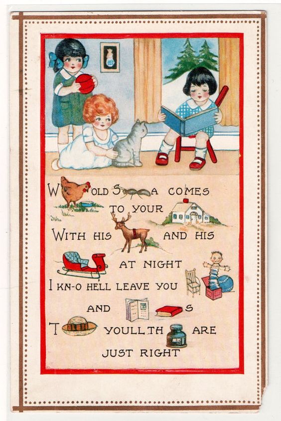
Anyway, here is part of my abstract to refresh your memory: Reading the Rebus is an online, visual archive of 19th century British and American rebus ephemera. The project aims to make a select group of historical rebus ephemera accessible in an engaging, collaborative and interactive format to scholars in diverse fields such as linguistics, history, education, communications, design studies, and visual arts, as well as members of the general public – opening up new possibilities for discovering how we see and interpret visual information. Each rebus puzzle will be treated as an interface of inquiry to conduct close reading experimentations, translations and interpretations by audience participants. Reading the Rebus challenges the notion of traditional texts by using humanistic qualitative analysis, while also contributing to the history of language and visual communication from cuneiform and hieroglyphs to contemporary, digital emojis. 

And so in the spirit of the rebus, I leave you with Xmas holiday greeting!

Analog vs. Digital Ramblings

This week’s readings left me conflicted. I found myself going back and forth between the benefits and detriments of the analog vs. the digital. The idea of digital “Open Access” as introduced by Peter Suber and Kathleen Fitzpatrick lays the foundation for public scholarship and the need to create equitable distribution of knowledge. Academic writing can no longer solely rely on publishing and university presses. I started thinking of OA in many different contexts, particularly using the various definitions of the word open. 1) Scholars should be open to not only making their works publicly accessible, but also collaborating with these publics. 2) While libraries offer so many beneficial services, I can see how journals housed within their walls can be considered closed, not open to certain communities. 3) Work that is open can be spread out, shared, unfolded. 4) Those working within the humanities and sciences need to expand their thinking to engage with digital projects, archives, online exhibitions, etc.

Conversely, I can’t help but think of the printed page. Any bibliophile or antiquarian bookseller will be the first to exclaim that the written word and paper will outlive us all! Where would we be as a society without manuscripts, incunabula, and papyrus books? Of course, the irony that most people (excluding the elite and privileged) access these materials online is not lost on me. But, it’s clear that large-scale publishing is not sustainable for financial and environmental reasons. E-pubs and OA have made it easier for authors to create works (whether this is financially viable for authors who are not tenured is up for debate).

Moving back to the digital world, Alex Gil’s Ed project is appealing as an example of minimal computing. The tool removes many of the financial and copyright barriers to scholarship and is also accessible, legible and flexible – opening up the demographics of readership. I take issue with the idea of “plain text”. No text written on a computer is devoid of pretensions. Even the fonts on our computers or web fonts online have implications – who designed them, who licensed them, who owns them? But, I also think about all the people, companies, organizations and institutions who have benefited from database-driven websites, content management systems and their graphical user interfaces. It is the diversity of content and design on the internet that makes it interesting (and the source of many unproductive hours). It may be that all digital work is ephemeral and will one day no longer exist. This brings to mind the phrase “If a tree falls in a forest and no one is around to hear it, does it make a sound?”. I’d rewrite it as “If a digital project no longer functions online, does the scholarship exist?”

Perhaps the idea of permanence is impossible to achieve for both analog and digital. As Johanna Drucker points out, I am probably focusing on the wrong argument. We should be questioning how humanistic knowledge itself is at risk, “If the humanities lose their cultural authority in the process of becoming digital, becoming managed quanta, or superficial entertainment, then what is the point?”

Visualizing Artemisia Gentileschi

Inspired by Johanna Drucker (“Humanities Approaches to Graphical Display” Digital Humanities Quarterly 5), my data visualization is an attempt to create something that is more interpretative, rather than certain. I was interested in the relation between an artist’s work and the personal, sometimes tragic, events that occur in that artist’s life. For example, do “tragic” events lead to more prolific output, specific style or point of view? Do “happy” events have any effect? Do personal events have no impact on an artist’s work at all? Although widely exhibited and studied by art historians and feminist scholars, 17th century Italian Baroque painter Artemisia Gentileschi’s life is not yet fully understood. Her paintings famously depict heroic women from the Bible, but it’s her personal life – as a victim of sexual assault, and sufferer of torture at the subsequent trial of her rapist – that often overshadow her important achievements. By plotting her body of work and life events in a timeline, I hoped the data visualization would reveal some qualitative aspects of this artist.

Data Collection and Tableau

I created my own data set using the publication Orazio and Artemisia Gentileschi (Metropolitan Museum of Art, 2001) and the Wikipedia page. I added all of her known paintings, titles and years (circa) to a spreadsheet. I also added major life events such as birth, death, marriage, birth of children, and the aforementioned tragic events. I have constructed this data based on my own subjective ideas of what is considered a “major life event”. I have also taken some liberties with the artwork data as the dates are uncertain. Again, I am reminded of one of Drucker’s statements, “Data are capta, taken not given, constructed as an interpretation of the phenomenal world, not inherent in it.”

I have no experience using Tableau so it was a learning process trying to get something resembling a data visualization. Other than the drag and drop functionality, I found the advanced features very difficult to figure out. I appreciate how the public website allows you to see worksheets created by other users but I did get overwhelmed at the possibilities this software offers.

At the same time, I was frustrated by Tableau’s limitations. It assumes to know the types of charts you want based on your data and leaves little room for interpretation. I can see why this is a great tool for statistical data and large data sets. Perhaps, a Tableau “story” would offer more flexibility.

Conclusion

I’m somewhat satisfied with the final result although the points end up looking very random and scattered. I could not deduce whether Gentileschi’s personal life had any impact on her output. She seemed to produce paintings steadily, even while experiencing catastrophe as a teenager, having children and moving from city to city. However, hovering over the points to reveal the paintings, I believe, help put her life into context. For example, in 1612, she is raped, her assaulter convicted, but she also marries later that year. Around the same time, she paints one her most famous pieces, Judith Slaying Holofernes, showing powerful women engaged in a violent act against a man. She would go on to paint this scene multiple times throughout her life.

Introduction to Archival Research

“Archives are the records created by people and organizations as they lived and worked. Collections can range in size from a single letter or diary to thousands of boxes of institutional records. They can contain drafts of literary works, financial records, meeting minutes, reports, memorabilia, as well as sound recordings, videos, film, databases, and software.” – NYPL

The Introduction to Archival Research Workshop was conducted by Donna Davey, adjunct reference librarian at GC. As someone new to archival research, it was interesting to learn the various methods and websites for archives, relevant to our recent readings on “History and the Archive”.

There is a wealth of information at GC Library’s Archival Research Guides. Donna focused on the “Catalogs & Databases” section of this page. As an example, we walked through how we might search the Civil Rights Movement in the U.S. 1950-60s:

  • WordCat: We used the advanced search feature for “civil rights movement”. On the results page, you can refine the results to only show “archival material” or a particular author. Clicking on an item gives you a detailed record. From here, you can click “Finding Aid”. This particular collection of Brotherhood of Sleeping Car Porters records, 1920-1968 is found in the Library of Congress. The Finding Aid provides an overview, bio/organizational/historical notes, scope and contents of the boxes, types of materials, arrangement, copyright uses, and much more. Most finding aids follow this format.
  • ArchiveGrid: We did the same search using ArchiveGrid. Their results page has a useful “Summary” view that categorizes the results by “Places”, “Topics”, “People”, “Archives” in a neat grid.

An important takeaway from this workshop is to always talk to a librarian about your project or before visiting a repository. They are extremely knowledgeable about the resources available. Since CUNY libraries are closed, they have online services, including a 24/7 chat. Lastly, the workshop emphasized that research is not linear, it is circular – you will always find new people and ideas to research so you may feel like you’re moving in a circle instead of a straight line.

Mapping Artist Nationalities at MoMA

Despite my map’s inherent flaws, it was a good exercise to experiment with mapping tools and test out the theories and ideas we’ve been reading about recently. From the beginning, I was interested in doing a map related to the arts. Luckily, the Museum of Modern Art in New York has provided open access to a dataset of artists and artworks in the collection: “The Artists dataset contains 15,236 records, representing all the artists who have work in MoMA’s collection and have been cataloged in our database. It includes basic metadata for each artist, including name, nationality, gender, birth year, death year, Wiki QID, and Getty ULAN ID.” After reviewing the data, I concluded nationality would be the focal point of my map; plotting the countries to visualize the artists’ nationalities.

Plotting 15,000+ points was not an option for several reasons: 1) too data-intensive for a simple map; 2) most of the artists are American so most plot points would be on this area (cities and states are not provided because “nationality” refers to country) 3) 3,000+ do not have nationality listed or it is listed as “various”, referring to artist collectives or other entities. I scrubbed the data to remove the information I could not use and added latitude and longitude for each country. Additionally, I added a column for # of artists for each country which allowed me to have one row per country, culminating in a spreadsheet with 100+ rows of data – much more map-friendly.

Using Leaflet

All of the recommended mapping tools are fascinating but I have some experience writing javascript code so I chose to do the map in Leaflet. I did some quick tutorials to familiarize myself with the tool and then Googled some different ways of handling this data. The simplest option was using JSON arrays for each plot point, rather than connecting the map to a .csv file. So, back to my spreadsheet, I converted # of artists per nationality to a percentage of the whole and added a column to concatenate the columns. This last column was copied/pasted into javascript. Finally, in my code, I created a formula for the plot point “circles” to convert the percentage of each nationality to a radius in meters. This needed some trial and error as I wanted the plot points to be big enough to be seen at a specific map zoom, while also maintaining the proportions of the data. The resulting map shows plot points of nationality tied to countries, which are clickable to see the # of artists belonging to that nationality.

Conclusion

Arguably, MoMA has been the international gatekeeper of modern and contemporary art since its founding in 1929. Situated in New York City, it is no surprise that most artists in MoMA’s collection are American and European. British, German, and French artists are well represented. From the map, it’s clear to see MoMA artists have many nationalities but there are also nations that are not represented at all in MoMA’s collection.

Flaws (there are many)

  • How recent is the data set provided by MoMA? Although github says the files were updated “27 days ago”, it’s not clear what was updated.
  • How accurate is the data set provided by MoMA? Are they modifying the data to tell a story which suits the institution?
  • Issues of nationality vs. race vs. citizenship vs. ethnicity. I found myself questioning the meaning of these terms through this process. Additionally, a nationality is not only tied to a country – artists are Native American, Palestine, Catalan and Canadian Inuit, for example. These are not not countries included on the map so I had to use artistic license to plot these places. Also, as I mentioned previously, 3,000+ artists do not have nationality in the dataset.
  • Latitude and longitude coordinates are placed at the centers of countries which do not fully represent “nationality”.
  • The sizes of my plot points are subjective, based on what I think would be a good visual representation of proportional size.
  • Art collecting by an institution is intrinsically related to colonization and my map compounds this issue by using a tool of colonization – the map itself.

Possibilities for Improvements

  • An interactive map that allows a view of the data over time to reveal collecting habits of the museum. When were European artists most collected? What is the nationality of artists collected in recent years? Do the collecting habits change based on the curators at the time? Do the collecting habits reflect concurrent events such as wars or social movements?

Re-framing, Re-Examining and The 1619 Project

This week’s readings emphasize the important role DH has in reframing humanities itself, a discipline which has been built to uphold systems of oppression through race, gender and class. DH projects allow us to reexamine our world-view through different lenses such as Black Studies, Feminism, and Caribbean Studies. However, we have to be mindful that the technological tools and data we use may have also been built upon those same systems. For example, if creating an archive, one has to examine how and from whom material was collected and if that material is a fair representation of the subject (institutions should not be immune from scrutiny in this assessment). And, in building that archive, do the digital tools used provide equity and accessibility? 

This brings to mind The 1619 Project by the NY Times which “aims to reframe the country’s history by placing the consequences of slavery and the contributions of Black Americans at the very center of our national narrative” through an interactive website, essays and podcasts. Despite the wealth of knowledge the project provides, there are barriers to access the information (NY Times paywall). More importantly, President Trump has recently warned that schools and institutions using the 1619 Project in their classrooms could be defunded by the federal government. I fear this threatens the value of DH. DH projects can bring to light areas in the humanities which deserve inspection. However, what are the consequences if they are not used for scholarship, or even discouraged/banned by power structures? I’d be interested in hearing what others think.

Accessibility and Sustainability

This week’s readings and featured projects have expanded my definition of Digital Humanities and opened up the possibilities of research, output and social justice issues within DH. It is interesting to note the trajectory of the readings (2012–2019) and where the focus of the next iteration of Debates in Digital Humanities will be, particularly with the current political climate and global pandemic.

One issue that often came to mind when viewing the websites is the accessibility and sustainability of DH work, mentioned by Gold and Klein in 2016. Torn Apart / Separados has been divided into two volumes. Volume 1 focuses on ICE detention centers and Volume 2 looks at ICE’s financial structure. The beauty of digital projects such as this is their ability to update, expand and transform over time. New data sets can be analyzed, collaborators added and different forms of technological tools deployed. However, with the rapidly changing nature of technology, will this project be accessible in five or ten years? Will the Javascript programming function in future iterations or is this not a consideration? Should DH practitioners focus our attention on audiences of the present and near-future and not far-future? For example, I have found “broken” or non-accessible areas of the Colored Conventions Project. While this minor inconsistency does not alter my view of the success and worthiness of this project, it is conceivable that other digital projects may be experiencing the same dilemmas, even at a larger scale.

The “Reflections” section of Torn Apart / Separados is extremely helpful in putting the visualizations in context. As much as visualizations are important, scholarly writing is also a necessary component of DH projects. Personally, I’d like to see projects expand beyond the world of academia and scholarship and include other voices as well. I gained a greater understanding of DH after reading the peer-reviewed projects in Reviews in Digital Humanities, but perhaps some DH projects can broaden their audiences to allow for more equitable access to information. Regardless, it is impressive how far the field has evolved. Its role in the research and knowledge of past, present and future issues is immense.