I was recently catching up with a friend that lives out in Jamaica and she mentioned that the neighborhood was named after beavers since New York was once home to a diverse ecosystem of wildlife before the settlers landed. She mentioned that Queens was once all swamp and marshes and that the word “Jamaica” derived from the word “Jameco” which is the word for beaver among the Lenape people. Hearing this brought back memories of the early settlers that I would learn about in my elementary class when I was about eight and remembered that New York was once home to wild animals that did not include rats, pigeons, squirrels, and the occasional raccoons. With this in mind, I wanted to visualize the decline of New York City’s natural wildlife. The goal I set myself is to show that pollution is one of the driving forces for the removal of these wild animals and that we should be placing the necessary resources to conserve sanctuary spaces and parks.
Not too long ago more and more residents have reported coyotes roaming around central park and even around the Bronx. These sightings were becoming so frequent that New York City’s official Parks website posted a “Living With Coyotes in New York City” blog post on their webpage. As I took off to find the appropriate data, I realized that I was dealing with too ambitious set of data points that included too many variables with missing dates which play an important role in my visualization. I then went on the search again for what else I can possibly visualize. The colder nights and the fact that the days are getting shorter made me miss summer and the lakes and beaches. This helped me settle on reports of harmful algal blooms that affect most large bodies of water, especially lakes where the water can remain stagnant for weeks on end. The dataset I downloaded contained the reports on the condition of the body of water. “S” being a suspicious bloom, “HT” meaning it contains high toxins, and “C” reporting a confirmed bloom. Adding the definitions to the abbreviations in the visualization proved to be difficult without first changing it on the source. I therefore went ahead and left it as is on the dashboard of Tableau and pressed forward.
I set off with the goal to visualize which county in New York had the greatest amount of reports of harmful algal blooms, my guess being counties in upstate since that is where all the lakes and rivers are. But as I placed my necessary pills into the correct columns and row sections, something very surprising came up. It is actually Suffolk county that came in with the most reports and Westchester coming in second. After seeing the bar graphs, it did make sense that Long Island would have the most reports seeing as they are surrounded by water all around where some leaks my seep through to the nearby lakes and reservoirs. What I wish I could do more research on however, is finding a way to standardize the data by population since I am fairly certain that some parts of Upstate are more densely populated than others. Westchester is also easily accessible by New York City residents so that may also play a role on the county placing second.
Hopefully this entices people to be more careful with what they leave behind by the body of water since most residents look forward to spending their time in lakes during the hot summer days. These algal blooms, if exposed to high enough concentrations, could be detrimental to someone’s health, especially those that enjoy eating shellfish where the toxins can easily transfer between the animal and person. And with the right resources we can have the right department take the necessary steps to make sure that these algal blooms are within a reasonable count where the rest of the ecosystem faces little to no harm and pose no threat to people.
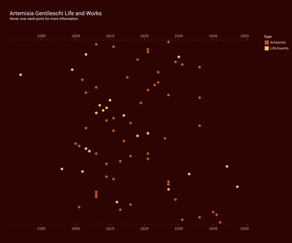
Inspired by Johanna Drucker (“Humanities Approaches to Graphical Display” Digital Humanities Quarterly 5), my data visualization is an attempt to create something that is more interpretative, rather than certain. I was interested in the relation between an artist’s work and the personal, sometimes tragic, events that occur in that artist’s life. For example, do “tragic” events lead to more prolific output, specific style or point of view? Do “happy” events have any effect? Do personal events have no impact on an artist’s work at all? Although widely exhibited and studied by art historians and feminist scholars, 17th century Italian Baroque painter Artemisia Gentileschi’s life is not yet fully understood. Her paintings famously depict heroic women from the Bible, but it’s her personal life – as a victim of sexual assault, and sufferer of torture at the subsequent trial of her rapist – that often overshadow her important achievements. By plotting her body of work and life events in a timeline, I hoped the data visualization would reveal some qualitative aspects of this artist.
Data Collection and Tableau
I created my own data set using the publication Orazio and Artemisia Gentileschi (Metropolitan Museum of Art, 2001) and the Wikipedia page. I added all of her known paintings, titles and years (circa) to a spreadsheet. I also added major life events such as birth, death, marriage, birth of children, and the aforementioned tragic events. I have constructed this data based on my own subjective ideas of what is considered a “major life event”. I have also taken some liberties with the artwork data as the dates are uncertain. Again, I am reminded of one of Drucker’s statements, “Data are capta, taken not given, constructed as an interpretation of the phenomenal world, not inherent in it.”
I have no experience using Tableau so it was a learning process trying to get something resembling a data visualization. Other than the drag and drop functionality, I found the advanced features very difficult to figure out. I appreciate how the public website allows you to see worksheets created by other users but I did get overwhelmed at the possibilities this software offers.
At the same time, I was frustrated by Tableau’s limitations. It assumes to know the types of charts you want based on your data and leaves little room for interpretation. I can see why this is a great tool for statistical data and large data sets. Perhaps, a Tableau “story” would offer more flexibility.
Conclusion
I’m somewhat satisfied with the final result although the points end up looking very random and scattered. I could not deduce whether Gentileschi’s personal life had any impact on her output. She seemed to produce paintings steadily, even while experiencing catastrophe as a teenager, having children and moving from city to city. However, hovering over the points to reveal the paintings, I believe, help put her life into context. For example, in 1612, she is raped, her assaulter convicted, but she also marries later that year. Around the same time, she paints one her most famous pieces, Judith Slaying Holofernes, showing powerful women engaged in a violent act against a man. She would go on to paint this scene multiple times throughout her life.
Given the recent death of Ruth Bader Ginsburg and the current Senate hearings for her nominated replacement, Amy Coney Barrett, the Supreme Court is all over the news. Supreme Court justices are not elected, and once approved by the Senate, they receive lifetime appointments. I wanted to know what those lifetime appointments translate to in actual term lengths.
Collecting and Sorting the Data
The majority of the data I wanted were conveniently available on the Supreme Court website, where they list every justice since the court began in 1789 to the present, including their title (chief justice or associate justice), the date they took their oath, and the date their service ended, as well as what state they were appointed from and which president appointed them. They list some caveats on their site regarding the dates, but for my purposes I chose to ignore them and just accept the dates given.
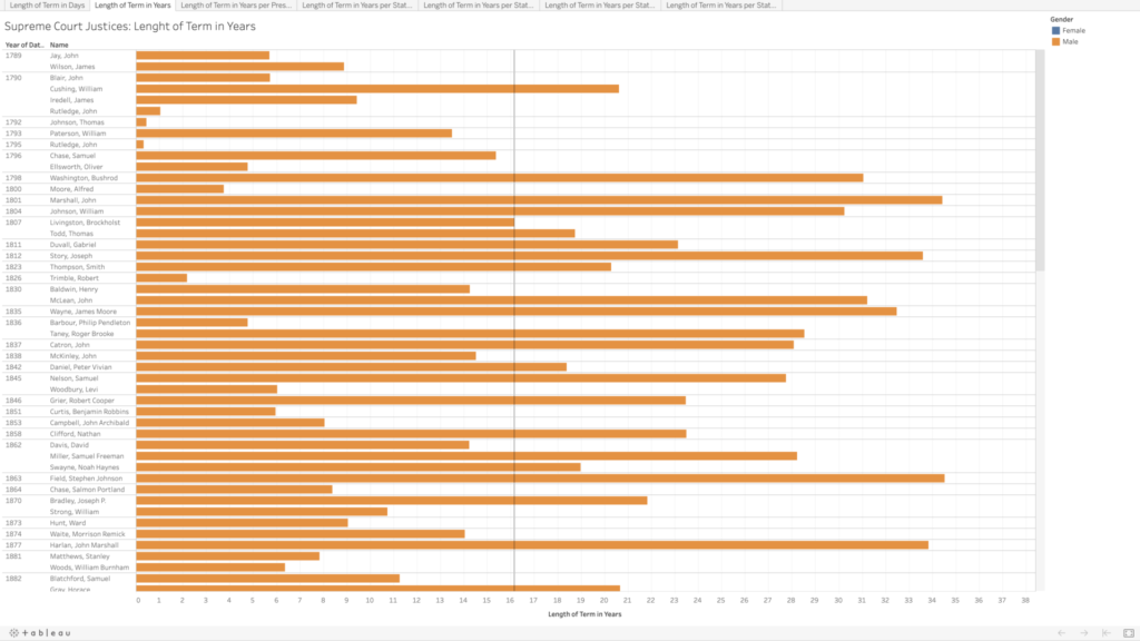
I copied their data into an Excel file, and integrated the chief and associate justices together, sorting in chronological order by oath date. In doing so, I realized there are three justices who held both titles, John Rutledge was the first, with a break in between titles (total of both terms is approximately 1.40 years). Harlan Fiske Stone and William H. Rehnquist also held both titles, being promoted from associate directly to chief justice (Stone’s total term length is 21.14 years, and Rehnquist’s is 33.66 years). In my tables, each of these three people have two listings by their names because of this, so it does slightly skew my average term length of 16.16 years (more than twice as long as the current term limits on presidents).
The Supreme Court was created in 1789, initially with one chief justice and five associate justices. It was expanded in 1869 to consist of one chief justice and eight associate justices (the number we have today). I wanted to calculate the length of each justice’s term in both days (because it would be whole numbers) and years (as these would be more recognizable and understandable), which was tricky in Excel as it does not recognize dates before January 1, 1900. For all of the justices who had both oath and termination dates after 1900, I was able to use existing formulas to calculate these values. For the dates preceding this, I copied them into a new sheet, and I added 1000 to each year to get Excel to recognize the values as dates, and then I was able to use the same formulas as before, though I had to copy the unformatted numbers into Word before pasting back into my main Excel table to make sure it kept the values rather than the formulas. For the current justices, I put in “termination” dates of today, October 13, just to get some sense of their term lengths thus far, though again I realize this is skewing my average and trends.
In addition to the term length, I also wanted to note the gender of each of the justices (which admittedly is problematic as I am assuming a gender binary and also ascribing gender to these people based on their name and pictures). Of the 119 appointed justices, only 4 have been women.
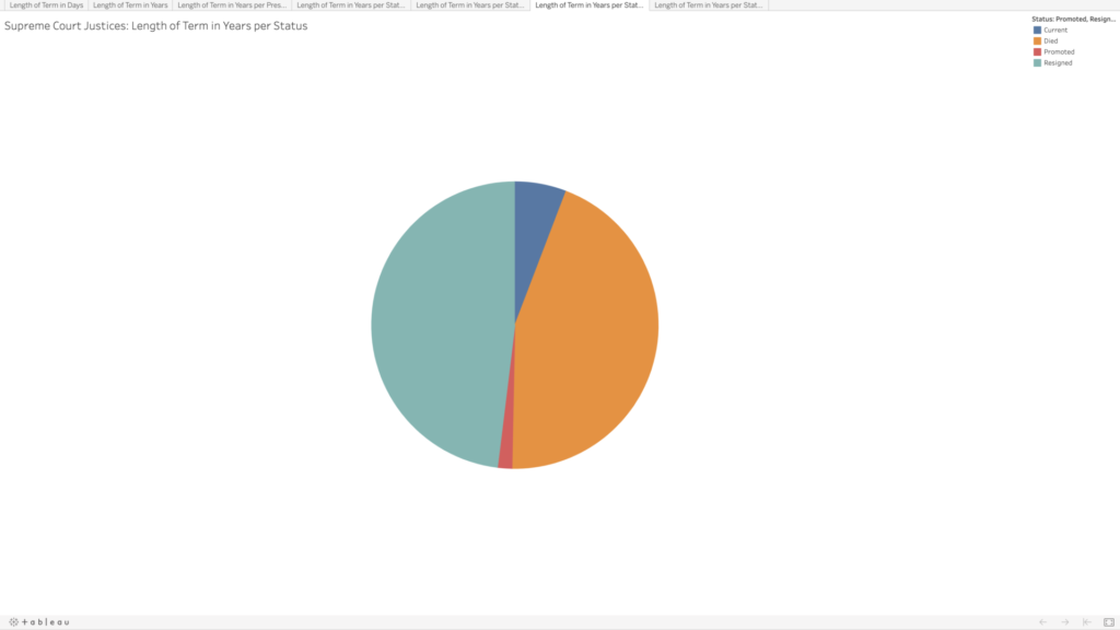
Given that justices have lifetime tenure, I also wanted to see how the terms were ending. Going into this, I had assumed that most justices’ terms ended with their deaths; however, it turns out there is a pretty even mix between resignation and death. This information wasn’t included on the Supreme Court website, so I searched each justice’s Wikipedia page to compare the date their term ended with their death date. Some entries made a distinction between resignation and retirement, but for my purposes I selected “resignation” for any justice whose term ended before they died. Back to Rutledge, he resigned twice; Stone and Rehnquist were both promoted directly from associate to chief. There are eight justices whose terms are ongoing—who I noted as “current.”
Visualizing the Data
I decided to use Tableau again to get more familiar with its features and tools. I played around with the data a bit to see if I could spot any trends in the term lengths—e.g., did term lengths get longer as life expectancy increased? To my untrained eye, the term lengths don’t seem to follow much of a trend. When looking at resignations versus deaths, there do appear to be some groupings—though I’m not sure what, if anything, could be inferred by this.
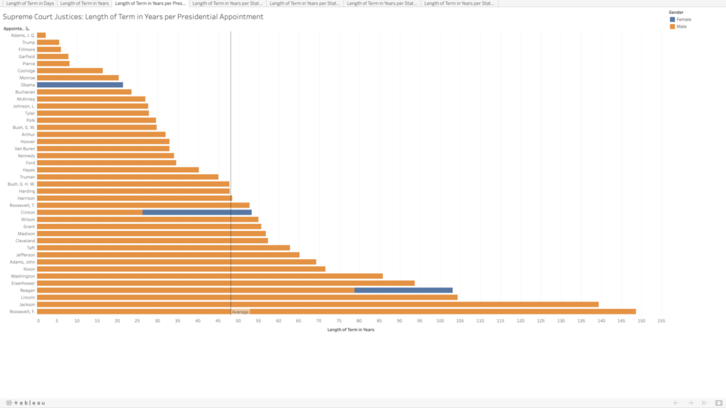
In playing around, I was able to visualize which presidents had the most sway in the Supreme Court, in terms of the total term lengths for all of the justices they appointed. I assumed Washington would be the clear leader, having the benefit of being the president to appoint the most justices, but several others beat him out, and Franklin D. Roosevelt has almost double the total terms (85.8 vs. 148.6 years). There are only four presidents who did not appoint any Supreme Court justices (William Henry Harrison, Zachary Taylor, Andrew Johnson, and Jimmy Carter).
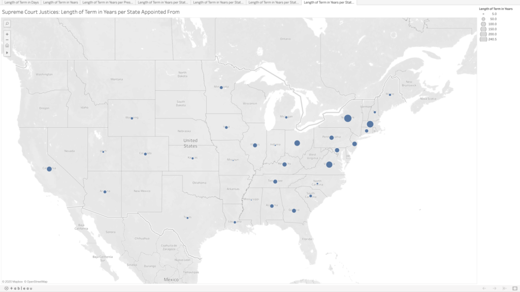
Lastly, because why not, I wanted to see the term lengths as they related to the states where the justices were appointed from. There are many states that have never had any Supreme Court justices, especially as you move further west. Again, I’m not sure what arguments about representation could be made here; I would think this speaks more to “manifest destiny” and the way in which states were created and admitted to the union than anything else.
Ideas for Future Expansion
Initially I had been curious to compare all of the justices by the age at which they began their terms, but that would have been a bit too time-consuming. I’m still curious to see if there are any trends here. All Article III federal judges are appointed for lifetime tenure (technically they can be removed, but in practice it seems like appointments are more or less until death or resignation), so it would be great to get data for all of them as well and see what kind of trends pop up.
I was inspired when learning from our readings how mapping software can provide those extra layers of important context to users in animated maps, so I wanted to challenge myself to build one this week. I chose to use Tableau Desktop to do this because it automatically gives suggestions for how to display your data, is relatively easy to use with drag and drop functionality, and is free for students.
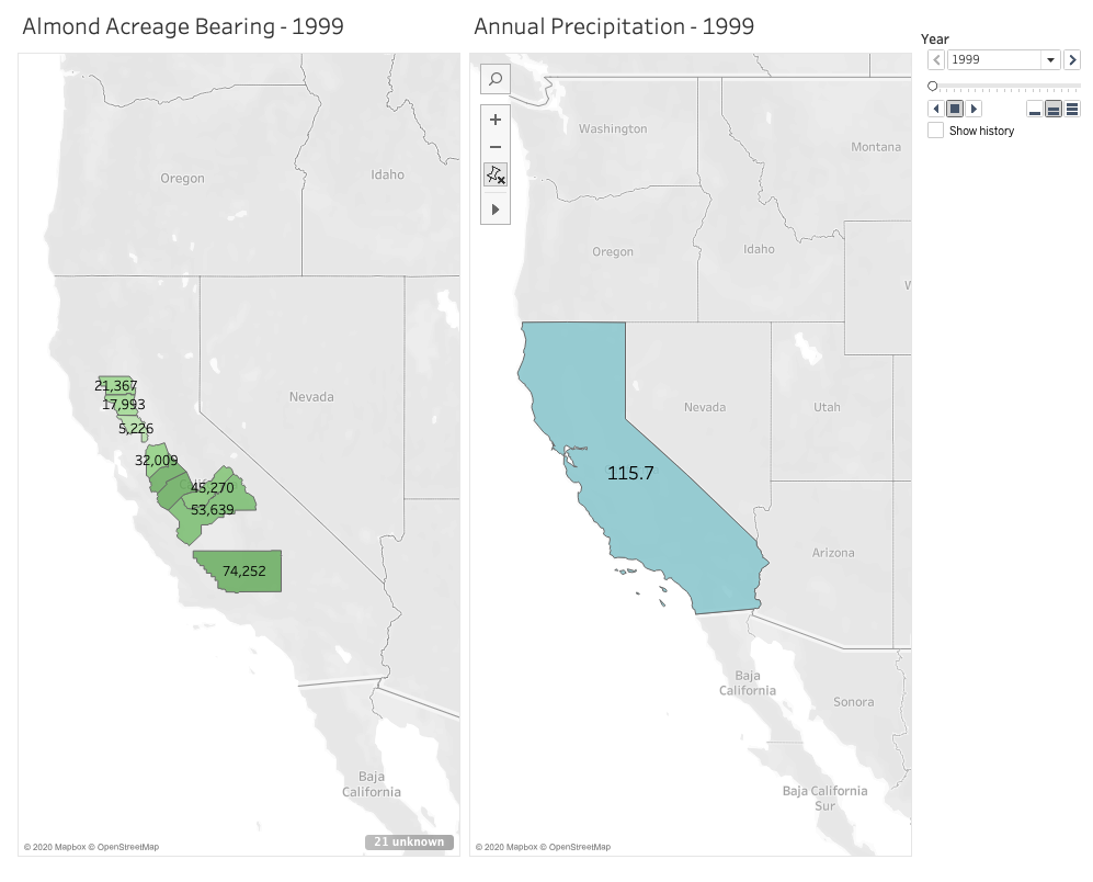
I’m passionate about sustainable farming and am curious about the role climate change continues to play on agriculture, so I chose to look for data in the state that annually generates the most revenue from agricultural production: California. Specifically, I wanted to see what the state’s annual precipitation levels are, and how those levels impact the amount of land that’s actually bearing crops. A lot of acreage is reserved for farming and planted heavily each season, but how much product is actually generated on that land in each growing season. With wildfire seasons getting stronger each year, and a severe drought that spanned from 2011 to 2019, there’s no doubt that climate change is affecting food growth in the state. As these changes continue to occur and grow in severity, the crops in California believed to be most impacted are fruit and nuts.
Given that growing almonds specifically requires much more water than fruits and vegetables, and considering how trendy almond milk is right now, I chose to focus on this crop in particular when measuring its bearing acreage in the state against average annual rainfall. Fortunately, California farmers have kept meticulous records since 1980 of not just how much of their land is reserved for the nuts, but also their yield. I chose to focus on 10 counties that had the highest amount of reserved acreage for planting almonds in 1980. But to narrow it down a little, I set a 20-year timeline to span from 1999 to 2019.
I definitely found that the most challenging part of this activity was finding the data I needed and formatting it correctly for Tableau to digest. While I easily found the data I needed for the almonds, I had a much harder time finding free and historical counts for average annual precipitation across the entire state. I found many government resources that listed measurements by month and by region, but I knew I wouldn’t have time to dedicate crunching out the averages I needed. I also ran into paywalls when I wanted to locate state-wide figures I needed for the 20 year-timeline I set for myself. I ended up settling on an easy list of annual rainfall in inches over the past 20 years in Los Angeles county alone. This data doesn’t exactly help me see what I want to at the state level, and Los Angeles isn’t one of those 10 counties in my list with almond growth. But I wanted to have something to experiment with and display for the purpose of this mapping project.
After reformatting my columns and rows a couple of times in excel, I finally worked out how Tableau would best intake my data in a way it would recognize. For example, rather than having a row for each county with the acreage listed out beneath columns for each year, it made more sense to have a single county column, a single year column, and a single acreage column in which they all corresponded by row. It took me around 3 attempts with importing the data to learn that this would work best.
Once I worked out these data formatting kinks, Tableau really did all the heavy lifting. I watched one YouTube video to see how an expert built a basic, non-animated geographic map. This helped me learn how I wanted to use color and shading in my display. The next video I watched gave a tutorial on how to use the year as a profile that gave the animation its power. Building the animated map wasn’t immediately obvious to me, so I’m grateful there are resources out there to follow along with. Despite reading how to manually set longitudes and latitudes for areas that Tableau didn’t recognize in the dataset, I couldn’t get Butte county to appear on my map. So rather than showing 10 counties as I intended, the final result has 9. I’ll have to dig more into what I was doing wrong there.
After some experimenting and playing with shading and color, I built two successful animated maps across the same 20-year span: one measuring the almond-bearing acreage and the other measuring annual precipitation in inches. In my head I was envisioning a single animated map that layered the acreage of these counties underneath the larger, state-wide precipitation layer. After experimenting with the tool and my data, I couldn’t figure out how to layer it all together with the visual effect I wanted. But maybe that end result would have been too busy for the user? I think if I continue learning from the many Tableau resources out there I could eventually figure it out and decide how to best present my data.
After the initial data mining and formatting challenges, I ultimately had success using Tableau and would recommend it for any geographic mapping needs. I really only touched the surface of what the tool can do, so I’m curious to see how else it can absorb and display information in engaging ways.
I was incredibly excited about this project when it was introduced in our first class, but as the due date kept getting closer, I was at a total loss as to what I could possibly want to map, having both too many ideas and not enough ideas at the same time. I took a deep breath, and I thought, it’s almost Halloween (my favorite time of year), let’s draw some inspiration there. And that’s how I settled on cemeteries. Call it a morbid curiosity, but they’re some of my favorite places to visit. There’s a tension between remembering and forgetting, especially in older cemeteries. If there is no one living with memories of a person, is their headstone doing the remembering for us? Is that really the same thing as remembering, and is it enough? The headstones themselves are already reducing a whole life into a few data points: name, birth and death dates, and maybe a title/relationship, quote, or a decorative symbol. And what happens when even those data points are eroded away and are no longer readable by visitors? Is it enough to be in a dedicated place of the dead and know that its inhabitants once lived? What do I even mean by “enough”? What is the responsibility of the living to the dead?
Initial Premise and Data Search
I live in Queens very close to Calvary Cemetery, which claims the largest number of interments (about 3 million) in the United States, and it’s an incredibly massive feature in my daily landscape. So first and foremost, I was curious to know how much physical space cemeteries are taking up in New York City. Many of them must be full, or close to it; indeed, many of the cemeteries in Queens and Brooklyn were established when Manhattan burial grounds were facing a severe shortage of space, exacerbated by a cholera outbreak in 1847. What happens when the cemeteries in the outer boroughs fill up? Is the current land usage sustainable? In addition to urban planning concerns, there are also many environmental concerns about some of the more popular death rituals (burial and cremation), but I wasn’t sure how to include that here. I mostly was hoping to see the relationship between the space allotted for the dead and the rest of the city—the space allotted for the living (though admittedly cemeteries are perhaps more for the living than they are for the dead).
Based on the suggestion in class, I initially tried to find data on cemeteries from NYC Open Data; there were no search results. So I googled “cemeteries in NYC.” Most of the results feature a selection of the oldest, or forgotten/hidden, or most unique, or most notable dead. There are also websites like Find a Grave, where you can search for specific headstones in their database. But I wasn’t seeing any datasets showing all of the cemeteries in the city. So I decided I should start to make my own dataset from a Wikipedia listing and searching in Google maps (admittedly a problematic start). This quickly proved time-consuming and frustrating as many of the cemeteries listed don’t have entries in Wikipedia, and even cemeteries that have their own entries don’t always include information about area, or they contain measurements that are vague (e.g., qualified by “nearly,” “about,” “more than”). Not to mention I’m not sure who accumulated this list and how complete it is. From a cursory search, I know that there are cemeteries in Manhattan that have been built atop of (again see the 6sqft article “What lies below: NYC’s forgotten and hidden graveyards”)—sometimes with bodies relocated, and sometimes not. Should these count as cemeteries on my map? (I’m inclined to think yes.) I was also curious to see when the cemeteries were established, but even that proved to be a tricky data point. Does that mean when the land was purchased for the purpose? Or when it was incorporated? Or when the first bodies were interred?
From the outset, I’m already seeing that there is no neutrality in the data I’m collecting—a la Johanna Drucker’s “Humanities Approaches to Graphical Display”—and it’s time-consuming even to just find a list of cemeteries. So I immediately scaled back to just focus on Queens, and then I added in Brooklyn when I realized there are several cemeteries that span both boroughs.
Choosing a Mapping Tool and Creating My Map
I assumed that a static map rather than an interactive map would be easier to start with, having no experience in using mapping tools. I wanted to try to use an open access tool, so I immediately nixed ArcGIS and started with QGIS, but I realized that neither of the all-in-one release versions are compatible with my Mac setup. From the interactive map tools, I didn’t want to wait for approval access with Carto, so I opted to sign up for a free license of Tableau Desktop.
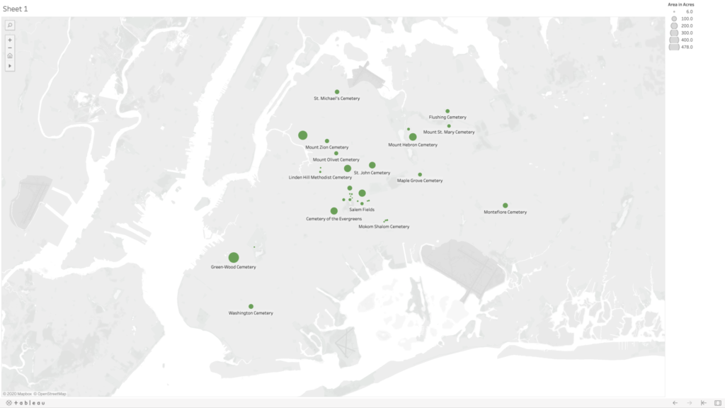
Very quickly, I was uploading my dataset, consisting of five columns—name, borough, geo coordinates, area in acres, and year established—and tried to make a map. I was dragging and dropping each of the columns into different fields in the Tableau workspace, but I was only able to get it to create graphs. I soon learned that the mapping would work better if I separate my geo coordinates into two separate categories for latitude and longitude (using the decimal values). After some trial and error, I figured out that you need to put longitudinal values into the columns category (y axis) and latitudinal values into the rows category (x axis), and finally I was seeing my cemetery dots. My original dataset had about 10 cemeteries in it, and my map was frankly looking really sad, so I decided to dig a little deeper and generate some more names and see if I could find info for the cemeteries without entries in Wikipedia. Thankfully I found the New York City Cemetery Project by Mary French. Through her research, I was able to fill my dataset out to 33 cemeteries in Queens and Brooklyn—there are very likely more as her project also includes historical information about potter’s fields and family burial grounds.
I used the area in acres category to be the scale, so that the dots appeared on my map on a size scale in relation to each other. Ideally, I would love this scale to relate to the scale of the map of the city in the background, but I could not figure out how to do this. Adjusting the scale is a matter of sliding a button up and down on a linear scale without any numbers, so I just picked a size scale that I found aesthetically pleasing. I’m also not 100% confident in my values for latitude and longitude as most of them were derived from my searching for the cemetery name in Google maps, and then right clicking “What’s Here?” for the values—and in doing so sometimes my mouse was clicking somewhere slightly different than where Google had placed it’s pin, and also Google sometimes seemed to have multiple pins for the same cemeteries, so I had to choose which to use, and sometimes it was placing pins near entrances and sometimes in the middle of the spaces. I also noticed there are many cemeteries that appear grouped together on the map, and there are instances where Google seems to be placing two pins in the same spot for two adjoining but different cemeteries.
Going back to NYC Open Data, I was able to find a dataset with information on all of the city parks, including area in acres. However, when I was trying to import this data to my map, I couldn’t figure out if the parks were in the correct location as that dataset was using different coordinates than I had used in my own dataset. Also, the acres column was coming through as a string rather than numbers—I cannot for the life of me figure out why—and so I have no confidence that what I was mapping for the parks was comparable in scale to what I had generated for the cemeteries, so I ultimately decided to scrap their data and just present my data on cemeteries in Queens and Brooklyn.
Map of cemeteries in the boroughs of Queens and Brooklyn shown in relative acreage to each other (not to scale with the map of New York City in the background).
Ideas for Future Expansion
The first area of expansion would be to expand my map to all of the boroughs. Given the importance of having access to outdoor spaces—especially during the current pandemic—and knowing that picnicking in cemeteries was at one time a common practice, I would like to further dig into the visiting practices at each of these cemeteries (e.g., are visitors allowed, are visitations limited, have visitor policies changed during COVID-19?). And also find out how to map the cemetery spaces in comparison with other green spaces in the city. I’d also be curious to see the density in each of the cemeteries (number of interments compared with acreage) and average cost of burial.
In addition to urban planning and environmental concerns, I think cemeteries are a great starting point for discussions about access, community building, and even broader ideas of what it means to be human (and which people are “worthy” of remembering). Burials are expensive, and those without means have generally been buried differently—both in ceremony and location. And access to different cemeteries has been restricted based on other factors like race, ethnicity, and religion. A prime example is the African Burial Ground National Monument, whose original grounds included the remains an estimated 15,000 Black people—both enslaved and free. The original cemetery was closed and slated for redevelopment in 1794, later to be “rediscovered” and “re-remembered” when the land was being excavated for the proposed construction of a federal building in 1991. What does this purposeful forgetting of a cemetery mean for that group, and how do cemeteries contribute to our understanding/claims of belonging to certain communities and specific locations?
Need help with the Commons?
Email us at [email protected] so we can respond to your questions and requests. Please email from your CUNY email address if possible. Or visit our help site for more information: