
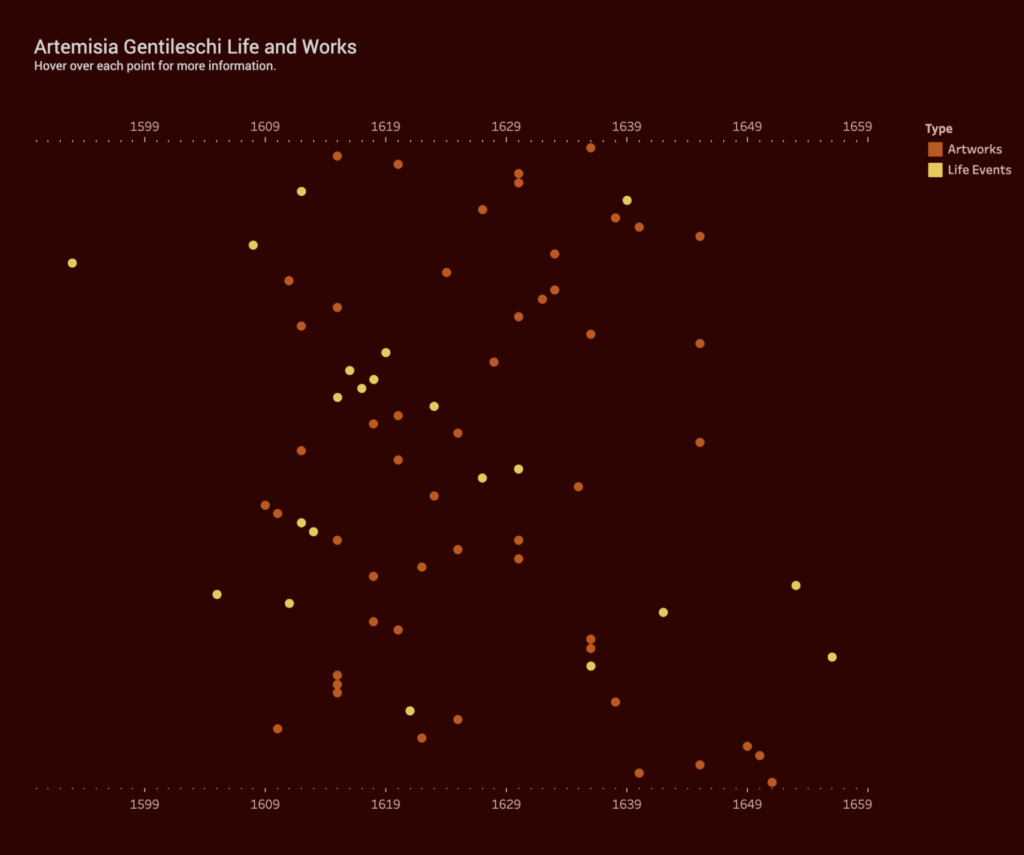
Inspired by Johanna Drucker (“Humanities Approaches to Graphical Display” Digital Humanities Quarterly 5), my data visualization is an attempt to create something that is more interpretative, rather than certain. I was interested in the relation between an artist’s work and the personal, sometimes tragic, events that occur in that artist’s life. For example, do “tragic” events lead to more prolific output, specific style or point of view? Do “happy” events have any effect? Do personal events have no impact on an artist’s work at all? Although widely exhibited and studied by art historians and feminist scholars, 17th century Italian Baroque painter Artemisia Gentileschi’s life is not yet fully understood. Her paintings famously depict heroic women from the Bible, but it’s her personal life – as a victim of sexual assault, and sufferer of torture at the subsequent trial of her rapist – that often overshadow her important achievements. By plotting her body of work and life events in a timeline, I hoped the data visualization would reveal some qualitative aspects of this artist.
Data Collection and Tableau
I created my own data set using the publication Orazio and Artemisia Gentileschi (Metropolitan Museum of Art, 2001) and the Wikipedia page. I added all of her known paintings, titles and years (circa) to a spreadsheet. I also added major life events such as birth, death, marriage, birth of children, and the aforementioned tragic events. I have constructed this data based on my own subjective ideas of what is considered a “major life event”. I have also taken some liberties with the artwork data as the dates are uncertain. Again, I am reminded of one of Drucker’s statements, “Data are capta, taken not given, constructed as an interpretation of the phenomenal world, not inherent in it.”
I have no experience using Tableau so it was a learning process trying to get something resembling a data visualization. Other than the drag and drop functionality, I found the advanced features very difficult to figure out. I appreciate how the public website allows you to see worksheets created by other users but I did get overwhelmed at the possibilities this software offers.
At the same time, I was frustrated by Tableau’s limitations. It assumes to know the types of charts you want based on your data and leaves little room for interpretation. I can see why this is a great tool for statistical data and large data sets. Perhaps, a Tableau “story” would offer more flexibility.
Conclusion
I’m somewhat satisfied with the final result although the points end up looking very random and scattered. I could not deduce whether Gentileschi’s personal life had any impact on her output. She seemed to produce paintings steadily, even while experiencing catastrophe as a teenager, having children and moving from city to city. However, hovering over the points to reveal the paintings, I believe, help put her life into context. For example, in 1612, she is raped, her assaulter convicted, but she also marries later that year. Around the same time, she paints one her most famous pieces, Judith Slaying Holofernes, showing powerful women engaged in a violent act against a man. She would go on to paint this scene multiple times throughout her life.

This entry is licensed under a Creative Commons Attribution-NonCommercial-NoDerivatives 4.0 International license.
Wow – this is really impressive and interesting! I’m so glad you added the paintings to each point so I could hover over them and immediately pick up on Gentileschi’s tone, color use, and theme over time. I’ll have to play around more with Tableau to learn how to import graphics to display in this way.
You mentioned that the points look random/scattered. Are the events/painting dates vertically arranged by month for each year? For example: In 1636 was ‘Adoration of the Magi’ completed in early January of that year based on where the dot is vertically placed? That’s how my brain wanted to understand them.
I was able to make many of my own ideas about her work with your tool. I could see museums wanting to install this in exhibits so visitors can explore how history connects to artist inspiration—or maybe how is doesn’t connect—and make their own interpretations. I agree that it’s not always easy to deduce whether personal events had impact on her work, but I do think ‘Judith Slaying Holofernes’ is quite revealing in how she was feeling at that tragic time.
Personally I’d love to have this on hand while I read texts by my favorite authors to try and make connections to what inspired their work. It could be fun to experiment displaying bodies of text in addition to or in place of the graphics you used here. Maybe I’m just looking forward to the text analysis praxis assignment coming up. Great job! I’m inspired!
Thanks Amanda, I really appreciate your comments! The ‘scattered’ points were vertically arranged by Tableau – alphabetically by title in descending order. So, ‘Adoration of the Magi’ is at the top and ‘Venus Embracing Cupid’ is at the bottom. This must be a setting in Tableau that I didn’t spend any time looking at. But, I can understand why you would see months. Unfortunately, the specificity of month/year is not found in work of this period. Anyway, I’m glad you were able to make your own interpretations. Looking forward to seeing your text analysis!
Patricia, I love this visualization! I appreciate your documenting your frustrations with Tableau, but let me tell you: your project looks amazing. It’s so minimalistic and elegant, with a choice of colors that makes me think about the palette of Italian Seicento paintings. I love that you included images of the paintings, it really helps to visualize AG’s evolution as an artist.
I think it would be cool to add the links to the Wikipedia pages/Museum pages dedicated to the paintings, in case users might want to learn more.
Bravissima!!! 🙂
Wow, thanks for your comments and suggestions! I’m glad you got the color references – I worked really hard on that part 😉