
Before settling on this specific topic, I already knew that I wanted to explore data that dealt with language, in particular data that showcased the linguistic diversity of New York City. As a self-professed language nerd, I often find myself doing my own research on the role that language plays in the US and as of recent how non-English speakers navigate an English-dominant country and workforce. Initially I opted to visualize in a chart the percentage of languages spoken by New Yorkers, but then decided that I wanted to dig a bit deeper. I’m more so interested in how the presence of these myriad languages is showcased in different situations, whether that be an everyday interaction or something a bit more complex such as filing for bankruptcy.
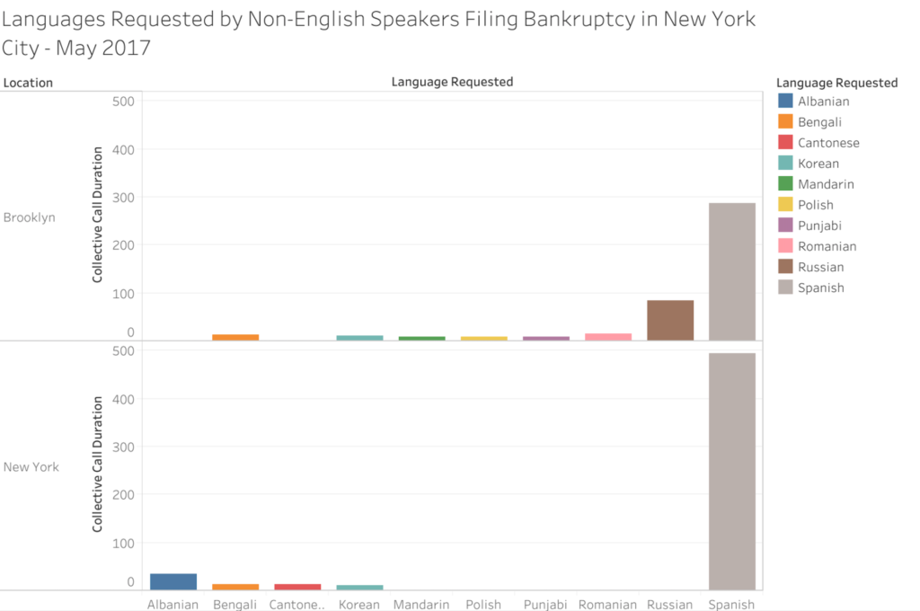
After searching for language related datasets on data.world, I discovered that the Language Assistance Program released monthly reports of US citizens who filed for bankruptcy and requested translators for their meeting with creditors due to limited English proficiency. Upon request, these individuals were provided a phone call with an interpreter that spoke their preferred language. The most recent month available on data.world was for the month of May in 2017 so that is the dataset that I selected. Additionally, this dataset recorded individuals from nearly every major US city but for this assignment I wanted to focus solely on New Yorkers. As the Language Assistance Program was releasing monthly datasets, the languages listed tend to differ with each month. In this specific month, the languages that were requested by individuals filing for bankruptcy were Albanian, Bengali, Cantonese, Korean, Mandarin, Polish, Punjabi, Romanian, Russian and Spanish.
To create my chart, I transferred my chosen data -the requested languages, collective call duration with interpreter for each language, and whether the calls took place in what the dataset listed as either New York (Manhattan) or Brooklyn – into an Excel sheet, and from there transferred it to Tableau. I ultimately selected this chart as I thought that it best showcased the information. Based on the chart, it’s evident that some languages like Spanish are more recurrent and are present in both locations, while other languages like Cantonese only appear one or two times and only appear in one location. However, as I have only visualized a single month for this assignment, I feel that I do not have sufficient information to make any hypotheses or have any solid takeaways based on the dataset. The next steps I’m going to take is gather more data from previous posts by the Language Assistance Program, visualize them into charts and compare the information, specifically looking for patterns in recurring languages and call durations.

This entry is licensed under a Creative Commons Attribution-NonCommercial-NoDerivatives 4.0 International license.
While this is pretty interesting data, it’s also a great example of how lack of context and the way we present data can be misleading. The graph could easily indicate a cumulative number of requests for these languages in bankruptcy proceedings up to May 2017. Also, it wasn’t until I read the blog post that I noticed that the graph indicated the duration of calls for each language on that particular month. I am really excited to see what you find out with more data and context.
You’re exactly right and this definitely ties into our discussion in Methods of Text Analysis on what can go wrong when we provide data without context. When I was transferring the dataset I noticed that there wasn’t any concrete information provided as to why the Language Assistance Program recorded this data, why it was recorded monthly and etc. While I selected this dataset solely for the purpose of creating a visualization chart, it is crucial to take into account the context of the data or lack thereof, as that context is arguably necessary in order to adequately analyze the data. I hope that as I expand more on this project and compare the data from prior months I’ll be able to find patterns and potential outliers in the data. Then again, without context this could prove to be quite difficult.
This is absolutely something that I should have noted in my blog post about the assignment or at least explored a bit more. Thanks so much for reading and pointing this out Lola, you’re awesome! ?
I think the blog post and viz are perfect conversation starters. Thank you! I wonder why the Department of Justice selected this data on US citizens in 2017. This was right after the ‘muslim ban’ and since then the administration has tried to make arguments for economic restrictions on immigration. I wonder if this was compiled in the early days of that process. Although according to the current resident in the White House, bankruptcy might actually be an indicator of extreme wealth.
Also, I think the timing on these calls is important to the translators, because they get paid by time.
Oh it started during the Obama administration. Okay, please let us know what you find out. 🙂