I’m guessing I’m not the only person who’s seen this research study popping up all over their social media. broadbandchoices, a broadband internet, mobile/home phone, and TV provider based in the UK, has conducted a study to determine the scariest horror movie ever made: The Science of Scare. Their team reviewed lists of best horror films from critics and on Reddit, and complied what they believe to be a list of the 50 best horror movies of all time.
Then they found 50 participants and had them all watch of the movies while wearing heart rate monitors to track heart rate spikes and compare average heart rates during the movies with their average resting rates.
The scientific rigor of this study certainly raises a lot of questions. Lists of best movies are incredibly subjective, and they do not provide the number of sources they consulted or provide the specific lists they took their movies from. How much of their final list was determined based on what was easily available to view? Also, they all seem to be predominantly English language movies (The Orphanage is the only one I’m familiar with on that list that was made in Spanish, but did they watch with subtitles or did they watch a dubbed version?). How did they settle on heart rate as the determining factor of what is scary–was it just because heart rate is relatively easy and noninvasive to measure? How did they pick the participants? What are their demographics (a Nerdist writeup says the participants were of different ages, but I’m not seeing anything about that from broadbandchoices)? What was their previous exposure to/feelings about the genre; did they have any pre-existing medical conditions that could have affected their heart rate monitoring? Under what conditions were the films screened–together, individually, at home, consecutively?
What do you all think? Is this just some harmless Halloween fun, or do “studies” like this contribute to a false narrative that data is objective?
For the record, I’ve never even heard of their top movie, and of their list of 35, I’ve seen 18. You?
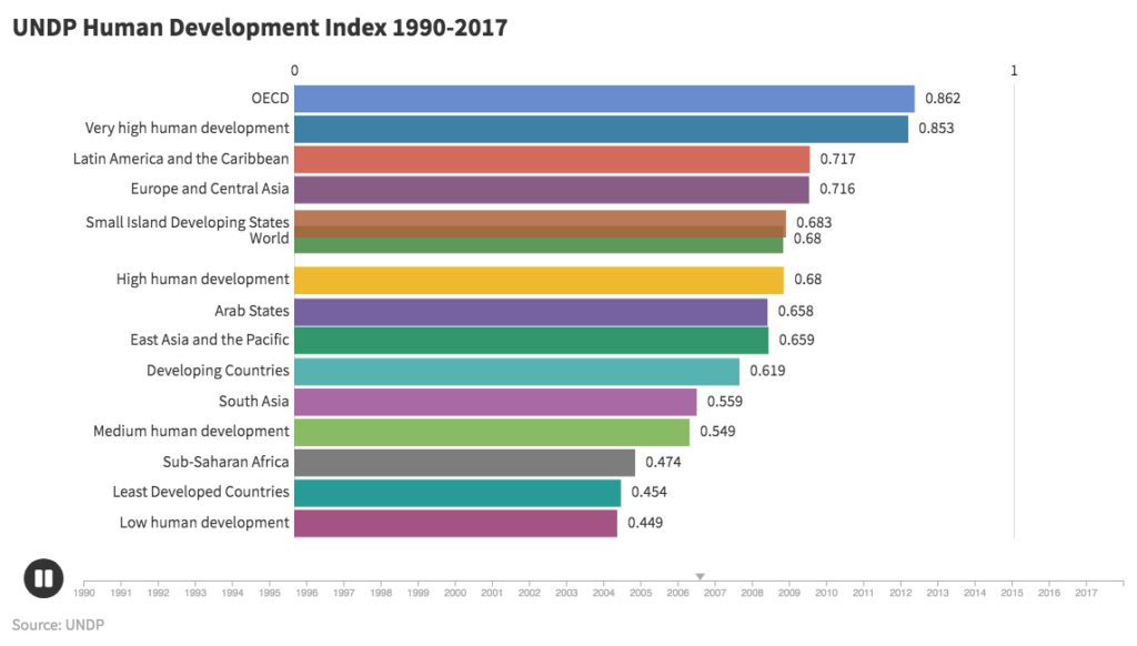
UNDP Human Development Index 1990-2017 (click image to view animation)
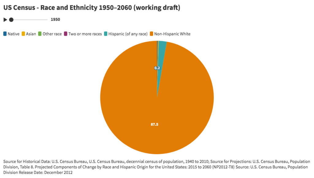
US Census – Race and Ethnicity 1950–2060 (click image to view animation)
Overview
Animated bar and pie charts attempt to narrate and reveal the changing relationships between variables, attributes, or features of a set of interpolated time series, and in the process identify historical trends.
Discussion
For the bar chart entitled “UNDP Human Development Index 1990-2017”, data was retrieved from the United Nations Development Program (http://hdr.undp.org/en/data). As a measure of human development in terms of a combination of indicators of life expectancy (based on the indicator of life expectancy at birth), education (based on indicators of expected years of schooling and mean years of schooling), and per capita gross national income (based on the indicator for GNI per capita), the HDI attempts to improve on older measures centered around income. The chart using country level data was too detailed and did not readily display any discernible insights. By zooming out and using regions and other summary categories, the animation increased to a level that resulted in meaningful trends beyond country-by-country rankings.
For the pie chart entitled “US Census – Race and Ethnicity 1950–2060”, data from the U.S. Census Bureau was retrieved for the breakdown of the US population by race and ethnicity between 1950 and 2060. Due to issues related to the changing definitions and questions for race and ethnicity, percentages for each year do not add up to 100%. When data categories change, the pie chart is an improvement over line charts in which time series do not uniformly cover the same time periods.
The London-based company behind these animated charts is Flourish (https://flourish.studio/), which is a registered trademark of Kiln Enterprises Ltd. The company targets agencies and newsrooms and offers discounts to non-profits and academic institutions. The freemium version requires that all charts be made publicly available. The personal subscription plan starts at $69 per month. The learning curve of the user interface is impressively low. Customization of charts is extensive, including multiple variables for font sizes, colors, captions, labels, legends, layout, number formatting, animation rates, headers, and footers. The company offers a wide range of visualization templates, including a variety of projection maps, scatter plots, 3D maps, hierarchy diagrams, marker maps, cards, 3D globes, photo sliders, network graphs, team sports visualizations, arc maps, and others. In addition to one-off visualizations, the application offers “stories”, which are animated presentations of one or more visualizations.
Challenges
US Census bureau historical data and projections present challenges resulting from the changes over time in the definitions of categories and questions. Both visualizations present issues with interpolation that hide unrepresented data. UNDP data presents issues related to hidden variability of indicators for demographic characteristics such as gender, race, ethnicity, age, and others with the geographic domains.
Conclusion
The animated bar chart for HDI suggests that while human development has gradually improved over time for all regions and categories, improvements relative to other regions have only occurred in the regions with middle values. The lowest HDI category (low human development) and highest HDI category (OECD) have not changed rank relative to the other categories. The lowest HDI category has only marginally changed relative to the highest category. Overall, regions have not shifted markedly in rank. Introducing other categories including “Global North” and “Global South” would help to reveal trends relevant to contemporary social, political, and economic analysis.
The animated pie chart visually demonstrates the decreasing white share of the population relative to the increasing non-white share of population. The point at which the white share becomes less than 50% appears around 2040. This could arguably be one of the most powerful explanatory demographic trends in contemporary US history. Explanatory power arguably represents a key measure of a successful visualization.
As a for-profit company, Flourish is potentially subject to constraints that run counter to the values and mission of the digital humanities and higher learning. To the extent open source software managed by non-profit associations and non-governmental organizations can replicate proprietary software applications, Flourish offers a model of a successfully hosted charting and visualization application.
When used carefully, visualizations offer opportunities to make compelling arguments about the state and nature of any phenomena that can be counted or perhaps merely represented. The most compelling visualizations are arguably those that reveal new insights well beyond the initial moments of comprehension. These kinds of visualizations invite iterative analysis in which changes in context or new information lead to new understandings. There are many risks, however, in attempting to argue and narrate through visualizations. Data visualizations can easily lead to distortions, omissions, and erasures as a result of either the data or its presentation. As with any powerful technology, critically informed experience and skill potentially lower the risks. As visualization tools and applications become more widely available, the need increases to disseminate an understanding of the hidden assumptions, distortions, and false representations embedded in data and its display.
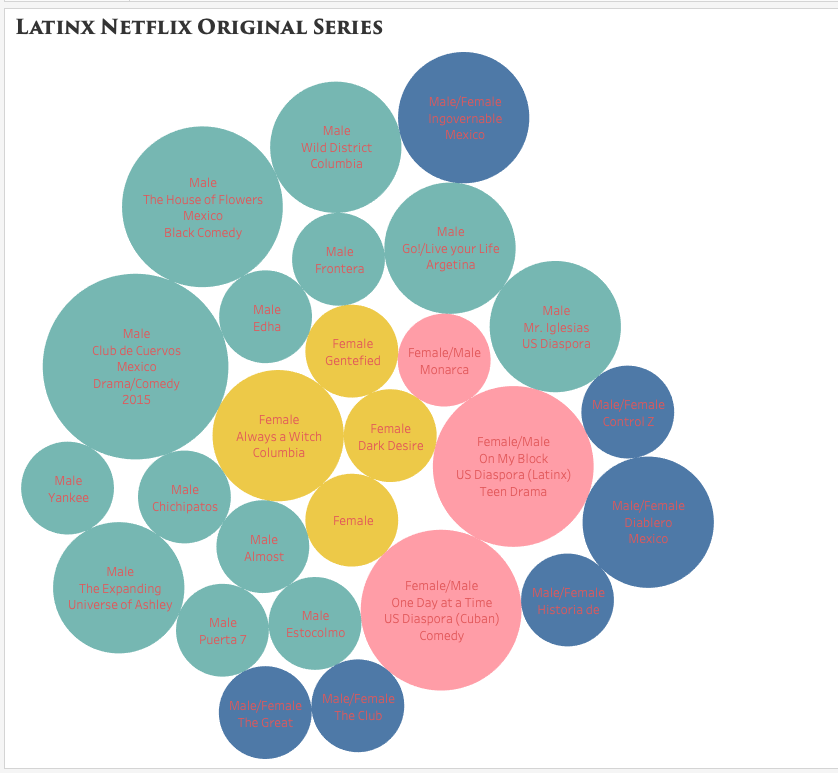
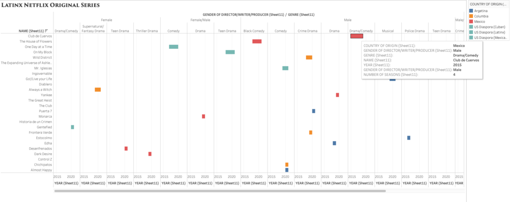
While browsing through Netflix for something to watch, I started to notice the lack of Latin American original television narratives. When searching for content, the algorithm does not distinguish between Spanish Language content, content from Spain, content from Latin America, and content from the Latin American diaspora here in the United States. I decided to use Tableau as a visualization tool to help better express, analyze, and, of course, bring to light the few yet impactful Latin American streaming series.
Compared to Argis, Tableau has proven to be a much more user-friendly tool to interpret complex data. Since I am familiar with Excel, I opted to import the data through this method and use the “drag and drop” capabilities to create relationships between them. I made a simple chart with 6 columns: title/name of the content, year launched, number of seasons, country of origin, genre, and the gender of the principal producers (creator/writer/director/producer). The easy to use the system within Tableau allowed me to organize the data as simple as only showing two relationships or showing multiple relationships. I was able to see how easy it is to manipulate the visualization to highlight the most important areas to a creator. As a creator myself, I was heavily interested in the producers’ gender and the genre of the longest-running titles.
packed bubbles visualization style
Grantt visualization style.
I debated which visualization to use and how much information was essential to include and display. While I enjoyed the Packed Bubbles visualization, I later opted for a cleaner and detailed look, like the one offered by Grantt. The visualization showcases the lack of diversity in the writer/director and country of origin (Mexico being the majority) while also highlighting the various genres/styles from Latin America.
I definitely enjoyed using this tool, whoever, the most difficult part was the export. Between the tableau online, the tableau server, and the original account, I could not export this project properly. However, had I had more time, I would have definitely tried my hand at a much larger and complex data set. Overall the program is easy to use, but the vast number of choices and styles can be overwhelming for any beginner.
Given the recent death of Ruth Bader Ginsburg and the current Senate hearings for her nominated replacement, Amy Coney Barrett, the Supreme Court is all over the news. Supreme Court justices are not elected, and once approved by the Senate, they receive lifetime appointments. I wanted to know what those lifetime appointments translate to in actual term lengths.
Collecting and Sorting the Data
The majority of the data I wanted were conveniently available on the Supreme Court website, where they list every justice since the court began in 1789 to the present, including their title (chief justice or associate justice), the date they took their oath, and the date their service ended, as well as what state they were appointed from and which president appointed them. They list some caveats on their site regarding the dates, but for my purposes I chose to ignore them and just accept the dates given.
I copied their data into an Excel file, and integrated the chief and associate justices together, sorting in chronological order by oath date. In doing so, I realized there are three justices who held both titles, John Rutledge was the first, with a break in between titles (total of both terms is approximately 1.40 years). Harlan Fiske Stone and William H. Rehnquist also held both titles, being promoted from associate directly to chief justice (Stone’s total term length is 21.14 years, and Rehnquist’s is 33.66 years). In my tables, each of these three people have two listings by their names because of this, so it does slightly skew my average term length of 16.16 years (more than twice as long as the current term limits on presidents).
The Supreme Court was created in 1789, initially with one chief justice and five associate justices. It was expanded in 1869 to consist of one chief justice and eight associate justices (the number we have today). I wanted to calculate the length of each justice’s term in both days (because it would be whole numbers) and years (as these would be more recognizable and understandable), which was tricky in Excel as it does not recognize dates before January 1, 1900. For all of the justices who had both oath and termination dates after 1900, I was able to use existing formulas to calculate these values. For the dates preceding this, I copied them into a new sheet, and I added 1000 to each year to get Excel to recognize the values as dates, and then I was able to use the same formulas as before, though I had to copy the unformatted numbers into Word before pasting back into my main Excel table to make sure it kept the values rather than the formulas. For the current justices, I put in “termination” dates of today, October 13, just to get some sense of their term lengths thus far, though again I realize this is skewing my average and trends.
In addition to the term length, I also wanted to note the gender of each of the justices (which admittedly is problematic as I am assuming a gender binary and also ascribing gender to these people based on their name and pictures). Of the 119 appointed justices, only 4 have been women.
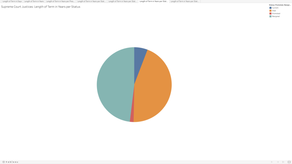
Given that justices have lifetime tenure, I also wanted to see how the terms were ending. Going into this, I had assumed that most justices’ terms ended with their deaths; however, it turns out there is a pretty even mix between resignation and death. This information wasn’t included on the Supreme Court website, so I searched each justice’s Wikipedia page to compare the date their term ended with their death date. Some entries made a distinction between resignation and retirement, but for my purposes I selected “resignation” for any justice whose term ended before they died. Back to Rutledge, he resigned twice; Stone and Rehnquist were both promoted directly from associate to chief. There are eight justices whose terms are ongoing—who I noted as “current.”
Visualizing the Data
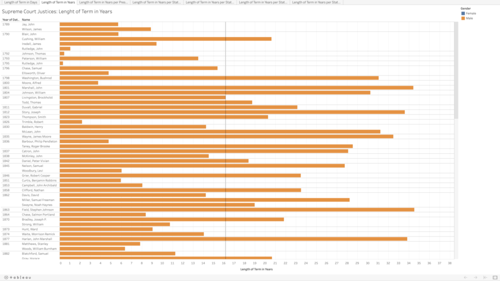
I decided to use Tableau again to get more familiar with its features and tools. I played around with the data a bit to see if I could spot any trends in the term lengths—e.g., did term lengths get longer as life expectancy increased? To my untrained eye, the term lengths don’t seem to follow much of a trend. When looking at resignations versus deaths, there do appear to be some groupings—though I’m not sure what, if anything, could be inferred by this.
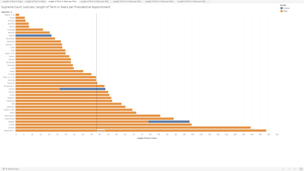
In playing around, I was able to visualize which presidents had the most sway in the Supreme Court, in terms of the total term lengths for all of the justices they appointed. I assumed Washington would be the clear leader, having the benefit of being the president to appoint the most justices, but several others beat him out, and Franklin D. Roosevelt has almost double the total terms (85.8 vs. 148.6 years). There are only four presidents who did not appoint any Supreme Court justices (William Henry Harrison, Zachary Taylor, Andrew Johnson, and Jimmy Carter).
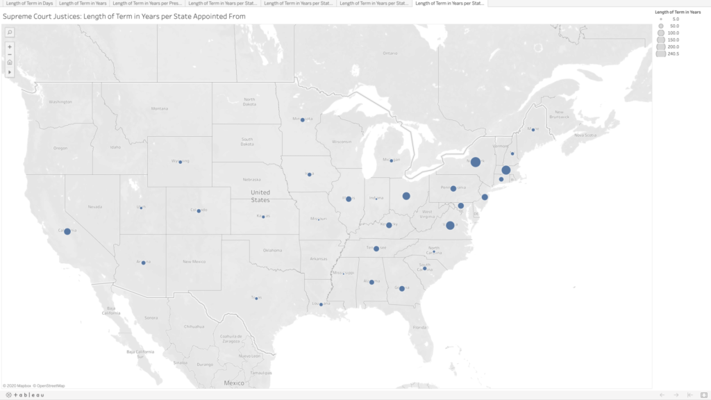
Lastly, because why not, I wanted to see the term lengths as they related to the states where the justices were appointed from. There are many states that have never had any Supreme Court justices, especially as you move further west. Again, I’m not sure what arguments about representation could be made here; I would think this speaks more to “manifest destiny” and the way in which states were created and admitted to the union than anything else.
Ideas for Future Expansion
Initially I had been curious to compare all of the justices by the age at which they began their terms, but that would have been a bit too time-consuming. I’m still curious to see if there are any trends here. All Article III federal judges are appointed for lifetime tenure (technically they can be removed, but in practice it seems like appointments are more or less until death or resignation), so it would be great to get data for all of them as well and see what kind of trends pop up.
One of the things I love the most about New York City is its diversity, which translates to the incredible variety of restaurants that we’re lucky to have at our disposal. I remember trying Vietnamese, Korean, and Ethiopian food for the first time in the city…Italy has great food, but not a lot of diversity!
I decided to use the dataset for the DOHMH New York City Restaurant Inspection Results, which I had downloaded in Spring 2020 for my Geospatial Humanities class. [1] I was hoping to make a map out of it, but I realized it was a little complicated with ArcGIS on my slow PC…however, this dataset worked very well for Data Visualization!
I was inspired by the work my classmates did for their Mapping assignment and decided to use Tableau for my data visualization. Thanks to a handy tutorial on the Tableau website, I was able to select the dimensions and measures I wanted to portray and explore different styles of visualization. I spent a morning just exploring the data on Tableau and trying to combine different fields to see if anything interesting came out. I experimented with Restaurant Grades and Scores, but then I decided to keep it simple and calculate the top 10 Cuisines for each borough. New Yorkers intuitively know that the best Chinese food is in Chinatown (Manhattan), Flushing (Queens), and Sunset Park (Brookyln). Or that you can find handmade mozzarella in Little Italy (the Bronx one!). And that there is a big Orthodox Jewish Community in South Williamsburg, so that’s the place to go if you are craving bagels, smoked fish, and chocolate babka. I wanted to see if the data reflected this empirical evidence.
I opted for a very simple bar chart showing the Top 10 Cuisines in each borough, which you can find here. I used a tutorial I found on Youtube to display the number of top cuisines for each borough, calculated as a percentage of the total. I decided to differentiate the cuisines by color for easy reference, but also for the aesthetical reason to portray the mosaic of NYC cuisines in my visualization.
As we can see from the visualization, American cuisine is the most prominent in each borough, with a spike in Manhattan. Chinese restaurants are the second most popular establishments in all boroughs except Staten Island, where they predictably get beaten by Italian restaurants. Italian food appears in the top 10 of Manhattan and Staten Island, but surprisingly not in the Bronx – where there is, however, a 7.7% rate for “Pizza” and a 2.7% rate for “Pizza/Italian”. Jewish/Kosher restaurants appear in the top 10 only in Brooklyn, which reflects my initial assumption. A thing I found interesting is that, despite there being a Koreatown in Manhattan, Korean cuisine makes it to the top 10 only in Queens.
In the end, this project left me with more questions than answers.
According to the metadata of the DOHMH New York City Restaurant Inspection Results (the “Data Dictionary” spreadsheet), the “Cuisine Description” field is an “Optional field provided by provided by restaurant owner/manager”. The fact that there is a discreet number of categories makes me think that the owner/manager of a restaurant needs to choose from a list, which means that diversity is necessarily reduced. How do you classify the amazing Chino-Latino cuisine?
What does “American Cuisine” mean? When I saw that field, I immediately assumed it meant burgers, BBQ joints, and steakhouses, but this is just my imagination (and my bias) filling the gap in the data. Soul food is definitely American, but it doesn’t fit neatly in the definition. I would love if there was an ulterior classification for American cuisine, or at least a more extensive description in the metadata.
In the future, I would like to investigate the correlation of predominant cuisine and demographics in a ZIP code: for example, Manhattan’s Little Italy has a lot of touristy Italian restaurants, but I doubt that there are many Italians or Italian Americans living in the neighborhood. I’m looking forward to the release of the 2020 Census Data for this.
How many restaurants have closed due to the Coronavirus crisis? Which cuisine was the most affected? I would need to interrogate the datasets for Spring 2020 and October 2020 to have a comparison.
I would greatly appreciate hearing your feedback on this project and how you would improve it. Stay safe and support your local restaurants!
P.S. The huge pizza in the image is from Juliana’s Pizza in Dumbo, Brooklyn and I highly recommend it!
[1] I’m mentioning the download timeframe because the data gets updated according to new inspections from the Department of Health. Here I’m presenting the data as it appeared in Spring 2020: this means that the dataset probably portrays restaurants that are now closed and doesn’t have data on new restaurants that might have opened since then.
Need help with the Commons?
Email us at [email protected] so we can respond to your questions and requests. Please email from your CUNY email address if possible. Or visit our help site for more information: