
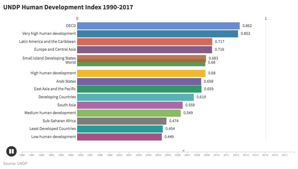
UNDP Human Development Index 1990-2017 (click image to view animation)
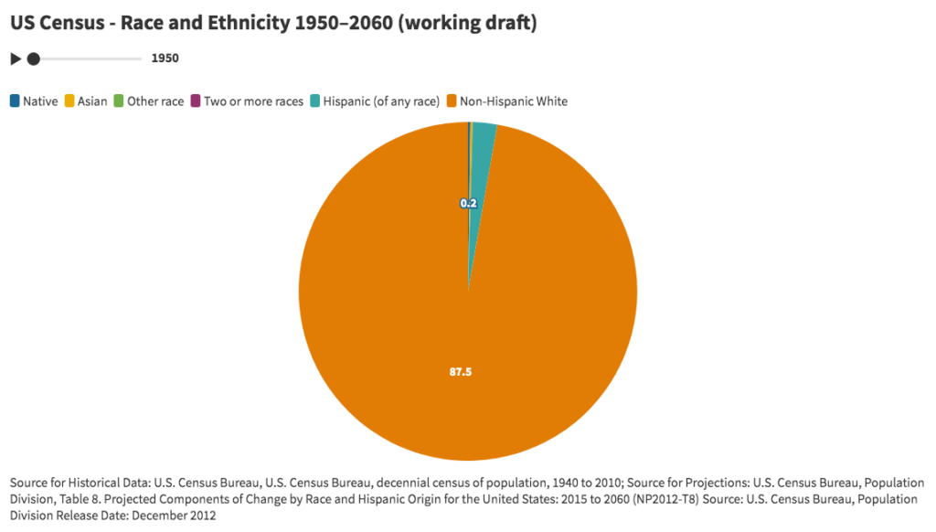
US Census – Race and Ethnicity 1950–2060 (click image to view animation)
Overview
Animated bar and pie charts attempt to narrate and reveal the changing relationships between variables, attributes, or features of a set of interpolated time series, and in the process identify historical trends.
Discussion
For the bar chart entitled “UNDP Human Development Index 1990-2017”, data was retrieved from the United Nations Development Program (http://hdr.undp.org/en/data). As a measure of human development in terms of a combination of indicators of life expectancy (based on the indicator of life expectancy at birth), education (based on indicators of expected years of schooling and mean years of schooling), and per capita gross national income (based on the indicator for GNI per capita), the HDI attempts to improve on older measures centered around income. The chart using country level data was too detailed and did not readily display any discernible insights. By zooming out and using regions and other summary categories, the animation increased to a level that resulted in meaningful trends beyond country-by-country rankings.
For the pie chart entitled “US Census – Race and Ethnicity 1950–2060”, data from the U.S. Census Bureau was retrieved for the breakdown of the US population by race and ethnicity between 1950 and 2060. Due to issues related to the changing definitions and questions for race and ethnicity, percentages for each year do not add up to 100%. When data categories change, the pie chart is an improvement over line charts in which time series do not uniformly cover the same time periods.
The London-based company behind these animated charts is Flourish (https://flourish.studio/), which is a registered trademark of Kiln Enterprises Ltd. The company targets agencies and newsrooms and offers discounts to non-profits and academic institutions. The freemium version requires that all charts be made publicly available. The personal subscription plan starts at $69 per month. The learning curve of the user interface is impressively low. Customization of charts is extensive, including multiple variables for font sizes, colors, captions, labels, legends, layout, number formatting, animation rates, headers, and footers. The company offers a wide range of visualization templates, including a variety of projection maps, scatter plots, 3D maps, hierarchy diagrams, marker maps, cards, 3D globes, photo sliders, network graphs, team sports visualizations, arc maps, and others. In addition to one-off visualizations, the application offers “stories”, which are animated presentations of one or more visualizations.
Challenges
US Census bureau historical data and projections present challenges resulting from the changes over time in the definitions of categories and questions. Both visualizations present issues with interpolation that hide unrepresented data. UNDP data presents issues related to hidden variability of indicators for demographic characteristics such as gender, race, ethnicity, age, and others with the geographic domains.
Conclusion
The animated bar chart for HDI suggests that while human development has gradually improved over time for all regions and categories, improvements relative to other regions have only occurred in the regions with middle values. The lowest HDI category (low human development) and highest HDI category (OECD) have not changed rank relative to the other categories. The lowest HDI category has only marginally changed relative to the highest category. Overall, regions have not shifted markedly in rank. Introducing other categories including “Global North” and “Global South” would help to reveal trends relevant to contemporary social, political, and economic analysis.
The animated pie chart visually demonstrates the decreasing white share of the population relative to the increasing non-white share of population. The point at which the white share becomes less than 50% appears around 2040. This could arguably be one of the most powerful explanatory demographic trends in contemporary US history. Explanatory power arguably represents a key measure of a successful visualization.
As a for-profit company, Flourish is potentially subject to constraints that run counter to the values and mission of the digital humanities and higher learning. To the extent open source software managed by non-profit associations and non-governmental organizations can replicate proprietary software applications, Flourish offers a model of a successfully hosted charting and visualization application.
When used carefully, visualizations offer opportunities to make compelling arguments about the state and nature of any phenomena that can be counted or perhaps merely represented. The most compelling visualizations are arguably those that reveal new insights well beyond the initial moments of comprehension. These kinds of visualizations invite iterative analysis in which changes in context or new information lead to new understandings. There are many risks, however, in attempting to argue and narrate through visualizations. Data visualizations can easily lead to distortions, omissions, and erasures as a result of either the data or its presentation. As with any powerful technology, critically informed experience and skill potentially lower the risks. As visualization tools and applications become more widely available, the need increases to disseminate an understanding of the hidden assumptions, distortions, and false representations embedded in data and its display.

This entry is licensed under a Creative Commons Attribution-NonCommercial-NoDerivatives 4.0 International license.