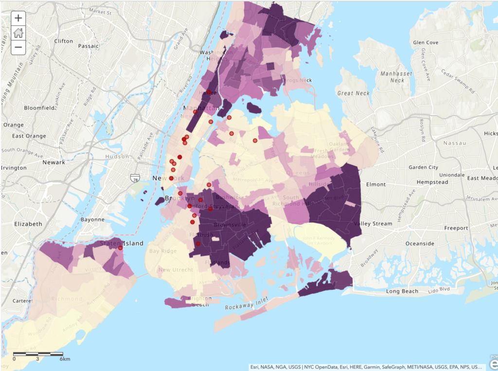
Yesterday I had the opportunity to participate in the Intro to Making Interactive Maps workshop which was expertly led by Olivia Ildefonso. The workshop was targeted to those who are interested in creating interactive maps but have little to no experience with marrying multiple datasets, creating intricate layers and executing a map that informs its viewers by telling a story. As someone who has scarcely any mapping experience aside from the two maps that I’ve created for assignments at the Graduate Center, I was a bit worried that I’d easily get lost or confused during the session. But I found that the workshop really catered to every participant regardless of amount of prior experience with mapping tools or lack thereof.
The workshop consisted of two parts: a presentation that included some crucial information on the basic fundamentals of interactive mapmaking as well as an overview of the map we were creating, and then hands-on experience making said map. One point I found really helpful in the presentation was how to determine what kind of mapping tools use. Olivia explained that the tools you use depend on whether the map you’re creating is going to be static or interactive. Additionally, your intended budget is another important factor, and combining data on multiple mapping tool such as ArcGIS and QGIS is common as they’re more accessible than some pricer tools. After discussing mapping techniques, exploring different tools and defining different kinds of data often found in interactive maps, we were able to try our hand at creating an interactive map.
Creating the Map:
The map we created mapped out 1 week of BLM protests in New York City, based around the research question: Do New York City’s BLM protests tend to take place more in majority Black neighborhoods or in majority non-Black neighborhoods? Olivia provided us with data including shapefiles for NYC boroughs, locations of protests and the percentage of race by neighborhood. We transferred this data over to ArcGIS and then were able to play around with color schemes, symbols, and the overall aesthetic of the map. Additionally, some of the data provided included specific details for protest locations and powerful images for each location, which we were shown how to add to our map points. I was truly impressed by how a string of data can be visualized (seemingly) seamlessly into locations, images, and points on a map.

Conclusion
To me, mapping is an art, and one that I have been interested in for years. With no experience, however, I admit I was initially daunted by it; I had no idea where or how to get started. This workshop made me feel very comfortable with ArcGIS and excited to create my own mapping projects in the future. Next, I’m excited to learn more about the actual process of finding data and preparing it for the mapping process.
If you’re interested, you can check out the map here 🙂


Agree! This was such a great and approachable workshop. I definitely want to revisit my praxis assignment after this intro to ArcGIS Online. I’m especially intrigued by the story map options.
Yes, I agree – me too! It was a really informative and great workshop. Btw, Olivia Ildefonso is the co-creator of the COVID-19 and Cages Mapping Project. If you haven’t seen it:
https://www.gc.cuny.edu/News/Student-News/Detail?id=55569
This is the map: https://covidprisonproject.com/cages-mapping-project/