
While browsing through Netflix for something to watch, I started to notice the lack of Latin American original television narratives. When searching for content, the algorithm does not distinguish between Spanish Language content, content from Spain, content from Latin America, and content from the Latin American diaspora here in the United States. I decided to use Tableau as a visualization tool to help better express, analyze, and, of course, bring to light the few yet impactful Latin American streaming series.
Compared to Argis, Tableau has proven to be a much more user-friendly tool to interpret complex data. Since I am familiar with Excel, I opted to import the data through this method and use the “drag and drop” capabilities to create relationships between them. I made a simple chart with 6 columns: title/name of the content, year launched, number of seasons, country of origin, genre, and the gender of the principal producers (creator/writer/director/producer). The easy to use the system within Tableau allowed me to organize the data as simple as only showing two relationships or showing multiple relationships. I was able to see how easy it is to manipulate the visualization to highlight the most important areas to a creator. As a creator myself, I was heavily interested in the producers’ gender and the genre of the longest-running titles.
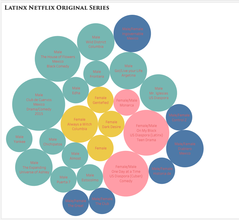
packed bubbles visualization style
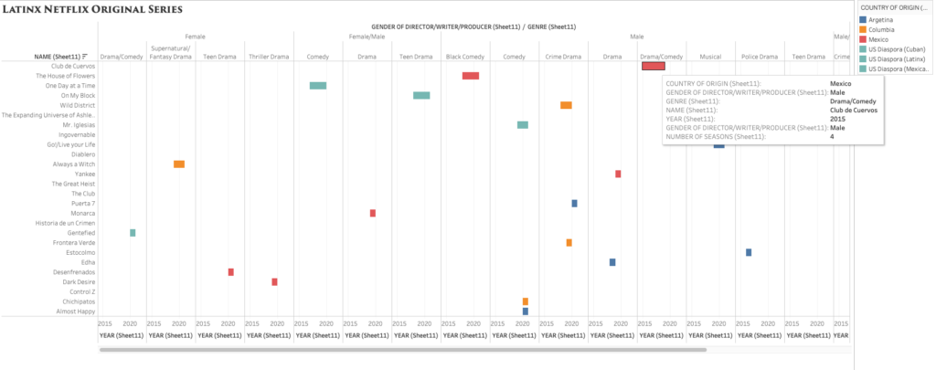
I debated which visualization to use and how much information was essential to include and display. While I enjoyed the Packed Bubbles visualization, I later opted for a cleaner and detailed look, like the one offered by Grantt. The visualization showcases the lack of diversity in the writer/director and country of origin (Mexico being the majority) while also highlighting the various genres/styles from Latin America.
I definitely enjoyed using this tool, whoever, the most difficult part was the export. Between the tableau online, the tableau server, and the original account, I could not export this project properly. However, had I had more time, I would have definitely tried my hand at a much larger and complex data set. Overall the program is easy to use, but the vast number of choices and styles can be overwhelming for any beginner.

This entry is licensed under a Creative Commons Attribution-NonCommercial-NoDerivatives 4.0 International license.
Great job, Maggi! I really like that you chose an interesting topic such as Netflix Latino…it looks like one of the data visualizations you would find on online magazines. Also, I see a lot of shows I love!
My advice would be to share this with Netflix and the shows social media pages 🙂
Just a question…why are some bubbles bigger than the others?
Hi Elena,
I’m glad you liked it. Since I had issues sharing the actual interactive visualization, you can’t see the key and the functions. Bubbles are colored and categorized based on the country, number of seasons, and whether the creator/writer/producer is male or female. The size depends on the number of seasons.
One of the things I was trying to accomplish through this is to distinguish between Netflix’s Spanish Language content, Netflix’s Spanish content(from Spain), and content produced from and about Latin American countries and cultures. Usually it’s hard to search for this on the site since it categorizes all Spanish content as the same. This is why you can search and watch more Spanish content but not necessarily content from Latin America; they are hidden.