
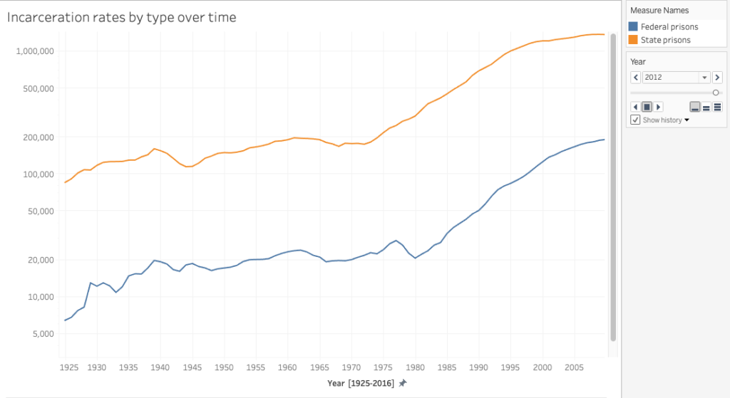
For this assignment, I wanted to continue to work with data that relates to mass incarceration. Searching for data, I found the non-profit, Prison Policy Initiative, which produces research and publishes data visualization projects that aims to expose “the broader harm of mass criminalization, and then sparks advocacy campaigns to create a more just society”. The Initiative emphasizes that due to the lack of accessibility of essential national and state level data, it strives to create data analysis and powerful graphics that are intended to bring in new supporters into the national conversation about criminal justice reform and over-criminalization. The Initiative also provides numerous datasets (for example National data, State level comparison data, and State specific data) which researchers used for reports that were published on its website. I selected the national dataset on incarceration rates in state prisons and federal prisons from 1925 – 2016. After sorting the data and moving it to a separate cvs file, I transferred it to Tableau.
In my first visualization attempt, I created two simple and separate graphs that show the incarceration rate of federal prisons and state prisons over time:

As I wanted to visualize both datasets in relation to each other to illustrate how state policies drive mass incarceration, I created two graphs and tested different visualization types. For the second graph, I used the animation feature to display the increase of incarceration over time in motion, thus calling attention to the rapid rise of incarceration, particularly during the 1980s “War on Drugs”. In order to view the animation, on the right hand corner there is the option to scroll back to the year 1925 and then by pressing play the plot points on the graph will start to move.

Thinking back to Drucker’s article “Humanities Approaches to Graphical Display” and interpretative models/approaches to data visualization, one idea for future expansion might be to create an interactive visualization that includes additional data that gives information that explain the numbers in detail. For example, the Prison Policy Initiative has published a visualization on incarceration rates by ethnicity/race and on women’s mass incarceration, which would be important criteria to add.

This entry is licensed under a Creative Commons Attribution-NonCommercial-NoDerivatives 4.0 International license.