Author Archives: Maggi Delgado

I’ll stick with creating the text instead of analyzing it!

For my final project, I proposed an extension for the text analysis tool suite, Voyant. During my first experience with this tool, I came across the need for a mixed text analyzer. Since I couldn’t find one, or at least one that was open source, I decided to contact Voyant and see if they would be interested in improving their already great device.

After speaking with Geoffrey Rockwell, one of the creators, I became intimated by the thought of the amount of work the would go behind making such an extension. I was convinced that it would be a simple tweak to their tokenizer, but the extension would ultimately need an experienced Javascript programmer and possibly a linguistic scholar. Rockwell pointed out that the way around analyzing mixed text is to first separate the corpus into two (or more depending on how many languages present in the corpus) and then import the texts individually to Voyant. I was not too thrilled with that idea. He told me about Voyant‘s Spyral which was design with digital humanist in mind. After receiving various suggestions on different extensions, the team at Voyant decided to construct a tool that would tailor the explorer’s newfound data based on Javascript coding. By importing both text and code, a user can essentially make the different extensions work to accommodate the user’s needs. Therefore, he suggested I could either learn Javascript or ask for help from a programmer to tweak the tokenizer myself and ask it to recognize and categorize the mixed text. I didn’t want to do that either.

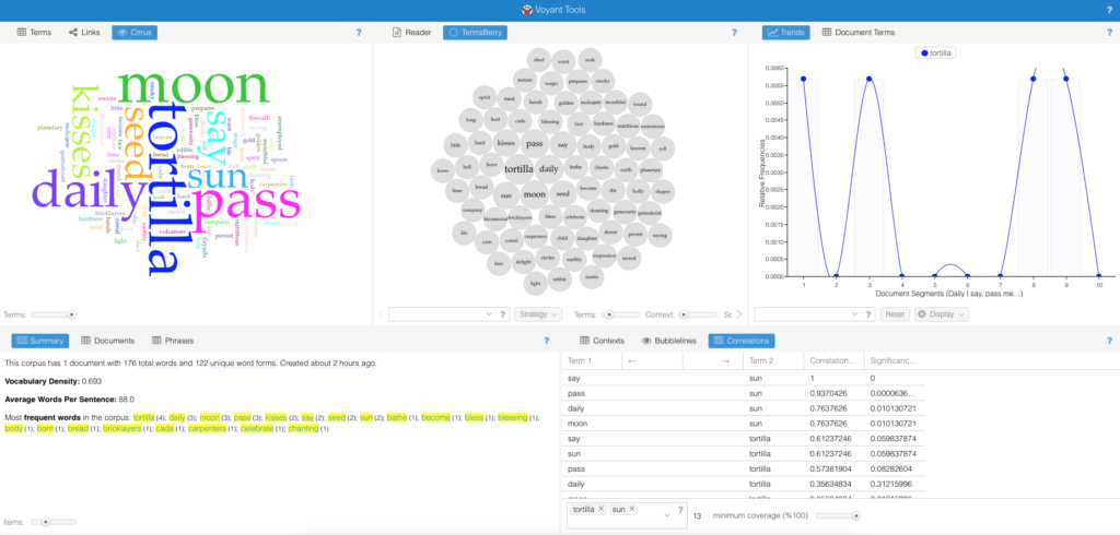
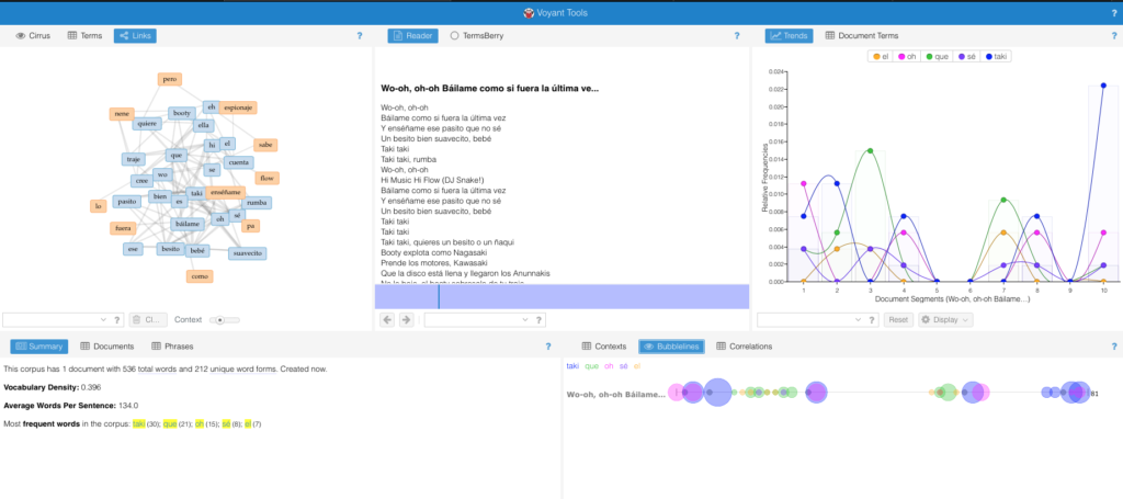
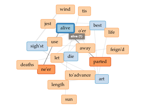
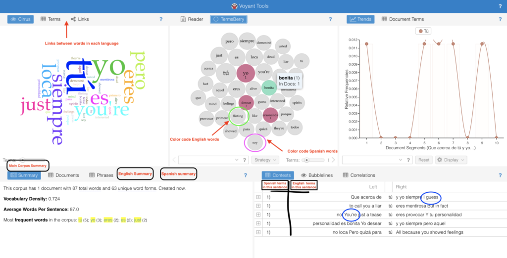
I proposed having an extension that would work alongside the other tools like Mandala, and Termberry to identify and classify the languages, determine the relationships between each other, and to compute how much of each language was used in the entire document. I sent over a sketch as well as a list of a few of the Voyant tools that could be modified to fit this extension.

What I didn’t realize is that even though I write bilingually most of the time (not just informally through mobile text messages and social media posts, but also when writing scripted television and other forms of storytelling), the style of writing is not widely accepted as formal or as style scholars are interested in analyzing. After researching, I found not digital humanists, but prominently analysis in customer service and marketing would be interested in this tool. This is because the writings they investigate are informal, digital consumer reviews, and social posts which tend to be bilingual.

I argued for the benefits in the humanities including literary scholars analyzing bilingual and multilingual poems, to more social linguists that would like to investigate the cultural influence behind these pieces as well the usage of syntax in such texts. However, after finding an experiment on such a tool done back in 2015, I understood that a more practical use for this tool might be in the pedagogical sector. Professor Siu Cheung Kong along with his colleges in Hong Kong, China created a plug-in on Moodle, an e-learning course builder for educators. The plug-in would allow educators to analyze the works of ESL and TSEOL students.

After the research I had a difficult time completing the last two section of this paper: work plan and dissamination. Other than an HTML and C++ lesson in high school, I never had any training in building any digital tool. I knew I needed help but I didn’t know where to start. I was sure of what I wanted the tool to do and how it must work seamlessly with Voyant, but other than needing Javascript, I was lost. I didn’t know the timeframe nor the work behind creating something like this.

Needless to say, I wanted to challenge myself and I did. I could have asked for more guidance in both the construction of this tool and the writing of this final paper. I needlessly struggled alone even after learning how much time and human power it takes to construct any digital humanities project, especially when the “digital” part is not your strong suit!

Word Soup! – Voyant’s Text Analysis Tool

I wanted to test out Voyant’s proficiency when it comes to using a text with multiple languages. To do this, I inserted various texts into the software: English, Spanish, and two texts with a mixture of both. Was Voyant able to 1. distinguish between the two languages and 2. make connections between words and phrases in both English and Spanish?

I first used Red Hot Salsa, a bilingual poem edited by Lori Marie Carlson. The text is composed of English and Spanish words adding authenticity to the United States’ Latin American experience. Voyant could not recognize, distinguish, nor take note of the differences in word structure or phrases. The tool objectively calculated the amount words used, the frequency by which they were used, and wherein the text, these words appeared. Another test consisted of a popular bilingual reggaeton song entitled Taki Taki performed by DJ Snake, Ozuna, Cardi B, and Selena Gomez. The system was able to again capture the amount of words and their frequent appearance. Yet, the way it measured the connection was through word proximity and in a song which repeats the same words and phrases, this measurement is not clear.

Finally, I decided on an old English text, one of my favorite poems: Sweetest Love, I do not Go by John Donne. Here I looked at the links tool and noticed the connection between the words die, sun, alive, and parted. The tool gave me a visual representation of metaphors inside the poem ( just because we are apart, we won’t die, like the sun, I will come again, alive ). I found the links section the most useful part of Voyant.

While exploring this tool, I recalled Cameron Blevin’s experience with text mining and topic modeling (Digital History’s Perpetual Future Tense). Like most of these digital apparatuses, one must go in with a clear intention prior to the text’s analysis and background. Without this, the quantitative measures will be there, but they will not have much meaning. They will become just Word Soup!

Visualizing Netflix Latino

While browsing through Netflix for something to watch, I started to notice the lack of Latin American original television narratives. When searching for content, the algorithm does not distinguish between Spanish Language content, content from Spain, content from Latin America, and content from the Latin American diaspora here in the United States. I decided to use Tableau as a visualization tool to help better express, analyze, and, of course, bring to light the few yet impactful Latin American streaming series.

Compared to Argis, Tableau has proven to be a much more user-friendly tool to interpret complex data. Since I am familiar with Excel, I opted to import the data through this method and use the “drag and drop” capabilities to create relationships between them. I made a simple chart with 6 columns: title/name of the content, year launched, number of seasons, country of origin, genre, and the gender of the principal producers (creator/writer/director/producer). The easy to use the system within Tableau allowed me to organize the data as simple as only showing two relationships or showing multiple relationships. I was able to see how easy it is to manipulate the visualization to highlight the most important areas to a creator. As a creator myself, I was heavily interested in the producers’ gender and the genre of the longest-running titles.

Grantt visualization style.

I debated which visualization to use and how much information was essential to include and display. While I enjoyed the Packed Bubbles visualization, I later opted for a cleaner and detailed look, like the one offered by Grantt. The visualization showcases the lack of diversity in the writer/director and country of origin (Mexico being the majority) while also highlighting the various genres/styles from Latin America.

I definitely enjoyed using this tool, whoever, the most difficult part was the export. Between the tableau online, the tableau server, and the original account, I could not export this project properly. However, had I had more time, I would have definitely tried my hand at a much larger and complex data set. Overall the program is easy to use, but the vast number of choices and styles can be overwhelming for any beginner.

Peeking Behind the Curtain

The See No Evil article by Miriam Posner reminded me of my first few “adult” jobs right out of college. You see, when you’re an intern, apparently you can ask as many questions as you want, but as an employee, you’ll be reprimanded for peeking behind the curtain. I won’t mention where, but while working at a large-scale media company, I made the mistake of asking too many questions about “how the sauce is made.” The company, as many do, employs a modular system. I was only supposed to know the details of my own work and the tasks it entails. Therefore asking about the responsibilities of other departments or who makes certain decisions was seen as intrusive. I later understood that maybe I was not reprimanded because of my curiosity but because even people like my supervisor, who “should have known” the answers to these questions, was not privy to this information. Besides this incident, during a horrible New York City snowstorm, we were all stuck in the office because the one person who knew how to operate and had access to a particular database couldn’t come in. No one question why couldn’t someone else touch this program or at least manage to operate it enough to allow the rest of us to continue with our work. Since then, I have faced many” on a need to know ” jobs, but I always feel incomplete and as if I might not know who exactly am I servicing or how I fit into the larger “making” process. 

“One doesn’t need to know what’s in the box, just where it needs to go. ” (Posner, See No Evil)

However, though I’m a huge proponent of transparency and, therefore, blockchain, I can’t help but think back to when I first learn how many Victoria Secret bras and HM t-shirts were made! Not everyone is ready to “assimilating a lot of information that companies have become very good at disavowing (Posner, See No Evil).” After catching up on the technology of surveillance and privacy in my Digital Pedagogy course, I can see how, as helpful and eye-opening this technology could be, it can also be super problematic. Just as we are employing tracking systems in consumer goods development, we are also tracking, more closely than ever, humans! Another problem that I can ascertain from this proposed technology is the increase in automation and AI taking over more of the handling process, displacing countless workers. I do share Jackson’s thoughts on repair (Rethinking Repair), and the blockchain technology seems to be a way to improve upon a system of accountability, tracking, and outdated infrastructure. However, when proposing improvements, we must also employ a level of care and engrossment (Bethany Nowviskie, Capacity Through Care), looking at each component and each group of people with great detail, subjectivity, and compassion.

Speaking of tracking, surveillance, and technology, Apple is set to implement airtags – a Bluetooth powered small tracking device that helps you find lost or misplaced items (probably other items as well). But thinking as DH scholar, how can this technology be socially useful? And how can it be misused? Is it being done with care?

Hypothes.is and Distance Learning

I’ve always thought of annotations as another form of marginalia. Annotating a text with insightful comparisons and word definitions was, at least for me, part of the private and intimate reading feeling. Though sometimes I would share these observations and findings with others, for the most part, it was a practice done on my own; it was part of my learning process. However, I’m learning now that this process is something to be shared; done in conjunction with others. Especially during distance learning, these digital annotations can be a social activity that has the potential to create and maintain lively discussions.

On September 29th, I attended the ITP Skills Lab session on the use of Hypothes.is: Doing Collaborative Text Annotation Online with Hypothes.is with Julie Fuller. During the workshop, Fuller shared with everyone how this tool, if used effectively, could be used as part of every teacher’s pedagogical technique. Hypothes.is whose mission statement is “to enable a conversation over the world’s knowledge”, was founded by Dan Whaley, is a free, open-source, digital tool that allows you to annotate almost anything on the web. Through this mission, Hypothes.is has become a great way to not only read but also learn collaboratively in a virtual environment. I was surprised by the examples presented during the workshops of students communicating openly, critically, and organically, just through the process of annotating a piece of text for school.

Host Fuller and an experienced educator who uses Hypothes.is explained that this tool can be a low stake way for students to participate in class. Those who are particularly shy in the classroom can still voice their opinions by adding an insightful annotation or replying to others. However, they also emphasized the importance of not using this tool or other pieces of technology just for the sake of it. In order to be effective, educators must always keep the learning objectives in the forefront.

Educators wanting to model the usefulness of the tool and its easy to use interface may do so first by creating a group. The group will host all of the students’ annotations, and the search function will serve well when the educator wants to take note of everyone’s participation for grading purposes. The instructor might need to scaffold this technique by first explaining the purpose of annotations, setting clear expectations, and showing examples. The host method that a great method for getting started with Hypothes.is is for educators to pre-populate the text with questions and prompts like asking students “gloss” over new vocabulary. Through this method, students learn and understand that annotations can serve as a way to help each other to digest difficult texts.

After this workshop, I was able to meet and speak with Hypothes.is ‘s VP of education, Jeremy Dean, during my Doing This with Novel course by professor Jeff Allred. During his visit, Dean emphasized the importance of defining Hypothes.is as a digital tool instead of a platform like Facebook. We also spoke on annotating on the web and fact-checking fake news, how the team is working on annotating videos on Youtube through transcription, and the constant struggle of public knowledge and ownership.

I’m excited to use this tool not just as a student here but also as an educator.

StoryMap

I never used mapping software before, so I wanted to keep this project simple. I decided to use this DH tool to help me trace my family’s journey from the Dominican Republic to the United States. I wanted to highlight not just the trajectory but also how my family scattered across the country. Though this was my main goal, during the process, I discovered an interesting pattern that I wanted to continue to explore but couldn’t find a way to do using the map provided. I was about to give up on Arcgis (powered by Esri) software when I noticed their Story Map tool

.

CLICK BELOW FOR INTERACTIVE STORYMAP

The Story Map tool allowed me to essentially, look at the story behind the map, the one I actually wanted to tell. While I was concern over the look and feel of the basemap and the layers (none that did the job I wanted ), I forgot about the bigger picture! The tool then so gave me the space I need it to tell my story and use the map more as supplemental material that supported my story and gave the audience a guided tour of the places and people mentioned. While creating the story I thought about Johanna Drucker, “Humanities Approaches to Graphical Display” and how to best add the human side to this data. I added photographs of my family members, where they were, and where they are now.

The first step was writing the story. My mother’s family started in a small rural area in the Dominican Republic called Jamo, La Vega. In the early 1960s, the family moved to the big city, Santo Domingo. My aunt subsequently came to the United States in the late 1960s and established a home in Washington Heights, New York City. Since then, the family hasn’t just grown but scattered to places like Columbus, Ohio, Boston, Massachusetts, and Orlando, Florida. When asked about why they either stayed in New York or left the city for more suburban and rural areas, they all mentioned an aspect of their home in Jamo and Santo Domingo. Both places hold many memories for each family member; they used this as a basis for their new homes here in the United States. While some want to maintain contact with their culture by staying near Washington Heights, others preferred to honor their live Dominican style by purchasing a home in Orlando and growing plantains and avocados, just like they did back in Jamo. My cousins in Jersey told me how much they missed having a backyard, space to host, and a large house to accommodate any family gathering similar to the home they had in Santo Domingo.

Once I wrote the story, I used the Express Map tool to add points and notes to the map. While I could pin a location and add a note, the difficulty came when using the line tool. I envisioned different colors the lines spreading from a single point (Washington Heights). However, the tool is limiting in that all points have the same color, and all the lines are of the same color as well, making it difficult to color-code each individual journey. The zoom in and out functions was also tricky and hard to control and focus making the process of adding the lines much more complicated.

The best part was adding the Guided Tour Map! I really enjoyed adding the photos that corresponded with each point of the journey/story. This tool, more than the Express Map one, gave the project a sophisticated look and added value to the points on the map; added faces to the points on the map. Overall, I feel more confident now to continue to use mapping software not just visualize stories, and journeys, but other data as well.

Currently, I’m using Inkarnate to create a fictional map for a fantasy story!


Covid-19 Visualizer

While browsing the Tableau page: Data is Beautiful and seeing the work of the OFFC, Selfiecity, examining selfies, and even Disney films categorize by the percentage of dialogue spoken by the gender, I decided to find a visualization of data and information on Covid-19. When looking for information, I usually prefer simple graphics and charts. I find the more “beautiful” yet complex information and data visualization to be misleading, confusing and have a higher potential for misinterpretation and exaggeration. However, once I clicked over to covidvisualizer, I began to understand the power of interactive visualization and the work it must have taken to create a beautiful and elegant design that also showcases hard data and information (of course this elegance is taken away by the bombardment of advertisements popping up on screen after spending a minute on the site).

Developed by two students at Carnegie Mellon University, the site reads: “We wanted people to be able to see this as something that brings us all together. It’s not one country or another country; it’s one planet – and this is what our planet looks like today”. The site pulls data from Worldometer every 2 minutes, and it allows you to visualize Covid-19 around the world. You are presented first with a red globe. The key indicates that the darker the hue, the denser in concentration are the deaths due to this virus.

Once you click on a point on the map, it displays raw numbers on deaths, active cases, and recovered patients. Another click allows you to see more detailed information like the number of cases, deaths, and tests per million people in the United States (or country/territory of your choosing). Lastly, the line graph displays the trends in the number of cases each month. While exploring, I was reminded of The Shape of History site and Elizabeth Palmer’s quote, “By emphasizing interaction, she places the source of knowledge in the interplay between viewer, text, and image.” Interacting with the globe, actually rotating it around and around, allowed me to have control over not just the information I wanted to see, but also how much of it I was willing to investigate. While zooming in and out of the globe and the various hues of red, I also thought about Bruno Latour’s definition of visualization, ” Whole’ is now nothing more than a provisional visualization which can be modified and reversed at will, by moving back to the individual components, and then looking for yet other tools to regroup the same elements into alternative assemblages,” (Lev Manovich, “What Is Visualization?“). The globe presented in this infoviz already looks like a great puzzle. Thus, essentially, the authors/designers of this visualization could add another aspect to this project that allows the users to rearrange/ reassemble the pieces (countries/territories) depending on the density of Covid-19 cases.

While covidvisualizer showcases complex information into small digestible bites in a colorful and interactive way, it fails to provide local details about the situation. I saw the information on a global scale, now I wanted to see what was happening locally and how is that information displayed.

While exploring the NYC1 site, which features city news, I came across simple yet powerful graphs that showcase the virus’s activity near me. The site showcases various graphs with purple and light green pastel colors. It divides the data by borough and further categorizes it by general cases, hospitalizations, sex, gender, and age. What’s interesting about this simple display is that at first glance, the information doesn’t seem detailed, but with a click of the mouse, you can zoom into the graphic and explore more detailed data like cases per day. The site reads, “This chart shows the number of confirmed cases by diagnosis date, hospitalizations by admission date and deaths by date of death from COVID-19 daily since February 29. Due to delays in reporting, which can take as long as a week, recent data are incomplete” it’s powered by Datawrapper. It displays this message when clicked: We have updated our Privacy Policy to reflect the new EU regulations. Please give it a read(it is written with the goal of clarity) and click here to accept it. 

Though not always the case, I can see how, as Lev Manovich puts it, “A different way to express this is to say that information design works with information, while information visualization works with data.” The shire number of information collected for a site like Covidvisualizer can be visually convoluted and hard to read in a simple line or bar graph. Therefore, it makes sense to have this data, these numbers, explored in a much more convenient and accessible way. Specifics are not needed here since we are looking at an overview of the world and the virus’s activity. When looking at local information and data, the user’s interest informs the graph and visualization. Therefore, working with smaller numerical values, the data displayed on NYC1 has space and formation. It needs to display overviews and more specific categorized information such as COVID-19 cases by age in Bronx, NY.

While exploring both sites, I’m also noticing the effect the colors, word density, and site navigation have on the actual visualization and graphics. Having black and red hues sets a different narrative tone and mood than pastel colors, for example.

Take a look at Covidvisualizer, what do you think?

Black DH

While teaching at MNN (Manhattan Neighborhood Network), my friend Destiny and I created and facilitated a course titled: Social Media for Social Good where we encouraged high school and college students to look at social media’s effects on real life social justice movements. During this time we looked platforms like Facebook and Instagram. We studied hashtags like #blacklivesmatter , #iftheygunnedmedown and #sayhername. We analyzed if these hashtags and social media campaigns and questioned if they were just a trend or a legitimate social justice movement that could have real life repercussions. At the time we concluded it was a mixture of both.
If I were to recreate this course today, I would take a look at #blackouttuesday . I’m always weary in partaking on trending hashtags and other social media trends since they tend to happen and spread so quickly, it doesn’t give me enough time to thoroughly research it before posting. This one in particular was suppose to be a way to “blackout” large corporations that “support BLM” but not in the best and most effective way. It was suppose to be a hashtag to bring awareness to issues and resources surrounding the BLM and at the time, the recent police brutality incidents that caused the death of Brianna Taylor and George Floyd. The hashtag was started by the music industry but it was quickly co-opted and appropriated by thousands of accounts that were simply trying to be part of the “trend.” These didn’t bring any attention to police brutality, didn’t offer resources to help organizations and individuals in the BLM nor did they even mention the names of Taylor and Floyd. So what was the point? Did this social media campaign make a difference? When scholars (DH scholars) look back, will this be seen as an effective campaign or as another selfish, attention seeking, trend for millennials to “feel connected” and “part of something”?

I thought about these questions while reading Kelly Gallon’s Making a Case for Black DH. Her piece emphasizes the importance of studying Black DH and other so called “Black Humanities” through the perspective of Black people. Were these hashtags created by Black people to bring awareness and start a discussion among their own? Can others partake? And in so, in what ways? How will these discussions and social media campaigns be perceived by the people of this communities in the future? How and by whom are they being persevere? Are they worth it?