

While browsing the Tableau page: Data is Beautiful and seeing the work of the OFFC, Selfiecity, examining selfies, and even Disney films categorize by the percentage of dialogue spoken by the gender, I decided to find a visualization of data and information on Covid-19. When looking for information, I usually prefer simple graphics and charts. I find the more “beautiful” yet complex information and data visualization to be misleading, confusing and have a higher potential for misinterpretation and exaggeration. However, once I clicked over to covidvisualizer, I began to understand the power of interactive visualization and the work it must have taken to create a beautiful and elegant design that also showcases hard data and information (of course this elegance is taken away by the bombardment of advertisements popping up on screen after spending a minute on the site).
Developed by two students at Carnegie Mellon University, the site reads: “We wanted people to be able to see this as something that brings us all together. It’s not one country or another country; it’s one planet – and this is what our planet looks like today”. The site pulls data from Worldometer every 2 minutes, and it allows you to visualize Covid-19 around the world. You are presented first with a red globe. The key indicates that the darker the hue, the denser in concentration are the deaths due to this virus.
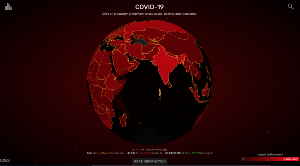
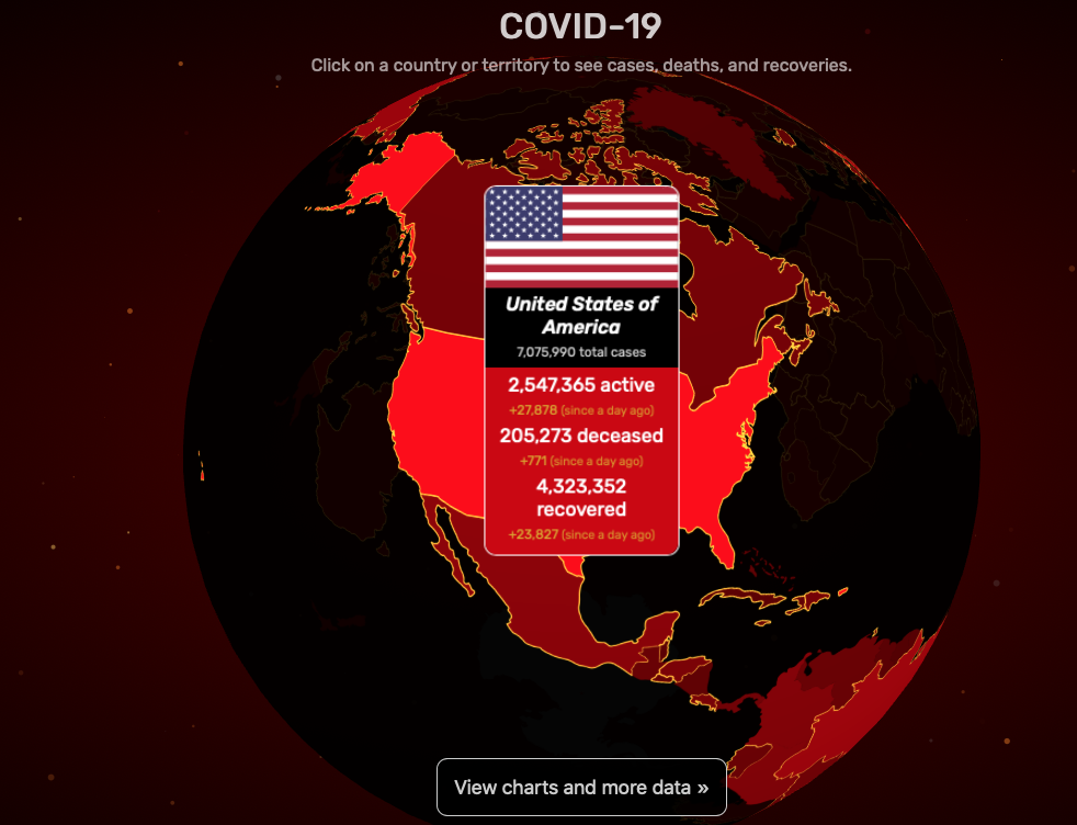
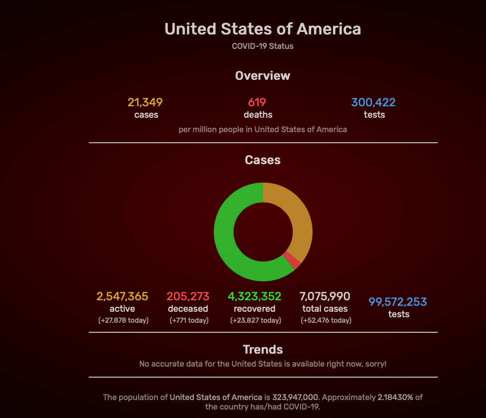
Once you click on a point on the map, it displays raw numbers on deaths, active cases, and recovered patients. Another click allows you to see more detailed information like the number of cases, deaths, and tests per million people in the United States (or country/territory of your choosing). Lastly, the line graph displays the trends in the number of cases each month. While exploring, I was reminded of The Shape of History site and Elizabeth Palmer’s quote, “By emphasizing interaction, she places the source of knowledge in the interplay between viewer, text, and image.” Interacting with the globe, actually rotating it around and around, allowed me to have control over not just the information I wanted to see, but also how much of it I was willing to investigate. While zooming in and out of the globe and the various hues of red, I also thought about Bruno Latour’s definition of visualization, ” Whole’ is now nothing more than a provisional visualization which can be modified and reversed at will, by moving back to the individual components, and then looking for yet other tools to regroup the same elements into alternative assemblages,” (Lev Manovich, “What Is Visualization?“). The globe presented in this infoviz already looks like a great puzzle. Thus, essentially, the authors/designers of this visualization could add another aspect to this project that allows the users to rearrange/ reassemble the pieces (countries/territories) depending on the density of Covid-19 cases.
While covidvisualizer showcases complex information into small digestible bites in a colorful and interactive way, it fails to provide local details about the situation. I saw the information on a global scale, now I wanted to see what was happening locally and how is that information displayed.
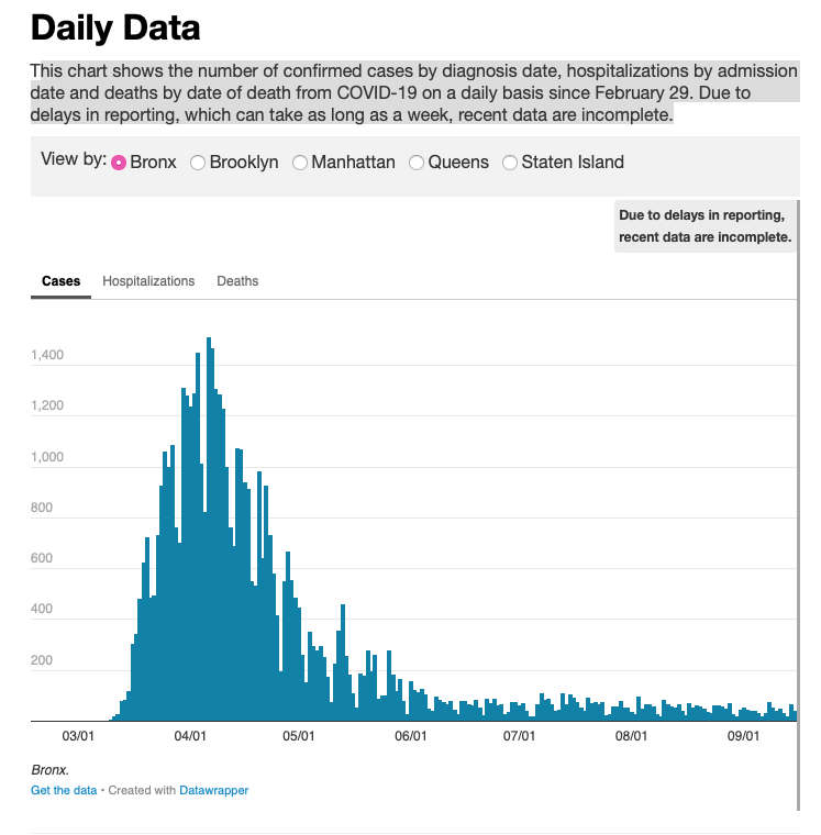
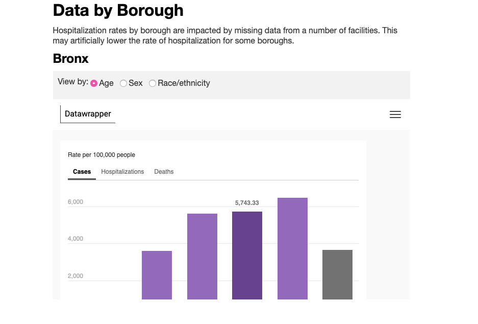
While exploring the NYC1 site, which features city news, I came across simple yet powerful graphs that showcase the virus’s activity near me. The site showcases various graphs with purple and light green pastel colors. It divides the data by borough and further categorizes it by general cases, hospitalizations, sex, gender, and age. What’s interesting about this simple display is that at first glance, the information doesn’t seem detailed, but with a click of the mouse, you can zoom into the graphic and explore more detailed data like cases per day. The site reads, “This chart shows the number of confirmed cases by diagnosis date, hospitalizations by admission date and deaths by date of death from COVID-19 daily since February 29. Due to delays in reporting, which can take as long as a week, recent data are incomplete” it’s powered by Datawrapper. It displays this message when clicked: We have updated our Privacy Policy to reflect the new EU regulations. Please give it a read(it is written with the goal of clarity) and click here to accept it.
Though not always the case, I can see how, as Lev Manovich puts it, “A different way to express this is to say that information design works with information, while information visualization works with data.” The shire number of information collected for a site like Covidvisualizer can be visually convoluted and hard to read in a simple line or bar graph. Therefore, it makes sense to have this data, these numbers, explored in a much more convenient and accessible way. Specifics are not needed here since we are looking at an overview of the world and the virus’s activity. When looking at local information and data, the user’s interest informs the graph and visualization. Therefore, working with smaller numerical values, the data displayed on NYC1 has space and formation. It needs to display overviews and more specific categorized information such as COVID-19 cases by age in Bronx, NY.
While exploring both sites, I’m also noticing the effect the colors, word density, and site navigation have on the actual visualization and graphics. Having black and red hues sets a different narrative tone and mood than pastel colors, for example.
Take a look at Covidvisualizer, what do you think?

This entry is licensed under a Creative Commons Attribution-NonCommercial-NoDerivatives 4.0 International license.
Hi Maggi … Thank you very much for finding and reporting on the Covidvisualizer site. It was not one that I had seen before. I agree that their use of color was extremely effective. Going back to our earlier readings about the power of maps, also interesting that the map opens with a view of the US. Does it do that because the U.S. has the highest rate of infection? A quick review of the site did not yeild that information to me.
I am a big NY1’s consumer and have also found their real-time reporting to be helpful, however, I could not find the interactive maps you described in your blog post. Would you post the link? …Thanks, Lisa
Lisa, the covidvizualier is the one with the interactive map. In the side, on the left side, there’s a list view of the countries and territories. They are listed by highest active cases. The US is indeed at the top of that list.
I agree with the notion of simplicity is sometimes better when it comes to mapping. A lot of the time when I delve into these interactive maps I spend more time trying to figure out how to navigate the site than actually retaining the information given to me. The example you have provided showing info on covid cases around the world was in my opinion a good showcase of a map that’s both interactive and informative without being overly complex.
Agreed! I was going to say what Faihaa said, but add I think the significance of the colors mentioned at the end enhances this impact by making the tool and its message intuitive on some level. Both the tools use and the message become easily accessible.
@mags31 Thanks for sharing! The Covidvisualizer does indeed provide a planetary world view successfully. However, after reading Drucker’s Humanities Approaches to Graphical Display, I’m wondering if there could be an alternate view, one that expresses more of the emotional landscape of the situation – a subjective, interpretive display of information rather than one that is observer-independent. The altered chart of Dr. Snow’s cholera chart that Drucker shows at the end of her article is powerful because it shows actual people, each unique, instead of single dots to represent people.
That’s interested. Maybe adding an extra layer after clicking on a country or territory, one would have the option to zoom in and see more information on the cities most affected via another more humanistic representation/visualization similar to Ducker’s alternative chart.
Have you seen the visualization on selfiecity? Maybe combining the two visualizations? A little data with a human touch like actual selfies?