
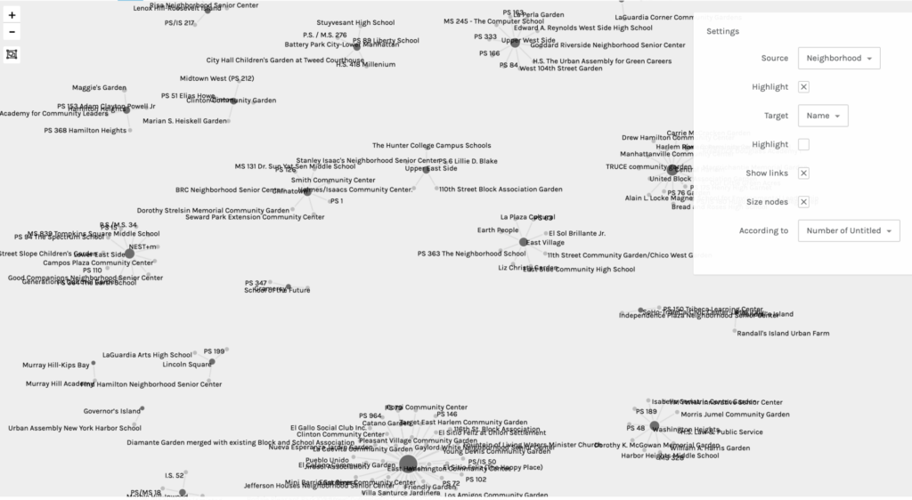
For my second praxis assignment, I chose to use the Palladio software tool to visualize community gardens in Manhattan. I obtained this data set from the NYC OpenData website. There are 21 Manhattan neighborhoods listed and each garden within the locale is provided.
Before engaging with the software, I had to “clean” my dataset. There were about 6 gardens that were missing information. Some were easy enough to track down, such as the zip code and coordinates (which was not really necessary for this project), but I struggled with choosing particular neighborhoods for the forgotten gardens. The parameters of certain areas tend to be vague and bleed into adjacent neighborhoods, so I was forced to make educated guesses based on other addresses and my own knowledge of the city. As I mentioned in my first praxis assignment, not only is the pressure to make the correct decision quite dreadful, but it is also terrifying to know that others have this level of authority over our shared knowledge. The next process of “cleaning” required me to decide what information to include and exclude. I chose to mainly focus on the neighborhood, type, post code, and name of each garden. Other data included the exact addresses, community boards, district numbers, and coordinates, but I excluded this information because they seemed more appropriate for a mapping project. Though, I am sure, there is always a way to graph this for other desired outcomes.
Palladio is pretty straightforward and beginner friendly, but I still had to do some trouble-shooting to get my dataset to load. I tried to export my data into a CSV file from my iMac’s Numbers software, but it did not work when I dragged the file to be uploaded into Palladio. When that did not work, I transferred the data onto a Google Sheets document and that export was successful. Once the information was loaded, I was asked to verify a few symbols before I started graphing. Below you will find five examples of my graphs when I experimented with different sources and targets:

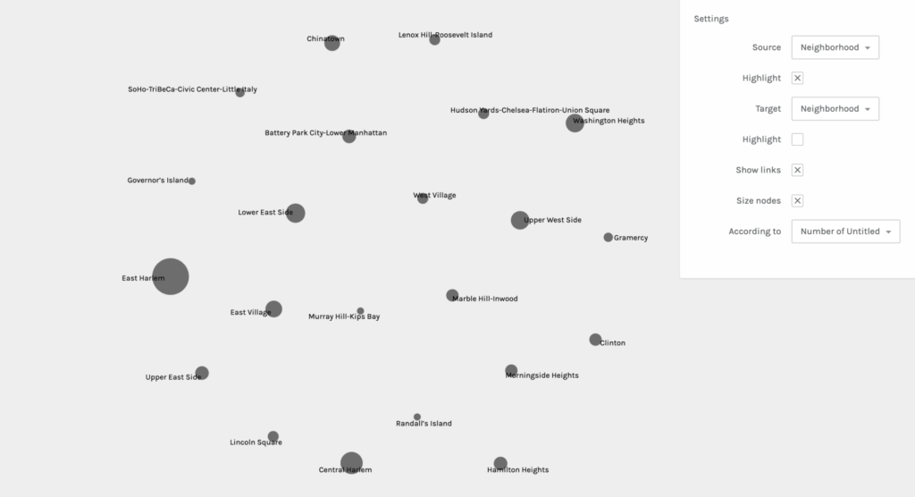
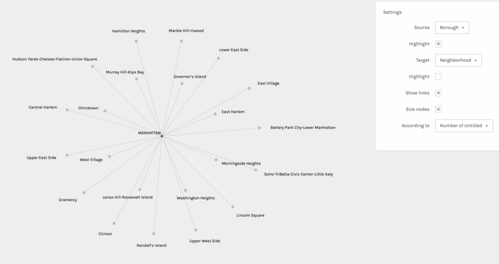
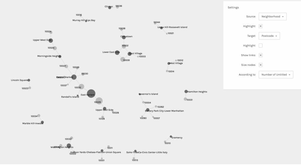
It was really interesting to experience the shifts of focus and interpretation in each graph when sources and targets were changed. It also helped me to consider different and new possibilities. This practice allowed me to learn first hand the ways in which you can obtain other valuable information from the same data set regardless of what you intended for the outcome(s). It also affirmed the notion that all information and data are valuable.
After being somewhat disappointed by the lack of color (though you can choose to highlight either the target or source) and the limited shapes and structural possibilities, I was reminded of Lev Manovich’s two key principles: reduction and space. He mentions the use of points, lines, curves, simple geometric shapes, and size and I remembered a small and personal data visualization project I was once introduced to: Dear Data. This project really opened my eyes to the possibilities of data vis. beyond simple graphs and tables. Any shape, color, and size can be creatively coded to convey meaning and information. I look forward to more experimentation and learning about data vis. in particular.

This entry is licensed under a Creative Commons Attribution-NonCommercial-NoDerivatives 4.0 International license.
Nice project! I like the fact that you provided screenshots of various versions of your visualization, to give an idea of what your process looked like. Just a question (maybe it’s just that I can’t read the labels very well): why are some of the dots connected to others?