Engaging with the PR Syllabus site made me quite emotional, a reaction I didn’t expect. As a young adult, nothing remotely similar existed. I spent hours upon hours digging through search engines, Wikipedia pages, and deciphering the credibility of suspicious sites and articles, in order to slowly and arduously piece together a lineage and history that was slowly forgotten and intentionally erased (via colonization and forced migration). But even after all of those years of self-study, my understanding of Puerto Rican history was still flawed and inconsistent. The one Puerto Rican Studies class I took as an undergraduate was wildly disappointing. Even then, knowing as little as I did, I knew this class lacked historical context and nuance, and lazily reinforced cultural stereotypes. But I didn’t have the language to express these concerns, nor did I know how to advocate for a syllabus created with intention and care.
Marta Effinger-Crichlow’s notion of home resonated deeply here. My need to excavate this history essentially stemmed from a desire to “encounter belonging and care”—a desire to remember and in turn “remain rooted in the diaspora”. When I felt ready, I found myself teaching back this history to my mother, grandmother, aunts, and uncles—all island born Puerto Ricans. I was deeply invested in our collective “knowing”. But Crichlow prompted me think about how much easier and quite beautiful it could have been to find home in a digital space like the PR Syllabus. How might this have enriched or shifted the trajectory of my family’s lives? How much more involved, actionable, and collaborative could I have been if I had access to something as simple as the PR Syllabus’ list of activist organizations and citizen initiatives?
I am so grateful for the folks who have co-created this immense, but necessary living project. It is definitely creates opportunities for both physical and digital manifestations of home.
ITP at New York University hosted a workshop called “Dismantle/Repurpose”. We were asked to bring old objects to be dismantled: out of date electronics, unworn sweaters, found furniture, etc… While we were using tools to physically deconstruct our objects, each speaker facilitated a discussion regarding the notion of “dismantling as a political/social/meditative act to create connections between the ideas presented and (un)making”.
The workshop began with the implementation of basic safety rules and procedures:
Make sure your electronics are not plugged into and outlet or any source of electricity (battery pack). Use a rubber or non-metal base to work on.
Be aware of static electricity. You can ground yourself with s small piece of metal (a penny or any other coin). Hold for 10-30 seconds.
Be mindful of sharp objects, tools, or breakage when dismantling your objects.
Pull long hair away from face and secure.
Work in a well-lit space.
Make sure you are not under the influence of any substances that can impair judgment, attention, coordination, and motor skills.
If you have any issues with or questions about your object, ask to be placed in a break-out room with a specialist who can support you.
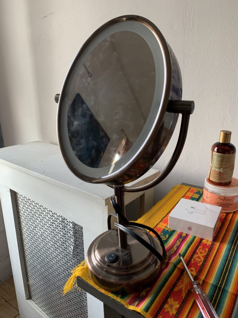
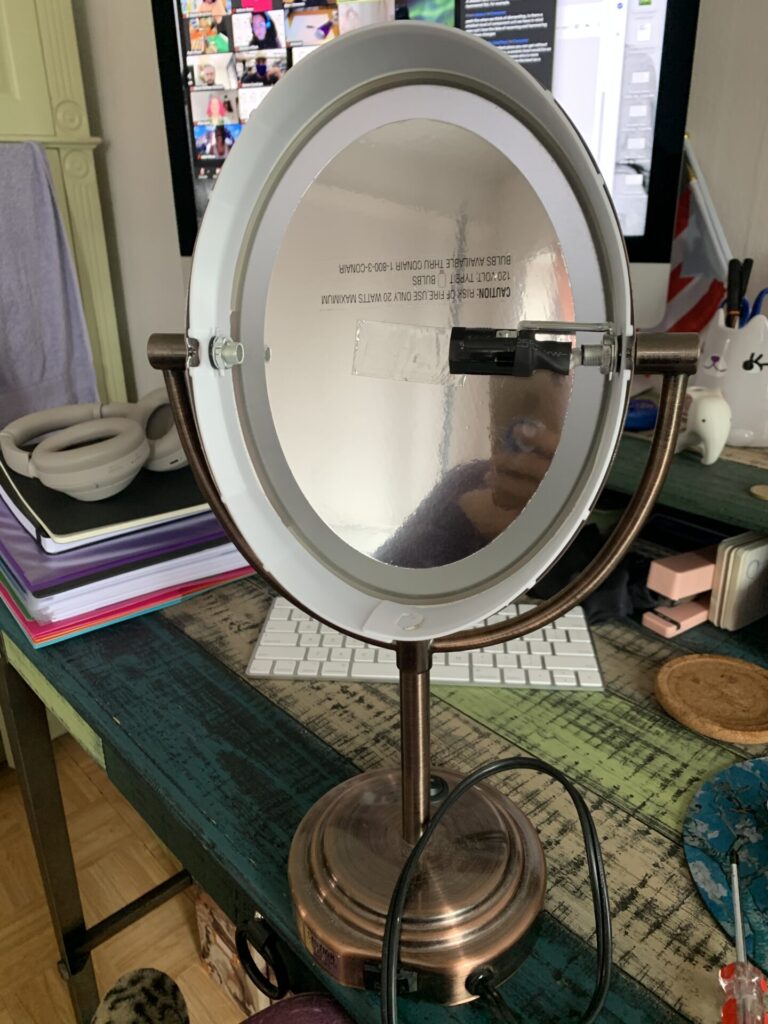
I chose to dismantle an old, two-sided magnification mirror that used to light up. See pictures below (before & after partially dismantling):
As we began to deconstruct our objects, Dr. Cyd Cipolla, a professor of Feminist Technologies, spoke to us about the relationship between humans and non-human machines. Below are some points I was able to jot down in between dismantling:
There is a contested boundary between the concrete and ephemeral/discursive and material. Human-made things are socio-material objects. This means that objects are situated and changed based on social setting and social movement.
One problem with machines is that they guide and through your interactions with it. For example, a copy machine will provide you with instructions on how to use it, what to press if you what a certain number of copies, or what to choose if you what it to be printed in black/white or color. It isn’t until the machine stops working how it is intended, that we are able to engage with it differently.
The exercise of dismantling an old object of our choosing allowed us to deconstruct the idea of an object along side the material itself. It provided us with an opportunity to dismantle our own internal bias. Ask what could be done differently? What can be changed? What are the possibilities?
Cipolla then provided us with a “Manifesto for Dismantling”:
Go Slow
(Dis)connect
Respect the work
Always ask questions
The next speaker was Ashley Jane Lewis, an interactive artist/maker and student at NYU’s ITP. She focused on the need to first acknowledge that tech labs and maker spaces are mostly developed, occupied, led by white men. She explained that this creates a web of obstacles for BIPOC folks to have to navigate in spaces that were not created with them in mind. She offered that one way to begin tackling this issue is by dismantling and reconstructing spaces through the use of Codes of Conduct. This would begin to detangle the web and create points of access for BIPOC and differently-abled folks. Lewis also explained that should be a living document and as you make changes and adjustments to it, must keep in mind who you are dismantling for. Think about where you ask questions and make assumptions. Here is the link to the Code of Conduct she co-created at ITP:
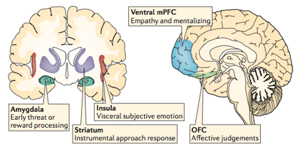
Lena Warnke, a cognitive scientist and PhD candidate at Tufts University, discussed neural connections to bias in the brain. She explained that the neural processes of stereotypes and prejudices are different, therefore required different approaches. The first image where the amygdala, insula, and striatum are highlighted are the effects of prejudice and the other is stereotyping:
Warnke makes it clear that there should be more work done to link neuro and social sciences. But she also explains that neuroscience research is still in its infancy and therefore these connections haven’t been fully explored yet.
Francisco Navas, Digital Producer and Journalist for The Guardian, broke down so much of what we have learned this semester regarding the myth of objectivity. He explained that his Journalism studies required a promise to seek out the “truth”, provide a broad scope to his readers, and to be “unbiased”. But he quickly learned about “objectivity” is that it is white and male. He then used an onion as a metaphor to peel away the layers of this lens and to dismantle objectivity.
Rashida Kamal is a recent graduate of ITP at NYU. She is a researcher, programmer, and designer. She is also a founding member of the Trash Club, a community platform for investigating waste and waste infrastructures through scholarship, community-driven action, and art. Kamal discussed dismantling e-waste. She explained that we received e-waste after it has been through all of its processes: excavated natural resources, production, distribution, usage, and then waste. She is invested in dismantling and recreating new waste systems that are currently insufficient. Kamal made me think about and question our role as digital humanists in this endeavor. We are very focused on access and creating new avenues to information and technology, but as humanists, shouldn’t e-waste and its environmental impacts be heavily considered in our work? Perhaps an eco-critical approach could reinforce this?
I really loved the way this workshop used the physical practice of dismantling as an opportunity for us to think critically and deeply about the theoretical and methodological elements of this work. During this holistic practice and experience of dismantling, I was able to make many connections, but I was also confronted by many questions and limiting thoughts and feelings around my relationship with technology:
I was hesitant and resistant to dismantling the mirror because I was afraid of doing it wrong. I was afraid of the lack of instruction and structure. I had the freedom to engage with this object in whichever way I wanted, but because I have only interacted with this piece of technology in the way that is intended, I was more hesitant than I anticipated.
I was anxious about not being able to put the object back together. Not because I was attached to it or because I wouldn’t be able to utilize it again (it was already broken), but because I was fixated on the original intention of its use and therefore its “correct” structure. This and my previous point, brought Cyd Cipolla’s mention of the socio-materiality of objects to life for me.
Tools were a huge factor in the ways I could(n’t) dismantle/reconstruct my object. This brought up a few things and reminded me of some of our class discussions: Which tools (technologies) are best for this project? Do I have access to these tools? If I don’t, how can I hack (or repurpose) the tools that I do have in order to get as close as possible to my desired outcome? What are the limits of these tools and how can I make them better?
Again, this was a wonderful workshop and great learning experience. I encourage everyone to attempt this practice and take note of your process!
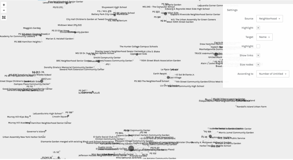
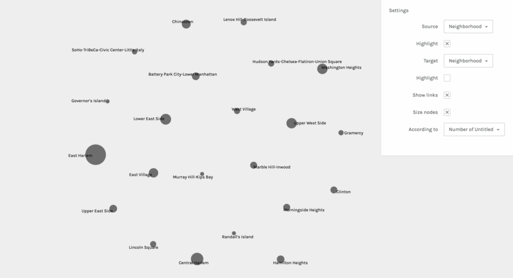
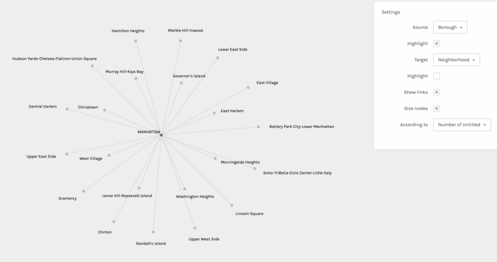
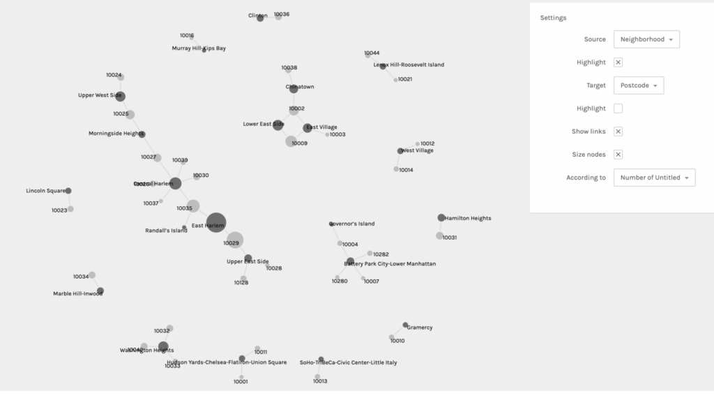
For my second praxis assignment, I chose to use the Palladio software tool to visualize community gardens in Manhattan. I obtained this data set from the NYC OpenData website. There are 21 Manhattan neighborhoods listed and each garden within the locale is provided.
Before engaging with the software, I had to “clean” my dataset. There were about 6 gardens that were missing information. Some were easy enough to track down, such as the zip code and coordinates (which was not really necessary for this project), but I struggled with choosing particular neighborhoods for the forgotten gardens. The parameters of certain areas tend to be vague and bleed into adjacent neighborhoods, so I was forced to make educated guesses based on other addresses and my own knowledge of the city. As I mentioned in my first praxis assignment, not only is the pressure to make the correct decision quite dreadful, but it is also terrifying to know that others have this level of authority over our shared knowledge. The next process of “cleaning” required me to decide what information to include and exclude. I chose to mainly focus on the neighborhood, type, post code, and name of each garden. Other data included the exact addresses, community boards, district numbers, and coordinates, but I excluded this information because they seemed more appropriate for a mapping project. Though, I am sure, there is always a way to graph this for other desired outcomes.
Palladio is pretty straightforward and beginner friendly, but I still had to do some trouble-shooting to get my dataset to load. I tried to export my data into a CSV file from my iMac’s Numbers software, but it did not work when I dragged the file to be uploaded into Palladio. When that did not work, I transferred the data onto a Google Sheets document and that export was successful. Once the information was loaded, I was asked to verify a few symbols before I started graphing. Below you will find five examples of my graphs when I experimented with different sources and targets:
It was really interesting to experience the shifts of focus and interpretation in each graph when sources and targets were changed. It also helped me to consider different and new possibilities. This practice allowed me to learn first hand the ways in which you can obtain other valuable information from the same data set regardless of what you intended for the outcome(s). It also affirmed the notion that all information and data are valuable.
After being somewhat disappointed by the lack of color (though you can choose to highlight either the target or source) and the limited shapes and structural possibilities, I was reminded of Lev Manovich’s two key principles: reduction and space. He mentions the use of points, lines, curves, simple geometric shapes, and size and I remembered a small and personal data visualization project I was once introduced to: Dear Data. This project really opened my eyes to the possibilities of data vis. beyond simple graphs and tables. Any shape, color, and size can be creatively coded to convey meaning and information. I look forward to more experimentation and learning about data vis. in particular.
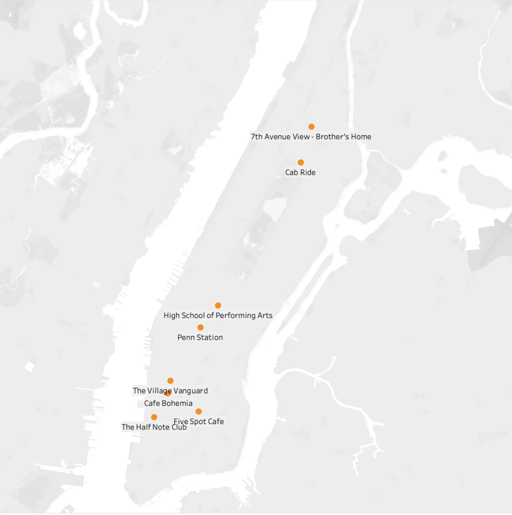
For my praxis assignment, I attempted to create a map of James Baldwin’s short story, Sonny’s Blues. I reread the short story in search of particular locations or any evidence of areas Sonny and his brother could have occupied or visited in Manhattan. Because Baldwin was only fully descriptive about one location, I was forced to do some digging into the histories of Harlem, Greenwich Village, and midtown in the 1950s. After many rabbit holes and Internet dives later, I thought, maybe this could be an opportunity for me to use my creative license, basic knowledge of the city I grew up in, educated guesses, and some internet searches to fill the gaps? Perhaps provide an “extended version” of Sonny’s Blues? Though I was excited about this potential, I immediately grew terrified by the notion that this kind of power lies in the hands of actual cartographers and others responsible for shaping geographies of anything/any place. I was also overcome by guilt, which echoed my discrepancies with Roland Barthes’, The Death of the Author. How dare I mess with such important, masterful work? But, I decided to move forward with the intention of interacting and engaging playfully with a piece of text that I love and respect immensely.
Creating Locations:
In much of the scholarship I have read about Sonny’s Blues, the consensus seems to be that this story is not really about Sonny. But that it is, in fact, about the narrator of this piece—Sonny’s nameless, older brother. I found this to be true when attempting to pinpoint locations within this narrative. Of the handful of spaces I was able to pick out of the story, Sonny and his brother either occupied them together, and on one occasion Sonny was not present at all.
At the beginning of the narrative, after a train ride, we are introduced to our first location, the High School that Sonny’s brother taught in. Baldwin did not name this school or provide a location, but this is one of the places where I decided to do some educated guessing. In an interaction with one of Sonny’s friends outside of the High School, Sonny’s brother asks, “Did you come all the way down here to speak to me?” Clearly, this High School had to be somewhere below Harlem and far enough downtown to merit his confusion. This school should also exist within the decade this piece was written in. After doing a bit of research, the High School of Performing Arts on 120 W 46th Street popped up. The location of this school also fits the description of the surrounding area described in this scene.
My next location assumption came from the scene where the brother meets Sonny and picks him up from a location downtown. Sonny had been out of state in a rehab facility. Penn Station became my guess for this location since it is one of the only places that is a central location for bus or train rides in and out of the city. Once the brothers were in a cab heading uptown to Harlem, Sonny asks for the driver to take the Westside of Central Park for a more scenic route. Baldwin then pin-points their turn on 110th and Lenox Avenue. Sonny then says, “We are almost there”, which leads me to believe that that their end location is at the heart of Harlem on 125th Street. In a following scene Sonny’s brother mentions looking out onto 7th Avenue from outside of his window. Because of this, I chose to locate the brother’s home on 125th street and 7th Ave.
Lastly, in the final scene if this narrative, Sonny’s brother is watching him play in a Jazz joint somewhere in the village. This could have been any tiny nightclub location, but I wanted to map some possible Jazz clubs that existed in the village during that decade. I found a map online and narrowed it down to four possibilities: Half Note Club on 289Hudson Street (1957-1972), Five Spot Café on 5 Cooper Square (1956-1962), Village Vanguard on 7th Ave. South (1935-present), and Café Bohemia on 15 Barrow Street (1955-1960).
Again, this was mostly a guessing game, but I tried my best to use as much evidence within the piece as possible.
Mapping Software:
I am completely new to mapping or coding software, so I was immediately drawn to Tableau because of its beginner level accessibility. After downloading the software, I was still unsure of how to move forward, so I found a Tableau mapping tutorial on YouTube. As suggested, I created an Excel sheet for the names, addresses, and coordinates for each location. I then downloaded the excel information into the software. But after dragging the longitudes and latitudes into the row and column sections, the software kept placing a single coordinate in Antarctica (a long way from Harlem). After about 45 minutes of trying to problem solve, I realized I had mistakenly flipped the coordinates on the excel sheet, longitudes were under the latitude column and vise versa. After making this correction, the coordinates moved into Manhattan. I was relieved when I was able to successfully map these points, but I quickly realized that perhaps this is not the best mapping software for this kind of project. I would like to have been able to obtain a more detailed map of New York City and Manhattan in particular.
Conclusion:
The assignment made it even more obvious to me that our methodologies for collecting and disseminating data need to be set through humanistic and collaborative lenses. Also, though I am still uncomfortable with the software, it was nice to push through my fear and ground this practice in a text that it meaningful and important to me. I am not sure I’d be able to do it any other way.
Before this week, most of what I had come across regarding mapping had primarily focused on cartography in relation to global geography, landscapes, and even soundscapes. Never on the forefront were considerations around the ontological implications—whose bodies are allowed to move freely across these maps, whose bodies are allowed to be human in relation to the space(s) they occupy. But one thing that is always certain is that the limitations and intentional erasures produced by colonial mapping will always beget counter-maps.
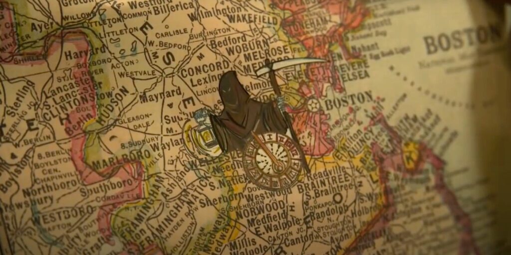
If you haven’t already, please do yourselves a favor and check out the powerful sci-fi series, Lovecraft Country on HBO. It’s f*cking bananas on so many levels! Anyway, in the first episode, we are introduced to George Freeman. This character is loosely based on Victor Hugo Green, the man who wrote and assembled, The Negro Travelers’ Green Book (we’ll pretend that problematic movie doesn’t exist for 5 minutes, k?). Green went on cross-country trips in order to create a catalog for Back travelers where he, “listed hotels, restaurants, beauty salons, nightclubs, bars, gas stations, etc…” (nypl.org). While Green’s journeys are not the focus of this series, the catalog becomes the navigational tool used to counter-map America’s very segregated and violent landscape. I am unsure if Green’s book was a collaboration, but in this episode, George Freeman’s daughter, Diana, illustrates map symbols onto her father’s traditional map based on his catalog and her own artistic and prophetic intuition. This made me think about Yarimar Bonilla’s notion of “prophetic cartographies”. Though Bonilla’s concept is much more complex, Diana focuses on the silences of the map in order to indicate where her father’s body would be vulnerable or free:
While delving further into Victor Hugo Green’s work, I found a digital archive of his text on the Schomburg’s website. To my surprise, they have also extracted the data from his book and created an interactive digital map! They even provided a tool where you can map a trip for either the year 1947 or 1956. The differences are interesting and provide a wealth of information.
Yarimar Bonilla references the idea that “the map is a technology of possession” and it becomes more evident that it is not only the possession of land, but of all things inherent to one’s humanity. Victor Hugo Green used his body as a barometer for the racial climate in each town and state he courageously visited in search of safe-havens for Black folks to just live, just be. This reminded me Asma’s comment last week about how technological tools can be used for community care. How do folks hold one another when the word diaspora opens a door to everywhere and nowhere simultaneously? Victor Hugo Green’s, The Negro Travelers’ Green Book, was a counter-map, a shield, and reclamation of time and space for his people.
Need help with the Commons?
Email us at [email protected] so we can respond to your questions and requests. Please email from your CUNY email address if possible. Or visit our help site for more information: