I really didn’t know what to expect when I joined our first Zoom class in August—a mere 4 months ago in calendar time and closer to 40 years ago in experienced time. How would I adjust to being in school after being so long away from it; how would grad school be different from college; how would remote learning even work? I was stumbling every time I even tried to describe what Digital Humanities (DH) was when people asked me what I was studying. “You know, like humanities, but digital.” Little did I know…
The vast scope of our readings, our care-full and engaging conversations, the most amazing and thoughtful and socially justice–minded project presentations everyone gave—I’m in awe of all of us and what we accomplished together. Thank you doesn’t fully cover it, but THANK YOU so much for everything. I can’t imagine a better introduction to the program, and I am beyond excited to start building our projects together next semester.
As others have mentioned, this final project felt very daunting. What do I know? I’m a little into the macabre, and I just wanted to map a few cemeteries, and I don’t even know that much about mapping. Am I really adding to the field at large? So I admit I called on my old friend procrastination, and I procrastinated. And then procrastinated a little more, for good measure. But even as I was putting off actually writing, ideas were stewing in my head.
And I’m so grateful to Prof. Gold for introducing me to a student further along in the program who is also interested in cemetery studies. She was so supportive and encouraging in our conversation, and she helped me realize there is indeed a place for my mapping idea in DH. And she led me to a recent anthropology dissertation from a Graduate Center alum about the historical deathscape of New York City from the colonial period onward. And that got me thinking, maybe it’s not too late, there really are a wealth of resources available within the GC. The mapping part of my mapping project was throwing me for a loop, and I remembered that Olivia Ildefonso led an intro to ArcGIS workshop, and as a digital fellow she offers consultations. And I’m so grateful to her for fitting me in last-minute at the end of the semester. She really helped me think about what my data set could look like and helped me reign in my scope creep. (At least I think she did; Matt, if scope creep is still an issue in my final proposal, just know that it was WAY worse in earlier drafts.)
So my final proposal is about creating an ArcGIS StoryMap of the cemeteries in Manhattan in 1820 compared with 2020. I’m most interested in capturing the obliterated cemeteries—which are in all five boroughs, but the most documented ones are in Manhattan—as I find it very exciting to be mapping things that don’t quite exist anymore. In addition to providing great numerical symmetry, I think these years are also significant within the scope of my project. New York City was the largest city in the country by 1800 (then just Manhattan), and the population more than doubled between the 1800 and 1820 Census. And the most significant legislature on burial bans in Manhattan wasn’t passed until 1823 and after, so I think 1820 captures a time of great growth (and death), and it predates laws that greatly altered the deathscape. Many of these laws were passed in direct response to outbreaks (namely of cholera and yellow fever), and I think it will be very interesting to visualize how they affected the landscape of the city at a time when we’re still understanding how the COVID-19 pandemic is affecting us in the present (or very recent past, as the case will be next semester).
As I was working, I was so entrenched in reading about cemeteries and finding out how my project would relate to/expand on other work in this area that I almost completely forgot about our course readings. Matt’s sage advice on rereading the proposal prompt saved the day, and I had a mini breakthrough once I started thinking about the landscape of New York in relation to our readings on infrastructure. I knew that it bothered me that there has been so much cemetery obliteration—even as part of my brain thinks that it’s not an environmentally sustainable practice and I have many complicated and contradictory questions about it being the “best” use of space—and I knew that at least some of the obliteration was purposeful, and not just because of financial interests. There are power structures that made these choices, who have built up and altered the way we live in and experience this city. And this infrastructure necessarily limits those experiences as much as it may enable them. So in mapping what has been removed, I dare to hope that my project is both an act of care and of disobedience.
Again, thank you all. It has been an utmost privilege to be in this class with you and share this experience. See you next semester!
From the moment the text analysis assignment was mentioned, I knew I wanted to do something with transcripts from the TV series Buffy the Vampire Slayer (seven seasons airing from March 10, 1997, to May 20, 2003). I had no idea what I wanted to examine or any question I might want to answer, but it’s a show I love and have seen many times, and I figured it would just be fun.
Text Gathering
I decided to do a “bag of words” comparison in Voyant using the Cirrus word cloud tool, and I originally expected to use each of the seven season finale episodes as my texts, assuming that a season finale encapsulates the overall themes from the entire season and I might be able to identify some kind of series-wide arch. But some finales were two-parters, so the amount of text being compared across seasons wouldn’t be the same, which I thought could be a problem. Inspired by our class conversation last week as we tried to answer the question “What is text?,” I realized there are several episodes of BTVS that play with some of the concepts we were discussing. So I decided to play around with the transcripts from select episodes instead to see what I might learn. I had wanted to take all of my transcripts from the same source, but this proved problematic as not every archive had complete transcripts for every episode. For the first two episodes I chose, I got the transcribed text from angelfire.com. For the latter two episodes I chose, I got the transcribed text from transcripts.foreverdreaming.org. None of these are official transcripts.
I initially copied the text for each episode into a word document, as I wanted to make sure there wasn’t any hidden metadata creeping into the text that might distort my visualizations/analyses. Some of the transcripts including stuff like “ACT I” or “Commercial Break,” both of which I removed. I was initially worried about the scene/stage directions being highly subjective as they were written by different fans (and not from the original scripts used in production) and also about the “Name: dialogue” format for the lines. But I figured most of this type of text also exists in other narratives like books when the author is setting scenes and defining who is speaking. However, when I put in the text for each episode, all of my word clouds were primarily just the names of the main characters and the most prominent secondary characters in each episode, which didn’t really seem very interesting in terms of analysis potential. So I then went back into each of the transcripts and removed the names of the four main characters (Buff, Willow, Xander, and Giles) as well as any of the other characters who are prominent in the series or were just prominent in that episode (e.g., Ms. Calendar, Angel, Spike, Anya, Oz, Tara, Dawn, Riley, Wesley, Jonathan, etc.). I also expanded the word clouds to include the top 155 words from each episode.
I Robot, You Jane
The first episode I chose is “I Robot, You Jane” (season 1, episode 8) in which a demon, Moloch the Corrupter, that had been imprisoned inside a book is released into the internet when the book is scanned as part of a digital archiving initiative at the school. Rupert Giles, the school librarian, gets into an argument with the computer science teacher Ms. Calendar, who is leading the initiative, at the beginning of the project:
Ms. Calendar: Oh, I know, our ways are strange to you, but soon you will join us in the 20th century. With three whole years to spare! (grins)
Giles: (smugly) Ms. Calendar, I’m sure your computer science class is fascinating, but I happen to believe that one can survive in modern society without being a slave to the, um, idiot box.
Ms. Calendar: (annoyed) That’s TV. The idiot box is TV. This (indicates a computer) is the good box!
Giles: I still prefer a good book.
Fritz: (self-righteously) The printed page is obsolete. (stands up) Information isn’t bound up anymore. It’s an entity. The only reality is virtual. If you’re not jacked in, you’re not alive. (grabs his books and leaves)
Ms. Calendar: Thank you, Fritz, for making us all sound like crazy people. (to Giles) Fritz, Fritz comes on a little strong, but he does have a point. You know, for the last two years more e-mail was sent than regular mail.
Giles: Oh…
Ms. Calendar: More digitized information went across phone lines than conversation.
Giles: That is a fact that I regard with genuine horror.
Ms. Calendar: Oh, you are a big snob. You, you think that knowledge should be kept in these carefully guarded repositories where only a handful of white guys can get at it.
Giles: Nonsense! I simply don’t adhere to a, a knee-jerk assumption that because something is new, it’s better.
Ms. Calendar: This isn’t a fad, Rupert! We are creating a new society here.
Giles: A society in which human interaction is all but obsolete? In which people can be completely manipulated by technology, well, well… Thank you, I’ll pass.
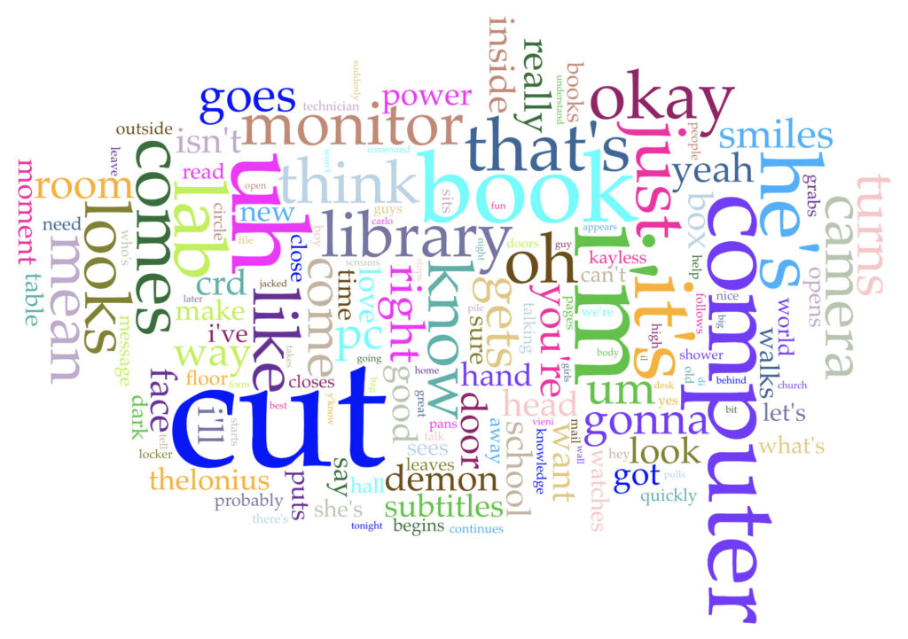
The episode aired in 1997, and Giles’s character is generally portrayed as a technophobe throughout the series. His latter argument against technological innovation as good only because of its newness and against technology being necessarily the direction of “progress” reminds me of Johanna Drucker’s “Pixel Dust: Illusions of Innovation in Scholarly Publishing.” And Ms. Calendar is clearly trying to promote technology and digital archives as means to open access and inclusion. Does any of this come through in the word cloud? I think a little bit, with computer and book coming through as two of the highest used words (at 39 and 37, respectively). Cut is the most used word at 93, but I’m fairly sure that is because of stage directions.
Voyant Cirrus word cloud for BTVS season 1, episode 8.
Earshot
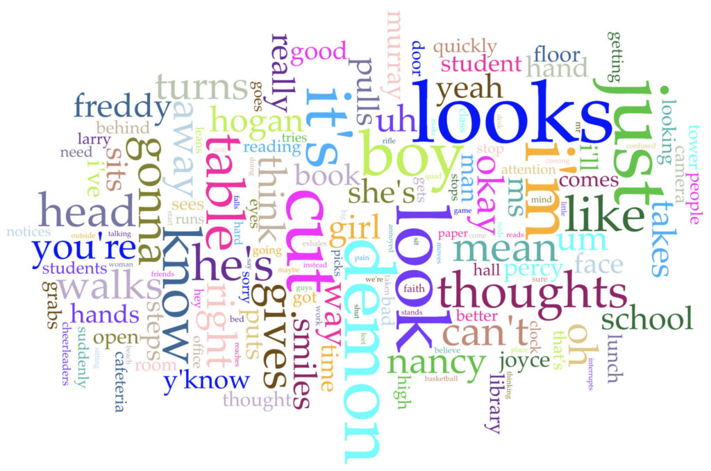
The second episode I chose is “Earshot” (season 3, episode 18). In this episode Buffy is fighting some demons, per usual, but something goes wrong when some bodily fluid from a demon is absorbed through her hand. She is infected with “an aspect of the demon,” which turns out to be an ability to hear other people’s thoughts. At first this is exciting as Buffy hears what other people are thinking of her and finds out interesting secrets people are keeping; however, the power grows and grows to the point at which it is driving her mad because she is hearing everything from everyone and cannot distinguish any of it. I thought of this episode when we were debating in class whether everything could be text and an example given was everything that people say, whether or not it is recorded or preserved. As we touched on text being understood through symbols, I thought words that we see only in our minds but do not share, either written or aloud, could also be text. This episode also felt like an apt analogy to what it might feel like for a human mind to analyze text on the same scale as a computer. What does this word cloud show? Looks, look, and looking are all very prominent, as are thoughts and demon. Cut again is very high, but this again I think is attributable to the stage directions.
Voyant Cirrus word cloud for BTVS season 3, episode 18.
Hush
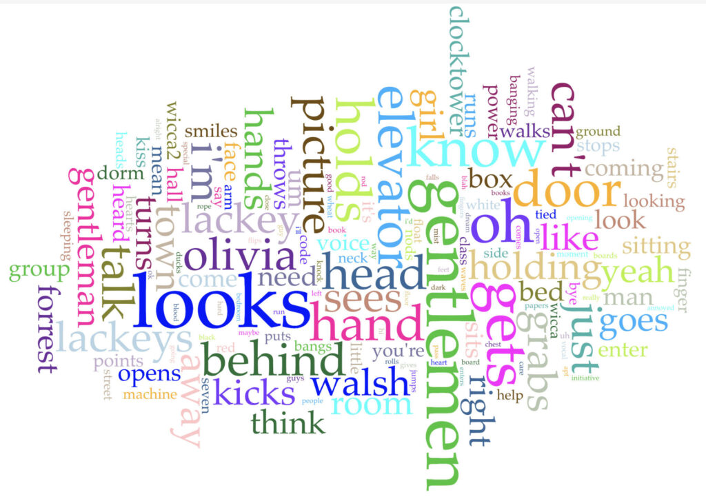
The third episode I chose is “Hush” (season 4, episode 10). In this episode, the town of Sunnydale is the setting for a gristly fairy tale, where the Gentlemen come in and silence everyone so that nobody can scream as they harvest the requisite number of hearts to terrorize humanity another day. So here we have an episode (and text) that is essentially quiet, with communication limited to succinct phrases and crude pictures easily written/drawn on portable white boards and the nonverbal—body language and pantomime. Are these forms of communication text? I’m inclined to say yes as ultimately an entire storyline is conveyed to the audience just as it is for any other episode of the show. Given that this episode has the least amount of dialogue and relies the most on stage directions, which were written by a fan and are not from the original script, I’m guessing this word cloud says more about the word preferences of the specific person who wrote this transcript more so than any of the other word clouds (though likely the original script would do the same of those writers, and now I’m wondering whether my assumption of a single author is even remotely accurate as each episode in the show and across the series would have had multiple and at times different authors). Gentlemen/Gentleman are both relatively dominant in this word cloud, as well as lackey/lackeys (who assist the Gentlemen). Looks is also high up there again, and picture and talk seem to be about the same size, though I think talk is present here because of its absence, especially as can’t is also very prominent (“Can’t even talk/can’t even cry” is part of the Gentlemen’s grim fairy tale rhyme).
Voyant Cirrus word cloud for BTVS season 4, episode 10.
Once More, with Feeling
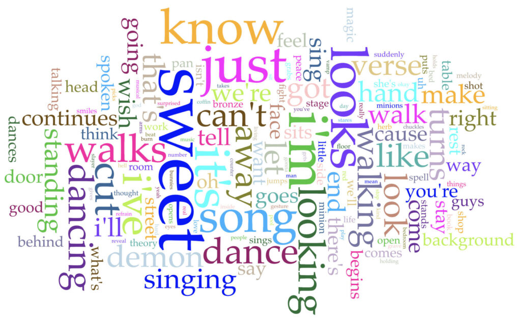
The last episode I chose is “Once More, with Feeling” (season 6, episode 7). The musical episode! This time all of Sunnydale is under the spell of a demon who forces everyone to communicate through song and dance. It’s a feast for the eyes and the ears. Someone in class had discussed sheet music as text, and certainly song lyrics are text. (Would choreography also count as text?) Going off of that, then, this episode would contain two texts (three?) actually, the music as well as the lyrics. How do these texts “speak” with and inform one another? How is the message conveyed differently? I’m not sure this word cloud can really measure that as it only represents the lyrical text and not the musical text. Sweet is by far the most used word (65); looks and looking feature prominently again (are these stage directions or spoken?). Song, singing, and dancing are also high up there, and I can see other music-related terms like musical, refrain, sing, sings, dances, music, rock. I’m happy to see that bunnies also makes the cut for this cloud (because “It must be BUNNIES!”).
Voyant Cirrus word cloud for BTVS season 6, episode 7.
Future Text Mining
What did I learn here? I’m not entirely sure. Also, I had all of my Voyant tabs open for a while, and I noticed that the layout of the word clouds kept shifting (like the stairs at Hogwarts). In checking my word cloud links, the displays have even changed from the versions I took sceenshots of (WHY?). This makes me even more confused about how Voyant determines the layout of this particular visualization tool and how useful it is to compare different words clouds against each other. Going forward I’d be curious to know how these clouds might look differently if I were working from the finalized scripts used for producing each episode. I’m also curious to dig a little deeper into the difference between stage directions and spoken dialogue. Do we need to distinguish them? It seems like they both ultimately work together to tell the story of each episode. Are there visual cues in the final episodes that are not represented in the stage directions? What does that say about translating text into images and vice versa?
As others have mentioned in class, I also generally approach the readings for the week in the order they are presented in our course schedule. And I was excited to be learning more about distance reading: how it’s not necessarily an argument against close reading, seeing similar arguments about acknowledging “data as capta” and that there’s no such thing as an objective distance reading, but there’s room for more complexity and nuance. And of course lots of mentions of Franco Moretti, who originally coined the term.
Then I get to Lauren F. Klein’s “Distance Reading after Moretti.” Moretti has been accused of sexual harassment and assault, the details of which became more broadly known during #MeToo. After briefly acknowledging this, Klein goes on to discuss the ways in which a lack of representation in the field contribute to certain distance reading practitioners reinforcing problematic power structures. Klein says, “And like literary world systems, or ‘the great unread,’ the problems associated with these concepts, like sexism or racism, are also problems of scale, but they require an increased attention to, rather than a passing over, of the subject positions that are too easily (if at times unwittingly) occluded when taking a distant view.”
And then I get to two readings, both written after the allegations, that engage with Moretti and his contributions to the field: Laura Mandell’s “Gender and Cultural Analytics: Finding or Making Stereotypes?” and Richard Jean So and Edwin Roland’s “Race and Distant Reading.” My first thoughts are, can we separate the work from the person who performed it? (I’m not sure, but I’m skeptical.) And then what is the responsibility of a scholar to be aware of such abuses of the people they reference? My first thought was perhaps (being relatively new to the field and unaware of different scholars’ relationships to each other and to the general happenings within DH), maybe they didn’t know. Or maybe this is another issue where the publication date isn’t actually representative of the chronology in which they were written. But both of these articles include Klein’s panel discussion in their works cited. Admittedly both articles are critical of Moretti, but those criticisms are separate from the sexual assault. Do they have to acknowledge this? Does not acknowledging it let Moretti retain his privileged position within the field as being someone against whom discourse on distance reading necessarily has to reference and frequently appear as a starting point from which criticism must begin? I definitely wouldn’t advocate for erasing him from the history of DH and/or distance reading, but I’m not sure just being critical of his work is enough when it’s clear the authors of the latter articles are also familiar with the rape and harassment allegations.
Is this something that only comes with more time (and even if that has been the case, is that the example we should follow)? Is there reputable discourse on the “founding fathers” of the United States that doesn’t address their owning and raping of slaves? (Now that I’ve asked this, I’m fearing the answer may indeed be “yes.”) Medicine certainly still has many skeletons in its closet to contend with, but there has been a movement to rename conditions previously named after Nazi doctors. (I’m not sure this is an example to be followed, but naming medical conditions after people is incredibly problematic and also not very helpful in understanding what a condition really is anyway, so that’s its own can of worms…)
I’m not sure exactly what repercussions Moretti has faced, though I fear little. I found this article from the Standford Politics about him and another professor.
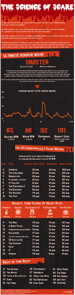
I’m guessing I’m not the only person who’s seen this research study popping up all over their social media. broadbandchoices, a broadband internet, mobile/home phone, and TV provider based in the UK, has conducted a study to determine the scariest horror movie ever made: The Science of Scare. Their team reviewed lists of best horror films from critics and on Reddit, and complied what they believe to be a list of the 50 best horror movies of all time.
Then they found 50 participants and had them all watch of the movies while wearing heart rate monitors to track heart rate spikes and compare average heart rates during the movies with their average resting rates.
The scientific rigor of this study certainly raises a lot of questions. Lists of best movies are incredibly subjective, and they do not provide the number of sources they consulted or provide the specific lists they took their movies from. How much of their final list was determined based on what was easily available to view? Also, they all seem to be predominantly English language movies (The Orphanage is the only one I’m familiar with on that list that was made in Spanish, but did they watch with subtitles or did they watch a dubbed version?). How did they settle on heart rate as the determining factor of what is scary–was it just because heart rate is relatively easy and noninvasive to measure? How did they pick the participants? What are their demographics (a Nerdist writeup says the participants were of different ages, but I’m not seeing anything about that from broadbandchoices)? What was their previous exposure to/feelings about the genre; did they have any pre-existing medical conditions that could have affected their heart rate monitoring? Under what conditions were the films screened–together, individually, at home, consecutively?
What do you all think? Is this just some harmless Halloween fun, or do “studies” like this contribute to a false narrative that data is objective?
For the record, I’ve never even heard of their top movie, and of their list of 35, I’ve seen 18. You?
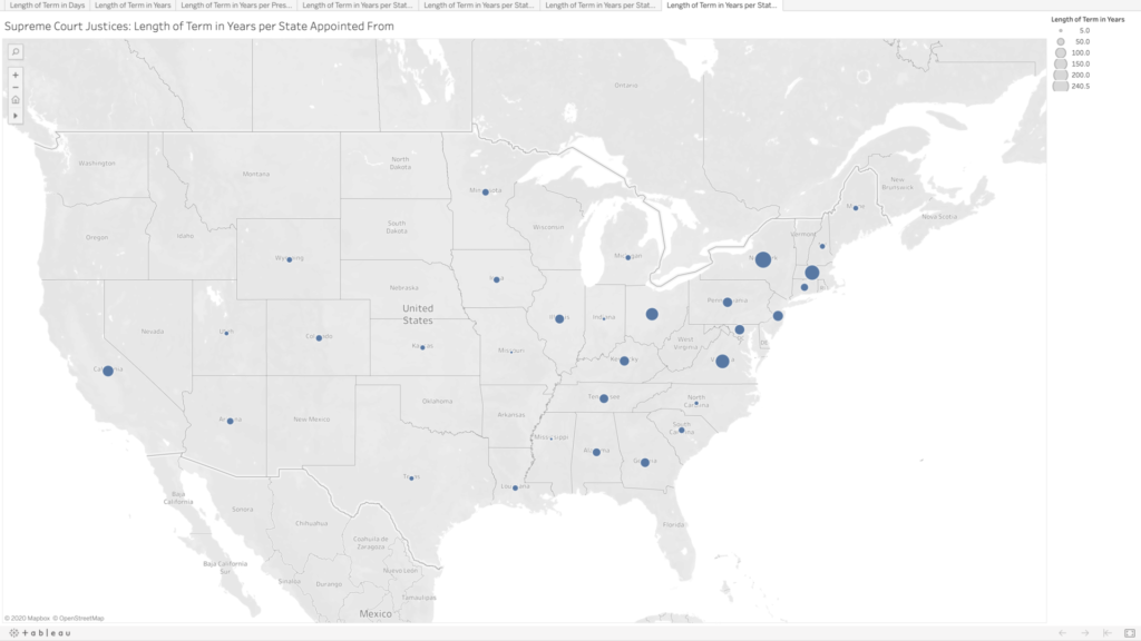
Given the recent death of Ruth Bader Ginsburg and the current Senate hearings for her nominated replacement, Amy Coney Barrett, the Supreme Court is all over the news. Supreme Court justices are not elected, and once approved by the Senate, they receive lifetime appointments. I wanted to know what those lifetime appointments translate to in actual term lengths.
Collecting and Sorting the Data
The majority of the data I wanted were conveniently available on the Supreme Court website, where they list every justice since the court began in 1789 to the present, including their title (chief justice or associate justice), the date they took their oath, and the date their service ended, as well as what state they were appointed from and which president appointed them. They list some caveats on their site regarding the dates, but for my purposes I chose to ignore them and just accept the dates given.
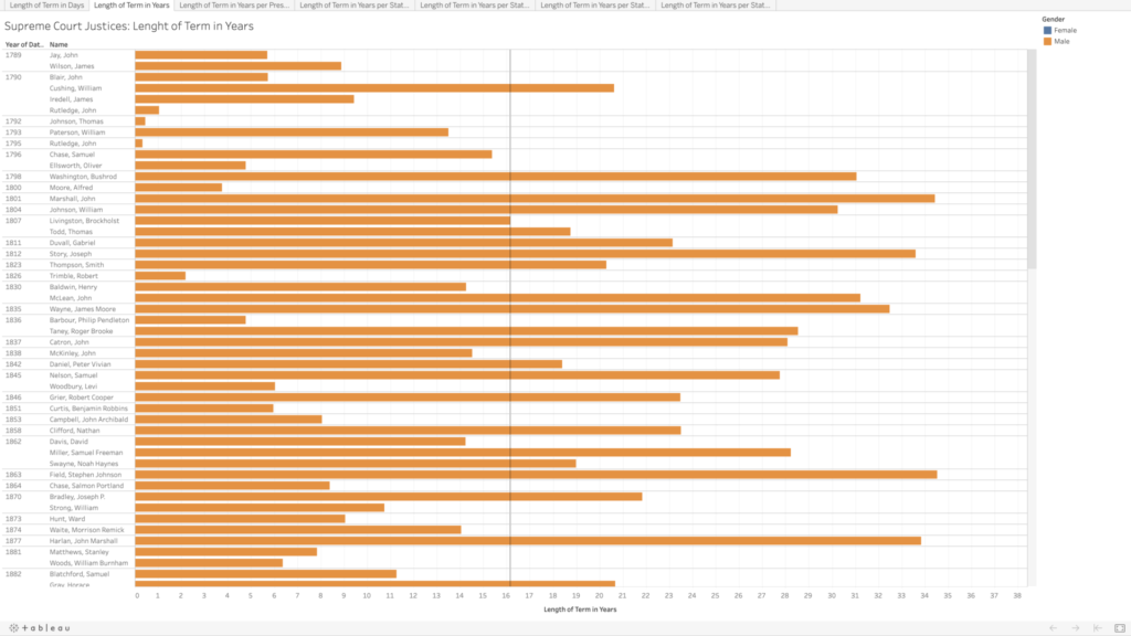
I copied their data into an Excel file, and integrated the chief and associate justices together, sorting in chronological order by oath date. In doing so, I realized there are three justices who held both titles, John Rutledge was the first, with a break in between titles (total of both terms is approximately 1.40 years). Harlan Fiske Stone and William H. Rehnquist also held both titles, being promoted from associate directly to chief justice (Stone’s total term length is 21.14 years, and Rehnquist’s is 33.66 years). In my tables, each of these three people have two listings by their names because of this, so it does slightly skew my average term length of 16.16 years (more than twice as long as the current term limits on presidents).
The Supreme Court was created in 1789, initially with one chief justice and five associate justices. It was expanded in 1869 to consist of one chief justice and eight associate justices (the number we have today). I wanted to calculate the length of each justice’s term in both days (because it would be whole numbers) and years (as these would be more recognizable and understandable), which was tricky in Excel as it does not recognize dates before January 1, 1900. For all of the justices who had both oath and termination dates after 1900, I was able to use existing formulas to calculate these values. For the dates preceding this, I copied them into a new sheet, and I added 1000 to each year to get Excel to recognize the values as dates, and then I was able to use the same formulas as before, though I had to copy the unformatted numbers into Word before pasting back into my main Excel table to make sure it kept the values rather than the formulas. For the current justices, I put in “termination” dates of today, October 13, just to get some sense of their term lengths thus far, though again I realize this is skewing my average and trends.
In addition to the term length, I also wanted to note the gender of each of the justices (which admittedly is problematic as I am assuming a gender binary and also ascribing gender to these people based on their name and pictures). Of the 119 appointed justices, only 4 have been women.
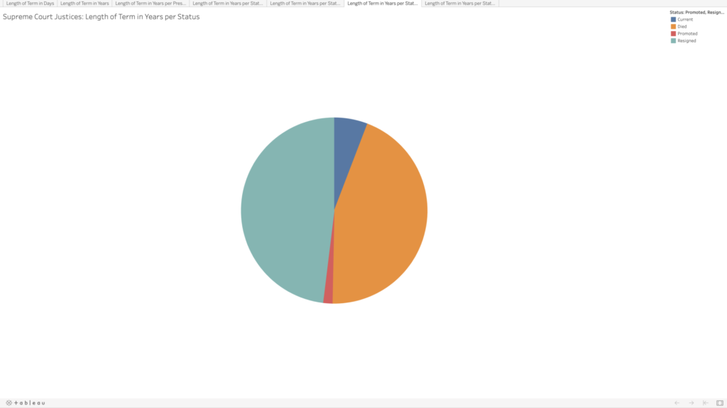
Given that justices have lifetime tenure, I also wanted to see how the terms were ending. Going into this, I had assumed that most justices’ terms ended with their deaths; however, it turns out there is a pretty even mix between resignation and death. This information wasn’t included on the Supreme Court website, so I searched each justice’s Wikipedia page to compare the date their term ended with their death date. Some entries made a distinction between resignation and retirement, but for my purposes I selected “resignation” for any justice whose term ended before they died. Back to Rutledge, he resigned twice; Stone and Rehnquist were both promoted directly from associate to chief. There are eight justices whose terms are ongoing—who I noted as “current.”
Visualizing the Data
I decided to use Tableau again to get more familiar with its features and tools. I played around with the data a bit to see if I could spot any trends in the term lengths—e.g., did term lengths get longer as life expectancy increased? To my untrained eye, the term lengths don’t seem to follow much of a trend. When looking at resignations versus deaths, there do appear to be some groupings—though I’m not sure what, if anything, could be inferred by this.
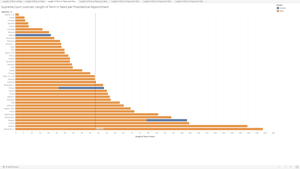
In playing around, I was able to visualize which presidents had the most sway in the Supreme Court, in terms of the total term lengths for all of the justices they appointed. I assumed Washington would be the clear leader, having the benefit of being the president to appoint the most justices, but several others beat him out, and Franklin D. Roosevelt has almost double the total terms (85.8 vs. 148.6 years). There are only four presidents who did not appoint any Supreme Court justices (William Henry Harrison, Zachary Taylor, Andrew Johnson, and Jimmy Carter).
Lastly, because why not, I wanted to see the term lengths as they related to the states where the justices were appointed from. There are many states that have never had any Supreme Court justices, especially as you move further west. Again, I’m not sure what arguments about representation could be made here; I would think this speaks more to “manifest destiny” and the way in which states were created and admitted to the union than anything else.
Ideas for Future Expansion
Initially I had been curious to compare all of the justices by the age at which they began their terms, but that would have been a bit too time-consuming. I’m still curious to see if there are any trends here. All Article III federal judges are appointed for lifetime tenure (technically they can be removed, but in practice it seems like appointments are more or less until death or resignation), so it would be great to get data for all of them as well and see what kind of trends pop up.
I have been thinking a lot since last week’s class discussion about decolonization versus democratization. Can we have both? Are they really in opposition to one another? These questions came up in regards to Marlene Daut’s article Haiti @ the Digital Crossroads: Archiving Black Sovereignty (Sx Archipelagos, 2019, no. 3, July). Daut says, “Confronting how we contextualize the archive from the perspective of decolonization rather than democratization allows us to acknowledge both the opportunities and limitations of what is contained in archives and to reveal our own privilege in being able to access and interpret the documents.”
Democracy feels like an unassailable lofty bar to which we all must strive, but just saying or assuming everyone is equal doesn’t make it true. Approaching an archive or other digital humanities (DH) project from a perspective of democratization ignores the power structures all around as some voices have taken more power for themselves—power to speak (and know others will listen), power to access, power to analyze—which necessarily limits what the project can achieve.
I’m wondering if Ernesto Oroza’s concept of “technological disobedience” could be useful to help foreground decolonization over democratization in DH work. In the YouTube video “Cuba’s Inventions from 30 Years of Isolation,” Oroza discusses many of the different ways people in Cuba took apart existing machines, technologies, and everyday objects to create new ones to suit their families’ needs, e.g., taking the motor out of broken driers to create fans or power other machines, using metal food trays to create antennae, and creating beef steak from grapefruit rinds. Oroza says, “People think beyond the normal capabilities of an object, and try to surpass the limitations it imposes on itself….This kind of object imposes a limit on the user, because it comes with an established technological code, which hardly ever satisfies all of the user’s needs, and sometimes he exceeds these needs. He manages to go beyond the object’s capabilities.” This is “technological disobedience,” where people reject and disregard the “authority” held by objects.
I admit I’ve never really thought of objects and technologies in this way. I’ve always thought in terms of what can this object do for me rather than what does this object limit me to doing. Is there such a thing as a technologically disobedient mapping project or archive—or more broadly a technologically disobedient DH? I’m not sure what that would look like, but I’m very excited to find out.
I was incredibly excited about this project when it was introduced in our first class, but as the due date kept getting closer, I was at a total loss as to what I could possibly want to map, having both too many ideas and not enough ideas at the same time. I took a deep breath, and I thought, it’s almost Halloween (my favorite time of year), let’s draw some inspiration there. And that’s how I settled on cemeteries. Call it a morbid curiosity, but they’re some of my favorite places to visit. There’s a tension between remembering and forgetting, especially in older cemeteries. If there is no one living with memories of a person, is their headstone doing the remembering for us? Is that really the same thing as remembering, and is it enough? The headstones themselves are already reducing a whole life into a few data points: name, birth and death dates, and maybe a title/relationship, quote, or a decorative symbol. And what happens when even those data points are eroded away and are no longer readable by visitors? Is it enough to be in a dedicated place of the dead and know that its inhabitants once lived? What do I even mean by “enough”? What is the responsibility of the living to the dead?
Initial Premise and Data Search
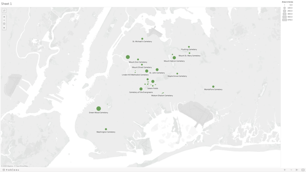
I live in Queens very close to Calvary Cemetery, which claims the largest number of interments (about 3 million) in the United States, and it’s an incredibly massive feature in my daily landscape. So first and foremost, I was curious to know how much physical space cemeteries are taking up in New York City. Many of them must be full, or close to it; indeed, many of the cemeteries in Queens and Brooklyn were established when Manhattan burial grounds were facing a severe shortage of space, exacerbated by a cholera outbreak in 1847. What happens when the cemeteries in the outer boroughs fill up? Is the current land usage sustainable? In addition to urban planning concerns, there are also many environmental concerns about some of the more popular death rituals (burial and cremation), but I wasn’t sure how to include that here. I mostly was hoping to see the relationship between the space allotted for the dead and the rest of the city—the space allotted for the living (though admittedly cemeteries are perhaps more for the living than they are for the dead).
Based on the suggestion in class, I initially tried to find data on cemeteries from NYC Open Data; there were no search results. So I googled “cemeteries in NYC.” Most of the results feature a selection of the oldest, or forgotten/hidden, or most unique, or most notable dead. There are also websites like Find a Grave, where you can search for specific headstones in their database. But I wasn’t seeing any datasets showing all of the cemeteries in the city. So I decided I should start to make my own dataset from a Wikipedia listing and searching in Google maps (admittedly a problematic start). This quickly proved time-consuming and frustrating as many of the cemeteries listed don’t have entries in Wikipedia, and even cemeteries that have their own entries don’t always include information about area, or they contain measurements that are vague (e.g., qualified by “nearly,” “about,” “more than”). Not to mention I’m not sure who accumulated this list and how complete it is. From a cursory search, I know that there are cemeteries in Manhattan that have been built atop of (again see the 6sqft article “What lies below: NYC’s forgotten and hidden graveyards”)—sometimes with bodies relocated, and sometimes not. Should these count as cemeteries on my map? (I’m inclined to think yes.) I was also curious to see when the cemeteries were established, but even that proved to be a tricky data point. Does that mean when the land was purchased for the purpose? Or when it was incorporated? Or when the first bodies were interred?
From the outset, I’m already seeing that there is no neutrality in the data I’m collecting—a la Johanna Drucker’s “Humanities Approaches to Graphical Display”—and it’s time-consuming even to just find a list of cemeteries. So I immediately scaled back to just focus on Queens, and then I added in Brooklyn when I realized there are several cemeteries that span both boroughs.
Choosing a Mapping Tool and Creating My Map
I assumed that a static map rather than an interactive map would be easier to start with, having no experience in using mapping tools. I wanted to try to use an open access tool, so I immediately nixed ArcGIS and started with QGIS, but I realized that neither of the all-in-one release versions are compatible with my Mac setup. From the interactive map tools, I didn’t want to wait for approval access with Carto, so I opted to sign up for a free license of Tableau Desktop.
Very quickly, I was uploading my dataset, consisting of five columns—name, borough, geo coordinates, area in acres, and year established—and tried to make a map. I was dragging and dropping each of the columns into different fields in the Tableau workspace, but I was only able to get it to create graphs. I soon learned that the mapping would work better if I separate my geo coordinates into two separate categories for latitude and longitude (using the decimal values). After some trial and error, I figured out that you need to put longitudinal values into the columns category (y axis) and latitudinal values into the rows category (x axis), and finally I was seeing my cemetery dots. My original dataset had about 10 cemeteries in it, and my map was frankly looking really sad, so I decided to dig a little deeper and generate some more names and see if I could find info for the cemeteries without entries in Wikipedia. Thankfully I found the New York City Cemetery Project by Mary French. Through her research, I was able to fill my dataset out to 33 cemeteries in Queens and Brooklyn—there are very likely more as her project also includes historical information about potter’s fields and family burial grounds.
I used the area in acres category to be the scale, so that the dots appeared on my map on a size scale in relation to each other. Ideally, I would love this scale to relate to the scale of the map of the city in the background, but I could not figure out how to do this. Adjusting the scale is a matter of sliding a button up and down on a linear scale without any numbers, so I just picked a size scale that I found aesthetically pleasing. I’m also not 100% confident in my values for latitude and longitude as most of them were derived from my searching for the cemetery name in Google maps, and then right clicking “What’s Here?” for the values—and in doing so sometimes my mouse was clicking somewhere slightly different than where Google had placed it’s pin, and also Google sometimes seemed to have multiple pins for the same cemeteries, so I had to choose which to use, and sometimes it was placing pins near entrances and sometimes in the middle of the spaces. I also noticed there are many cemeteries that appear grouped together on the map, and there are instances where Google seems to be placing two pins in the same spot for two adjoining but different cemeteries.
Going back to NYC Open Data, I was able to find a dataset with information on all of the city parks, including area in acres. However, when I was trying to import this data to my map, I couldn’t figure out if the parks were in the correct location as that dataset was using different coordinates than I had used in my own dataset. Also, the acres column was coming through as a string rather than numbers—I cannot for the life of me figure out why—and so I have no confidence that what I was mapping for the parks was comparable in scale to what I had generated for the cemeteries, so I ultimately decided to scrap their data and just present my data on cemeteries in Queens and Brooklyn.
Map of cemeteries in the boroughs of Queens and Brooklyn shown in relative acreage to each other (not to scale with the map of New York City in the background).
Ideas for Future Expansion
The first area of expansion would be to expand my map to all of the boroughs. Given the importance of having access to outdoor spaces—especially during the current pandemic—and knowing that picnicking in cemeteries was at one time a common practice, I would like to further dig into the visiting practices at each of these cemeteries (e.g., are visitors allowed, are visitations limited, have visitor policies changed during COVID-19?). And also find out how to map the cemetery spaces in comparison with other green spaces in the city. I’d also be curious to see the density in each of the cemeteries (number of interments compared with acreage) and average cost of burial.
In addition to urban planning and environmental concerns, I think cemeteries are a great starting point for discussions about access, community building, and even broader ideas of what it means to be human (and which people are “worthy” of remembering). Burials are expensive, and those without means have generally been buried differently—both in ceremony and location. And access to different cemeteries has been restricted based on other factors like race, ethnicity, and religion. A prime example is the African Burial Ground National Monument, whose original grounds included the remains an estimated 15,000 Black people—both enslaved and free. The original cemetery was closed and slated for redevelopment in 1794, later to be “rediscovered” and “re-remembered” when the land was being excavated for the proposed construction of a federal building in 1991. What does this purposeful forgetting of a cemetery mean for that group, and how do cemeteries contribute to our understanding/claims of belonging to certain communities and specific locations?
Zotero has been suggested as a tool and resource in the orientation meeting for the MA in Digital Humanities, as well as being mentioned in passing in class and in workshops. But my initial, limited understanding of it was as a tool for creating reference lists and managing citations, and that seemed like something that would be useful at some point in a somewhat distant future, so I put it in the back of my mind.
When I saw last week that the Mina Rees Library was doing a Zotero introductory workshop during my lunch hour, I thought, why not? And I’m so glad I did. Jill Cirasella, associate librarian for scholarly communication and digital scholarship, led the workshop, and you could tell right from the start that Zotero is a tool she is passionate about using and helping others to use as well. She took a few moments to ask all of the participants what programs we were in and our research interests to tailor her introduction workshop for each of us.
For me, she said it was great to start using Zotero now, early in the master’s program, so that I could start building my own personal library for future referencing. Articles I add to my Zotero account now could be useful for research several years later, and beyond. Which, yes, of course. How did I not think of that? Future references lists don’t appear out of thin air; they are the result of prior and present research.
Zotero is a free, open access tool used to gather and organize research. Through Zotero, you can create a personalized library from which you can easily cite articles and generate reference lists in papers. Most of the main referencing styles (e.g., APA, Chicago, MLA) are stored as templates, and you can easily toggle between different styles if you are submitting articles for different purposes with different styling preferences.
Essentially Zotero exists in three parts that are all in communication with each other: a website with cloud storage, a desktop application with word processor plugin, and a search engine extension. Once you create your account online and download the appropriate applications and plugins for your setup, most of your work with Zotero will likely happen through your search engine extension and your desktop application and word processing plugin. Jill strongly suggested we set up the Zotero application to automatically sync to the website, where personal libraries are almost instantly backed up to cloud storage, both as a failsafe in case something happens and also so that you can work on your library from anywhere. Zotero saves the content you are interested in remembering, including all of the metadata, links, and associated files (e.g., PDFs). Zotero is free to use, but the amount of cloud data available for free is limited, so Jill suggested not including associated files in your automatic syncs as this could quickly use up all of your free storage.
The thing that has me most excited for Zotero is the ability to create group libraries. In these blog posts and in our class discussions, people have been bringing up new materials to check out. I think a class library in Zotero could be a great way for us to put all of those sources into one place for all of us to easily access. What does everyone else think about using this as a group tool for class?
For anyone interested, I highly recommend attending a future Zotero introduction workshop. The next one on the library workshop calendar is on September 23 from 2:00 to 3:00PM. The library has also written up a guide on how to use Zotero.
I love maps. I’ve always been interested in them–for travel (customizing google maps for myself before I take a trip), for art (there are several hanging in my apartment; even my shower curtain is a colorful ol’ Mercator projection), for symbolism (I wrote a collection of poems in undergrad around maps). And I know that the size of countries and the standard presentation of them is problematic–I remember this coming up in geography courses maybe even as early as middle school, though once addressed we just kept moving forward with the basic world maps most of us are familiar with.
Until reading the first two chapters of How to Lie with Maps by Mark Monmonier (edition unknown), I never considered what other elements of a map need to be carefully analyzed and considered–the scale and the symbolization, and even more broadly recognizing what is being left out. Maps are as much about what is absent as what is present. I admit that’s not something I always readily recognize. And I found this quote to be especially poignant: “In the sense that all maps tell white lies about the planet, small-scale maps have a smaller capacity for truth than large-scale maps” (Monmonier, 6-7). I’ve never thought about maps in terms of their “capacity for truth.”
We also have to consider whose truths are being told in maps, which is further explored by Yarimar Bonilla and Max Hantel in their article “Visualizing Sovereignty: Cartographic Queries for the Digital Age” (published by sx archipelagos). Colonial powers created and used maps in order to possess these spaces. Bonilla and Hantel argue “the map reifies the truth of what it represents, promising and delivering virgin lands and nonsovereign territories in need of discovery, settlement, borders, and territorial authority.” But how do we move beyond these limited maps? Can we? I found it very interesting to literally watch them attempt to overcome this through the many iterations of maps of the Caribbean they created over the years to better represent these places and their complex relationships with colonial powers. And ultimately I do think they offer some hope as to the broader possibilities of maps: “Yet, the landscape of possibility always exceeds the limits of representation. Moreover, the map is itself a function of a foundational set of codes concerning who controls visual representation and what counts as representable in the first place. Attending to those codes themselves, rather than to simply the maps they generate, profoundly disrupts the cartographic gaze and its imposed limits.”
In scoping out the many suggested websites for this week, I admit I am feeling excited about what is possible with maps, but also incredibly overwhelmed given the vast amounts of data and years of research that went into all of them. I do love how Slave Revolt in Jamaica, 1760-1761, is framed as “a cartographic narrative” and how Vincent Brown has included so much text, providing the background and accompanying each action on the interactive map.
I was also very drawn to the Renewing Inequality project and their use of maps within maps and a range of visual assets (starting with The People & the Program and scrolling through, I’m just so impressed by this user experience). I knew about some of these “urban renewal” projects but not most of them. For instance, I had no idea that NYU/Bellevue was one such project. Bellevue champions itself as the premier hospital in a public hospital system that provides care to the most underserved populations, but what does it mean that its current physical space came into being by literally displacing those same populations?
The idea of counter cartographies came up in last week’s readings and again this week. Aside from the appealing alliteration, I find myself wanting to know more about this, and I found some interesting links that I wanted to share with the group:
In “Counter-mapping: cartography that lets the powerless speak” (published in The Guardian, Mar 6, 2018), Laurence O’Dwyer discusses alternative mapping projects that promote the stories of people are who usually ignored and maps that try to chart psychological spaces as well as physical ones.
In “Counter Mapping” (published by Emergence Magazine, I’m unsure on the date, but several of the footnotes reference sources from 2018), Adam Loften and Emmanual Vaughan-Lee explore a mapping project undertaken by Zuni artists to create maps, counter to the straight lines of government-drawn reservation areas, that are rooted in memories and experiences of the community.
This Is Not an Atlas, which started out as a collective book project and has expanded into an online version, brings together critical geographers and activists to “collectively learn how to read space and how to initiate emancipatory processes from below.”
Email us at [email protected] so we can respond to your questions and requests. Please email from your CUNY email address if possible. Or visit our help site for more information: