
Link to map animation:
https://public.tableau.com/shared/JDWHFMPGM?:display_count=n&:origin=viz_share_link
I was inspired when learning from our readings how mapping software can provide those extra layers of important context to users in animated maps, so I wanted to challenge myself to build one this week. I chose to use Tableau Desktop to do this because it automatically gives suggestions for how to display your data, is relatively easy to use with drag and drop functionality, and is free for students.
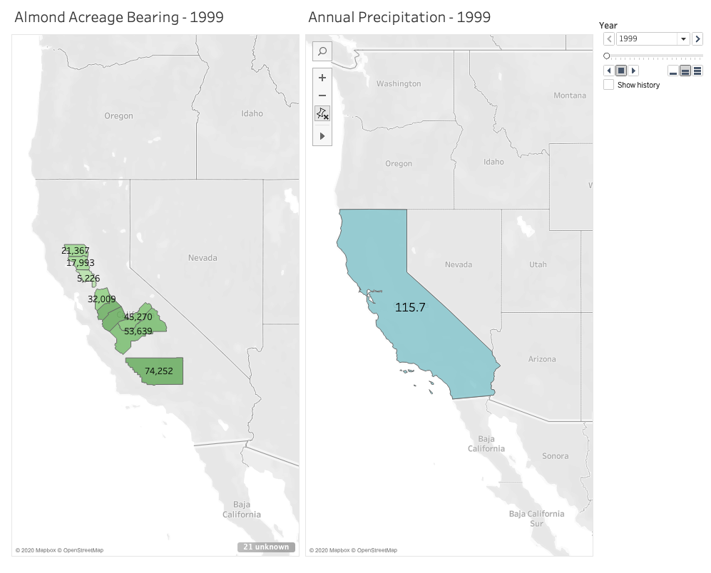
I’m passionate about sustainable farming and am curious about the role climate change continues to play on agriculture, so I chose to look for data in the state that annually generates the most revenue from agricultural production: California. Specifically, I wanted to see what the state’s annual precipitation levels are, and how those levels impact the amount of land that’s actually bearing crops. A lot of acreage is reserved for farming and planted heavily each season, but how much product is actually generated on that land in each growing season. With wildfire seasons getting stronger each year, and a severe drought that spanned from 2011 to 2019, there’s no doubt that climate change is affecting food growth in the state. As these changes continue to occur and grow in severity, the crops in California believed to be most impacted are fruit and nuts.
Given that growing almonds specifically requires much more water than fruits and vegetables, and considering how trendy almond milk is right now, I chose to focus on this crop in particular when measuring its bearing acreage in the state against average annual rainfall. Fortunately, California farmers have kept meticulous records since 1980 of not just how much of their land is reserved for the nuts, but also their yield. I chose to focus on 10 counties that had the highest amount of reserved acreage for planting almonds in 1980. But to narrow it down a little, I set a 20-year timeline to span from 1999 to 2019.
I definitely found that the most challenging part of this activity was finding the data I needed and formatting it correctly for Tableau to digest. While I easily found the data I needed for the almonds, I had a much harder time finding free and historical counts for average annual precipitation across the entire state. I found many government resources that listed measurements by month and by region, but I knew I wouldn’t have time to dedicate crunching out the averages I needed. I also ran into paywalls when I wanted to locate state-wide figures I needed for the 20 year-timeline I set for myself. I ended up settling on an easy list of annual rainfall in inches over the past 20 years in Los Angeles county alone. This data doesn’t exactly help me see what I want to at the state level, and Los Angeles isn’t one of those 10 counties in my list with almond growth. But I wanted to have something to experiment with and display for the purpose of this mapping project.
After reformatting my columns and rows a couple of times in excel, I finally worked out how Tableau would best intake my data in a way it would recognize. For example, rather than having a row for each county with the acreage listed out beneath columns for each year, it made more sense to have a single county column, a single year column, and a single acreage column in which they all corresponded by row. It took me around 3 attempts with importing the data to learn that this would work best.
Once I worked out these data formatting kinks, Tableau really did all the heavy lifting. I watched one YouTube video to see how an expert built a basic, non-animated geographic map. This helped me learn how I wanted to use color and shading in my display. The next video I watched gave a tutorial on how to use the year as a profile that gave the animation its power. Building the animated map wasn’t immediately obvious to me, so I’m grateful there are resources out there to follow along with. Despite reading how to manually set longitudes and latitudes for areas that Tableau didn’t recognize in the dataset, I couldn’t get Butte county to appear on my map. So rather than showing 10 counties as I intended, the final result has 9. I’ll have to dig more into what I was doing wrong there.
After some experimenting and playing with shading and color, I built two successful animated maps across the same 20-year span: one measuring the almond-bearing acreage and the other measuring annual precipitation in inches. In my head I was envisioning a single animated map that layered the acreage of these counties underneath the larger, state-wide precipitation layer. After experimenting with the tool and my data, I couldn’t figure out how to layer it all together with the visual effect I wanted. But maybe that end result would have been too busy for the user? I think if I continue learning from the many Tableau resources out there I could eventually figure it out and decide how to best present my data.
After the initial data mining and formatting challenges, I ultimately had success using Tableau and would recommend it for any geographic mapping needs. I really only touched the surface of what the tool can do, so I’m curious to see how else it can absorb and display information in engaging ways.