Author Archives: Amanda Filchock

Lessons Learned and Looking Ahead

And just like that my very first semester in the DH program is done. While this year of learning was unlike any other, I’m so impressed with how smooth it went and how easy it was to transition to remote learning. I’m thankful we have access to technology that lets us learn and continue with our grad careers. I’m also incredibly thankful to have had such wonderful classmates! Everyone is so intelligent, kind, and thoughtful, and I’m looking forward to working with you next semester!

With this final project I did feel a little overwhelmed when thinking how to piece it all together, but I also felt confident in my abilities to fill in the gaps that I didn’t already know. Because this was my first semester (and it’s been 5 years since I left undergrad) I was feeling a little apprehensive about writing a paper again. However, the final project guidelines that Matt provided were a great roadmap, and I felt better knowing that I had something to follow when getting my thoughts out. As I discovered throughout the whole fall, it was also a challenge balancing full-time work and life responsibilities with classwork. In this area, I’m actually thankful to have saved time commuting and running around the city since there’s not a whole lot we can do these days. But it’s worth acknowledging the emotional and mental stress we’ve all been put through this year, and I’m proud of us for showing up each week to share thoughts and learn while working towards these final projects. Again, I’m inspired of all of you and in awe at the project proposals you came up with. Brianna mentioned this in our last class and I’m reiterating here, I want to work on all of these projects!

For my proposal of a tool to help farmers and community orgs have better access to the food supply chain, I was definitely ambitious. But I thought… hey, why not? I think the majority of the impact here is revealing the gaping issues that exist and prevent farmers from staying in business and struggling families surviving. So even if the problems here are just too large for any single tool to solve, let alone a proposal from only a graduate course and not some major government program, I think it’s worth doing the research to shed some light on the ways these groups are struggling. I learned so much about the complex and byzantine food supply system that currently runs things, and got insight into heartbreaking figures that reflect how many families are struggling to put food on the table. All this to say, it helps to break things into pieces rather than try to bite off everything all at once. Thanks to Matt’s notes when I initially submitted my proposal last month, I broke up the whole project into phases that could be used as stepping stones that would make up one powerful, multi operation tool, or used individually depending on the needs of the user. I think we all stumbled across this over the semester but again, scope creep is real.

Many of us also shared worries about not knowing the full tech requirements and roles to build our projects. And I think that’s OK! I know I only scratched the surface of this area while doing research for this project, and I’m excited to meet new experts and learn more about these roles in future DH classes. It can be frustrating to not know everything or be an immediate expert, but I know the learning is in the journey and we’ve only just begun. Similarly, I’m taking these DH courses only part-time and will slowly work towards the finish line. I’m jealous when I hear about the other classes many of you are taking at the same time. They all sound so interesting! I get antsy and want to bite off more than I could handle with everything else I’m juggling. But then I shift my focus and get excited about the amazing classes coming up. I hope you all feel the same way because this DH program is fascinating.

Thanks again for a great semester! Have a wonderful break and see you in the new year. Feel free to find me on LinkedIn, social media, etc. to connect!

DH Pedagogy Blog Post: Student Empowerment Through Experimentation

It was interesting to get a peek under the hood into crafting DH curriculum in this week’s readings. Ryan Cordell gave a very clear outline into his trial and error with his early Intro to DH course for undergraduate students. I appreciate his honesty in explaining how and why his department rejected his initial course proposal, and also in his almost confession that DH readings and theory don’t impress undergrad students. They’re unimpressed by the word “digital” because their entire lives are already lived online; although we learn in Risam’s ‘Postcolonial Digital Pedagogy’ that the term “digital native” used to describe students today is complicated. In fact, Risam introduces us to the idea that the fallacy of this is “the assumption that the increased consumption of digital media and technologies produces a deeper understanding of them.” No teacher can assume that all of their students are coming in with the exact same skillset at the start of a semester. Just as those students shouldn’t assume that they have more advanced tech skills than their teacher. Cordell reveals how much he learned from his students’ projects over the course of a semester, and suggests colleagues should follow his same pedagogical approach.

I found a few parallels between the Cordell and Risam pieces. One of these is the attitude they share that DH pedagogy shouldn’t teach specific tech skills to students, but to let students access the skills that they would need by working with an assortment of tools. Risam created the metaphor of the student as a carpenter, building their own knowledge structures from the ground up. Giving them a huge advantage to be able to identify gaps. I found it inspiring that students should be encouraged to create and explore, emphasizing the role of production over consumption. Cordell explains similar thoughts, and argues that that’s the best way to overhaul DH pedagogy.

I agree with the recommendation from both writers to have students experiment through access to many different tech skills. And I appreciated that we were given this same freedom in our Intro to DH course. Just like in the way we were encouraged to approach our praxis assignments for this course, it’s recommended that DH pedagogy should start small by having students working with a focused group of tools initially, experimenting across different modalities, gradually building their toolbox within their own universe. Both writers also agree that student-produced projects are more valuable at showing DH skills learned during the course rather than a final essay, allowing students to better showcase their engagement with the material through interaction. Risam describes how power dynamics in the classroom should shift in this way, rather than having students just learning for the sake of regurgitation at the end which I think is very empowering for the students.

One final theme mentioned in the readings that mirrors our course is teaching students to have a healthy attitude towards failure. When working on both our mapping and text praxis projects we talked about scope creep and how our expectations changed as we worked with the tools. We didn’t always succeed, and it’s OK that this happens. Risam brings this up by looking at the relationship between “blue sky thinking” versus “practicality of implementation”. Like most things in life, things rarely work out the way we intended them to. Teaching students to navigate roadblocks while pursuing the end goal is invaluable to their long term education and overall success. Being able to experiment and make our own way with these DH tools that are (mostly) new to us, is the best way to learn how, why, and when to stir things up and create our own digital spaces. I didn’t have the space here to delve into all of this week’s readings, but I found them insightful and I think educators across all fields can benefit from the recommendations from these pieces.

Little Women, Little Surprises

As I mentioned on Wednesday, I went into this project thinking I had a hypothesis in mind and was determined to make a discovery. But I ended up spending most of this project just exploring the functionality of both Voyant and Google Ngram, and wasn’t able to really make any monumental revelations. I was even wracking my brain to come up with sample text that would reveal something, but struggled to think up anything specific. I ended up browsing the public domain and pulled up Louisa May Alcott’s, Little Women, just to get started with something. But exploring is good – and I enjoyed getting familiar with these text analysis tools.

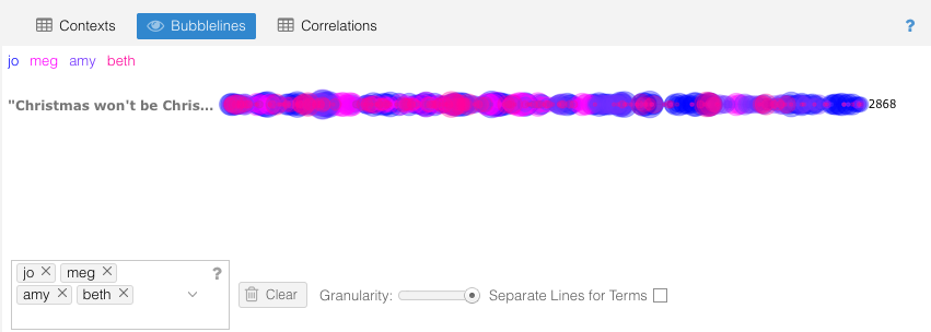
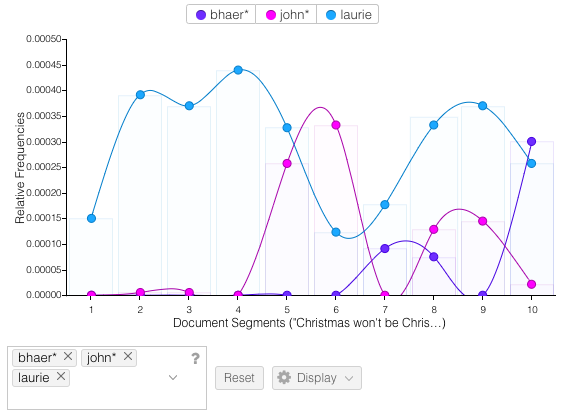
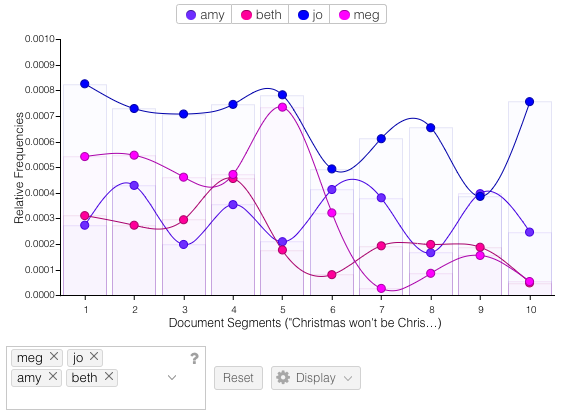
Voyant is easy to use and gives lots of tools to click through and try out. It’s also very visually appealing. I pasted in the text of the full novel and first searched within the Trends and Bubblelines windows to see how often each of the sisters are mentioned throughout the course of the novel. The results are clear to follow and not too surprising (see the number of mentions of Beth and Meg decline after their death and marriage respectively – sorry, spoilers). I did find that 2 of the colors were a little too close in shade, and I didn’t figure out how to change them to see a little more color contrast. Next I wanted to see the equivalent searches for the major male characters of the novel. Laurie was already one of the most common terms, so he popped up in the top 10 drop down to select. But I had to stop and think about how to search for Friedrich Bhaer and John Brooke. I looked up both first and last names to find the most frequent name for each character, and ended up going with “Bhaer” and “John”. Again, clean narratives lines are the end result. I did like being able to reference the content in the Reader window by clicking on one of the points in the Trends chart and seeing it take you right to the start of that content segment. I also found it helpful to hover over an individual word in Reader to see its frequency, and then click to have that term override the Terms window to see that same frequency trend line over the duration of the novel.

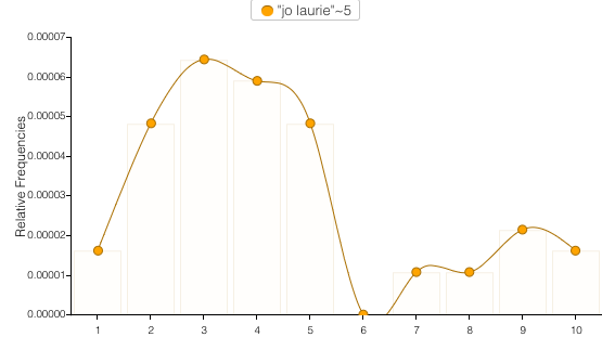
Finally I explored the Links feature to see common relationships between words in the text. For obvious reasons I chose to look at the link between Jo and Laurie. It’s really entertaining to watch the word bubbles hover around between the connecting lines. Trends seems to be the default reactor for most of the clicks as immediately clicking on the links line creates a new Trends line there. I accidentally discovered this and had to re-do the previous search to go back.

Voyant really does all the heavy lifting for you, and there’s zero insight into how it operates behind the scenes. For quick, easy to visualize results, Voyant does a great job. While looking specifically at a novel, Voyant was useful for tracing narrative connections. I could see it being some kind of add on to Sparknotes for readers looking to dig deeper into content. But overall I think I was a little disappointed with the tool’s limitations.

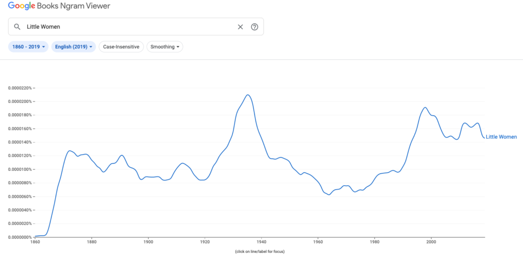
Next I plugged “Little Women” into Google’s Ngram to see frequency trends of the novel title over time. Similar to my work in Voyant, I wasn’t too surprised with the results but had fun using the tool.

The frequency count begins to increase after 1864, continuing up steadily through the novel’s publication in 1868 and peaking at 1872. Then it plateaus and fluctuates through 1920 before dramatically increasing again with the highest peak at 1935. A quick search told me that the story’s first sound film adaptation starring Katharine Hepburn premiered in 1933. For me the best part of using Ngram was playing detective and digging up the reasons behind the frequency increases. A couple other highlights I clued into: the 1994 Academy Award-nominated film adaptation and a major mention in a popular episode of ‘Friends’ in 1997.

Overall I did find the text analysis praxis valuable because I was able to experiment and explore what the tools are capable of. Probably the most important lesson I learned is that projects don’t always turn out the way you expect them to. In a way this is similar to the mapping praxis but instead of the scope limiting me, it was the tools here that put up those constraints. I also think I got in my own way by having really high expectations going into things, thinking I would have a strong hypothesis up front and the tools would help me prove it.  We discussed that this area of DH can be challenging despite most initially assuming text mining to be immediately beneficial for projects in the field. And after this praxis, my assumptions have definitely changed.

Less Is More, But Audiences Want That Digital Razzle Dazzle

“The library is a prerequisite to let citizens make use of their right to information and freedom of speech. Free access to information is necessary in a democratic society, for open debate and creation of public opinion.”

― Susan Orlean, The Library Book

This week’s readings reminded me of Susan Orlean’s excellent book, The Library Book, which essentially is a long love letter to public libraries and the information they share for free. I read it this past summer and highlighted so many great quotes that came in handy this week as I thought through these pieces on open access and minimal computing. I highly recommend it for any of you library/word fans out there.

Much like in public libraries, it’s the behind the scenes work (applying metadata, determining content organization, shelving books) that’s the least exciting, but the most important for usability in digital content platforms. This non-automated type of work requires human maintenance and is also what ensures the content’s survival. In “Pixel Dust”, Johanna Drucker argues that this work done by librarians and digital curators is actually the most exciting and innovative because of how the data can be searched and used for learning. Not how it’s presented in flashy ways on screen. She says, “Novelty and insight are effects of reading, not byproducts or packaging.” People are going to digital editions simply for the purpose of gaining knowledge. Why should they be distracted with heavy design? Maybe I’m becoming an aging millennial, but I agree that the pop ups, animations, and complicated “choose your own adventure” layouts of most sites today are distracting and hide the content I’m trying to access, hindering any kind of long term preservation.

Alex Gil explains how he thought similarly when he designed Ed. He makes the case for why simple is better when it comes to digital design, with benefits that include lower maintenance costs and more control around both ownership and usability of the text. As someone who spends her day job working extensively in a CMS while strategizing how to publish shared content across the web, mobile apps, and print materials, I was pleasantly surprised to read about his criticism of the expensive systems. It takes continuous work to preserve and maintain the correct audience tagging structures. Not to mention the frequent trainings that take away from the time I need to just read the content and understand what the audience needs to know from me as the author. And his point about the inequality of these systems is especially valid, as often it’s only those senior, more educated positions that really know how to use the system and determine its influence over the content.

Maybe a lot of the favor towards those “dazzling displays” that Drucker refers to can be blamed on people’s reduced attention span in our current internet age. There’s just too much information presented to us in too many mediums at a very quick speed. How are audiences supposed to know what to trust? It’s impossible to wade through it all, and digital spaces battle over getting you to visit by breaking out their snazziest interfaces. You would think audiences would prefer to get the information they need as quickly and simply as possible when they consult a digital space. Then they can move on to the next thing, but audiences gravitate towards and money is heavily invested in those sites that offer the most in their displays. And I agree with Peter Suber when he says in his piece, “What is Open Access”, that it’s really a cultural obstacle that we face to see wide acceptance of minimal, open access. Looking forward to hearing others’ thoughts in our discussion.

_________________________________

Additional quotes from The Library Book that popped in my head while reading for this week:

“The publicness of the public library is an increasingly rare commodity. It becomes harder all the time to think of places that welcome everyone and don’t charge any money for that warm embrace.”

― Susan Orlean, The Library Book

“if something you learn or observe or imagine can be set down and saved, and if you can see your life reflected in previous lives, and can imagine it reflected in subsequent ones, you can begin to discover order and harmony. You know that you are a part of a larger story that has shape and purpose—a tangible, familiar past and a constantly refreshed future. We are all whispering in a tin can on a string, but we are heard, so we whisper the message into the next tin can and the next string. Writing a book, just like building a library, is an act of sheer defiance. It is a declaration that you believe in the persistence of memory.”

― Susan Orlean, The Library Book

Predicting Climate Change’s Impact on Almond Bearing Acreage in California via Tableau

Link to map animation:

https://public.tableau.com/shared/JDWHFMPGM?:display_count=n&:origin=viz_share_link

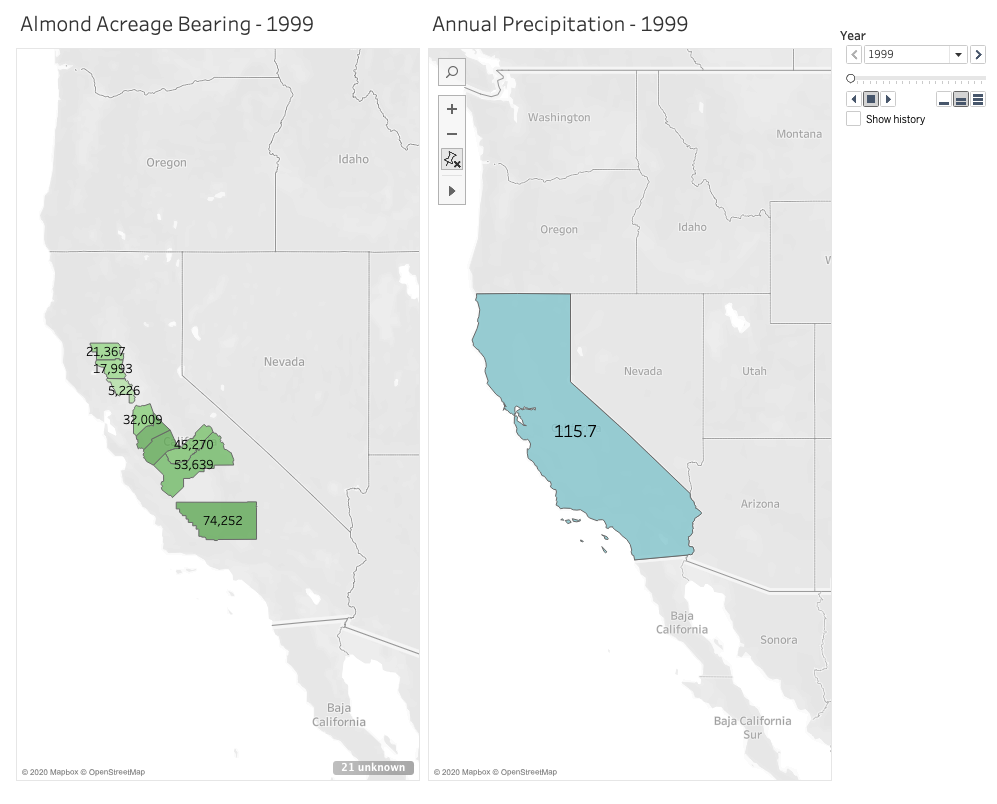
I was inspired when learning from our readings how mapping software can provide those extra layers of important context to users in animated maps, so I wanted to challenge myself to build one this week. I chose to use Tableau Desktop to do this because it automatically gives suggestions for how to display your data, is relatively easy to use with drag and drop functionality, and is free for students.

I’m passionate about sustainable farming and am curious about the role climate change continues to play on agriculture, so I chose to look for data in the state that annually generates the most revenue from agricultural production: California. Specifically, I wanted to see what the state’s annual precipitation levels are, and how those levels impact the amount of land that’s actually bearing crops. A lot of acreage is reserved for farming and planted heavily each season, but how much product is actually generated on that land in each growing season. With wildfire seasons getting stronger each year, and a severe drought that spanned from 2011 to 2019, there’s no doubt that climate change is affecting food growth in the state. As these changes continue to occur and grow in severity, the crops in California believed to be most impacted are fruit and nuts.

Given that growing almonds specifically requires much more water than fruits and vegetables, and considering how trendy almond milk is right now, I chose to focus on this crop in particular when measuring its bearing acreage in the state against average annual rainfall. Fortunately, California farmers have kept meticulous records since 1980 of not just how much of their land is reserved for the nuts, but also their yield. I chose to focus on 10 counties that had the highest amount of reserved acreage for planting almonds in 1980. But to narrow it down a little, I set a 20-year timeline to span from 1999 to 2019.

I definitely found that the most challenging part of this activity was finding the data I needed and formatting it correctly for Tableau to digest. While I easily found the data I needed for the almonds, I had a much harder time finding free and historical counts for average annual precipitation across the entire state. I found many government resources that listed measurements by month and by region, but I knew I wouldn’t have time to dedicate crunching out the averages I needed. I also ran into paywalls when I wanted to locate state-wide figures I needed for the 20 year-timeline I set for myself. I ended up settling on an easy list of annual rainfall in inches over the past 20 years in Los Angeles county alone. This data doesn’t exactly help me see what I want to at the state level, and Los Angeles isn’t one of those 10 counties in my list with almond growth. But I wanted to have something to experiment with and display for the purpose of this mapping project.

After reformatting my columns and rows a couple of times in excel, I finally worked out how Tableau would best intake my data in a way it would recognize. For example, rather than having a row for each county with the acreage listed out beneath columns for each year, it made more sense to have a single county column, a single year column, and a single acreage column in which they all corresponded by row. It took me around 3 attempts with importing the data to learn that this would work best.

Once I worked out these data formatting kinks, Tableau really did all the heavy lifting. I watched one YouTube video to see how an expert built a basic, non-animated geographic map. This helped me learn how I wanted to use color and shading in my display. The next video I watched gave a tutorial on how to use the year as a profile that gave the animation its power. Building the animated map wasn’t immediately obvious to me, so I’m grateful there are resources out there to follow along with. Despite reading how to manually set longitudes and latitudes for areas that Tableau didn’t recognize in the dataset, I couldn’t get Butte county to appear on my map. So rather than showing 10 counties as I intended, the final result has 9. I’ll have to dig more into what I was doing wrong there.

After some experimenting and playing with shading and color, I built two successful animated maps across the same 20-year span: one measuring the almond-bearing acreage and the other measuring annual precipitation in inches. In my head I was envisioning a single animated map that layered the acreage of these counties underneath the larger, state-wide precipitation layer. After experimenting with the tool and my data, I couldn’t figure out how to layer it all together with the visual effect I wanted. But maybe that end result would have been too busy for the user? I think if I continue learning from the many Tableau resources out there I could eventually figure it out and decide how to best present my data.

After the initial data mining and formatting challenges, I ultimately had success using Tableau and would recommend it for any geographic mapping needs. I really only touched the surface of what the tool can do, so I’m curious to see how else it can absorb and display information in engaging ways.

Learning the Basics of Python with GCDI

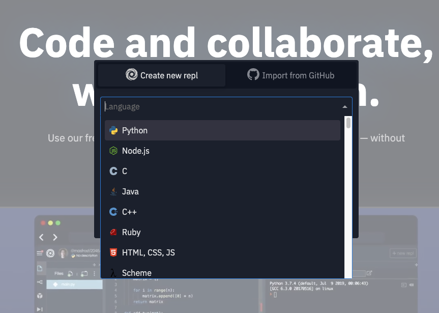
Last Thursday, 9/10 I attended the Intro to Python workshop hosted by the GCDI, and led by Rafa, a Digital Fellow, PhD student, and organizer of the Python Users’ Group at the Graduate Center. Before the event, I received a few emails with instructions on how to install the software we’d be using in the workshop. It seemed a little intimidating, but Rafa provided detailed instructions and offered to help troubleshoot leading up to the event. And if anyone wasn’t successful with their installations, we were recommended, repl.it, to follow along.

Getting started in repl.it

With the Python green light, ‘>>>’, up on our Terminals, we began experimenting. We started practicing with simple math problems, then learned how to assign variables to create the iconic greeting, “hello world.” Generally, if you give the terminal instructions, it will respond immediately. We did a lot of trial and error, learning that we use the text editor to write the file but the computer runs it.

Why learn Python? It’s a general purpose language, meaning you can do pretty much anything with it: text/data analysis, create a website or video game, etc. Python is also incredibly popular, and coding is very social. With Python’s clean and simple code, it’s easy for developers to understand each other. Its users can’t really go too rogue because they’re forced to write in the standard language. Thanks to its popularity, there are countless tutorials and videos to learn from.

I didn’t have any background in Python, so this workshop was the perfect place to start. Rafa said “Learning Python is a journey.” I’m excited to dig into the language more, and to understand how I might want to use it in future projects. I plan to continue learning via YouTube and attending the GC’s Python User Group. Be sure ake a look at the GCDI’s upcoming calendar of virtual events: https://gcdi.commons.gc.cuny.edu/calendar/. Given the challenges of virtual learning, Rafa did an excellent job of teaching us the basics in a limited time.

Is Author Credit an Issue With Collaboration?

The idea of collaboration being critical to the success of DH projects is thread across all of the readings, and we can plainly see successful examples of it when browsing the sites. Specifically, the creators of Torn Apart/Separados left a note that they plan to make the maps and workflows available through Nimble Tents Toolkit, which is powered by the open sourced GitHub. They’re inviting others to continue to build on the work they’ve already started, and/or to copy the workflows for presenting a different issue. I completely agree with the benefits of collaboration covered in this week’s readings: faster publication, amplification of diverse and marginalized voices, recruitment of experts with different skillsets to help build more powerful tool, peer review etc. But I wonder how challenging it becomes to credit the authors of highly collaborative work. Is it a concern that a group might split off and run with some or all of the base work to create their own project? Maybe this flexibility is what makes DH truly powerful, and authorship and credit aren’t as important since digital humanists are all working towards the same goal of curating and learning from the information presented.

The readings also told us that similar to how expansive the definition of DH is, its impact has shifted away from scholarship to responding to the larger world. This made me think of the popular Citizen app, where a team monitors police reports and shares an alert that’s then pinged out to registered users. Passersby with the app can stream live video of the activity, and a comment thread is created for each event where neighbors can ask questions and share additional information. Each incident is left up on a local map for about a week. Related to the earlier paragraph, who are the mysterious Citizen authors/reporters? Does it even matter who gets the credit between the public users and the reporters as long as the information is being shared?

One last thing that left an impression on me this week was from the “Digital Black Atlantic Introduction” — the idea that memory isn’t only about invoking the past, but linking to the present and future. Toni Morrison called it “re-memory”, that by remembering a memory in the present we’re reconstructing the past. The authors mention an example from the essay, “Access and Empowerment: Re-discovering Moments in the Lives of African American Migrant Women” of returning to lost texts by Black authors. By working with the material in the classroom, students not only learn about archiving and history through preserving the memories, but they’re also cultivating a lasting interest in the material and themes. By using digital tools, we can recover and reclaim what’s been forgotten while connecting to the present. This entire theme was really interesting to me, and I find it inspiring that current generations can build and adapt the past through technology to learn about today and the future.