
Despite my map’s inherent flaws, it was a good exercise to experiment with mapping tools and test out the theories and ideas we’ve been reading about recently. From the beginning, I was interested in doing a map related to the arts. Luckily, the Museum of Modern Art in New York has provided open access to a dataset of artists and artworks in the collection: “The Artists dataset contains 15,236 records, representing all the artists who have work in MoMA’s collection and have been cataloged in our database. It includes basic metadata for each artist, including name, nationality, gender, birth year, death year, Wiki QID, and Getty ULAN ID.” After reviewing the data, I concluded nationality would be the focal point of my map; plotting the countries to visualize the artists’ nationalities.
Plotting 15,000+ points was not an option for several reasons: 1) too data-intensive for a simple map; 2) most of the artists are American so most plot points would be on this area (cities and states are not provided because “nationality” refers to country) 3) 3,000+ do not have nationality listed or it is listed as “various”, referring to artist collectives or other entities. I scrubbed the data to remove the information I could not use and added latitude and longitude for each country. Additionally, I added a column for # of artists for each country which allowed me to have one row per country, culminating in a spreadsheet with 100+ rows of data – much more map-friendly.
Using Leaflet
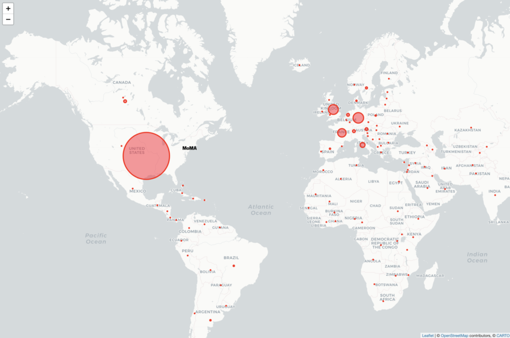
All of the recommended mapping tools are fascinating but I have some experience writing javascript code so I chose to do the map in Leaflet. I did some quick tutorials to familiarize myself with the tool and then Googled some different ways of handling this data. The simplest option was using JSON arrays for each plot point, rather than connecting the map to a .csv file. So, back to my spreadsheet, I converted # of artists per nationality to a percentage of the whole and added a column to concatenate the columns. This last column was copied/pasted into javascript. Finally, in my code, I created a formula for the plot point “circles” to convert the percentage of each nationality to a radius in meters. This needed some trial and error as I wanted the plot points to be big enough to be seen at a specific map zoom, while also maintaining the proportions of the data. The resulting map shows plot points of nationality tied to countries, which are clickable to see the # of artists belonging to that nationality.
Conclusion
Arguably, MoMA has been the international gatekeeper of modern and contemporary art since its founding in 1929. Situated in New York City, it is no surprise that most artists in MoMA’s collection are American and European. British, German, and French artists are well represented. From the map, it’s clear to see MoMA artists have many nationalities but there are also nations that are not represented at all in MoMA’s collection.
Flaws (there are many)
- How recent is the data set provided by MoMA? Although github says the files were updated “27 days ago”, it’s not clear what was updated.
- How accurate is the data set provided by MoMA? Are they modifying the data to tell a story which suits the institution?
- Issues of nationality vs. race vs. citizenship vs. ethnicity. I found myself questioning the meaning of these terms through this process. Additionally, a nationality is not only tied to a country – artists are Native American, Palestine, Catalan and Canadian Inuit, for example. These are not not countries included on the map so I had to use artistic license to plot these places. Also, as I mentioned previously, 3,000+ artists do not have nationality in the dataset.
- Latitude and longitude coordinates are placed at the centers of countries which do not fully represent “nationality”.
- The sizes of my plot points are subjective, based on what I think would be a good visual representation of proportional size.
- Art collecting by an institution is intrinsically related to colonization and my map compounds this issue by using a tool of colonization – the map itself.
Possibilities for Improvements
- An interactive map that allows a view of the data over time to reveal collecting habits of the museum. When were European artists most collected? What is the nationality of artists collected in recent years? Do the collecting habits change based on the curators at the time? Do the collecting habits reflect concurrent events such as wars or social movements?

This entry is licensed under a Creative Commons Attribution-NonCommercial-NoDerivatives 4.0 International license.
I love your map idea. I’m very curious to know how MoMa handled issues of artists’s nationality say from East and West Germany or the former Yugoslovia (as I see artists included from those areas). I am also curious to know if the nationalities are self-reported by the artists or assigned by the museum.
Something else I’d be very curious to know is how these numbers change if we looked at what art is part of the permanent, displayed collection, what art appears in exhibitions, and what art is kept in storage. I have a friend who works at The Met, and it seems like the vast majority of the large museum holdings are in storage, with a portion on loan at other institutes. So many questions!