

In 2018 I had the fortune of visiting Langston Hughes’ house in Harlem during a children’s program organized by the independent bookstore Revolution Books. In the brownstone’s living room, an actor read his favorite poems by Langston Hughes, including one that wasn’t exactly appropriate for children: Harlem Sweeties, an ode to the sensual beauty of the women of Harlem, whom he depicts as delicious desserts and candy. I really loved the poem, not only for its tongue-in-cheek tone, but because it perfectly described the great diversity of Sugar Hill, the neighborhood where I was living at the time.
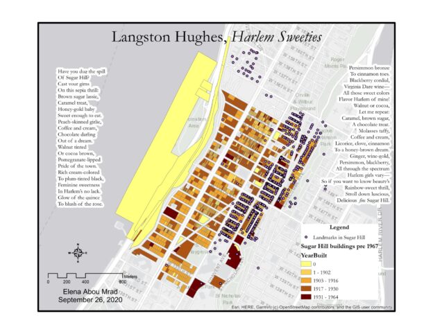
While working on my map, I asked myself: what did Sugar Hill look like in Langston Hughes’ time? Therefore, I decided to create a map of the neighborhood that depicted the buildings before 1967, the year that Hughes passed. I used ArcGIS because I felt comfortable with the software and its tools. However, this choice came with its sets of problems, as I will describe later in the post.
Step-by-Step Process
- I selected a light gray basemap from ArcGIS’s options, to give a simple background to my map.
- I imported data from the MapPLUTO database, a dataset of land use and geographic data collected by NYC agencies.
- To draw a map of Sugar Hill, I selected the parts of the map that had the neighborhood’s ZIP code, 10031. (Select by Attributes)
- From this group, I selected only the buildings built before 1967. (Select by Attributes)
- I decided to indicate the age of the buildings with a color scale in the tones of beige and brown. The newer the building, the darker the color. I chose this color palette because it reminded me of the colors that Hughes mentions in Harlem Sweeties
- Sugar Hill is a Historic District, so I decided to import the Designated and Calendared Buildings and Sites dataset from NYC Open Data to show which Sugar Hill buildings are landmarks.
- I wrote the text of the poem on the map and changed the font to make it look nicer.
- I edited the layout of the map, adding a legend, a compass, and a scale indicator.
- I created JPEG and TIFF files of the map.
What you don’t see in the map, AKA problems
While working on my mapping assignment, I kept a little journal of my progress and lack thereof. I found this process very helpful when learning how to code in prof. Smyth’s Software design lab. Therefore, here’s a list of what you can’t see in the map, but was a part of the process:
- The hour I wasted pursuing other ideas and getting frustrated because I couldn’t get the data to display on the map the way I wanted. I tried to work on:
- A map of NYC Restaurants divided by cuisine, using the DOHMH New York City Restaurant Inspection Results;
- A map of trees in NYC, to try and find the trees mentioned by Walt Whitman in his poems. Data from the 2015 Tree Census;
- My personal favorite: a map of Central Park squirrels by color. Yes, there is a Squirrel Census.
- The hour I wasted trying to georeference an old map of Williamsburg on ArcGIS.
- Every time ArcGIS crashed, or my computer crashed. Basically, every time I gave the software a command, it took 5 minutes to complete the work. I took a bunch of coffee breaks.
I decided to share the challenges I encountered while working on this project because, when we look at maps, we don’t usually think about the process behind them. Maps on the internet look great and present the information as a fact, and not as the product of many small and big decisions. I think my map looks pretty nice in its final form, but I think it’s useful to show not only the destination, but also the bumps in the road.