Author Archives: Kevin Pham

A Digital Pedagogy of Play?

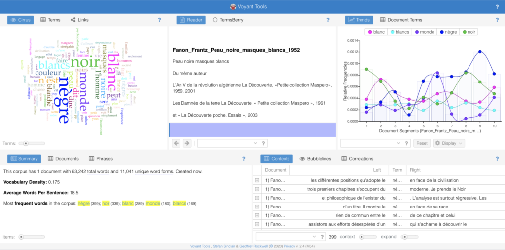
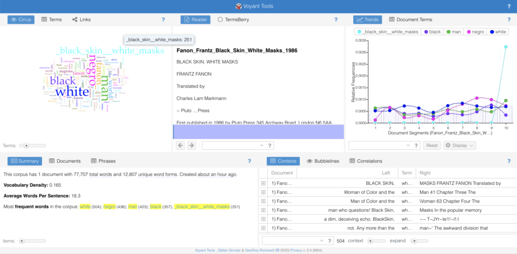
My thinking on the readings from the week on Digital Pedagogy is generally scattered, but seems to boil down to what the limits of the academy are, and how the academy as a site of knowledge production has proven itself to be inextricable from other normative institutions. Without getting into the history of the academy and the university in this post, a question I have is: How are the ways in which we think and imagine within the academic classroom subtended by the academy’s relationship to normative power structures (namely, the state, capital, corporations, etc.)? As such, how does this pose a problem to the field of Digital Humanities and its subfields, such as postcolonial DH?

One of the ways these questions came to mind is from reading Lizabeth Paravisini-Gebert’s “Review of Puerto Rico Syllabus: Essential Tools for Critical Thinking about the Puerto Rican Debt Crisis”: While Paravisini-Gebert’s analysis of the syllabus’ content is important, I’m interested in the ways she went about critiquing the medium of the syllabus—specifically, its design. For example, she notes the following:

“The landing page, where the viewer now scrolls down to access the “About,” “Goals,” and “Project Leaders” sections, in addition to a lengthy video titled Exploring the Puerto Rico Syllabus Project, could benefit from being “nested” horizontally below a footer image in order to keep navigation functionality simple. As it stands now, there is too much crucial information about the project “beneath the fold.” A comparison of the site to the other public syllabi sites highlighted on the “About” page shows the number of missed opportunities at the design level…

Given the wealth of visual materials associated with the themes of debt, development, migration, and natural disasters in Puerto Rico (which include the works of artists responding to the 2017 hurricanes), their incorporation into the site would both contribute to its appeal to readers and provide a rich archive that could be easily incorporated into the syllabus itself—not as mere points of visual interest but as a fundamental contribution to the usefulness of the site.” (Paravisini-Gebert)

As someone who works as a product designer at a tech company, I find these critiques of the site’s design at the level of “functionality,” “simplicity,” and “usefulness” eerily similar to terms used within “design thinking” and “human-centered design” practices within the tech industry, without an interrogation of the fact that the desire for functionality, simplicity, and usefulness are leveraged not necessarily for the sake of accessibility, but for the purpose of making consumption and the accruing of profit easier and thus more productive. I’m interested in how the ways in which we desire technology to be designed and interact is subtended by the tech capitalism, and what that means for “the spirit of making” within the Digital Humanities. Because indeed, the calls for “creativity and innovation, critical thinking and problem solving, communication and collaboration” (Risam, 92) are also very similar to those of the 1960s cyber-counterculture that led to the formation of the tech industry as we know it. It would be wise of us, then, to be critical in interrogating not just how normative power structures subtend out imagination of what technology can look and feel like, but also how calls to imagine and create (and, I would argue, “care”) are grounded in an optimism that can be easily co-opted by the very structures we are seeking to critique.

This is where I think play can play an important role in digital pedagogy. Going back to interaction design: To counter the capitalist desire for productivity and ease of use, what would it look like to create an interface that is intentionally hard to use? Or perhaps, an interface that’s intentionally slow (see: Katherine Behar)? Or even, one that is nearly unusable? As such, how can we use play to reveal and resist the contradictions that lie at the heart of normative and violent structure? I think these are questions that could be useful, especially in a postcolonial digital pedagogy: For if we’re looking to critique how normative (white) structures have contributed to “constructing a world that privileges the stories, voices, and values of the Global North and how digital cultures in the twenty-first century reproduce these practices” then its just as important to consider how are capacities to create and imagine are limited by this very construction. Intentional play, I think, is a mode from which we can take a step back, and start to question what and how we’re making, as well as think about what we’re up against. This sort of focus, to me, seems necessary in a digital pedagogy.

CUNY Academic Works Workshop

A couple weeks ago, I attended a workshop by Jill Cirasella—Librarian at CUNY on Scholarly Communication—about CUNY Academic Works. As a follow-up with other talks and workshops on open/public access scholarship understood generally, this talk focused on CUNY’s addition to such work: CUNY Academic Works. The platform is a service of the CUNY libraries dedicated to collecting and providing access to the research, scholarship, and creative work of the CUNY; in service to CUNY’s mission as a public university, content in Academic Works is freely available to all.

In distinction from open access platforms, CUNY Academic Works is a public access service, in that it does not require an open access license—all that’s needed is rights to share your work online. CUNY Academic Works, as Jill lays out, is a great opportunity for CUNY-affiliated people to make their work publicly available, and reach wide audiences, including readers you’d have never imagined would read your work. In fact, you can see the ripple effect of your work with visualizations provided by the service.

The service provides:

  • online access to works no otherwise available
  • cost-free online access to works paywalled elsewhere
  • long-term online access to works on impermanent sites

While most of us may be familiar with the platform in that GC dissertations, theses, and capstones projects must be published on it, with CUNY Academic Works you can also upload:

  • Journal articles
  • books and book chapters working papers/reports
  • datasets
  • conference presentations
  • reviews of books, films, etc.
  • open education resources (OER)
  • and other forms of scholarly, pedagogical, or creative work

While a lot of different file types can be uploaded to CUNY Academic Works, dynamic creations can’t be uploaded. Usually, code is uploaded in such cases, and a lot of DH practitioners upload .warp files.

Jill then went into general concepts around publishing, mentioning that in most cases and with most publishers, you are allowed to post some version of your article, noting that most allow some form of self-archiving. Additionally, you can sometimes negotiate your contract, and specifying the terms under which you’d like to publish. You can also sometimes ask after you’ve published that you may want to add to the repository—CUNY Academic Works being one option. She recommended NOT doing so on commercial sites, such as ResearchGate and academic.edu, as these sites sometimes end up being sold, meaning everything disappears. Additionally, these companies actively sell user data for profit.

In regards to actually uploading to CUNY Academic Works, the process is relatively straightforward. You don’t need to create an account with CUNY, but you will need to be affiliated. Submission provides the following inputs:

  • List of places your work will be submitted and live (i.e. GC, State Island, etc.) but can indicate your affiliations later
  • Document type – Publication date
  • Agreement of ownership
  • Embargo period (i.e. a period during which it is unavailable to the public)
  • Keywords
  • Disciplines
  • Language
  • Abstract Field
    • Shouldn’t be copy-pasted; Google scholar will match the abstract to the paywalled version, and may not share the CUNY academic works version if the abstract is the same
  • Additional comments
  • Upload file
    • Can also upload additional files

Lastly, Jill gave some advice to authors when considering publishing options, which I found heartening (the following is directly from her slides):

  • Ask yourself why you write (To share ideas, advance theory, add knowledge? To build a reputation? To be cited? To get a job? To get tenure and promotion?)
  • Research any journal/publisher you’re considering. (Quality? Peer reviewing process? Copyright policy?)
  • If you have the right to share your article online, exercise that right! (Whose interests do paywalls serve?)
  • If you don’t have the right share online, request it.

Text Mining Praxis Assignment: Fanon’s ‘Black Skins, White Masks” in French vs. English

For my text mining assignment, I wanted to see what would happen if I tried separately inputting a book in two different languages. In particular, I wanted to see if Voyant could capture/visualize any translation decisions or “glitches in translation” that may come up when a language is translated from one language to another: Would some words appear more often in one language than another? Would some words not translate clearly? Can translation decisions be captured and understood clearly through a tool like Voyant?

I chose to input PDFs of Frantz Fanon’s 1952 book Peau Noire, Masques Blancs (French translated to English as Black Skins, White Masks), and its 1986 English translation by Charles Lam Markmann. Both versions were downloaded from Monoskop. In both texts, I had the word clouds show just the top 125 words of each text.

From inputting the two translations into Voyant, the most noticeable was a metadata issue, in that Voyant indexed “_black_skins_white_masks” from the English translated version, causing the “word” to take up a lot of space in the word cloud. Underlines were an issue for a few terms in the English version’s word cloud, as well as inclusions of Fanon’s name as a term. These, I presume, are pieces of metadata hidden throughout the PDF in ways that I cannot trace easily through a simply “ctrl+find” on my Preview application.

In regards to the actual terms, there were clear discrepancies in the frequency of term usage between the English and French versions of the text (at least from the eye of someone who doesn’t know French). To name a few examples: “Noir” was used 339 times, while “black” was used 357 times; “negrè” was used 399 times while “Negro” was used 436 times; “blanc” was used 289 times while “white” was used 504 times; and “l’homme” was used 94 times while “man” was used 423 times. On the one hand, as someone who does not know French, there may be other words in French taht were used in place of, say, “man”, that just “l’homme” and may diagnose the large difference in usage between the two terms.

On the other hand, what is made clear through the word clouds is that specific decisions are made in the act of translation that shows the non-linearity and non-neutrality of the very act. While this is a relatively obvious and drawn-out claim made time and again, it was interesting to see it happen in front of my own eyes. Additionally, its interesting to think about how my understanding of the text may change if/when I learn French and read the text in its original language. This made clear to me why one may prefer different translations to others, and how specific terms may not only better depict a certain claim, but also perhaps historicize and contextualize these claims in ways that particular translations may not be able to communicate.

Overall I found this assignment to be interesting and makes me think about language as a technology/technique in and of itself: The non-neutrality of language, perhaps, as a way in which specific ways of knowing and understanding are brought to the forefront in ways inextricable from power—which is something that Sylvia Wynter has talked about before.

Mapping Assignment: 2018 ICE Removals

Because my experience in digital mapping and visualization is little to none, I used this assignment as primarily an opportunity to quickly experiment and play around with different ways to visualize simple data, as well as think about the ways in which my ineptitude may lead to results that are perhaps misleading, and thus revealing the subjective nature of maps/visualizations. I decided to download the free trial of Tableau, since it was noted as the easiest of the visualization programs talked about throughout the course. The large amount of documentation on Tableau added to my attraction to the program, though I ended up not using much of it.

After thinking about it for a bit and scrolling through some public datasets, I decided I wanted to map ICE deportations in the United States. I initially wanted a dataset that would specifically note the racial demographics of deportations, since it was something I thought could be useful. However, there weren’t any readily-available datasets that provided such demographics, so I settled for basic datasets I found on the ICE webpage, for deportations in 2018, organized by month and “area of responsibility” (e.g. “Atlanta Area of Responsibility”). Because this is a mapping assignment, I assumed this data set would work easily if I just uploaded it to Tableau, but realized I need to manually input the state each “area of responsibility” was in (which was organized by city, generally) in order for it map on easily to Tableau’s system. So I put the data I needed into a Google Sheet.

One issues I ran into when copy-pasting this data and inputting the states is that two areas of responsibility, Washington D.C. and the National Criminal Analysis and Targeting Center (NCATC) don’t have explicit states that they lie in (or at least that I know of). The way I could’ve offset this, I suppose, is getting coordinates of every area of responsibility, but I didn’t really know how to do that, so I ended up just not including these last two areas. This highlights the subjectivity of my resulting map, clearly noting this visualization as one of capta, in the words of Drucker.

Once I’d input the data into Tableau, I spent a lot of my time just playing around with different ways to visualize the limited data I had. Though the limitations were inevitable and predictable, I had a good time just playing around with how things looked when I tried using different colors, shapes, etc. At the end of the day, predictably, if I visualized the data certain way, it wouldn’t really communicate what the data was meant to portray, in the sense that it doesn’t align with the quantitative values in a way that is immediately obvious. However, I found it a fun exercise to think about how visualizations can be used in such a way to move against the grain of normative modes of visualization; in other words, visualizing the data in a way that doesn’t follow established principles or customs.

Additionally, notice that the map shows “2 unknown” on the bottom right of the screenshot, which indicates my failure to include the deportations conducted by the two areas of responsibility noted above.

Visualization and an Ethics of Opacity

From trying to connect the dots of this week’s readings, I keep coming back to Cottom’s allusion to Posner when attempting to articulate the conundrum of power in distant reading/quantitative textual analysis. Specifically, Posner asks, “What would maps and data visualizations look like if they were built to show us categories like race as they have been experienced, not as they have been captured and advanced by businesses and governments?”

In “What is Visualization?” Manovich walks us through a brief history of information visualization, noting reduction and spatiality as key tenets of the practice. According to Manovich, information visualization’s emphasis of the former “parallels the reductionist trajectory of modern science in the 19th century” that emphasized a simplified and building-block-like view of human and natural systems. But with the advent of new media and advancements in technology in general, Manovich denotes a shift in infovis practice characterized by the potential of visualization without reduction. In a very different way but with similar goals, Drucker’s “Humanities Approaches to Graphical Display” counters reductive attempts/practices of information visualization that ignore the nature of data itself as constructed from subjective capture, observation, and interpretation. In refusing realist conceptions and data and visualization, Drucker poses that “all data have to be understood as capta and the conventions created to express observer-independent models of knowledge need to be radically reworked to express humanistic interpretation.” As such, Drucker invokes a “humanistic approach” to re-imagine information visualizations as “expressive metrics and graphics” that communicate “the subjective expression of perceived phenomena.” By re-considering infovis as phenomenological experiences that necessitate reckonings of time and space, Drucker attempts to refuse the reductive conception of data (and visualization) as (instantiations of) objective fact. I enjoyed the images that Drucker provided that articulated the ways in which affect distorts individual perceptions of time and space, highlighting the “co-dependent relation between observer and experience.” I also applaud her refusal to “simply introduce a quantitative analysis of qualitative experience into our data sets,” and to instead “[shift] its terms from certainty to ambiguity,” marking her approach as less an alternative than a disruption. This approach does what Jess Marie Johnson claims as necessary to good visualization, in that it “asks provocative questions that leave users with more questions than answers.”

However, while Drucker considers how visualizations that index gender are grounded in assumptions of gender itself, she (perhaps necessarily) leaves out articulations of how categories of race, gender, and sexuality orient subjective experience, and how that might be visualized. This is a bit disappointing, for as Cottom makes clear, it’s imperative that the power relations these categories undergird are thought through. From reading her piece, I assume that if given this task, Drucker would articulate these categories as animating the affective, and thus spatio-temporal, experiences of certain individuals differently, given how one may encompass intersections of these categories, thus highlighting the subjectivity of these experiences—to which I would argue that such an analysis is not enough. To aptly illustrate how the minoritized move through the world, visualization must also interrogate how these categories determine (claims to) relationality itself, which I don’t think Drucker, nor Manovich, reckon with enough.

As philosopher Axelle Karera posits in “Blackness and the Pitfalls of Anthropocene Ethics,“ relationality is “inherently not only a position that the black cannot afford or even claim. The structure of relationality is essentially the condition for the possibility of their enslavement.” In this vein, I would argue that Drucker’s inability to articulate/elision of race into her approach is due to humanism’s dependence on the subject-object dichotomy; for, as Drucker states, “the humanistic concept of knowledge depends upon the interplay between a situated and circumstantial viewer and the objects or experiences under examination and interpretation. That is the basic definition of humanistic knowledge, and its graphical display must be specific to this definition in its very foundational principles.” However, there is no interrogation of who has historically been deemed subject or object. Indeed—in thinking through Karera and other scholars like Calvin Warren and Saidiya Hartman—if you’re considering the history of the Black, then you must recognize its entanglement of existence with the category of “the object” or “the thing” to begin with. It’s impossible, then, for visualization to assume a humanist approach that includes the Black, and articulates an alternative to (racial-hierarchical) relationality, when it cannot presume the Black as subject in the first place. A humanist approach that centers subjective experience cannot elide the force of race as [Human]ism’s orienting principle.

In fact, a humanist-phenomenological approach to the Black may not be an accurate one at all: In discussing her book Wayward Lives, Beautiful Experiments with fellow Black studies scholar Rivzana Bradley, Saidiya Hartman elaborates that her piece considers “ways to think about collective life outside of the subject-object distinction by attending to the deep, shared embodiment of promiscuous sociality, to be situated in the urban sensorium in a way that exceeds and undoes the very notion of subjective interiority… to think about these forms of intimacy and sociality, as opposed to the experience of an individual in the world.” As opposed to Druckers, Hartman, in her work, displays an acute awareness of how co-dependence/entanglements are shaped by categories of representation and Human hierarchies. Thus, if we are to take up Johnson’s question—if “multidimensional data visualizations or polysingular… renderings of the Thurston or Affir family trees better capture the dense networks of kin, mutuality, and precarity at play in bondage”—then perhaps we need to think whether there can be a humanist approach to visualization that can take up networked formations, yet refuse the subject-object dichotomy—and whether that can be called a humanist approach at all.

The subject-object dilemma also becomes apparent in Guiliano and Heitman’s piece as they critique the open-source data movement and the susceptibility of Native images “to infinite and unanticipated refraction…the endless internet remix and/or misuse.” In their interrogation of the 2013 project “Performing Archive: Curtis + The Vanishing Race,” the authors note how the project’s team ironically reproduces the very (colonial) acts of de-historicization/contextualization that they claimed to counter, by re-centering the archive for their own gain. The authors articulate the problem of the project—and of open access writ large—as its refusal to engage with the objects’ producers (here Native Americans) and contexts of production, while treating their objects/knowledge as a commons—effectively reproducing colonial logics that degrade “Native people as “prop” or an object upon which history and historical actors act” (italics added). The Native person as object and white person as subject, in this way, highlights humanism’s subject-object dichotomy as oriented by categories of representation: Questions of who uses (or visualizes) the commons and who is the commons are answered by racialized economies of dispossession, historically upheld by centuries of white violence.

Overall, what Guiliano and Heitman’s piece reveals to me, when understood in tandem with my reading of Drucker, is that perhaps questions of race in regards to data acquisition, mapping, and/or visualization necessitate an ethics of opacity and non-relationality—the option to refuse vis-/ibility/ualization that does not sufficiently articulate under whose terms information will be deployed. While an acknowledgement of data’s subjective construction is indeed necessary, an ethics of opacity troubles why visualization is necessary in the first place, and who the ones doing the visualizing are.

[D]igital [H]umanities vs. digital humanities: DH and/as the Digital Black Atlantic

I’m interested in how this week’s readings, over time, seem to draw out this tension between what could be understood as “Digital Humanities” and “digital humanities.” I understand the former, with first letters intentionally capitalized, as an attempt by scholars (as seen especially in the readings from 2012-2016) to understand a field’s relationship to the academy. Specifically, the Digital Humanities, as an academic field and institution itself, is continuously trying to balance the potentially subversive use of technology with traditional modes of knowledge production. On the other hand, “digital humanities” seems to act as the very refusal of these traditions: the refusal to acknowledge the white, Western university as epistemic authority, and the refusal to derive an understanding of its Value from it. It’s in finding a liminal position within these positions (based on the readings) that I find a lot of DH scholars. In particular, Spiro’s attempt at defining the field’s values—such as diversity and openness—can perhaps be understood as one possible way to alleviating this tension, in that defining values provides the specificity needed for the field to be taken seriously, yet are defined in such a way that opens it up for conversation, interdisciplinarity, and new “relations.”

However, if “A DH That Matters” makes anything clear, it’s that our world in crisis has revealed that out very understanding of relations are subtended by histories of slavery and colonialism—relations that are undergirded by race, gender, and sexuality. Thus, I found myself trying to define DH around projects like “The Digital Black Atlantic” and The Early Caribbean Digital Archive. Specifically, what these projects communicate is that the subversive potential of DH lies not in the technology themselves, but in how DH invites us to rethink what we consider our sources and sites of knowledge production: What would it mean for us to read the margins as not secondary, but primary sites of exploration and knowledge? A theoretical/methodological lens of the “Black Atlantic”, Josephs and Risam argue, “negotiates movement across time and space, forging varied spatial and temporal relationships,” through re-mixing the archive and reconfiguring memory in the present. In calling attention to and re-mixing “travel narratives, novels, poetry, natural histories, and diaries” as a way to disrupt the Western archive, The Early Caribbean Digital Archive does just that; acting as, what Donaldson would call, an “ephemeral archive” that speaks to “the transient nature of modern memory,” and emplacing the past, present and future together. From these projects, I see the potential for DH to cultivate a politic that celebrates and takes seriously overlooked, non-traditional texts—which, in this moment, may look like tweets, Instagram infographics, hashtags, etc.

In this way, what these projects—and a Black critical lens in general—provides “digital humanists” is, perhaps, the very refusal of the “humanist” concept itself. Indeed, Black feminists like Sylvia Wynter, Hortense Spillers, and Christina Sharpe have long written about how the figure of “The Human” has been historically constructed as the white, cis-heterosexual male—a colonial technology that defines Blackness as non-human, imposes relationality as hierarchy, and justifies centuries of brutality and violence along lines of race, gender, and sexuality. If we take this as our starting point, then the remixing of the archive with a Digital Black Atlantic lens can be understood as not only the act of recovering the past, but an onto-epistemological practice that refigures ways of Being and Becoming: specifically, ways that refuse the sovereignty of The (rational, individualistic, and technocratic) Human. And so I wonder: If we are to take these works seriously, then would a digital humanities for the 2020’s and beyond be better understood as a digital non-humanities? And what would that look like?