

Because my experience in digital mapping and visualization is little to none, I used this assignment as primarily an opportunity to quickly experiment and play around with different ways to visualize simple data, as well as think about the ways in which my ineptitude may lead to results that are perhaps misleading, and thus revealing the subjective nature of maps/visualizations. I decided to download the free trial of Tableau, since it was noted as the easiest of the visualization programs talked about throughout the course. The large amount of documentation on Tableau added to my attraction to the program, though I ended up not using much of it.
After thinking about it for a bit and scrolling through some public datasets, I decided I wanted to map ICE deportations in the United States. I initially wanted a dataset that would specifically note the racial demographics of deportations, since it was something I thought could be useful. However, there weren’t any readily-available datasets that provided such demographics, so I settled for basic datasets I found on the ICE webpage, for deportations in 2018, organized by month and “area of responsibility” (e.g. “Atlanta Area of Responsibility”). Because this is a mapping assignment, I assumed this data set would work easily if I just uploaded it to Tableau, but realized I need to manually input the state each “area of responsibility” was in (which was organized by city, generally) in order for it map on easily to Tableau’s system. So I put the data I needed into a Google Sheet.
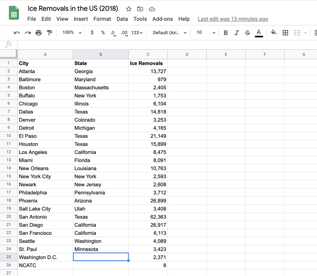
One issues I ran into when copy-pasting this data and inputting the states is that two areas of responsibility, Washington D.C. and the National Criminal Analysis and Targeting Center (NCATC) don’t have explicit states that they lie in (or at least that I know of). The way I could’ve offset this, I suppose, is getting coordinates of every area of responsibility, but I didn’t really know how to do that, so I ended up just not including these last two areas. This highlights the subjectivity of my resulting map, clearly noting this visualization as one of capta, in the words of Drucker.
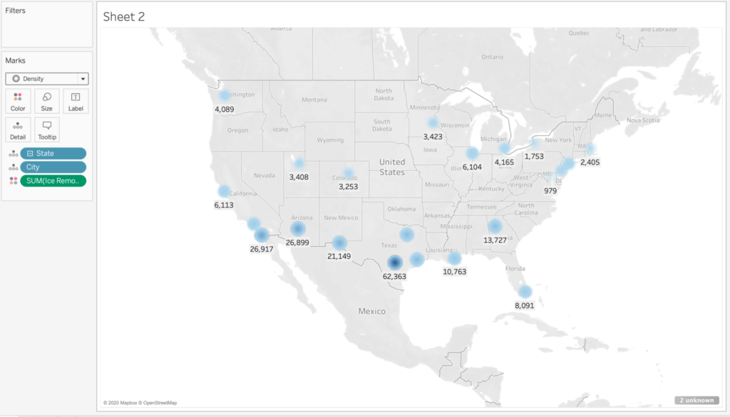
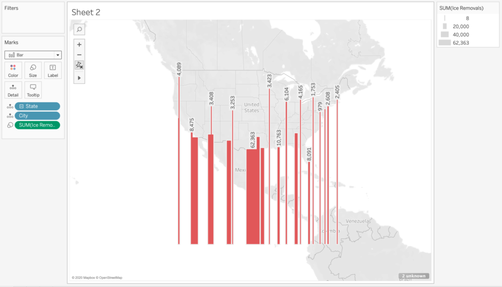
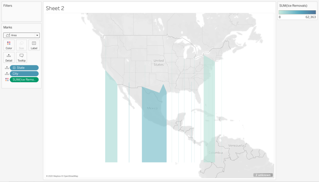
Once I’d input the data into Tableau, I spent a lot of my time just playing around with different ways to visualize the limited data I had. Though the limitations were inevitable and predictable, I had a good time just playing around with how things looked when I tried using different colors, shapes, etc. At the end of the day, predictably, if I visualized the data certain way, it wouldn’t really communicate what the data was meant to portray, in the sense that it doesn’t align with the quantitative values in a way that is immediately obvious. However, I found it a fun exercise to think about how visualizations can be used in such a way to move against the grain of normative modes of visualization; in other words, visualizing the data in a way that doesn’t follow established principles or customs.
Additionally, notice that the map shows “2 unknown” on the bottom right of the screenshot, which indicates my failure to include the deportations conducted by the two areas of responsibility noted above.

This entry is licensed under a Creative Commons Attribution-NonCommercial-NoDerivatives 4.0 International license.