A few years ago I worked on an independent project that included some analysis of Enver Hoxha’s rhetoric during his rule, from WWII until the end of his life in 1985. More specifically, I looked at how Hoxha redefined terms central to his rhetoric over and over again to serve his political needs, especially during moments of political upheavals. I read through his body of work looking for the words ‘liberal’ and ‘conservative’ in over a half century old collection of his writings.
For this textual analysis assignment I wanted to see how these tools could help with my Hoxha research, as it is also central to what I am hoping will become my capstone project. Luckily there are a few online archives that contain Hoxha’s work. I collected the text from Marxists.org, a volunteer supported project that contains his complete works and a few selected English translations. The translated work does not include much of the time period or topics that would be useful to my project.
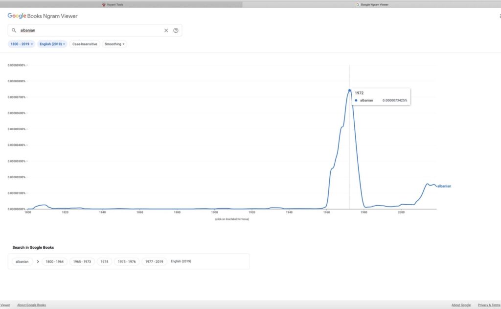
I began the analysis process by attempting to analyze the Albanian text. The results were what I expected: Voyant Tools produced only an error message, and Mimno could not read Albanian. I also used Google Ngram to see if there was a trend that pointed out a crucial date in my research (1972) and the results were really surprising, as Albania was completely closed off at the time and I did not realize the events of 1972 were felt outside the country.
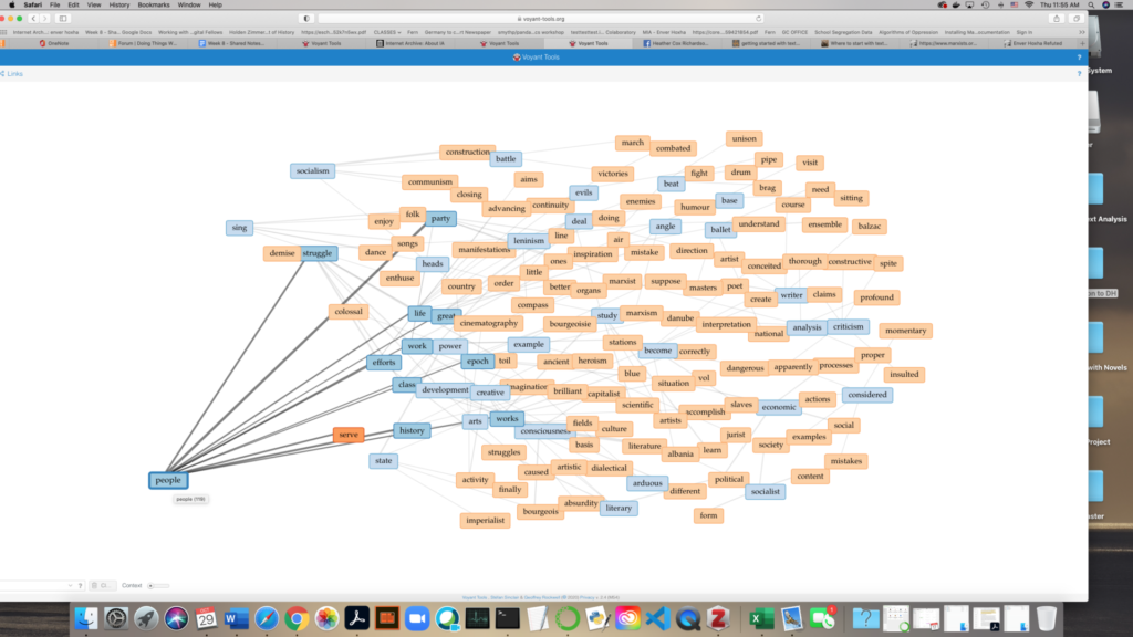
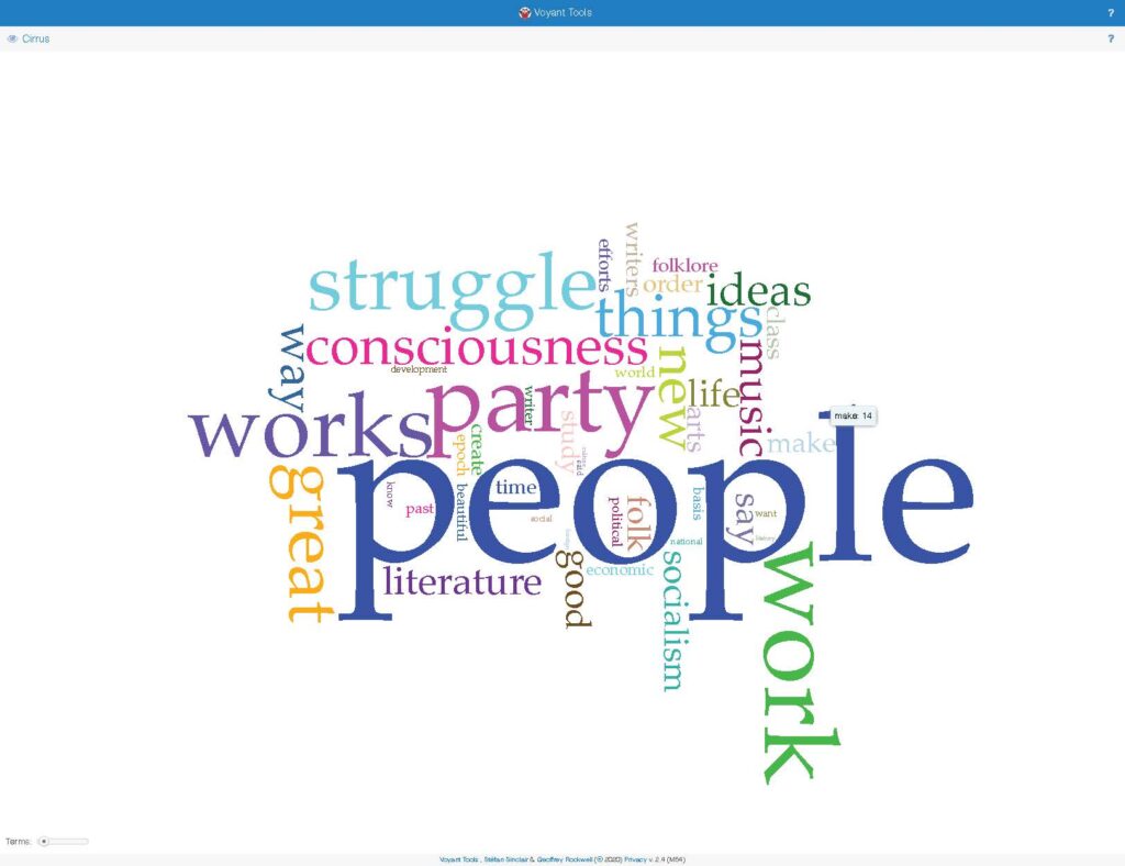
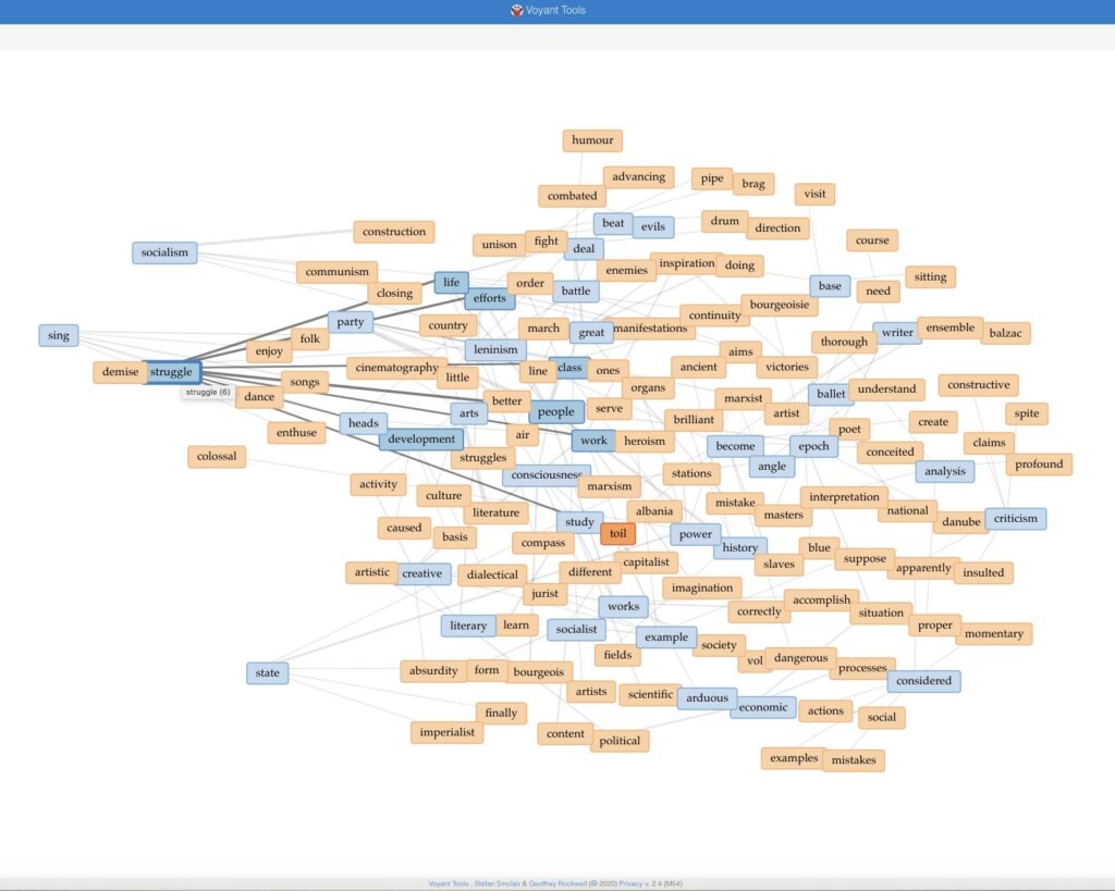
I decided to focus on Voyant Tools because it was much more accessible, and continue to work with Hoxha’s English text. I played around with tools available on Voyant, looking for any relationship or word that could indicate a pattern I had not noticed by painstakingly reading through the text. Ultimately I found nothing useful for my research and I do not anticipate that to change with the rest of the English text. Although my project ideally lends itself to textual analysis, as it is looking at terms over a period of time, I don’t expect the relationships or patterns that could emerge from a textual analysis to dramatically affect my research. But I remain open to the idea that I might find more supporting evidence this way. I would love to have the opportunity to use the original Albanian and find out, because the visualizations on Voyant are great and this was fun.
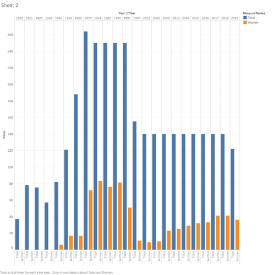
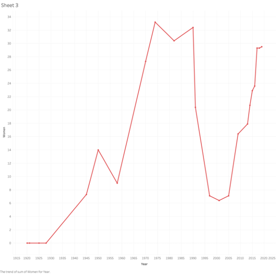
Keeping with the theme from my first attempt from the mapping exercise, I decided to visualize the representation of women in the Albanian parliament for 1920-2019. This data was collected from the Albanian Institute of Statistics. I am familiar with some of these numbers because I have referenced in a paper a few years ago. I was looking forward to learning about later sessions of the government, and also to find out what the viz showed about women’s representation. The data is pretty straight forward, it looks at the number of women representatives in each Albanian legislature, and I was hoping the graph would mark a few points of extreme sudden highs and drops.
The first issue I had with the viz was that legislative districts have been redrawn many times over this period, and this visually seemed to exaggerate the gender disparity, thus rendering the path of women representation less obvious. I decided that instead of comparing male and female representatives, I would include the total number of the representatives and the total number of women for each administration. This made the numbers of women legislators a bit more clear. I decided to focus on this viz and also produce a simple graph of the percentage of women in parliament, to be able to look at the trajectory only. This trajectory is not the steady increase that one might expect; it marks extreme highs and lows in representation that bring up a few questions.
This graph shows the number of women and men representatives for each congress.This graph shows the number of women representatives against the total number of representatives.This graph shows the trajectory of women representation in parliament from 1920-2019.
The first moment on the viz is the complete lack of women’s presentation from 1920 until after WWII. This time marks the rule of King Zog, and later Mussolini, followed by WWII, but this is not surprising or interesting for the purposes of this exercise. Another notable moment is the sharp increase of representation of women in the late 1970s. This was the peak of women’s emancipation movement by the Hoxha regime, but what is interesting is that in the middle of a huge campaign to include women in his government, that number begins to decrease in the 1980s and picks up again after his death and during the democratic movement in 1990. Albania was not a democracy at this time, and these representatives were hand-picked from the ranks of the communist party, which included as many women leader as men. Whey did Hoxha elect to decrease the number of women? What might perhaps be the most shocking part of the graph, is that women’s representation sharply decreases in the legislatures after the fall of communism. In 2001, there were only 9 women in a legislature body of 131. Women’s presence has steadily increased since 2005 and it is now at almost 30%. What caused this drop and what changed after 2005?
I began this exercise by installing QGIS, which created some issues with my computer and was not the right tool for a person with no experience in mapping. I applied for both the Carto and a Tableau free student account, and began the free trial in Tableau desktop. In the end, I decided to use Tableau Public, because the interface was more simple and instructional videos were accessible to a novice like me. My original intention was to map a timeline for women’s right to vote globally, but given the difficulty in finding data (combined with my technical ignorance) I moved on to the area I am most comfortable with. I attempted to map out the timeline of women’s right to vote in Europe.
I wanted to move away from a simple timeline, which leaves out many important details and can be misleading about the real political and cultural position of women at the time. I wanted to keep the data as simple as possible, so I selected a list of countries with the dates when women were allowed to vote from womensuffrage.org. The list is not comprehensive, but it contains some detail on different forms of “voting rights.” I moved the data into a text file and attempted to find ways to incorporate details, such as the legal limitations based on education level, age, property that still prevented women from voting in many of these countries. One obvious error embedded in the data is the anachronism of listing Bosnia and Herzegovina in 1949; decades before the country existed.
I decided to leave this information in for the purposes of this assignment. Ultimately, I could not figure out how to include the additional data, and I ended up with different versions of the same timeline map I was trying to avoid. I would like to return to this project and figure out a way to incorporate the details I had to omit, such as which women could vote, or include places were women later lost the right to vote. I was thinking about Visualizing Sovereignty over the course of this experiment, not only because I faced many of the same problems, but because I think it would be interesting to map out how women’s right to vote in European powers interplays with women’s suffrage in the Caribbean. Here are a couple of visualizations from this map.
My goal for this exercise was to build an understanding of visualization tools and the mapping process. I have wondered about the starting point for many of the visualizations we have seen in this course, especially those that require very large datasets. I felt completely lost about how to begin this project, but through the process of researching data and solving technical issues, l discovered a great volume of databases open and readily accessible online. There are tremendous governmental resources for spatial files, climate, economic, and demographic information readily available. I also found many technical resources, such as blogs with problem solving ideas, like easy ways to find latitude and longitude for a great number of data.
Map 2: NYC Poodles
I continued to explore what Tableau could do as practice, but also because I wanted to produce something lighthearted. It has been a very difficult and frightening time since RGB’s passing, and I was looking for some joy in this process. In my house a lot of happiness comes in the form of a 9 week old puppy (Kuma the sheepadoodle), so I decided to look for data on dogs in NYC. Years ago, I saw a map of the most popular dog breeds and names in NYC and I hoped to find different ways to present NYC canine data. While this process did not produce the political and interpretative challenges of the previous map, it taught me a lot about the technical issues, and reliability of data.
I downloaded the NYC Dog Licensing Dataset from the NYC OpenData. I attempted to join a spatial file of NYC boroughs with the dog breed information, but failed every time. The troubleshooting process for this issue gave me the most in terms of technical understanding. I changed text to ‘string’, renamed and removed columns, learned to combine latitude and longitude to make a point, but there was one major issue with the dataset that was not workable: the zip codes were incorrect, or at least they were not exclusively NYC. This presents a challenge when trying to map out NYC dogs. See Map below.
Ultimately I was able to visualize the data in a few ways. In the end I discovered that (if we’re to trust this viz) my zip code is tied for the largest number of poodle mixes in the city, although it is not the most popular breed. I could not figure out why the measure values show up this way, but the ratio of poodle mixes shown looks accurate.
For someone who has no experience with many of the technologies introduced in our coursework, it has already been tremendously helpful to attend some of the workshops available through this program. I began by attending the GC Digital Scholarship Lab Virtual Open House; which was an introduction to GC Digital Initiatives, the people, and their upcoming programs. If you were unable to join the open house, you can still find the information covered during the event here, and look for upcoming workshops directly on the Calendar page.
I am particularly interested in any programs that can help with my research process, so I plan to attend several workshops offered by the Library. You can find upcoming Libray workshops on their Events page. We receive notifications for many of these workshops, but I find it useful to plan looking at the calendars. For the purposes of this blog post, I will write about the three workshops I have attended so far, and how they have helped with my coursework and academic goals.
The command line can be very intimidating to someone without programming experience. When I came across issues with the installation path (working on a Python project for my Methods of Text Analysis course) all possible solutions involved using the terminal, or command line. Because I was not confident enough I had to re-install Python, which was very time consuming.
The reason I signed up for this workshop, was not just related to this specific class assignment. I think the command line is a great starting point for anyone looking to learning programming, and having more access and control over each task performed by the computer. The workshop topics included how to navigate the filesystem, manipulate the environment, execute useful commands, and communicate between programs.
As someone who plans to pursue a PhD and archival work, I am especially interested in any workshop that can help with my research. Introduction to Archival Research was the first such Library workshop I attended. I found it most useful as an overview of how to approach archives, and to gain specific information about the layout of major digital archives.
I set up a Zotero account at the beginning of the semester, but I had not looked closely at the program yet. During this workshop we followed along to collect, organize, and create citations. This program is a fantastic resource; not only because it eliminates the need for the most tedious work of creating citations, but also to organzie and share resources for larger projects. It was very helpful to go through it with a person available to ask questions to.
I had not planned to write a post this week, but I feel that I need to highlight something very central to the way I approached these readings that I could not organically insert in a comment, and also share this important video.
As someone interested in nationalism and how national identity is created, I am forever investigating the idea of a “national government” or “nation state”, how borders are drawn, by whom, and how they define and change the group(s) contained within or those excluded. The questions I continued to ask as I was reading Mapping the Caribbean were: Whose sovereignty? What do we mean by sovereignty here?
The project “seeks to foreground the analytical importance and predominance of nonindependent societies while also rethinking how sovereignty itself can be imagined, conceptualized, theorized, and visualized beyond the constraints of Western cartography”, but it only directly addresses sovereignty in the end, as part of the challenges of this process. This is not by accident. The authors’ aim is to represent sovereignty as a “historically contingent claim” and not as an ontological value, but this is not really possible to present on a map that must rely on independence as a “solid and equivalent state.”
One of the most satisfying moments in the piece was reading that “In her previous research about Guadeloupe, Yarimar found that local activists viewed the search for sovereignty not as the attainment of nation-state status but as the ability to exert control over elements that impacted daily life…”This reminded me of conversations had in this course about the open and experimental nature of DH projects, and how much is learned from failure during experimentation. This bit of information speaks to the historic and cultural nature of sovereignty, that challenges the frame of the nation state, in a way that the outcome of the project (the map) cannot (for now).
The map is a tremendous tool, and it helped me acquire a general understanding of the political timeline of a region I know very little about, but also to realize the potential that this and similar projects hold in challenging and enriching a conversation about nationalism and national identity.
DH emerged from the readings as an inclusive, open, collaborative, diverse, multi-disciplinary, and democratic academic space. This is evident in the projects/sites, which are collaborative, multi-disciplinary, and feature a diverse set of backgrounds and expertise. What stood out the most in the readings was the increasingly political nature of Digital Humanities work, and the ability of the DH community to respond so quickly to larger societal problems, which are now far greater than they were in 2016 or 2019. It was not difficult to observe the sense of social and civic responsibility (discussed in the Debates series) in the projects, all of which apply technical and scholastic DH tools to build platforms, store and facilitate communications that elevate voices less heard.
In TornApart/Separados the entire process of developing the visual tools is detailed on the site, including challenges that the visualization of data and government data in particular presented and adjustments that followed. Much like the Early Caribbean Digital Archive and Colored Conventions Project, TornApart is a collaboration of a diverse team that includes librarians, academics from several disciplines, journalists, and project managers among others. On a side note, it was interesting to see InGen has moved on from dinosaur theme parks but still swimming in morally dubious waters.
The early Caribbean Digital Archive reflects not only the civil sensibility mentioned above, but also how DH work can challenge established academic practices. By making archives and collections moreaccessible and moving away from a Eurocentric perspective, this project seeks to “decolonize the archive” through the voices of black, Creole, indigenous and colonized people. Similarly, the Colored Conventions Project highlights the very important role that black women played in nineteenth-century Black organizing, which would otherwise remain unseen. This project is a tremendous and timely resource, not least because it makes this information accessible at a time when many political forces seek to delete or rewrite the black experience.
Need help with the Commons?
Email us at [email protected] so we can respond to your questions and requests. Please email from your CUNY email address if possible. Or visit our help site for more information: