After reading the class assignments related to text analysis, I found the idea of analyzing large sets of text to be potentially exciting, insomuch as esoteric subjects are dependably vaguely thrilling on the outset. Learning about text analysis and more specifically that practise called distant reading with a mind to eventually imitate something like it, seemed to me like peering into an exclusive clubhouse (which I can see in my mind’s eye as a cavernous hall furnished with ornate tapestry and filled with distinguished, singular types of people). How fortunate and how luxurious, to contemplate what vast amounts of characters might reveal once compiled and compared, much less set about the task itself!
So I humbly undertook to use what was advertised as the simplest and easiest tool for the job — that platform called Voyant. My first idea was a bit grandiose, inspired as I was by the course readings. I wrote in my notebook for a bit about some thoughts I had on this trend in many parts of my own life around the topic now called “DE&I”, or diversity, equity and inclusion.
I thought it might not be too difficult, to pull some information down from the web for an analysis of the use of some key words and the percent change, if you will, from the 1950s and 60s (let’s say), to the 2000s and 2010s. I thought I could focus this research around possible words used in children’s books, as I also had an idea that they might be more readily available than some other works (and more straightforward too).
With children’s books in mind I altered the premise somewhat from “DE&I” per se (which is rather adult) to words that execute on that stratagem, such as “encourage”, “together”, “different”, “share”.
But. It is not practicably different to access children’s books as plain text vs adult books, nor is it particularly easy to in a short while comb through different kinds of these books to compare/contrast ones that will provide even something close to a coherent sampling for study.
So I changed tactic and decided here we are in an election year, with a pattern of words basically doing our heads in. Shall we compare the mention of key words at the front page of major newspapers on any given day, and can we draw from that any insight into a publication’s authors, audience, ownership, point of view? What else could we see?
A few well-known papers:
On the NYtimes.com: we can see that the focus in text is almost the same on Trump vs Biden, and on seats gained vs lost.
Washingtonpost.com: very similar to NYtimes.com.
WSJ.com (the Wall Street Journal) provides a different view, with more emphasis on “election” in general.
With the understanding and disclaimer that it may be over-simplistic and not thorough at all to use the data visualizations only as proofs in this case, for the purpose of illustration here I copy/paste examples of the Voyant-generated word clouds for the sites mentioned. See below:
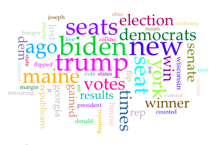
NYTimes
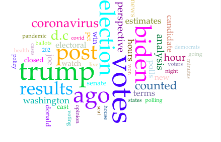
WashingtonPost.com
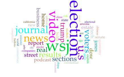
WSJ.com (Wall Street Journal)