For my second praxis assignment, I chose to use the Palladio software tool to visualize community gardens in Manhattan. I obtained this data set from the NYC OpenData website. There are 21 Manhattan neighborhoods listed and each garden within the locale is provided.
Before engaging with the software, I had to “clean” my dataset. There were about 6 gardens that were missing information. Some were easy enough to track down, such as the zip code and coordinates (which was not really necessary for this project), but I struggled with choosing particular neighborhoods for the forgotten gardens. The parameters of certain areas tend to be vague and bleed into adjacent neighborhoods, so I was forced to make educated guesses based on other addresses and my own knowledge of the city. As I mentioned in my first praxis assignment, not only is the pressure to make the correct decision quite dreadful, but it is also terrifying to know that others have this level of authority over our shared knowledge. The next process of “cleaning” required me to decide what information to include and exclude. I chose to mainly focus on the neighborhood, type, post code, and name of each garden. Other data included the exact addresses, community boards, district numbers, and coordinates, but I excluded this information because they seemed more appropriate for a mapping project. Though, I am sure, there is always a way to graph this for other desired outcomes.
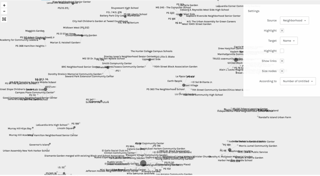
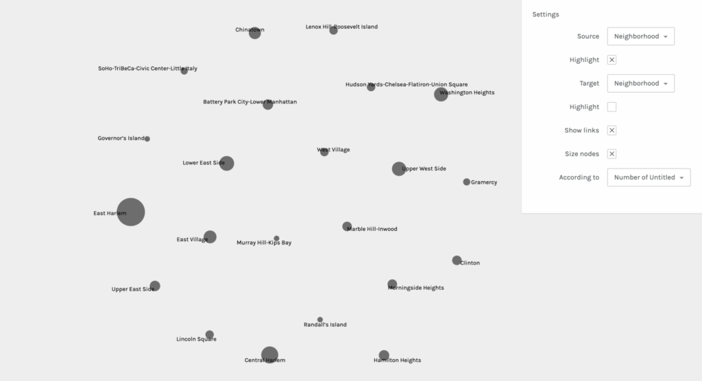
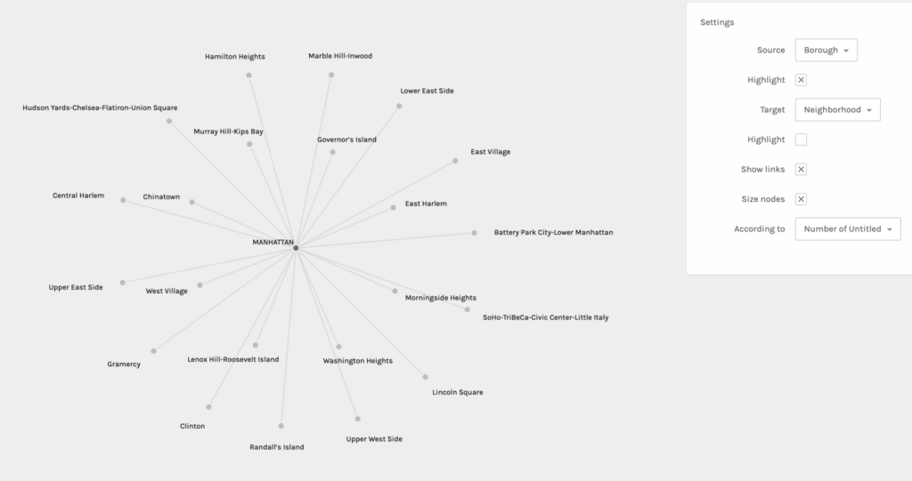
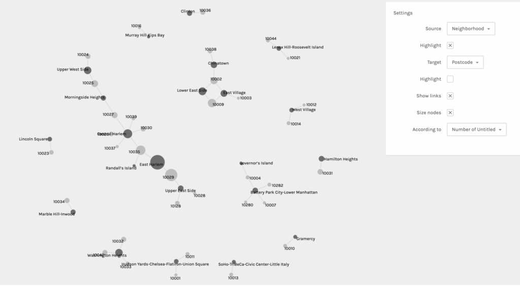
Palladio is pretty straightforward and beginner friendly, but I still had to do some trouble-shooting to get my dataset to load. I tried to export my data into a CSV file from my iMac’s Numbers software, but it did not work when I dragged the file to be uploaded into Palladio. When that did not work, I transferred the data onto a Google Sheets document and that export was successful. Once the information was loaded, I was asked to verify a few symbols before I started graphing. Below you will find five examples of my graphs when I experimented with different sources and targets:
It was really interesting to experience the shifts of focus and interpretation in each graph when sources and targets were changed. It also helped me to consider different and new possibilities. This practice allowed me to learn first hand the ways in which you can obtain other valuable information from the same data set regardless of what you intended for the outcome(s). It also affirmed the notion that all information and data are valuable.
After being somewhat disappointed by the lack of color (though you can choose to highlight either the target or source) and the limited shapes and structural possibilities, I was reminded of Lev Manovich’s two key principles: reduction and space. He mentions the use of points, lines, curves, simple geometric shapes, and size and I remembered a small and personal data visualization project I was once introduced to: Dear Data. This project really opened my eyes to the possibilities of data vis. beyond simple graphs and tables. Any shape, color, and size can be creatively coded to convey meaning and information. I look forward to more experimentation and learning about data vis. in particular.
I was recently catching up with a friend that lives out in Jamaica and she mentioned that the neighborhood was named after beavers since New York was once home to a diverse ecosystem of wildlife before the settlers landed. She mentioned that Queens was once all swamp and marshes and that the word “Jamaica” derived from the word “Jameco” which is the word for beaver among the Lenape people. Hearing this brought back memories of the early settlers that I would learn about in my elementary class when I was about eight and remembered that New York was once home to wild animals that did not include rats, pigeons, squirrels, and the occasional raccoons. With this in mind, I wanted to visualize the decline of New York City’s natural wildlife. The goal I set myself is to show that pollution is one of the driving forces for the removal of these wild animals and that we should be placing the necessary resources to conserve sanctuary spaces and parks.
Not too long ago more and more residents have reported coyotes roaming around central park and even around the Bronx. These sightings were becoming so frequent that New York City’s official Parks website posted a “Living With Coyotes in New York City” blog post on their webpage. As I took off to find the appropriate data, I realized that I was dealing with too ambitious set of data points that included too many variables with missing dates which play an important role in my visualization. I then went on the search again for what else I can possibly visualize. The colder nights and the fact that the days are getting shorter made me miss summer and the lakes and beaches. This helped me settle on reports of harmful algal blooms that affect most large bodies of water, especially lakes where the water can remain stagnant for weeks on end. The dataset I downloaded contained the reports on the condition of the body of water. “S” being a suspicious bloom, “HT” meaning it contains high toxins, and “C” reporting a confirmed bloom. Adding the definitions to the abbreviations in the visualization proved to be difficult without first changing it on the source. I therefore went ahead and left it as is on the dashboard of Tableau and pressed forward.
I set off with the goal to visualize which county in New York had the greatest amount of reports of harmful algal blooms, my guess being counties in upstate since that is where all the lakes and rivers are. But as I placed my necessary pills into the correct columns and row sections, something very surprising came up. It is actually Suffolk county that came in with the most reports and Westchester coming in second. After seeing the bar graphs, it did make sense that Long Island would have the most reports seeing as they are surrounded by water all around where some leaks my seep through to the nearby lakes and reservoirs. What I wish I could do more research on however, is finding a way to standardize the data by population since I am fairly certain that some parts of Upstate are more densely populated than others. Westchester is also easily accessible by New York City residents so that may also play a role on the county placing second.
Hopefully this entices people to be more careful with what they leave behind by the body of water since most residents look forward to spending their time in lakes during the hot summer days. These algal blooms, if exposed to high enough concentrations, could be detrimental to someone’s health, especially those that enjoy eating shellfish where the toxins can easily transfer between the animal and person. And with the right resources we can have the right department take the necessary steps to make sure that these algal blooms are within a reasonable count where the rest of the ecosystem faces little to no harm and pose no threat to people.
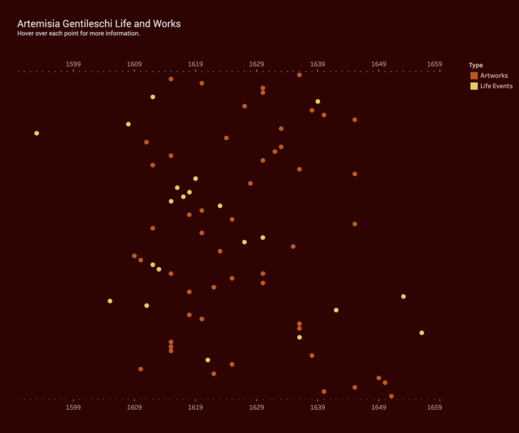
Inspired by Johanna Drucker (“Humanities Approaches to Graphical Display” Digital Humanities Quarterly 5), my data visualization is an attempt to create something that is more interpretative, rather than certain. I was interested in the relation between an artist’s work and the personal, sometimes tragic, events that occur in that artist’s life. For example, do “tragic” events lead to more prolific output, specific style or point of view? Do “happy” events have any effect? Do personal events have no impact on an artist’s work at all? Although widely exhibited and studied by art historians and feminist scholars, 17th century Italian Baroque painter Artemisia Gentileschi’s life is not yet fully understood. Her paintings famously depict heroic women from the Bible, but it’s her personal life – as a victim of sexual assault, and sufferer of torture at the subsequent trial of her rapist – that often overshadow her important achievements. By plotting her body of work and life events in a timeline, I hoped the data visualization would reveal some qualitative aspects of this artist.
Data Collection and Tableau
I created my own data set using the publication Orazio and Artemisia Gentileschi (Metropolitan Museum of Art, 2001) and the Wikipedia page. I added all of her known paintings, titles and years (circa) to a spreadsheet. I also added major life events such as birth, death, marriage, birth of children, and the aforementioned tragic events. I have constructed this data based on my own subjective ideas of what is considered a “major life event”. I have also taken some liberties with the artwork data as the dates are uncertain. Again, I am reminded of one of Drucker’s statements, “Data are capta, taken not given, constructed as an interpretation of the phenomenal world, not inherent in it.”
I have no experience using Tableau so it was a learning process trying to get something resembling a data visualization. Other than the drag and drop functionality, I found the advanced features very difficult to figure out. I appreciate how the public website allows you to see worksheets created by other users but I did get overwhelmed at the possibilities this software offers.
At the same time, I was frustrated by Tableau’s limitations. It assumes to know the types of charts you want based on your data and leaves little room for interpretation. I can see why this is a great tool for statistical data and large data sets. Perhaps, a Tableau “story” would offer more flexibility.
Conclusion
I’m somewhat satisfied with the final result although the points end up looking very random and scattered. I could not deduce whether Gentileschi’s personal life had any impact on her output. She seemed to produce paintings steadily, even while experiencing catastrophe as a teenager, having children and moving from city to city. However, hovering over the points to reveal the paintings, I believe, help put her life into context. For example, in 1612, she is raped, her assaulter convicted, but she also marries later that year. Around the same time, she paints one her most famous pieces, Judith Slaying Holofernes, showing powerful women engaged in a violent act against a man. She would go on to paint this scene multiple times throughout her life.
Before settling on this specific topic, I already knew that I wanted to explore data that dealt with language, in particular data that showcased the linguistic diversity of New York City. As a self-professed language nerd, I often find myself doing my own research on the role that language plays in the US and as of recent how non-English speakers navigate an English-dominant country and workforce. Initially I opted to visualize in a chart the percentage of languages spoken by New Yorkers, but then decided that I wanted to dig a bit deeper. I’m more so interested in how the presence of these myriad languages is showcased in different situations, whether that be an everyday interaction or something a bit more complex such as filing for bankruptcy.
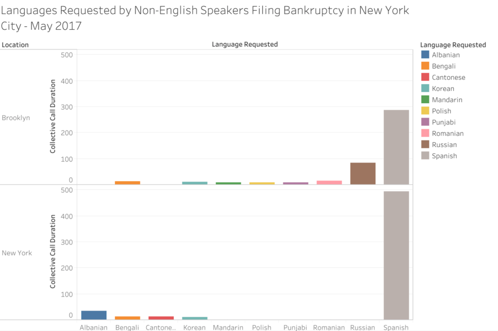
After searching for language related datasets on data.world, I discovered that the Language Assistance Program released monthly reports of US citizens who filed for bankruptcy and requested translators for their meeting with creditors due to limited English proficiency. Upon request, these individuals were provided a phone call with an interpreter that spoke their preferred language. The most recent month available on data.world was for the month of May in 2017 so that is the dataset that I selected. Additionally, this dataset recorded individuals from nearly every major US city but for this assignment I wanted to focus solely on New Yorkers. As the Language Assistance Program was releasing monthly datasets, the languages listed tend to differ with each month. In this specific month, the languages that were requested by individuals filing for bankruptcy were Albanian, Bengali, Cantonese, Korean, Mandarin, Polish, Punjabi, Romanian, Russian and Spanish.
To create my chart, I transferred my chosen data -the requested languages, collective call duration with interpreter for each language, and whether the calls took place in what the dataset listed as either New York (Manhattan) or Brooklyn – into an Excel sheet, and from there transferred it to Tableau. I ultimately selected this chart as I thought that it best showcased the information. Based on the chart, it’s evident that some languages like Spanish are more recurrent and are present in both locations, while other languages like Cantonese only appear one or two times and only appear in one location. However, as I have only visualized a single month for this assignment, I feel that I do not have sufficient information to make any hypotheses or have any solid takeaways based on the dataset. The next steps I’m going to take is gather more data from previous posts by the Language Assistance Program, visualize them into charts and compare the information, specifically looking for patterns in recurring languages and call durations.
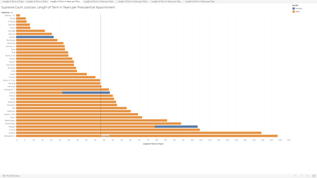
Given the recent death of Ruth Bader Ginsburg and the current Senate hearings for her nominated replacement, Amy Coney Barrett, the Supreme Court is all over the news. Supreme Court justices are not elected, and once approved by the Senate, they receive lifetime appointments. I wanted to know what those lifetime appointments translate to in actual term lengths.
Collecting and Sorting the Data
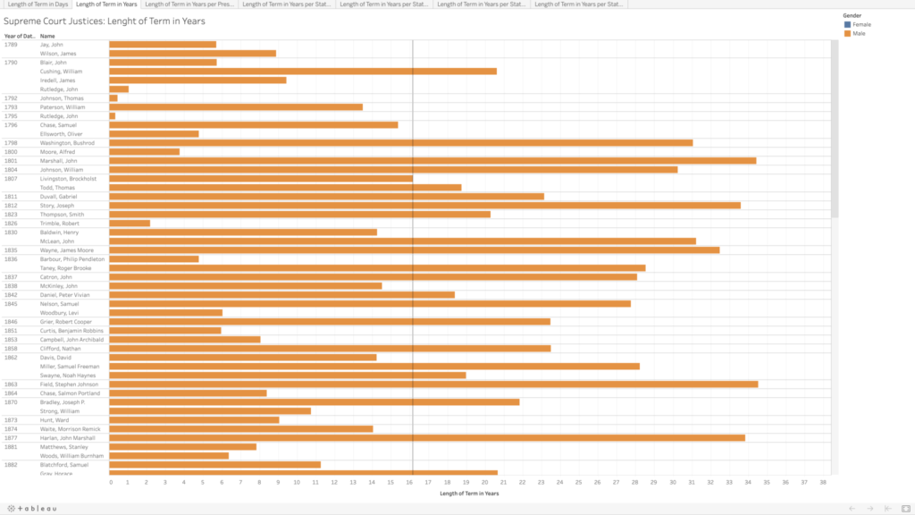
The majority of the data I wanted were conveniently available on the Supreme Court website, where they list every justice since the court began in 1789 to the present, including their title (chief justice or associate justice), the date they took their oath, and the date their service ended, as well as what state they were appointed from and which president appointed them. They list some caveats on their site regarding the dates, but for my purposes I chose to ignore them and just accept the dates given.
I copied their data into an Excel file, and integrated the chief and associate justices together, sorting in chronological order by oath date. In doing so, I realized there are three justices who held both titles, John Rutledge was the first, with a break in between titles (total of both terms is approximately 1.40 years). Harlan Fiske Stone and William H. Rehnquist also held both titles, being promoted from associate directly to chief justice (Stone’s total term length is 21.14 years, and Rehnquist’s is 33.66 years). In my tables, each of these three people have two listings by their names because of this, so it does slightly skew my average term length of 16.16 years (more than twice as long as the current term limits on presidents).
The Supreme Court was created in 1789, initially with one chief justice and five associate justices. It was expanded in 1869 to consist of one chief justice and eight associate justices (the number we have today). I wanted to calculate the length of each justice’s term in both days (because it would be whole numbers) and years (as these would be more recognizable and understandable), which was tricky in Excel as it does not recognize dates before January 1, 1900. For all of the justices who had both oath and termination dates after 1900, I was able to use existing formulas to calculate these values. For the dates preceding this, I copied them into a new sheet, and I added 1000 to each year to get Excel to recognize the values as dates, and then I was able to use the same formulas as before, though I had to copy the unformatted numbers into Word before pasting back into my main Excel table to make sure it kept the values rather than the formulas. For the current justices, I put in “termination” dates of today, October 13, just to get some sense of their term lengths thus far, though again I realize this is skewing my average and trends.
In addition to the term length, I also wanted to note the gender of each of the justices (which admittedly is problematic as I am assuming a gender binary and also ascribing gender to these people based on their name and pictures). Of the 119 appointed justices, only 4 have been women.
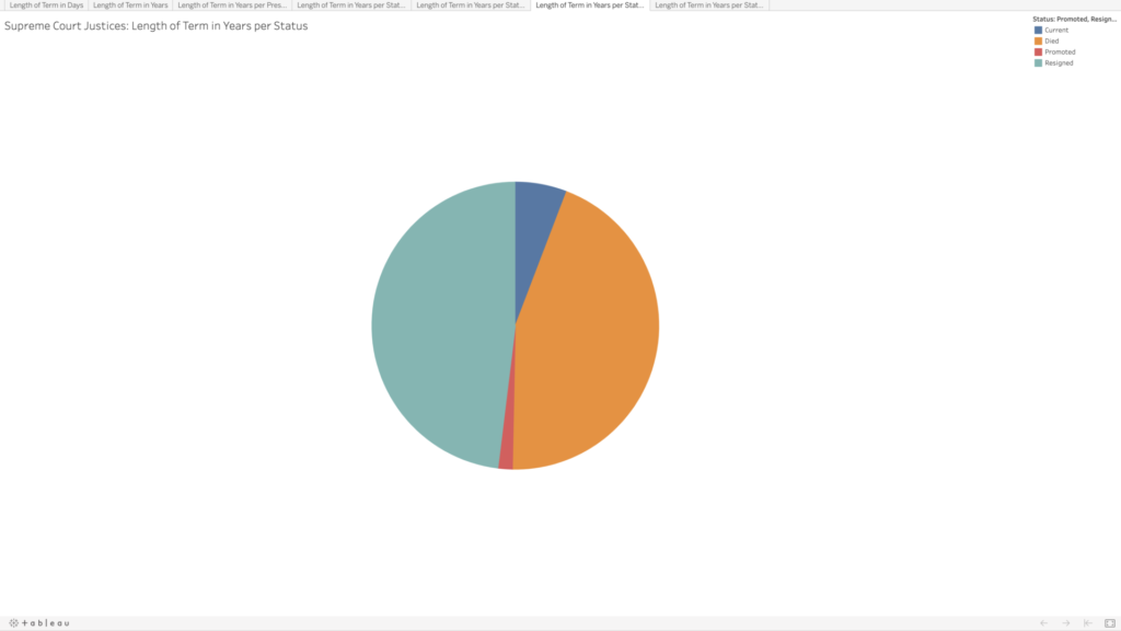
Given that justices have lifetime tenure, I also wanted to see how the terms were ending. Going into this, I had assumed that most justices’ terms ended with their deaths; however, it turns out there is a pretty even mix between resignation and death. This information wasn’t included on the Supreme Court website, so I searched each justice’s Wikipedia page to compare the date their term ended with their death date. Some entries made a distinction between resignation and retirement, but for my purposes I selected “resignation” for any justice whose term ended before they died. Back to Rutledge, he resigned twice; Stone and Rehnquist were both promoted directly from associate to chief. There are eight justices whose terms are ongoing—who I noted as “current.”
Visualizing the Data
I decided to use Tableau again to get more familiar with its features and tools. I played around with the data a bit to see if I could spot any trends in the term lengths—e.g., did term lengths get longer as life expectancy increased? To my untrained eye, the term lengths don’t seem to follow much of a trend. When looking at resignations versus deaths, there do appear to be some groupings—though I’m not sure what, if anything, could be inferred by this.
In playing around, I was able to visualize which presidents had the most sway in the Supreme Court, in terms of the total term lengths for all of the justices they appointed. I assumed Washington would be the clear leader, having the benefit of being the president to appoint the most justices, but several others beat him out, and Franklin D. Roosevelt has almost double the total terms (85.8 vs. 148.6 years). There are only four presidents who did not appoint any Supreme Court justices (William Henry Harrison, Zachary Taylor, Andrew Johnson, and Jimmy Carter).
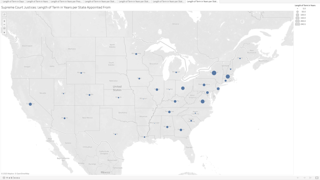
Lastly, because why not, I wanted to see the term lengths as they related to the states where the justices were appointed from. There are many states that have never had any Supreme Court justices, especially as you move further west. Again, I’m not sure what arguments about representation could be made here; I would think this speaks more to “manifest destiny” and the way in which states were created and admitted to the union than anything else.
Ideas for Future Expansion
Initially I had been curious to compare all of the justices by the age at which they began their terms, but that would have been a bit too time-consuming. I’m still curious to see if there are any trends here. All Article III federal judges are appointed for lifetime tenure (technically they can be removed, but in practice it seems like appointments are more or less until death or resignation), so it would be great to get data for all of them as well and see what kind of trends pop up.
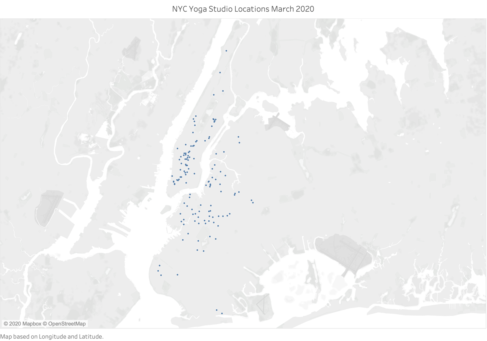
As an NYC yoga studio instructor, I thought it might be a little bit depressing but also therapeutic to map out the structures themselves for our first mapping assignment, as sort of an honor or remembrance to what was. While gathering the initial latitude and longitude data for the first assignment, many other questions began to pop-up, alongside my desire to map the dreaded, “permanently closed” or “relocated” studio data. Let it be known that I am assuming that our audience here understands that boutique fitness studios and all fitness centers are still mostly prohibited from holding group fitness classes due to the health crisis, however, this month I have seen more studios re-open and it’s rumored to evolve in a positive direction. I thought, what better time to have a map of these studios right before their opportunity is to re-open, that is, if they can still afford to pay their rent. Further, as a technical trainer, I also have been seeking to understand this monumental transition to online live-streaming platforms for fitness classes from what once was our in-person only studio-based learning environment, which was a very hands on one and limited to a rectangular mat on a hardwood floor as our only device required. My perspective may just be a bit broader and harsher versus one’s who’s access to knowledge is limited to solely the studios website, google search and/or social media, but it’s not perfect.
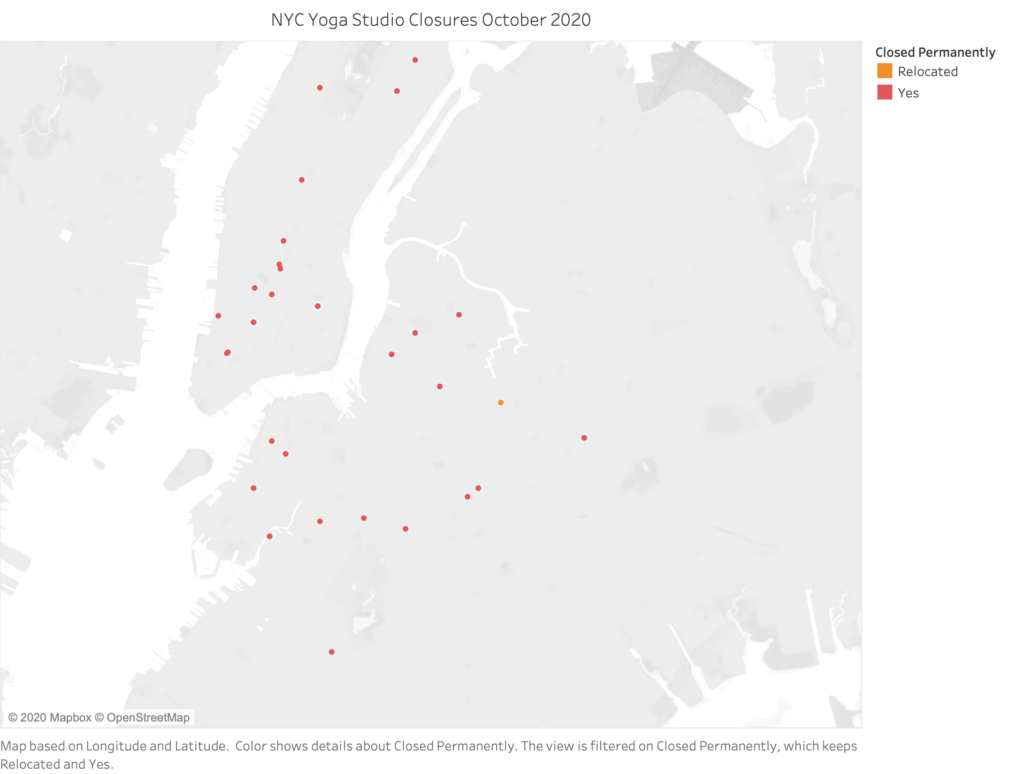
Map of 133 Brooklyn, Queens and Manhattan Boutique Yoga Studios, March 2020
Since posting our first mapping assignment, I have added on approximately 10 more studios to the dataset but have still decided to exclude the Bronx and Staten Island. The results from Google are so poor in regards to yoga in the Bronx, that and I simply do not know enough about that area, so I cannot present that area with confidence. What I can infer from the available data that I have come across is that whatever studios that were formerly there, are likely to have shuttered permanently before COVID-19 hit or during, as some of the studio websites are not even posted to Google. Further, I thought, what types of populations live in the Bronx and why isn’t there more yoga there? To be honest, I am pretty sure we are referring to around 5 studios we are leaving off this list. Last, the decision to exclude Staten Island is purely because of time constraints and my lack of awareness in that area, but there are at least a dozen studios in Staten Island located mostly along their main highways, but I wanted to focus on areas of NYC that truly rely on public transport and their prime locations for their overall success.
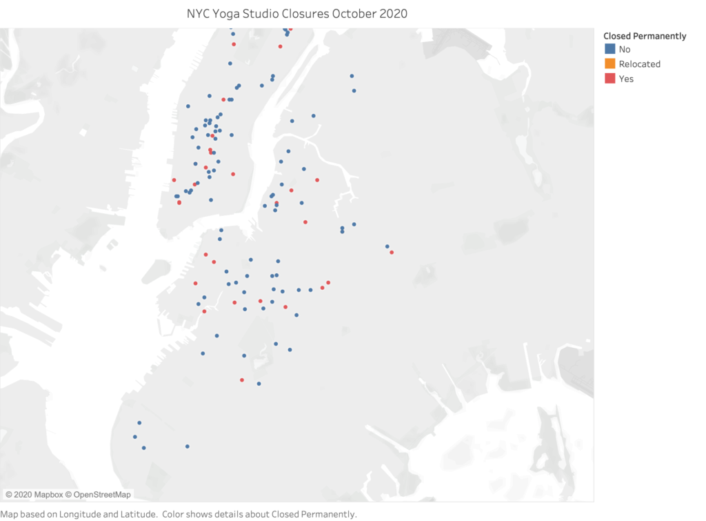
133 Studios. Blue infers that their leases may still be active, red infers the studio is 100% closed. Only ONE studio has reportedly relocated to a new space and has publicly announced this.Out of 133 studios, only 29 studios have left their physical location and 1 has permanently relocated. Filter on to represent the studios that have closed/relocated, this is as of October 2020.
What I can draw from this closure data is that facilities that are permanently closed are in general the larger studios in more densely populated areas (both with people inhabiting those neighborhoods in the city but also an over-population of yoga studios) that rely on large numbers of students and classes offerings that were necessary for their survival. Unfortunately, I have found that Google Search result data is outdated in regards to what’s permanently open or closed, so I had to really dig deep or know someone who works there to learn of their studio closing. I know for a fact that more will be closing their doors permanently, but this is as close to true, public data as I could put together.
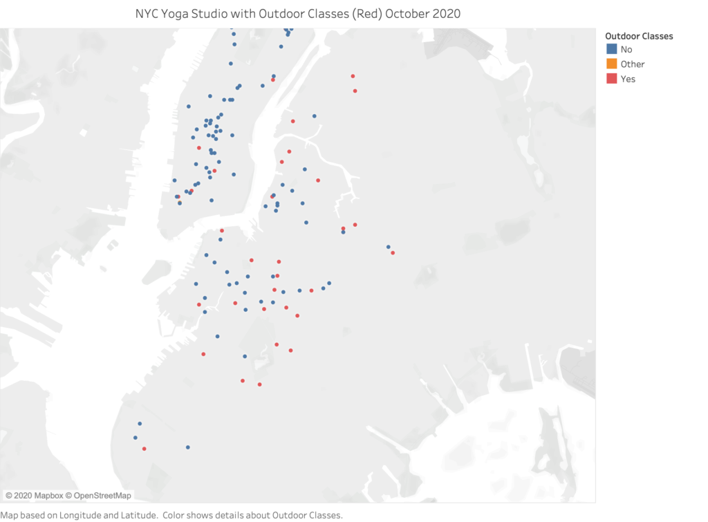
The last map visualization I will be sharing below is a map that I was hoping someone else in the news media would make ahead of me so that I could attend more in-person classes with ease. Here is a map of all the studios who are or were very recently holding outdoor in-person classes:
Studios who either have a rooftop or a park nearby have been holding outdoor classes since the summer and all the way through October.
It was difficult to put this map together as I had to visit many individual studio’s websites or their social media page to discover how and where a studio was hosting in-person classes outside in the open-air. Based on what I found, 38 out of 133 were able to hold space on their rooftops, their own backyards, a bar or restaurant with backyard or patio nearby to their studio or of course some classes were held in NYC park’s. I am very curious how these studios will survive in the long term because of this ability to hold in-person classes hopefully gives them a much greater chance to survive this severe dry spell in income that would have normally been earned in the physical studio space. This is not a map of where those park classes are being held, although some of these studios do have a private area to gather in their existing immediate vicinity, but you can see a lot of these studios with this added service were already located near a major park like Central Park, Prospect Park or Astoria Park. This list may also be inaccurate due to it being October and some studios have ceased their outdoor offerings already, and some studios have always offered outdoor sessions regardless of the health pandemic.
I do happen to be in Lev Manovich’s Data Visualization class and enjoyed our assigned reading “What is Visualization”, which inspired me move on from creating maps and to move on to using bar graphs for the next data set, but I still think it’s important to relate all of this to the studios geographical location in order to draw intelligent conclusions.
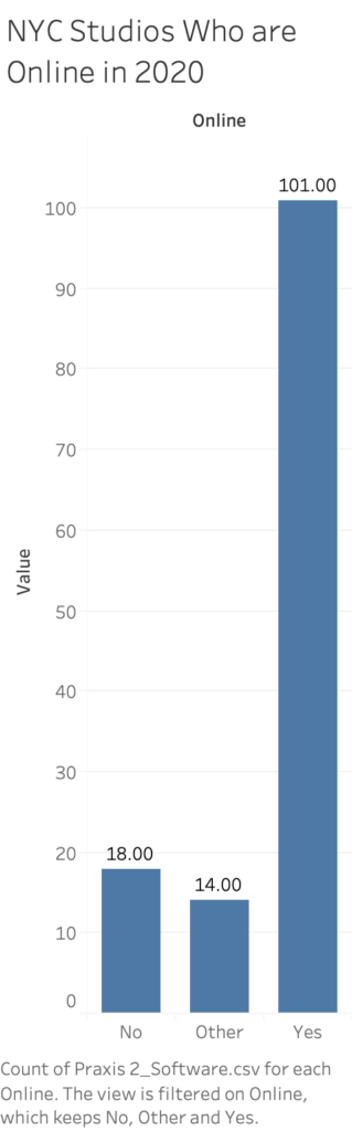
Although I’ve left it out of this dataset, there a few studios who had online offerings prior to the COVID-19 pandemic, but it was far and few between. Most notably so is Sky Ting, which has four locations in Brooklyn and Manhattan, so covering a fairly large community from the get go, the former Yoga Vida teachers were already offering on-demand classes through Vimeo and seem to be doing extremely well. Several other somewhat celebrity or well-known studios in the city also have existing partnerships with popular on-demand and live-stream platforms like ALOmoves, JetSweat and OmStars to name a few. However, I was not able to identify one studio who was already live streaming their full schedule of class sessions over Zoom, Instagram or other platforms. The bar graph to the left represents studios who were online in some capacity by October 2020. The 18 were a definite no, they were not online in any sense of the word outside of a website that stated the facility was temporarily closed due to the pandemic and the 14 ‘other’ studios I was not able determine if they were doing any live-streaming, or they appeared to be in some sort of transition of their streaming services, based on my research using Google and word of mouth amongst teachers.
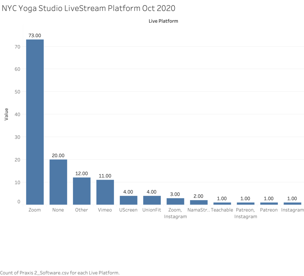
Below is a representation of exactly which live streaming service the studios chose to go with. This is where the data gets somewhat murky for me and taught me a lot of hard lessons as to how to track data that is somewhat geographically based yet not at the same time. There is more to this than what meets the requirement for our lesson here, but some studios have more than one location, so in turn their studio brand may be over-represented in this visualization below. The fact of the matter is that there are or were at least 40 studios here in this dataset that belong to subsets of studios per owner or company, but since their brand and their leases were still active, I chose to keep this representation as close as possible to the number of physical locations that still exist today. The point in keeping this all together is that if the branch of the studio was not in a particular community, how would that community even learn about the studio in the first place? So, they all count!
As we can see in the above visualization, the overwhelming majority of studios went with Zoom to host their live-stream classes. I personally work for companies that live-stream through Zoom and what I can infer here is that it was the most low cost, easy to use and reasonable solution for all of us and it was also somewhat easily integrated with extremely popular concierge booking software ‘MindBody.’ Zoom also offers cloud recordings that are captured quite easily so that you can make the class available for two weeks for folks to replay at their leisure, but my understanding is that it not such a simple task for the studio or instructor to deliver or market this with ease as they usually have to manually send an email with the link to the recording. Moving on, the ‘Other’ category essentially includes studios who’ve made it impossible to decipher which platform they stream from and I have reached out to them by email as to which I am awaiting response. Moving on, it’s interesting to see Vimeo take off in it’s popularity and based on my limited perspective, a lot of these studios did not even start out on fancy platforms like Patreon, Vimeo, UScreen, and UnionFit or NamaStream right away, as these are all fairly new platforms (with some exceptions) for digital content hosting and streaming. My suspicion is that studios are going with these platforms because of their superior recording qualities, user-interfaces and hosting abilities. It’s been a long-time complaint that Zoom records at a lower resolution and their on-demand recordings are simply not created for a large public automatically access. I also know for a fact that more studios over the last six months have scaled-back in their offerings due to low attendance, lack of automation and other business concerns, and many more studios that were formerly hosting classes only on Instagram Live or even Facebook Live because they had not yet bought into a more professional online learning system. I did not come across any studio hosting yoga classes through Facebook at this time, but I knew of at least two in this data set that formerly were up until they bought into a better system. The other interesting finding is that no studio was reportedly using Cisco’s WebEx and only one private company I’ve heard of is using BlueJeans, which not included in this dataset but both of those are enterprise video streaming solutions that cost a great deal of money for their use (informed by my background in enterprise IT), and it’s often the case that studios can’t afford something like that.
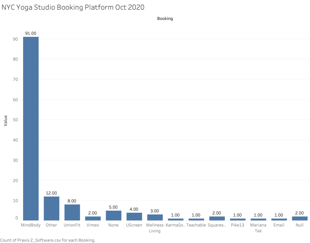
The last visualization is one that has simply bothered me for a very long time and that is the dominant use of the platform ‘Mindbody’ for booking a class with the studio. This large number of 90 alludes to Mindbody’s legacy use in this industry and it’s still in great use due to the fact that you cannot actually book an appointment, manage clients or product inventory using Zoom, even though the class is streamed through that virtual space. The greatest disappointment this industry has seen since Covid-19 is Mindbody’s failure to launch a solid live streaming solution through their existing platform. Personally, I have used their ‘beta’ version which is simply an embedded live stream video to their page, which is still in testing and it was extremely glitchy back in July when I tried it. In my experience and others, students did not receive the link or instructions as to how to access the class after booking it and the software did not “check the students in” for attendance, and that is the most basic example of failure to automate tasks, and that is what studios really need right now for the obvious reasons of time and money. Since 90 studios are still using mindbody to manage their reservations, my assumption is that 86 of them are still manually e-mailing links to Zoom classes to those who signed up and a separate link to the teacher. This number is based off the only plug-in I’ve learned of that automates this process which is called FitxGrid, as to which I’ve only discovered four studios using, which is not included in this visual representation. FitxGrid automates the task of emailing links to classes for students and teachers and it is still new and expensive for studios to invest in, especially since it’s a plug-in for Mindbody.
Now, you might take a look at this visualization and ask why isn’t ClassPass included In it, but the fact of the matter is that ClassPass has been dumped by so many studios post-covid that it was not even worth including especially since it is not a client manager or a point of sale system like MindBody, Wellness Living and KarmaSoft are. However, for a future project it would be worth investigating how rapidly ClassPass was dismissed from the industry during Covid-19. Prior to Covid, I assume that the number is higher on the MindBody side because it was not only until recently that some of these studios have moved over to Vimeo, UScreen, UnionFit etc. for their booking and live-streaming solutions. The question remains for me if UnionFit, Uscreen and Vimeo offer the studio a change to sell physical products and truly manage clients in the robust way that Mindbody does, but I am certain that they manage clients and subscriptions effectively in some way. The other observation I will offer is that KarmaSoft is almost automated with Zoom in sending links to the students who’ve signed up, but it seems that studios are not trending in that direction because KarmaSoft does not offer space to hold pre-recorded classes, and my assumption is that is probably what will be next and studios are looking for more complete solutions. On-Demand data as it relates to studios is something I would have liked to have added to this data set but again, collecting this data is very scattered in it’s process. My estimate is that it’s probably about half of NYC studios are sharing pre-recorded classes AKA on-demand content and that would be a small number due to the limitations these platforms present. UnionFit, Vimeo, UScreen, Zoom all offer this but Mindbody does not.
While I am aware that this assignment has asked us to avoid sharing more geo-spatial data, I thought to share a bit more about the NYC studio geography initially in this post because it’s important to see where the majority of studios are situated, where are locations are closing down more swiftly and what software they are using, as a lot of it is related. It’s with these types of geographical visualizations that I was able to determine several things: 1. That larger, brand name studios, some of which have multiple locations and some who have already shuttered their doors permanently, were therefore possibly able to invest more into their online streaming platforms and they may have more freedom to move away from legacy systems and invest in better platforms, they may also have access to an outdoor space or have a flexible leases. 2. Is it just in general that everyone might be stuck on Mindbody and Zoom forever because of their lack of resources/cash flow, and why is it that it is so difficult to to fully migrate a mindbody CRM to something else? 3. Is there an attachment to lower rent spaces that might be holding studios back from relocating, and where are these small studios most likely located that still have their leases? (You guessed it, Brooklyn and Queens!) 3. More, the reason why I included outdoor session tracking is because I believe this data can help us understand which studios will survive in the long term due to this unfairly distributed income opportunity, and this also shows us that any studio located nearby a park space or with access to their roof top may mean that this is the way of the yoga studio’s future, geographically, if they should decide to maintain a physical practice space in this Covid-adapted way of facilitating group fitness classes.
The final points I want to address here are cost of classes now that they are outside of the studio, the other major on-demand and live stream competitors and means of translating learning. Based on my research and without tracking every single studio on my sheet, the average for one online class cost was anywhere from free, but mostly in the $10- $25 range and the highest I saw for an outdoor session was $30. Prior to the shutdown, drop-ins were averaging $14-30 in the three boros that this blog entry concerns. How is it that studios are willing to charge that full price when the student is not accessing the same services inside the physical studio and are paying for their own devices and WiFi to access to the class? Even more, how were these independent teachers affording their devices to live stream from, as most of them lost their jobs and their main income streams and were given the choice to put their devices through a ton of extra use, where they otherwise would not have? What does quality assurance look like when everyone’s subject to wi-fi and device failures/ Other very large questions I have are, what is the teacher pay now, versus prior to co-vid? I can’t tell you all of this exactly, but for a lot of us our payment dropped to be much lower than we used to receive in person and we are all teaching far less. How is fairness being distributed here across teachers, students, and studios when it comes to paying for a new live-stream service that the majority of us never asked for? Why are we still attached to these spaces if we can no longer afford them? Clearly I have so many questions.
Recently, Apple announced their entrance into the on-demand fitness world with their new service appropriately titled Fitness+ to be released this Autumn, and to be quite honest, as a former employee and group fitness teacher I am very glad that I no longer work for the company, largely due to the fact that their on-demand fitness sessions only cost $10 a month and which will further damage local studios earnings. Even more, Peloton was offering 90 days of free on-demand videos since the beginning of the shutdown, so how can the independent yoga studio compete with these major competitors, especially when the prices are unbeatable and we are moving into an on-demand world? The other thing I would have liked to have tracked a bit better is the on-demand offerings for local yoga studios, some of which have it and some do not. My best estimate is less than half the studios have a large, high quality on-demand video library. These are things that take time to build, so my suspicion is that this will continue to evolve greatly.
Lastly, as a teacher for so many years on a variety of subject and as a Digital Pedagogy junkie, I must bring attention to the fact that yoga is verbally learned and I was taught as a teacher to not demonstrate the entirety of physical yoga class for the students to replicate in their body’s. So, much like other types of learning, my suspicion is that it’s happening much slower on the other side of the zoom screen. I cannot truly see my students body most of the time when I teach due to the fact I have a 13-inch screen, and sometimes with many tiny students in little squares, so what I have to do is over-verbalize the session until I know that student a bit better in their yoga practice. This is something I expect to change greatly, but I am not sure how, but it cannot be forever that teachers are blindly teaching flows into a zoom screen where they may or may not see their students. My criticism for group fitness is that this way of learning has not been well thought out and we are seeing a mass-closure of studios because of this poor planning and all we can do is blame co-vid.
One of the things I love the most about New York City is its diversity, which translates to the incredible variety of restaurants that we’re lucky to have at our disposal. I remember trying Vietnamese, Korean, and Ethiopian food for the first time in the city…Italy has great food, but not a lot of diversity!
I decided to use the dataset for the DOHMH New York City Restaurant Inspection Results, which I had downloaded in Spring 2020 for my Geospatial Humanities class. [1] I was hoping to make a map out of it, but I realized it was a little complicated with ArcGIS on my slow PC…however, this dataset worked very well for Data Visualization!
I was inspired by the work my classmates did for their Mapping assignment and decided to use Tableau for my data visualization. Thanks to a handy tutorial on the Tableau website, I was able to select the dimensions and measures I wanted to portray and explore different styles of visualization. I spent a morning just exploring the data on Tableau and trying to combine different fields to see if anything interesting came out. I experimented with Restaurant Grades and Scores, but then I decided to keep it simple and calculate the top 10 Cuisines for each borough. New Yorkers intuitively know that the best Chinese food is in Chinatown (Manhattan), Flushing (Queens), and Sunset Park (Brookyln). Or that you can find handmade mozzarella in Little Italy (the Bronx one!). And that there is a big Orthodox Jewish Community in South Williamsburg, so that’s the place to go if you are craving bagels, smoked fish, and chocolate babka. I wanted to see if the data reflected this empirical evidence.
I opted for a very simple bar chart showing the Top 10 Cuisines in each borough, which you can find here. I used a tutorial I found on Youtube to display the number of top cuisines for each borough, calculated as a percentage of the total. I decided to differentiate the cuisines by color for easy reference, but also for the aesthetical reason to portray the mosaic of NYC cuisines in my visualization.
As we can see from the visualization, American cuisine is the most prominent in each borough, with a spike in Manhattan. Chinese restaurants are the second most popular establishments in all boroughs except Staten Island, where they predictably get beaten by Italian restaurants. Italian food appears in the top 10 of Manhattan and Staten Island, but surprisingly not in the Bronx – where there is, however, a 7.7% rate for “Pizza” and a 2.7% rate for “Pizza/Italian”. Jewish/Kosher restaurants appear in the top 10 only in Brooklyn, which reflects my initial assumption. A thing I found interesting is that, despite there being a Koreatown in Manhattan, Korean cuisine makes it to the top 10 only in Queens.
In the end, this project left me with more questions than answers.
According to the metadata of the DOHMH New York City Restaurant Inspection Results (the “Data Dictionary” spreadsheet), the “Cuisine Description” field is an “Optional field provided by provided by restaurant owner/manager”. The fact that there is a discreet number of categories makes me think that the owner/manager of a restaurant needs to choose from a list, which means that diversity is necessarily reduced. How do you classify the amazing Chino-Latino cuisine?
What does “American Cuisine” mean? When I saw that field, I immediately assumed it meant burgers, BBQ joints, and steakhouses, but this is just my imagination (and my bias) filling the gap in the data. Soul food is definitely American, but it doesn’t fit neatly in the definition. I would love if there was an ulterior classification for American cuisine, or at least a more extensive description in the metadata.
In the future, I would like to investigate the correlation of predominant cuisine and demographics in a ZIP code: for example, Manhattan’s Little Italy has a lot of touristy Italian restaurants, but I doubt that there are many Italians or Italian Americans living in the neighborhood. I’m looking forward to the release of the 2020 Census Data for this.
How many restaurants have closed due to the Coronavirus crisis? Which cuisine was the most affected? I would need to interrogate the datasets for Spring 2020 and October 2020 to have a comparison.
I would greatly appreciate hearing your feedback on this project and how you would improve it. Stay safe and support your local restaurants!
P.S. The huge pizza in the image is from Juliana’s Pizza in Dumbo, Brooklyn and I highly recommend it!
[1] I’m mentioning the download timeframe because the data gets updated according to new inspections from the Department of Health. Here I’m presenting the data as it appeared in Spring 2020: this means that the dataset probably portrays restaurants that are now closed and doesn’t have data on new restaurants that might have opened since then.
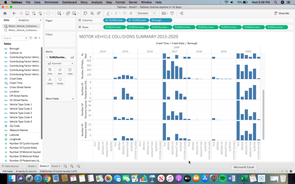
For the first mapping assignment I opted to learn how to use Tableau’s mapping feature. Since I am using the fourteen-day free trial some features were not available to me, so I will be posting screenshots of the map as well as the corresponding numbers per borough as the trial version does not allow me to publish a navigable link.
Since this was my first encounter with any mapping software some initial difficulties i faced were becoming accustomed to the user interface and how things were meant to work. Once I understood how to properly utilize Excel spreadsheets through Tableau and the different uses of CSV Excel spreadsheets and regular spreadsheets the process to map the data became clear. Through Tableau you are only able to map up to two geographical variables, so although the data I procured through the NYC Open Data Project’s website provided several different data, such as number of cyclists, motorists, pedestrians, etc. injured or killed, I chose only to map the most serious part of the data which was the total number of peoples killed or injured in motor vehicle accidents.
Above is the link to data and exportable Excel spreadsheets of data on motor vehicle accidents from 2015-2020. Attached below are the screenshots of the data I organized through Tableau and the final map. The file of the spreadsheets is too large to be posted here but can be easily accessed through the above link.
Above is the final map produced from the CSV Excel spreadsheet. The numbers represented by these orange dots are as follows:
BRONX: 30,292 INJURED, 89 KILLED
MANHATTAN: 27,194 INJURED, 129 KILLED
BROOKLYN: 62,936 INJURED, 238 KILLED
QUEENS: 51,090 INJURED, 223 KILLED
STATEN ISLAND: 7,037 INJURED, 36 KILLED (This data is negligible compared to the other boroughs and as such the dot over Staten Island is barely visible, despite the orange color.)
Although rudimentary, this first attempt at mapping anything has provided many valuable insights. These initial difficulties that I have been able to overcome will now allow me to move into mapping more sophisticated and personal data. I am interested now in mapping multiple variables with geospatial connotations as maps of this nature are usually the easiest to comprehend and the limit to what can be mapped geographically is nearly endless. I am unsure, however, of what software program to attempt next, as Tableau was straight forward and beginner friendly, but limiting in terms of mapping options.
This past Wednesday I had the pleasure of attending a virtual zoom workshop centered around citation and source materials. The workshop was lead by Graduate center librarian Jill Cirasella and NYU guest speaker Margaret Smith. Although this workshop isn’t directly correlated with the subject material associated with Digital Humanities, I still felt it was an important one to attend due to the fact that article writing and review is a big component when it comes to graduate work and even though I am only about two months into my journey to the coveted masters degree, I figure it’s better to start learning early about how I can find the best sources to support my work and how I can make sure the said sources are legitimate and accurate.
Cirasella started off the discussion by bringing up this idea of research impact. Qualitative questions like how important is an article?how prominent is a researcher? and how influential is their body of work? were thrown out. To my surprise the answer to these questions was a quantitative one-research metrics, the measure used to quantity the amount of influence a piece of scholarly work has. In other words how many times a publication has been cited in other respective work. Before I go any further I should preface this by saying that this isn’t the definite answer to those questions, just the most convenient one for those who are evaluating the work. Cirasella made it a point to tell us that this isn’t an indicator to show how important or qualified the article is but it is a form of measure that is definitely looked into when concerning a published piece. The first form of research metric that was really keyed in on in the discussion was h-index. H-index is the largest number h for which the author has published h articles that would of been cited h or more times. I know that sounds confusing so here goes my attempt in explaining it- say an author has an h-index of 5, that means the author has 5 articles that have been cited 5 or more times. That doesn’t mean the author has only 5 published articles but it does mean that 5 of their articles have each been included in 5 or more citations. If that still sounds ridiculous to you, trust me you’re not alone. H-index has had it’s fair share of criticism and has a reputation for not taking into consideration certain variables when calculating the number for the index. Variables such as not counting in co-authorship and the fact that it could be easily manipulated by the author (i.e author citing their own work in their other work, getting their author friends to cite their work- very shady).
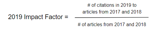
Another form of metric that was brought up was Impact Factor. As opposed to h-index, impact factor is used to measure how good a journal is. By definition impact factor is the number of citations in a given year to a specific journal’s articles for the two years prior, divided by the number of articles from those two prior years. (See image below to get a better understanding)
Impact factor is used when comparing journals in the same discipline and does get tied to a journal’s reputation and researcher’s career. Although much like h-index this metric can be manipulated and also is not an accurate way to discern the quality of an article. An alternative that was provided to me that you guys can also check is SCImago Journal Rank– calculated based on citation data from Scopus with Citations weighted according to “importance” of the citing journal (where “importance” is determined recursively, based on the journals that cite it). On the topic of alternatives I also wanted to mention the last form of metric we looked into- Almetrics. This is another way of judging impact as it goes beyond scholarly citations and looks into links from blogs, social media, news articles, Wikipedia etc. However the downside to this is the obvious favoritism that is given towards the written pieces that involve more buzzworthy popular topics that people are more inclined to read about.
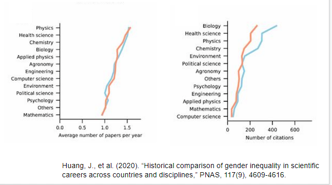
At this point it is clear to see that each of these research metrics has it’s drawbacks which can be a bit annoying. Nevertheless the most infuriating thing that was brought up during the workshop was not the metrics themselves but the fact that all of them are influenced by the gender gap that is abundantly present in the world of citation. Margaret Smith ended the workshop by bringing this matter to the forefront. During her discussion she explained how men are more likely to cite other men in their work even in fields that have majority women authors. Co -authored papers that are mixed gender also have the male author cited more than the female and those with traditionally feminized names are less likely to get their work cited. This implicit bias has been long studied and recognized, below I will provide visual evidence that was provided to us during the presentation.
If you are a fellow female writer here are some tips provided by Smith to help with this issue
Be consistent in personal/institutional names
Retain as many rights as possible (librarians can help!)
Submit work to a repository (CUNY Academic Works).
Ensure your non-article research products are citable (e.g., put research data into a repository that assigns a DOI).
Go beyond numbers.
In all I felt this workshop was super insightful and definitely has given me more of a clear perspective into journal and article citing. I’ll be more mindful into looking into the quality of the work rather than the “popularity” it has garnered through use of multiple citations. At the end of the day number’s don’t mean anything if the work isn’t even a accurate projection of it. I will also take it upon myself to try to cite more women in my work to help do my part in bridging the gender gap and I hope you guys will do the same.
I remember watching the YouTube video of Cuba’s DIY inventions man years ago and Alex Gil’s quote “technological disobedience has a feminist component, or at the very least matriarchal?” resonated with me since I would frequently catch my mother fixing something in the kitchen, bathroom, or in the living room whenever my dad wasn’t around or was to tired from work to fix anything. One memory that never fails to bring a giggle is when I came home from school one day and she was kneading dough with a coke bottle. I asked why she wasn’t using the rolling pin instead, and as soon as I finished my sentence, she showed me that the handles broke off and created a crack on the pin from top to bottom. When Ernesto Oroza said that women “assume enormous responsibility for the survival of the family. They organize activities, lead by example, inspire, push. They understand the biological rhythms of the house, the interrelation of all activities, the subplots of need, and not only as a reaction to the masculine tendency to delegate responsibility” brought back memories of my own mother pulling off MacGyver-esque tactics at home.
There is also another short video documentary that shows that even though Cuba has been cut of from the rest of the world, they still find means of staying in touch with media by creating their own homemade internet by downloading movies and shows and distributing it among the residents. This hard drive also houses apps for iPhone and Androids as well that most Cubans wouldn’t have access to. The video also dives into who distributes these hard drives and even the distributors don’t fully know the supply chain, all they know is that someone brings it to them on a weekly basis. Corporations such as Amazon are probably the biggest contributors that scratch that insatiable need for instant gratification. With the option to have something delivered to you at a minimum of two days, it is hard to say no to your impulses. But again, as the “See No Evil” article by Miriam Posner mentions, it’s hard to truly track down who touches the product from manufacturing to delivery. All of this creates less than optimal working conditions for people, but it should be up to us to push for more transparency and honesty from companies to truly know who they themselves are receiving their products. After all, it is us as the consumers who have the power to no longer support businesses that use suspicious trade ethics.
Need help with the Commons?
Email us at [email protected] so we can respond to your questions and requests. Please email from your CUNY email address if possible. Or visit our help site for more information: