Author Archives: Faihaa Khan

One Semester Down in DH

Thoughts on Class- When I first started looking into possible majors to start my graduate work I decided I wanted to take a risk. Sure I could of continued on my path of English Lit and Journalism but a part of me (very strong part of me) was not satisfied with what I was doing in regards to both of these subject areas. I wanted to explore a new territory, one that was completely foreign to me. One that I know would help me develop new skills but also challenge me along the way. Somewhere along my research trying to find a subject that would do that for me I stumbled upon Digital Humanities. Truth be told I had to google the definition of this field cause I had never heard of it before. The search results that came up both confused and intrigued me. I didn’t know what this subject entailed but from what I could see it included a little bit of everything. From there I took a gamble and decided to apply for the Masters DH program at the Graduate Center. When I first learned of my acceptance I was elated but soon a feeling of panic also set in. I was coming into this with no prior experience, although experience wasn’t needed the egoist in me didn’t want to come off like I didn’t know what I was doing. But I didn’t know what I was doing . Every week in class I listened to my peers wise words and insight and I sat there not knowing what to say. I felt intimidated but also so amazed by the thoughts you guys came up with. This class was mentally stimulating in so many ways. Professor Gold did a great job in allowing us students have an open space to discuss and converse. I soon realized that I wanted to navigate this class the best way I felt I could. I wanted to listen, learn and absorb. If I didn’t have the right words to try to convey what I wanted to I gladly listened to my peers do it. Maybe in the end I do have some regrets about not participating that much but I’m happy with how this semester went. Thank you to all of you guys for being such a great class.   

Final Project- As the semester was nearing its end I knew it was time for me to start thinking of a topic for a final project. As I racked my brain for ideas on what I wanted to do my project on I unfortunately kept hitting dead ends. I initially wanted to do something based off of social media and how I can somehow come up with a way to create filters on platforms to help separate factual information from posts that are put up to spread lies. I know some sites already do this but I wanted to create an upgraded version. However this idea didn’t end up going anywhere as I quickly overwhelmed myself with the prospects of what I needed to do to complete this project. I had no idea where to start or how I would expand on it. So in a last minute decision I decided to start fresh and look at the prompt to get a new idea. Although this project would of been great practice I figured I wasn’t ready to dive into grant work just yet. I’m keeping the social media project in the back of my head for the future but for my first semester I wanted to go with the seminar paper option instead. Labeled under pedagogy the seminar paper I chose to go with involves creating a syllabus for a hypothetical DH class. I immediately gravitated towards this as I knew it would allow me to be creative. As a first year DH student it may come off bold and pompous to feel as though I have authority over what should be taught in a DH class but in my opinion I just saw this as an opportunity to add to the conversation that is already being had in DH. What can be done to improve this field? What should be allowed in DH? How far should it expand? I wanted to showcase what I thought was most pertinent in this field and how I feel a class of this subject area should function. In my paper I label my class as a quasi workshop setting. Most of class time will be spent doing hands on projects such as text mining movie scripts and books and using Google Earth to track the location of their parents’ hometown like Mayukh Sen did in “”Dividing Lines. Mapping platforms like Google Earth have the legacies of colonialism programmed into them“. These are just some examples but students will use what they know from readings and class discussions and apply it to physical work. Some of my projects are directly inspired by ones we had to create for this class, though I did make a few minor tweaks. Along with projects I also added a blog post element. Over the course of this class I thoroughly enjoyed both writing and reading everyone’s posts on Cuny Commons. I felt that they were a great way to express ourselves in a class setting without having to be too formal. Blogs for my hypothetical class were created for students to communicate their thoughts along the semester. As an instructor I want to know what’s going on in my students minds, I want to know if they’re engaged with the material. The blog posts and the projects will make up for most of their grade and participation counts for 10%. I would ideally want student to participate in class but I know from my own personal experience that doing so is not always easy. The discussions we have in class will revolve around reading material I have provided. Some texts were taken from Prof. Gold’s syllabus as I felt they worked well with certain subjects I wanted to teach. Others were taken from other DH syllabi I found on the web. I looked into each one and decided which worked the best. Additionally I also added a few articles I had found on my own that I felt added extra food for thought. Based off of the readings and projects I crafted the two final project options. One will be a 10 page paper based on a specific term or debate that came up in the readings or a creative project that features students utilizing a computerized DH tool to expand upon a in class project. This will also include a 5 page paper explaining their process and any problems they encountered. In all I wanted my syllabus to mix in traditional elements of a DH class with an updated twist. When researching DH syllabi I’ve noticed many are densely populated with reading material, most of which I felt could be done without. Maybe I feel this way because I geared my syllabus towards a undergraduate/elective level but I personally believe students will be more captivated by this field if they were given more opportunity in class to perform rather than read. I think this intro course gave us a pretty good balance of assignments and readings. For my own class I simply wish to expand on it.


Text Mining through Harry Potter and the Sorcerer’s Stone

As a former English major I’ve read and analyzed my fair share of texts. Everything from mid century novels to Shakespearean plays pretty much encapsulated four years of my life. Although I appreciate the literary enrichment they have provided me they did not entice my literary curiosity as much as the Harry Potter series, in particular the first book. I guess I’m favoring more sentimental value over content value when I make this statement but much like the first praxis assignment I wanted to work with something that was of genuine interest to me and when I think of a text that does that nothing comes to mind more than “Harry Potter and the Sorcerer’s Stone”. I can read this book over hundred times and still feel like I’m being directly transported into a world of magic- a key term that I will end up exploring while text mining.

***Now before I get into my findings I want to put a disclaimer here about the author that created this book***- Unfortunately in recent years J.K Rowling has been known less for the books she created and more for her controversial and offhand remarks regarding trans individuals in particular trans women. I do not agree with her way of thinking when it comes to this topic at all and find her thoughts on the matter to be appalling and unacceptable. However in our last class we touched upon this idea of separating art from the artist in regards to their work. After giving this much thought I felt it was okay to go on using a Harry Potter book as the focus of my project as I don’t believe the legacy of these treasured tales should be sullied by the gross remarks of the author. With that being said I apologize to anyone I may offend, it is not my intention to do so. I come in with completely innocent intentions.

In looking at the tools that were suggested to us I decided to start things off easy and try my hand at using Voyant. The logistics of this tool is fairly simple and to the point. The homepage starts off on a box where you can input text, url’s or upload a downloaded file. I already have a full e-book version of “Harry Potter and the Sorcerer’s Stone” on my laptop that I downloaded from a website called passuneb.com- an e-learning platform that provides free educational resources to primary and secondary students. Although I am thankful for the easy accessibility and zero dollar charge that came with the downloaded e-book I was a bit irked by what I can only describe as water marks on each page.

(These two were on every page)

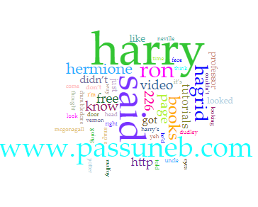
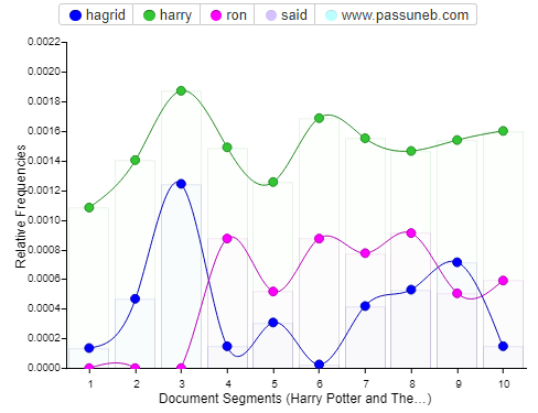
The repetitiveness of the website’s name ended up getting added to my generated corpus and mixed in with my results. I couldn’t find a way to omit it from my results but luckily I was able to take it out in my line graph showcasing document segments.

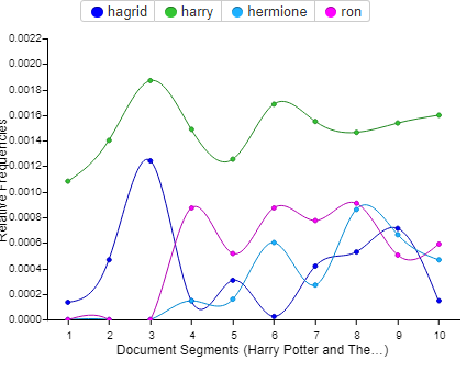
My cirrus word cloud visualizes www.passuneb.com in a larger font because the term appears 452 times, that’s more than the appearance of the names of most of the characters. In addition the line graph that Voyant came up with also featured the website’s name as well as the word said, both of which were taken out by me as I didn’t think they were relevant in what I wanted to see. Instead I wanted to focus more on the central characters names and how many times they appear in the novel. Voyant pointed out that the names Harry, Ron and Hagrid pop up the most with Harry having a total of 1,214, Ron with 410 and Hagrid with 336. From here I started playing around with the tool myself. I wanted to add Hermione to my document segment graph as she is a vital character to the novel. Her name comes up 258 times putting her right behind Hagrid in terms of character names. Adding her into the graph was easy as Voyant has a feature right underneath the graph where you can input the words you want to visualize. You can input multiple words or just leave it as one. Each character name was differentiated into a different color with the key above the map to show which color coincides with each name. Voyant also has a display feature which allows the user to add labels or change the style of mapping. For example instead of a line graph one can do a bar graph, however I felt the line graph was the most clear way to show the results.

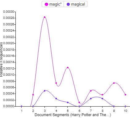
After looking into the character names I was interested to see what would come up if I looked at how many times a particular word or phrase appeared in the novel. The words I chose to go with were magic and magical- it only makes sense for a book that’s based off of the existence of magic. In my findings the word magic came up 48 times while magical came up 11. I was a bit shocked the results were lower than expected but perhaps that’s my mind playing tricks on me as I must of convinced myself that the words came up more than they actually did each time I read the book. I guess this is why tools like this are so important when it comes to research, the human mind is not one hundred percent accurate at all times.

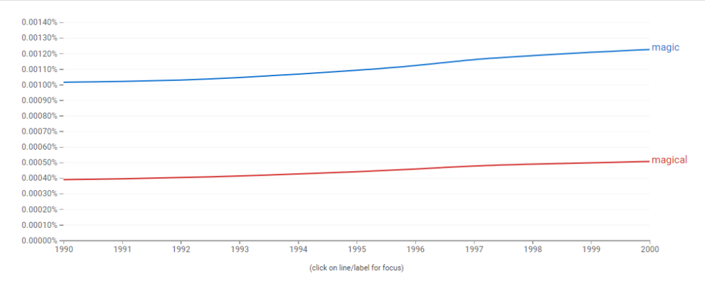
Nonetheless I still wanted to experiment more with these words so I decided to shift my attention to Google Ngram. In the search bar I input the words magic and magical and narrowed down the year search from 1990-2000. The words saw an increase starting from 1997 towards 2000, “Harry Potter and the Sorcerer’s Stone” was first published in June of 1997. I’d like to believe the introduction of this enchanting series jumpstarted the increase.

In conclusion I have mixed emotions about this first step I have taken into text mining. It was fascinating to say the least to be presented with these findings in less than a minute but I feel like the tools still have a few flaws. In Voyant’s case I fully understand why the they chose to put the website’s name in the results as it is featured in the text and is used often. Voyant did it’s job and emphasized it in it’s finding. However for aesthetic purposes I wanted to solely visualize specific things in my results i.e the character’s names and the word magic/magical and wish the website wasn’t as spotlighted. If I’m missing something and there is a way to take a word out of the cirrus then please let me know in the comments. As for Google Ngram, I felt the tool was easy enough to use but I was a bit disappointed with the lack of information that was provided to me. In other words I wish there was more to play around with on the site, perhaps features that allow you to change the physical appearance of the map other than the smoothing tool. Complaints aside this exercise has definitely opened me up to a world of research that I have not had the chance to experience before. I look forward to working with these tools some more in the future.

Biases in Distant Reading

In Richard Jean and Edwin Roland’s essay “Race and Distant Reading” they define distant reading as a process used to “describe the use of quantitative method to study large, digitized corpora of texts”. Basically the practice of this method is to analyze a large number of texts through a digital system, in order to find common textual patterns. The term was coined by literary historian Franco Moretti and has since been debated and critiqued in the field of DH.

The critiques in question have a common thread in the readings we had this week and honestly it’s not something I was exactly shocked to hear about. Biases against race and gender have long been an issue in the literary world. The nuances of both factors are often neglected and not accounted for and distant reading fully showcases that. With distant reading we don’t get the close attention to detail that these components fall under. Lauren F. Klein’s essay “Distant Reading after Moretti” explains that this seems to be a problem of scale- “they require an increased attention to, rather than a passing over, of the subject positions that are too easily (if at times unwittingly) occluded when taking a distant view” and this is where the problem arises. With a “passing over” way of analyzing texts we are left with clichés and stereotypes based off of assumptions.

Not only can these assumptions cause inaccuracies in results but in today’s society the idea of this way of thinking and organizing is just not plausible. Labeling things to fit the criteria of a certain race or gender is near impossible considering the social construct of both is always changing. Gender is no longer just an M/F category and thus should not be viewed as such. In Laura Mandell’s essay she references professor Donna Haraway in “Gender and Cultural Analytics: Finding or Making Stereotype?” and sums up how gender should be viewed in distant reading. One line that really stuck out to me is when she says that gender in writing should be defined as a “category in the making”…as a set of conventions for self-representations that are negotiated and manipulated” Similarly in “Race and Distant Reading”, Jean and Roland state that “the racial ontology of an author is not stable; what it means to be white or black changes over time and place”,they use author Nella Larsen as an example where today most scholars will identify her as black while in the 1920’s she was referred to as mulatta.

Furthermore it goes without saying that race and gender should absolutely not be the only signifier to allude to a writer in analyzing their identity. There are a number of elements that go into forming a person’s identity and such elements should be taken notice of. Klein suggests that exposing these injustices will help make the practice more inclusive, something I really hope takes off because in my opinion the concept of distant reading seems like something that can be of great use in the world of research.

Research Metrics and What they mean and What they don’t Workshop

This past Wednesday I had the pleasure of attending a virtual zoom workshop centered around citation and source materials. The workshop was lead by Graduate center librarian Jill Cirasella and NYU guest speaker Margaret Smith. Although this workshop isn’t directly correlated with the subject material associated with Digital Humanities, I still felt it was an important one to attend due to the fact that article writing and review is a big component when it comes to graduate work and even though I am only about two months into my journey to the coveted masters degree, I figure it’s better to start learning early about how I can find the best sources to support my work and how I can make sure the said sources are legitimate and accurate.

Cirasella started off the discussion by bringing up this idea of research impact. Qualitative questions like how important is an article? how prominent is a researcher? and how influential is their body of work? were thrown out. To my surprise the answer to these questions was a quantitative one-research metrics, the measure used to quantity the amount of influence a piece of scholarly work has. In other words how many times a publication has been cited in other respective work. Before I go any further I should preface this by saying that this isn’t the definite answer to those questions, just the most convenient one for those who are evaluating the work. Cirasella made it a point to tell us that this isn’t an indicator to show how important or qualified the article is but it is a form of measure that is definitely looked into when concerning a published piece. The first form of research metric that was really keyed in on in the discussion was h-index. H-index is the largest number h for which the author has published h articles that would of been cited h or more times. I know that sounds confusing so here goes my attempt in explaining it- say an author has an h-index of 5, that means the author has 5 articles that have been cited 5 or more times. That doesn’t mean the author has only 5 published articles but it does mean that 5 of their articles have each been included in 5 or more citations. If that still sounds ridiculous to you, trust me you’re not alone. H-index has had it’s fair share of criticism and has a reputation for not taking into consideration certain variables when calculating the number for the index. Variables such as not counting in co-authorship and the fact that it could be easily manipulated by the author (i.e author citing their own work in their other work, getting their author friends to cite their work- very shady).

Another form of metric that was brought up was Impact Factor. As opposed to h-index, impact factor is used to measure how good a journal is. By definition impact factor is the number of citations in a given year to a specific journal’s articles for the two years prior, divided by the number of articles from those two prior years. (See image below to get a better understanding)

Impact factor is used when comparing journals in the same discipline and does get tied to a journal’s reputation and researcher’s career. Although much like h-index this metric can be manipulated and also is not an accurate way to discern the quality of an article. An alternative that was provided to me that you guys can also check is SCImago Journal Rank– calculated based on citation data from Scopus with Citations weighted according to “importance” of the citing journal (where “importance” is determined recursively, based on the journals that cite it). On the topic of alternatives I also wanted to mention the last form of metric we looked into- Almetrics. This is another way of judging impact as it goes beyond scholarly citations and looks into links from blogs, social media, news articles, Wikipedia etc. However the downside to this is the obvious favoritism that is given towards the written pieces that involve more buzzworthy popular topics that people are more inclined to read about.

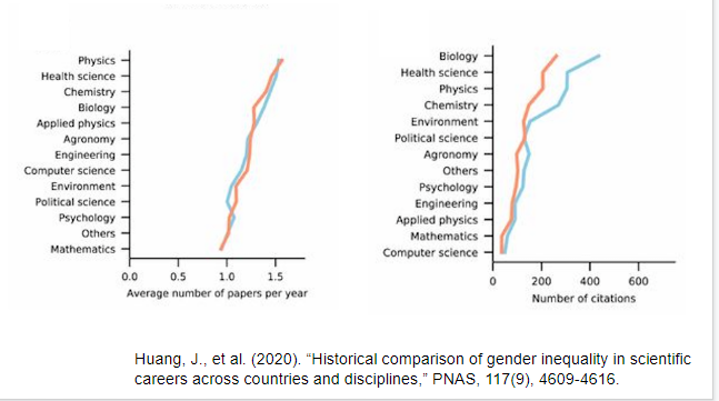
At this point it is clear to see that each of these research metrics has it’s drawbacks which can be a bit annoying. Nevertheless the most infuriating thing that was brought up during the workshop was not the metrics themselves but the fact that all of them are influenced by the gender gap that is abundantly present in the world of citation. Margaret Smith ended the workshop by bringing this matter to the forefront. During her discussion she explained how men are more likely to cite other men in their work even in fields that have majority women authors. Co -authored papers that are mixed gender also have the male author cited more than the female and those with traditionally feminized names are less likely to get their work cited. This implicit bias has been long studied and recognized, below I will provide visual evidence that was provided to us during the presentation.

If you are a fellow female writer here are some tips provided by Smith to help with this issue

  • Be consistent in personal/institutional names
  • Retain as many rights as possible (librarians can help!)
  • Submit work to a repository (CUNY Academic Works).
  • Ensure your non-article research products are citable (e.g., put research data into a repository that assigns a DOI).
  • Go beyond numbers.

In all I felt this workshop was super insightful and definitely has given me more of a clear perspective into journal and article citing. I’ll be more mindful into looking into the quality of the work rather than the “popularity” it has garnered through use of multiple citations. At the end of the day number’s don’t mean anything if the work isn’t even a accurate projection of it. I will also take it upon myself to try to cite more women in my work to help do my part in bridging the gender gap and I hope you guys will do the same.

Most Notorious Serial Killers on the East Coast

Brainstorming an Idea– My initial thought process while beginning to attack this project was to stick with something simple that I can already find an organized public data set on. However I also wanted to delve into a very specific topic that happens to be a genuine interest of mines. In the end the latter turned out to be a bit more pertinent to me. I’m sure I might be getting a few raised eyebrows over what I chose but I assure you it’s nothing more than a fascination. In college l I took a particular interest in serial killers after researching a few for a project I was working on for a speech class. The intrigue carried on ever since and my engrossment in these rather vile individuals has not changed. In fact one of my favorite past times include reading wiki pages dedicated to them and watching a Youtube video based on them right after (before going to sleep for added thrill).

I knew I could find an adequate amount of information to make this visually come to life on a map but at the same time I knew it would be very ambitious. As this is my first time using a mapping tool I wanted something manageable within my limited abilities, this meant I had to narrow down on the specifics of what I wanted to visualize. Instead of doing all 50 states I went with just the east coast and as far as data is concerned, I went with what I thought would be the four most vital pieces of information- gender, state they are from, the number of victims they had and the years that they were active killers.

Creating a Data Set– I will admit googling public data sets on serial killers did turn up quite a few searches but nonetheless nothing as specific as what I was attempting to do, this lead to me essentially creating my own data set on Microsoft Excel.

Finding the names of the killers I wanted was the easy part. A quick google search brought me to a list of the most notable serial killers by state. All I had to do from here is cherry pick the ones from the east coast . The particular list I used was compiled by Frank Olita published on Insider.com (https://www.insider.com/serial-killers-from-every-state-in-america-2018-5) Once I had my list of 14 names it was time do my research on each one, because they are notorious figures finding the information I needed on them wasn’t very difficult. However I did encounter a bit of a grey area when looking into the number of victims portion of my research. Some of the killers on my list do not have a definite number of cases. For example one killer could have 100 speculated cases but only be convicted on record for 2. In order to save space on my map I decided to just put a guesstimate total sum with both convicted and speculated which is why I advise those looking at my map to take that portion with a grain of salt. These are not 100% accurate numbers.

Mapping– Once I had all my info compiled on an excel spread sheet it was time to input it into my mapping software, the one I decided to go with was Tableau Desktop. When going down the list of mapping tools, this was described as the easiest to use which honestly is the sole reason I went with it. With that being said I still struggled immensely with operating it in the beginning. For one it took about 3 hours to fully download onto my laptop. Once I got the application finally set up I was unfamiliar with virtually everything I saw in front of me. A few clicks here and there and I managed to figure out how to import my excel sheet. The cool thing about Tableau is that all you have to do is import a file of a data set and the mapping is done for you in less than a second. Although, the suggested visualization it comes up with may not be what you envisioned. This was another problem I faced when using Tableau, the original suggestion they designed was not to my liking. I wanted all of my data to be presented in one singular image of a map, Tableau put all the points on to separate images of maps for each of the serial killers data sets. I couldn’t figure out what I had to do to manipulate the image to do what I wanted, this is when Youtube came to save the day. I looked up a variety of tutorials on tableau and figured out the basics of how to shift around your data on the software to get your map to look the way you want. Basically Tableau has a click and drag feature that allows you to change the physical appearance of your map. In the columns and rows section I input the longitude and latitude (auto-generated by Tableau) to give me a singular image of the United States Map. I dragged my gender data into the color feature which differentiate male and female (male-green female-purple). The name data into the label feature which allows the viewers to see the names correlated with each state and then the number of victims, time active and state name into the detail feature which created a box that shows all this info when you hover over a state with your mouse.

Unfortunately Tableau does not allow you to share interactive maps without uploading it on to Tableau public first. I was not exactly comfortable with sharing my project on a public site due to my slightly inaccurate info so instead I recorded a video on my phone showing the hover feature in effect.

(Note- Craig Price from Rhode Island was included but due to the small size of the state it’s hard to visualize on the map. He was active from 1987-1989 and had a total of 4 victims)

Future Improvements– I’m not completely disappointed with how my map turned out but I do accept the fact that it could of been a lot better if I had taken the time to organize my data sets more. In the future I want to be more specific with how I choose to showcase the number of victims. Instead of combining suspected with convicted I should of made two separate columns for each, maybe even play around with the color tool to help differentiate it on the map. I also think it would be interesting to add more personal details about the killers apart from the statistics. Perhaps the hover over feature can display a short bio on each one and/or the notable crimes they committed. In all I see my map as a beginner level attempt, I have a few of the fundamentals down for the software I used but with more practice and organization I’m sure this map can really flourish.

Can Google Earth be beneficial?

Being an individual culturally linked to South Asia I am going to be completely transparent and say that I most definitely have a favored bias with a particular reading that was assigned to us this week. The reading in question is Mayukh Sen’s “Dividing Lines”- an analytical take on how the Hollywood produced movie “Lion” glorifies the use of Google Earth to tell the story of how an Indian boy who accidentally gets separated from his family when he was young, uses the tool to help find his way back home and reunite him with his loved ones. Although the movie is based upon true events in “Dividing Lines” Sen critiques the film on how it handles the almost seamless relationship between man and technology. In his own words he describes the use of Google Earth in the movie as a “one-way transaction between an error-prone, sleepless human and an intelligent device, rather than as a human’s struggle to overcome a potentially useful technology’s limitations and biases”.

Sen backs his statement by mentioning Saroo Brierley’s (movie was based on him) memoir “A Long Way Home” where he describes the arduous process he had to endure to meet his end goal. This is in contrast to the movie where his plight is only seen as a small added factor. In addition to this Sen also details his own use of Google Earth where he experiments in finding the village his mother was born and raised in. The experiment proved fruitless as external factors undeniably came in the way. For one Sen’s mother did not know the anglicized spelling and the exact address of the location. The main thing Sen had to work with were visual cues drawn from distant memory. We find out that this didn’t even end up serving a purpose as hazy and unclear images resulted in their search. It is clear that faults of the user of the application are a definite component in a failed search. However Sen does not shy away in lamenting that past Colonial rule and interference are key factors in addressing the inconsistencies that those part of the South Asian diaspora face when trying to investigate the past.

With that in mind I decided to use Google Earth for my own experimental purposes and decided to try the same method in attempting to find the area my father grew up in in Bangladesh. As a disclaimer I would like to inform everyone that this is my first time using the application so a lot of the time used in this process was me trying to figure out how to use it properly. Once I got the basics down I typed in the neighborhood’s name and to my surprise it confirmed an actual result. I didn’t know the address of my father’s childhood home so finding the exact house was near impossible. However through the images that were provided to me I most definitely recognized some of the architecture and can confirm that I was in the correct general area. This exercise has without a doubt peaked my interest and I’m curious as to how much of a deep dive I can perform once I have more information from my father. Perhaps then I can formulate an potential idea for a final project. My father moved around quite a bit during the Bangladesh War of Liberation against Pakistan. With his help in tow along with the inspiration I have gained into looking at other cultural specific maps that have been designed , I was possibly thinking of creating a map pinpointing areas that he lived in. To expand on this I also want to add in places he frequented while living in these areas. Given Sen’s criticism of the application along with critiques of maps in general that I learned from the other readings we had this week I expect to encounter issues along the way. With that being said I believe a task to this degree can still be beneficial. Not only will it help me discover more aspects of my father’s life but it will also help me discern the realities of my cultural past through a non euro-centric lens.

Why Do We Need to Define it?

It is in human nature to want to put a direct definition to every entity we encounter. For various reasons one might say that this is in fact the correct way to go about life, especially when diving into the world of academics. Without a clear cut agenda of what a field of study is trying to convey, how can one begin to understand it? Or rather how might one begin to define it? This seems to be the main issue in the DH department that I’ve come to find out in my readings- an ongoing debate on what it is to be a digital humanist and what can they contribute to this contemporary way of learning and teaching.

In Matthew K. Gold’s essay “The Digital Humanities Moment” in Debates in the Digital Humanities (2012) he brings up the controversial debate sparked by University of Nebraska scholar Stephen Ramsey. His talk titled “Who’s in and Who’s Out” brazenly included the statement of “If you are not making anything, you are not …a digital humanist” this is in addition to him proclaiming that one must be able to code in order to be considered a digital humanist. Gold brings up that this declaration had brought out intense debate during the session and online discussions as well. This situation in itself has proven the conundrum of DH. Some individuals are hard set on viewing it through a strictly technological standpoint but for others DH is more. This is discussed further into Gold’s essay when discussing what compromises Digital Humanities. Is it a place for theory? Politics? Can social media be an asset to it or does it trivialize it? All these questions up for discussion but with that comes inevitable arguments.

In trying to find a solution an interesting but relatively weak metaphor that was proposed at the 2011 ADHO annual conference featured the idea of DH being viewed as a “big tent”. However much like everything else in this field, this too was also up for debate and criticism. In Matthew K.Gold and Lauren F.Klein’s “Digital Humanities: The Expanded Field” in Debated and the Digital Humanities (2016) they showcase examples of these critiques. Melissa Terras in ‘Peering inside the Big Tent’  “expressed concern that the big tent of DH, like those employed by the evangelical groups of the nineteenth-century United States, whose outdoor revival meetings inspired the phrase, might be less welcoming—due to scholarly status, institutional support, and financial resources—than those already on the inside would hope or believe”. Gold and Klein address the disapproval of the metaphor and bring up the fact that Digital Humanities is being practiced more and more as an ever growing field and thus must be perceived in a broader context. However the problem of scale then arises, how much can one subject area withstand? This goes back to the initial issue I brought it up concerning definition. If DH addresses more than one thing at a time, how can it be defined?

Lisa Spiro in “This is Why We Fight’: Defining the Values of the Digital Humanities” dives into this topic but her solution to it goes beyond a standard definition. Rather she suggests creating a core set of values. These values were split up into 5 sections- Openness, Collaboration, Collegiality and Connectedness, Diversity and Experimentation. Through these values Spiro advocates for the Digital Humanities to work together to promote a community that is open to cooperation and unity so that multiple tools and ideas can all be processed and shared through one outlet. She admits that in doing so ideas may clash and get complicated but in her own words she believes that “by developing a core values statement, the digital humanities community can craft a more coherent identity, use these values as guiding principles, and pass them on as part of DH education”.

With Spiro’s notion of a collaborative project in mind I checked out the multiple projects/websites provided to us and I found that her ideas were tangible if one is willing to do put forth the effort to do so. One titled the ” The Early Caribbean Digital Archive” features an open collection of poetry, diaries and novels as well as a collection of maps and images. Already we see a partnership between literary elements and those concerning visual aspects. In addition to this the site also aims to “remix” the archives found with digital tools to get a more accurate reading of the materials found since most of it was primarily authored and published by Europeans. Similarly we see this with “The Colored Conventions Project”, the purpose of which is to bring forth the buried history of the 19th century Black organizing to a an interdisciplinary research hub for anyone to access. The CCP explains they go about this through the use of partnerships that help with a variety of things such as locating, transcribing and archiving. The site also organizes and produces digital exhibits which feature a look at areas of interest that are not discussed as much, such as the contributions of black women towards the economy during the 1830’s delegate conventions or the early activism of Black Californians that challenged laws and policies used against them. On paper an inclusive hub of different outlets of information may seem disjointed and scattered, but my personal experience on these sites say otherwise. Instead of expounding on the issues that were presented to me in the readings, I was proved that it could be done if values of teamwork are applied.

In all I believe the issue of defining in the DH community is one that doesn’t necessarily need to be solved. To pigeon hole and gate keep this field is only doing a disservice to those who participate in it. In my personal opinion, the more informational sources you can tap into the better, and if that means collaborating with those who specialize in a different field than you, so be it. I don’t think DH needs a limit or a certain set of skills to qualify someone. That thinking seems archaic and with the ever changing world we live in we must think outside the box (or tent) if we really want DH to be used to it’s full potential.