The notion of public intellectuals and public scholarship in Fitzpatrick’s chapter “Working in Public” really resonated with me and made me think back to interviews I conducted with Christopher Long (who is mentioned in the chapter) and Dan Cohen (who is mentioned in the Drucker article) for a podcast project from last semester in which we talked about collaborative and open access projects that target broader audiences both within and outside the university. Christopher Long is the co-founder of the Public Philosophy Journal which has adopted a formative peer review process “that encourages engaged citizens from within and beyond the academy to work together through shared practices of writing [thus] shifting the peer review process from evaluation and gatekeeping to formation and shared learning” (Long, 2018). Long highlights the need to create a culture of shared scholarly practice, which I think is vital in the current socio-political climate.
Fitzpatrick further emphasizes “that public intellectuals should take on more responsibility for communicating scholarly work to public audiences” (161). My interviews with Christopher and Dan also addressed new modes of scholarly communication that challenge the structures of traditional academic publishing and scholarly writing, focusing in particular on podcasting as a wide-ranging means of scholarly communication. Both of them make use of podcasts in their work as a bridging medium between the academic world and the public: Long created the Digital Dialogue Podcast in which he invited colleagues to discuss their work, and used a lot of the episodes as footnotes in the digital publication of one of his books; Cohen is the producer of the academic podcast What’s New, which he uses to promote other scholars’ works, and to emphasize the human pursuits of the academy, thus making research relatable to the public. I think another aspect of open access and scholarly communication discourse is the redefining of what constitutes scholarly communication. In the context of higher education, podcasting’s value as a method of research dissemination should also be considered a fundamental strand of the open access movement and provides a way of bringing research outside of the walls of the academy.
Peter Suber’s “Green”, “Gold”, “Gratis”, and “Libre” open access taxonomy points to how the emancipatory upside of technology continues to break down the proprietary barriers of the Ancien Régime’s enclosures. While the startup world and the world of mergers and acquisitions continue to monetize the latest convergences of technology sectors from the top, parallel convergences emerge from the bottom up as increasingly interdependent communities of workers construct transparent knowledge stacks of open access layers built over free and open source software (including open-source hardware). Suber’s impressive efforts dovetail with a long list of precedents in technology including Richard Stallman (Free Software Foundation), Linus Torvalds (Open Source Software), and even perhaps counter-intuitively Phil Zimmermann (Pretty Good Privacy encryption). There are, however, a variety of often conflicting ideologies reflected throughout the subversive knowledge stack. Stallman’s strict legalism and communitarian framing of the “freedom to run, copy, distribute, study, change and improve the software” contrast with the libertarian and civil libertarian ideas of figures such as Eric Raymond (author of The Cathedral and the Bazaar) and John Gilmore (Electronic Frontier Foundation).
Suber’s advocacy of free and open repositories for “libre” knowledge would seem to serve as an effective and practical agenda for the humanities and the larger world of education. Suber states that “the ultimate promise of OA is not to provide free online texts for human reading, even if that is the highest-value end use. The ultimate promise of OA is to provide free online data for software acting as the antennae, prosthetic eyeballs, research assistants, and personal librarians of all serious researchers” (122). While Suber’s vision has the ring of science fiction, especially given the chaotic plethora of siloed databases, changes driven by pragmatic needs for integration and more human centered search tools are year-by-year blurring the lines between reality and imagination. To the extent Suber’s vision is a premonition of things to come, it offers opportunities for re-imagining the role of publishers and their business models. What stands in the way of the convergence of business models for digital goods and services with the interests of the public domain?
In contrast to Suber’s optimism for an OA future and its associated technologies, Johanna Drucker’s cautionary rendering of the “shiny red object” syndrome and the “innovation bandwagon” offers an important tonic and reminder of the human in the digital humanities. Yet Drucker’s nostalgia for the goodwill of wealth hoarding tycoons such as Andrew Carnegie leave today’s generation waiting for Jeff Besos, Tim Cook, and the absurd appearance of Beckett’s Godot. Drucker incisively argues that, despite so many hopes and efforts to the contrary, technology is not the “panacea” for resolving the crises of digital publishing, whether academic or trade. In advocating for alternatives to Google, such as the Digital Public Library of America, Drucker also points toward non-proprietary, free, gratis, and libre applications such as LibreOffice, Gimp, and Audacity.
Given Drucker’s sobering criticisms, the options offered seem underwhelming. Much of the highest managerial strata of the publishing and media industries are still stuck in an older pre-digital world, preferring to kick the proverbial can down the road. New approaches are likely to be considered as the MP3 generation takes over. A fundamental problem would seem to lie in what Walter Benjamin intimated in 1936 in “The Work of Art in the Age of Mechanical Reproduction”, namely that “[t]o an ever greater degree the work of art reproduced becomes the work of art designed for reproducibility” (225). Monetization can no longer be based on physical irreproducibility and scarcity. Moreover, “[f]ascism attempts to organize the newly created proletarian masses without affecting the property structure which the masses strive to eliminate” (241).
In the meantime perhaps some of the most important digital repositories will continue to be sites such as the Internet Archive (archive.org) and The Wayback Machine (waybackmachine.org), which as the number of broken links explodes increasingly becomes the recovery mechanism for a broken public memory.
Works Cited
Benjamin, Walter. 1969. Illuminations. New York: Schocken Books.
Suber, Peter. 2012. Open Access. Cambridge: The MIT Press.
This week’s readings left me conflicted. I found myself going back and forth between the benefits and detriments of the analog vs. the digital. The idea of digital “Open Access” as introduced by Peter Suber and Kathleen Fitzpatrick lays the foundation for public scholarship and the need to create equitable distribution of knowledge. Academic writing can no longer solely rely on publishing and university presses. I started thinking of OA in many different contexts, particularly using the various definitions of the word open. 1) Scholars should be open to not only making their works publicly accessible, but also collaborating with these publics. 2) While libraries offer so many beneficial services, I can see how journals housed within their walls can be considered closed, not open to certain communities. 3) Work that is open can be spread out, shared, unfolded. 4) Those working within the humanities and sciences need to expand their thinking to engage with digital projects, archives, online exhibitions, etc.
Conversely, I can’t help but think of the printed page. Any bibliophile or antiquarian bookseller will be the first to exclaim that the written word and paper will outlive us all! Where would we be as a society without manuscripts, incunabula, and papyrus books? Of course, the irony that most people (excluding the elite and privileged) access these materials online is not lost on me. But, it’s clear that large-scale publishing is not sustainable for financial and environmental reasons. E-pubs and OA have made it easier for authors to create works (whether this is financially viable for authors who are not tenured is up for debate).
Moving back to the digital world, Alex Gil’s Ed project is appealing as an example of minimal computing. The tool removes many of the financial and copyright barriers to scholarship and is also accessible, legible and flexible – opening up the demographics of readership. I take issue with the idea of “plain text”. No text written on a computer is devoid of pretensions. Even the fonts on our computers or web fonts online have implications – who designed them, who licensed them, who owns them? But, I also think about all the people, companies, organizations and institutions who have benefited from database-driven websites, content management systems and their graphical user interfaces. It is the diversity of content and design on the internet that makes it interesting (and the source of many unproductive hours). It may be that all digital work is ephemeral and will one day no longer exist. This brings to mind the phrase “If a tree falls in a forest and no one is around to hear it, does it make a sound?”. I’d rewrite it as “If a digital project no longer functions online, does the scholarship exist?”
Perhaps the idea of permanence is impossible to achieve for both analog and digital. As Johanna Drucker points out, I am probably focusing on the wrong argument. We should be questioning how humanistic knowledge itself is at risk, “If the humanities lose their cultural authority in the process of becoming digital, becoming managed quanta, or superficial entertainment, then what is the point?”
“The library is a prerequisite to let citizens make use of their right to information and freedom of speech. Free access to information is necessary in a democratic society, for open debate and creation of public opinion.”
This week’s readings reminded me of Susan Orlean’s excellent book, The Library Book, which essentially is a long love letter to public libraries and the information they share for free. I read it this past summer and highlighted so many great quotes that came in handy this week as I thought through these pieces on open access and minimal computing. I highly recommend it for any of you library/word fans out there.
Much like in public libraries, it’s the behind the scenes work (applying metadata, determining content organization, shelving books) that’s the least exciting, but the most important for usability in digital content platforms. This non-automated type of work requires human maintenance and is also what ensures the content’s survival. In “Pixel Dust”, Johanna Drucker argues that this work done by librarians and digital curators is actually the most exciting and innovative because of how the data can be searched and used for learning. Not how it’s presented in flashy ways on screen. She says, “Novelty and insight are effects of reading, not byproducts or packaging.” People are going to digital editions simply for the purpose of gaining knowledge. Why should they be distracted with heavy design? Maybe I’m becoming an aging millennial, but I agree that the pop ups, animations, and complicated “choose your own adventure” layouts of most sites today are distracting and hide the content I’m trying to access, hindering any kind of long term preservation.
Alex Gil explains how he thought similarly when he designed Ed. He makes the case for why simple is better when it comes to digital design, with benefits that include lower maintenance costs and more control around both ownership and usability of the text. As someone who spends her day job working extensively in a CMS while strategizing how to publish shared content across the web, mobile apps, and print materials, I was pleasantly surprised to read about his criticism of the expensive systems. It takes continuous work to preserve and maintain the correct audience tagging structures. Not to mention the frequent trainings that take away from the time I need to just read the content and understand what the audience needs to know from me as the author. And his point about the inequality of these systems is especially valid, as often it’s only those senior, more educated positions that really know how to use the system and determine its influence over the content.
Maybe a lot of the favor towards those “dazzling displays” that Drucker refers to can be blamed on people’s reduced attention span in our current internet age. There’s just too much information presented to us in too many mediums at a very quick speed. How are audiences supposed to know what to trust? It’s impossible to wade through it all, and digital spaces battle over getting you to visit by breaking out their snazziest interfaces. You would think audiences would prefer to get the information they need as quickly and simply as possible when they consult a digital space. Then they can move on to the next thing, but audiences gravitate towards and money is heavily invested in those sites that offer the most in their displays. And I agree with Peter Suber when he says in his piece, “What is Open Access”, that it’s really a cultural obstacle that we face to see wide acceptance of minimal, open access. Looking forward to hearing others’ thoughts in our discussion.
_________________________________
Additional quotes from The Library Book that popped in my head while reading for this week:
“The publicness of the public library is an increasingly rare commodity. It becomes harder all the time to think of places that welcome everyone and don’t charge any money for that warm embrace.”
“if something you learn or observe or imagine can be set down and saved, and if you can see your life reflected in previous lives, and can imagine it reflected in subsequent ones, you can begin to discover order and harmony. You know that you are a part of a larger story that has shape and purpose—a tangible, familiar past and a constantly refreshed future. We are all whispering in a tin can on a string, but we are heard, so we whisper the message into the next tin can and the next string. Writing a book, just like building a library, is an act of sheer defiance. It is a declaration that you believe in the persistence of memory.”
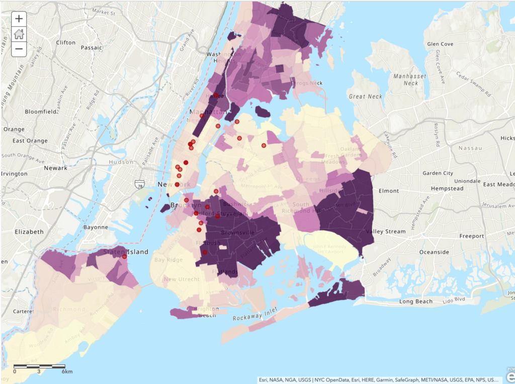
Yesterday I had the opportunity to participate in the Intro to Making Interactive Maps workshop which was expertly led by Olivia Ildefonso. The workshop was targeted to those who are interested in creating interactive maps but have little to no experience with marrying multiple datasets, creating intricate layers and executing a map that informs its viewers by telling a story. As someone who has scarcely any mapping experience aside from the two maps that I’ve created for assignments at the Graduate Center, I was a bit worried that I’d easily get lost or confused during the session. But I found that the workshop really catered to every participant regardless of amount of prior experience with mapping tools or lack thereof.
The workshop consisted of two parts: a presentation that included some crucial information on the basic fundamentals of interactive mapmaking as well as an overview of the map we were creating, and then hands-on experience making said map. One point I found really helpful in the presentation was how to determine what kind of mapping tools use. Olivia explained that the tools you use depend on whether the map you’re creating is going to be static or interactive. Additionally, your intended budget is another important factor, and combining data on multiple mapping tool such as ArcGIS and QGIS is common as they’re more accessible than some pricer tools. After discussing mapping techniques, exploring different tools and defining different kinds of data often found in interactive maps, we were able to try our hand at creating an interactive map.
Creating the Map:
The map we created mapped out 1 week of BLM protests in New York City, based around the research question: Do New York City’s BLM protests tend to take place more in majority Black neighborhoods or in majority non-Black neighborhoods? Olivia provided us with data including shapefiles for NYC boroughs, locations of protests and the percentage of race by neighborhood. We transferred this data over to ArcGIS and then were able to play around with color schemes, symbols, and the overall aesthetic of the map. Additionally, some of the data provided included specific details for protest locations and powerful images for each location, which we were shown how to add to our map points. I was truly impressed by how a string of data can be visualized (seemingly) seamlessly into locations, images, and points on a map.
Conclusion
To me, mapping is an art, and one that I have been interested in for years. With no experience, however, I admit I was initially daunted by it; I had no idea where or how to get started. This workshop made me feel very comfortable with ArcGIS and excited to create my own mapping projects in the future. Next, I’m excited to learn more about the actual process of finding data and preparing it for the mapping process.
If you’re interested, you can check out the map here 🙂
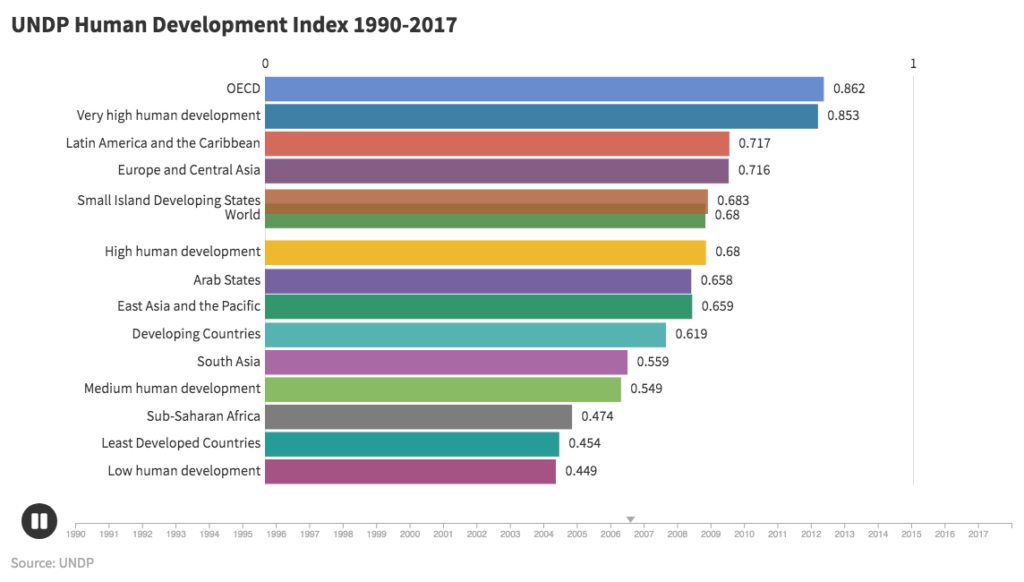
UNDP Human Development Index 1990-2017 (click image to view animation)
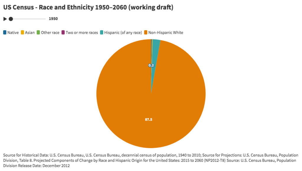
US Census – Race and Ethnicity 1950–2060 (click image to view animation)
Overview
Animated bar and pie charts attempt to narrate and reveal the changing relationships between variables, attributes, or features of a set of interpolated time series, and in the process identify historical trends.
Discussion
For the bar chart entitled “UNDP Human Development Index 1990-2017”, data was retrieved from the United Nations Development Program (http://hdr.undp.org/en/data). As a measure of human development in terms of a combination of indicators of life expectancy (based on the indicator of life expectancy at birth), education (based on indicators of expected years of schooling and mean years of schooling), and per capita gross national income (based on the indicator for GNI per capita), the HDI attempts to improve on older measures centered around income. The chart using country level data was too detailed and did not readily display any discernible insights. By zooming out and using regions and other summary categories, the animation increased to a level that resulted in meaningful trends beyond country-by-country rankings.
For the pie chart entitled “US Census – Race and Ethnicity 1950–2060”, data from the U.S. Census Bureau was retrieved for the breakdown of the US population by race and ethnicity between 1950 and 2060. Due to issues related to the changing definitions and questions for race and ethnicity, percentages for each year do not add up to 100%. When data categories change, the pie chart is an improvement over line charts in which time series do not uniformly cover the same time periods.
The London-based company behind these animated charts is Flourish (https://flourish.studio/), which is a registered trademark of Kiln Enterprises Ltd. The company targets agencies and newsrooms and offers discounts to non-profits and academic institutions. The freemium version requires that all charts be made publicly available. The personal subscription plan starts at $69 per month. The learning curve of the user interface is impressively low. Customization of charts is extensive, including multiple variables for font sizes, colors, captions, labels, legends, layout, number formatting, animation rates, headers, and footers. The company offers a wide range of visualization templates, including a variety of projection maps, scatter plots, 3D maps, hierarchy diagrams, marker maps, cards, 3D globes, photo sliders, network graphs, team sports visualizations, arc maps, and others. In addition to one-off visualizations, the application offers “stories”, which are animated presentations of one or more visualizations.
Challenges
US Census bureau historical data and projections present challenges resulting from the changes over time in the definitions of categories and questions. Both visualizations present issues with interpolation that hide unrepresented data. UNDP data presents issues related to hidden variability of indicators for demographic characteristics such as gender, race, ethnicity, age, and others with the geographic domains.
Conclusion
The animated bar chart for HDI suggests that while human development has gradually improved over time for all regions and categories, improvements relative to other regions have only occurred in the regions with middle values. The lowest HDI category (low human development) and highest HDI category (OECD) have not changed rank relative to the other categories. The lowest HDI category has only marginally changed relative to the highest category. Overall, regions have not shifted markedly in rank. Introducing other categories including “Global North” and “Global South” would help to reveal trends relevant to contemporary social, political, and economic analysis.
The animated pie chart visually demonstrates the decreasing white share of the population relative to the increasing non-white share of population. The point at which the white share becomes less than 50% appears around 2040. This could arguably be one of the most powerful explanatory demographic trends in contemporary US history. Explanatory power arguably represents a key measure of a successful visualization.
As a for-profit company, Flourish is potentially subject to constraints that run counter to the values and mission of the digital humanities and higher learning. To the extent open source software managed by non-profit associations and non-governmental organizations can replicate proprietary software applications, Flourish offers a model of a successfully hosted charting and visualization application.
When used carefully, visualizations offer opportunities to make compelling arguments about the state and nature of any phenomena that can be counted or perhaps merely represented. The most compelling visualizations are arguably those that reveal new insights well beyond the initial moments of comprehension. These kinds of visualizations invite iterative analysis in which changes in context or new information lead to new understandings. There are many risks, however, in attempting to argue and narrate through visualizations. Data visualizations can easily lead to distortions, omissions, and erasures as a result of either the data or its presentation. As with any powerful technology, critically informed experience and skill potentially lower the risks. As visualization tools and applications become more widely available, the need increases to disseminate an understanding of the hidden assumptions, distortions, and false representations embedded in data and its display.
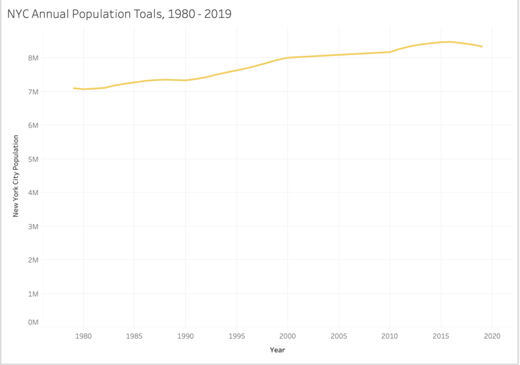
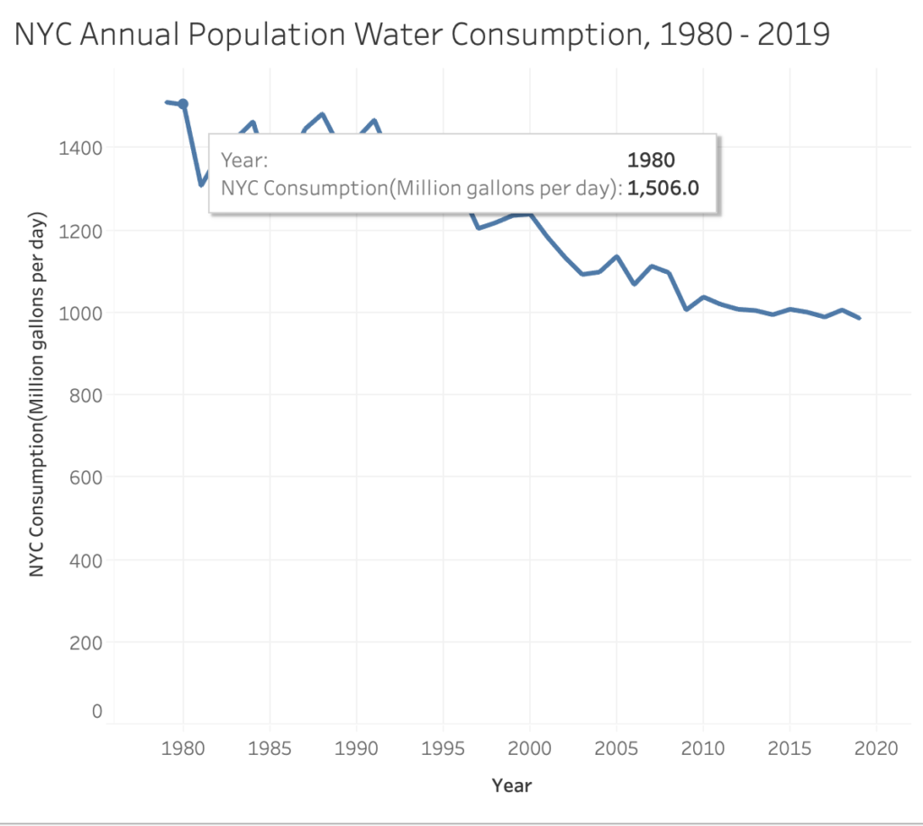
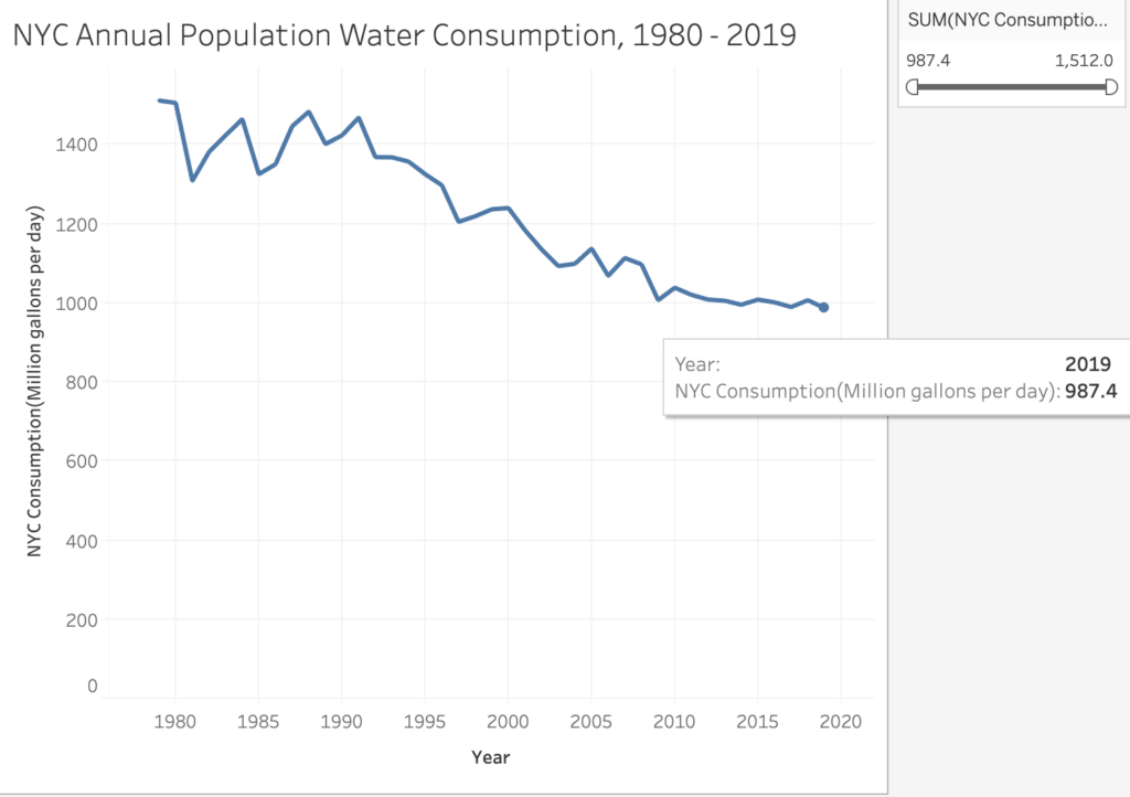
My visualization project concerns daily water consumption in New York City, collected from 1980 – 2019. Pulling from the New York City OpenData Project database, this “brief history” as described by the City, shows a mostly declining rate of daily water consumption within the last 18-19 years that leave much to infer about the reasons ‘why’.
I visualized this data using TableauPublic to examine the City’s water consumption dataset via Line Graph to probe for correlational informational as it concerns the year, annual City population total, and the consumption (million gallons per day).
Analyzing the Line Graphs, A – C
[Line Graph ‘A’]
The first Line Graph, A, is a simple visual which demonstrates the annual population totals from the year 1980 – 2019 (though dates 1979 and 2020 are included to support the range). According to this graph, the general population in New York City has grown by over one million residents – and counting – between 1980 – 2019.
While what readily can be inferred is that the population total has gradually increased each year, what cannot be is whether or not this information captures all residents across citizenship (U.S., legal residency, etc.) for annual daily water consumption from 1980 -2019.
[Line Graph ‘B’]
The second Line Graph, B, examined daily water consumption (million gallons per day) by the year. In 1980, 1.5 million gallons of water was consumed on a daily average, which had a population total of approximately 7 million residents in the City. But in 1985, the population total grew to approximately 7.2 million residents with water consumption declining to 1.3 million gallons of water on a daily average.
The last noticeable peak for daily water consumption was the year 2000, which had a population total of 8 million residents and 1.2 million gallons of daily water consumption recorded.
[Line Graph ‘C’]
The final Line Graph, C, demonstrates significant data totals that point to a decline of daily water consumption by the year. Between 2000 and 2019, the highest peak for population and daily water consumption was the year 2000, with the lowest being 2019, which peaked at under 1 million gallons of daily water consumption recorded for 8.3 million residents in the City.
The most noticeable detail of Line Graph ‘C’ is the steady consumption of water between 2014 – 2019, which had similar population values (8 million residents) and daily water consumption totals that fluctuated between 900,000 – 1 million gallons on average.
Conclusion
In addition to census details mentioned earlier (‘who’ gets counted), overarching or guiding questions that feel most apparent are:
why is daily water consumption declining as the annual population increases?
And importantly: is this a bad thing?
A few answers can be found in the June 2016 Update, Water Demand Management Report, by the DeBlasio mayoral administration for New York City. According to the report, water managed by the City’s Department of Environmental Protection (DEP) was traditionally approached by increasing ”supply to meet demand.” However, the DEP focus have shifted to decrease consumption seen in the 1980s and 90s to conserve water and optimize “existing systems” through programming, incentives, and policy as the population increases.
The 2016 Update entailed six strategies:
Water Municipal Efficiency Program;
Residential Water Efficiency Program;
Non-Residential Water Efficiency Program;
Water Distribution System Optimization;
Water Supply Shortage Management;
and Wholesale Customers Demand Management.
While residential properties accounted for 78% of the City’s water consumption according to the year of the report, the greatest ripples seen at home can be traced to the Educational and Non-Residential “water saving” partnerships, which influence behavior and create incentives for daily water conservation at home.
A case-study for the report is “30th Annual Water Resources Art and Poetry Contest from January through May 2016.” The DEP recognized environmentally-conscious artwork, DEP Water Ambassadors, and over 1,600 submissions for the DEP Water Champions competition for City students. It can be inferred that students are not only generating concern about the importance of water in school, but that such attitudes adapted in their youth are likely to be brought home, and at best, normalized in their relationship to the environment.
In summary, water consumption feels like the most logical response to what science tells us about global warming, especially in multi-cultural municipalities such as New York City, which was not my original thought when contemplating the dataset.
Beyond the presumable good that is associated with conserving water, I am interested in the behavioral and ontological outcomes this may produce as it concerns humans’ relationship to the earth, and how optimizing the environment through human-measures, seen in the report, can be impact human-self and human-human relationships as it concerns care and compassion.
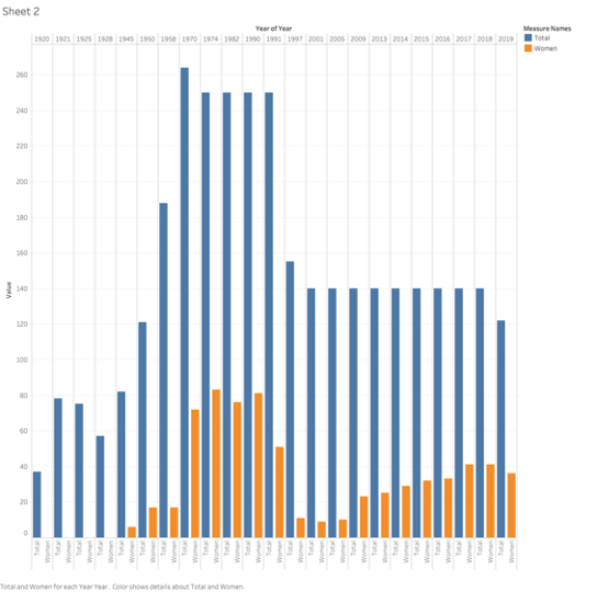
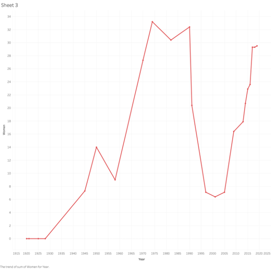
Keeping with the theme from my first attempt from the mapping exercise, I decided to visualize the representation of women in the Albanian parliament for 1920-2019. This data was collected from the Albanian Institute of Statistics. I am familiar with some of these numbers because I have referenced in a paper a few years ago. I was looking forward to learning about later sessions of the government, and also to find out what the viz showed about women’s representation. The data is pretty straight forward, it looks at the number of women representatives in each Albanian legislature, and I was hoping the graph would mark a few points of extreme sudden highs and drops.
The first issue I had with the viz was that legislative districts have been redrawn many times over this period, and this visually seemed to exaggerate the gender disparity, thus rendering the path of women representation less obvious. I decided that instead of comparing male and female representatives, I would include the total number of the representatives and the total number of women for each administration. This made the numbers of women legislators a bit more clear. I decided to focus on this viz and also produce a simple graph of the percentage of women in parliament, to be able to look at the trajectory only. This trajectory is not the steady increase that one might expect; it marks extreme highs and lows in representation that bring up a few questions.
This graph shows the number of women and men representatives for each congress.This graph shows the number of women representatives against the total number of representatives.This graph shows the trajectory of women representation in parliament from 1920-2019.
The first moment on the viz is the complete lack of women’s presentation from 1920 until after WWII. This time marks the rule of King Zog, and later Mussolini, followed by WWII, but this is not surprising or interesting for the purposes of this exercise. Another notable moment is the sharp increase of representation of women in the late 1970s. This was the peak of women’s emancipation movement by the Hoxha regime, but what is interesting is that in the middle of a huge campaign to include women in his government, that number begins to decrease in the 1980s and picks up again after his death and during the democratic movement in 1990. Albania was not a democracy at this time, and these representatives were hand-picked from the ranks of the communist party, which included as many women leader as men. Whey did Hoxha elect to decrease the number of women? What might perhaps be the most shocking part of the graph, is that women’s representation sharply decreases in the legislatures after the fall of communism. In 2001, there were only 9 women in a legislature body of 131. Women’s presence has steadily increased since 2005 and it is now at almost 30%. What caused this drop and what changed after 2005?
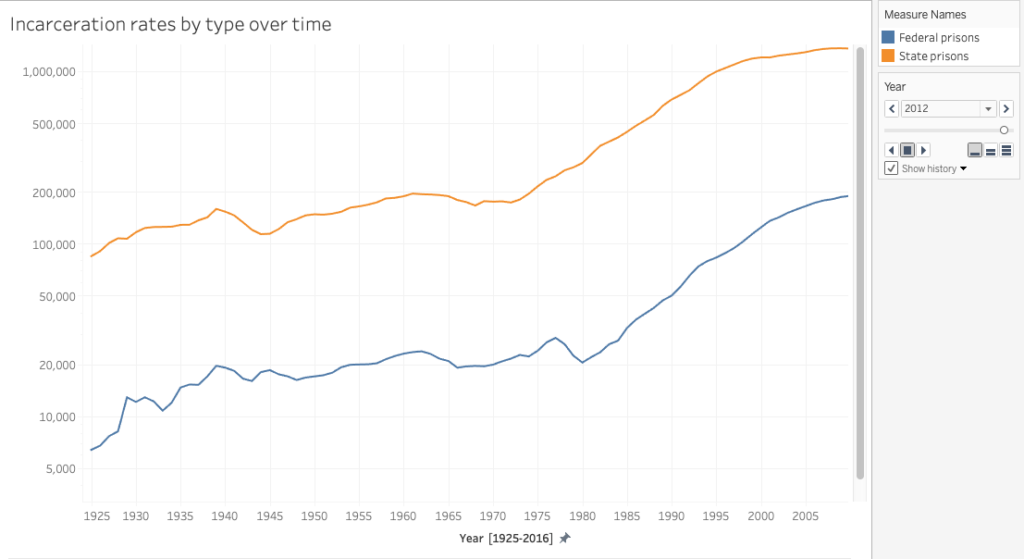
For this assignment, I wanted to continue to work with data that relates to mass incarceration. Searching for data, I found the non-profit, Prison Policy Initiative, which produces research and publishes data visualization projects that aims to expose “the broader harm of mass criminalization, and then sparks advocacy campaigns to create a more just society”. The Initiative emphasizes that due to the lack of accessibility of essential national and state level data, it strives to create data analysis and powerful graphics that are intended to bring in new supporters into the national conversation about criminal justice reform and over-criminalization. The Initiative also provides numerous datasets (for example National data, State level comparison data, and State specific data) which researchers used for reports that were published on its website. I selected the national dataset on incarceration rates in state prisons and federal prisons from 1925 – 2016. After sorting the data and moving it to a separate cvs file, I transferred it to Tableau.
In my first visualization attempt, I created two simple and separate graphs that show the incarceration rate of federal prisons and state prisons over time:
As I wanted to visualize both datasets in relation to each other to illustrate how state policies drive mass incarceration, I created two graphs and tested different visualization types. For the second graph, I used the animation feature to display the increase of incarceration over time in motion, thus calling attention to the rapid rise of incarceration, particularly during the 1980s “War on Drugs”. In order to view the animation, on the right hand corner there is the option to scroll back to the year 1925 and then by pressing play the plot points on the graph will start to move.
Thinking back to Drucker’s article “Humanities Approaches to Graphical Display” and interpretative models/approaches to data visualization, one idea for future expansion might be to create an interactive visualization that includes additional data that gives information that explain the numbers in detail. For example, the Prison Policy Initiative has published a visualization on incarceration rates by ethnicity/race and on women’s mass incarceration, which would be important criteria to add.
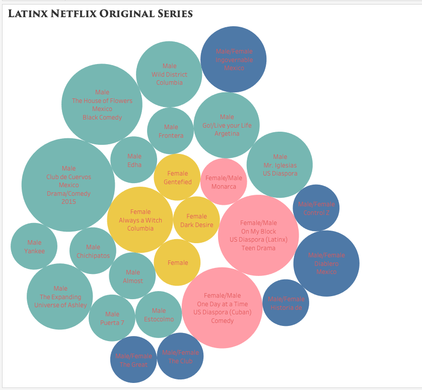
While browsing through Netflix for something to watch, I started to notice the lack of Latin American original television narratives. When searching for content, the algorithm does not distinguish between Spanish Language content, content from Spain, content from Latin America, and content from the Latin American diaspora here in the United States. I decided to use Tableau as a visualization tool to help better express, analyze, and, of course, bring to light the few yet impactful Latin American streaming series.
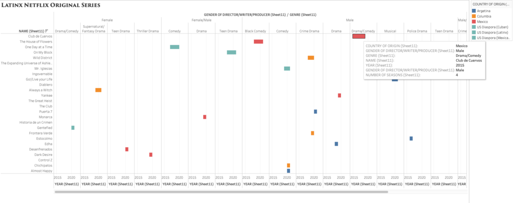
Compared to Argis, Tableau has proven to be a much more user-friendly tool to interpret complex data. Since I am familiar with Excel, I opted to import the data through this method and use the “drag and drop” capabilities to create relationships between them. I made a simple chart with 6 columns: title/name of the content, year launched, number of seasons, country of origin, genre, and the gender of the principal producers (creator/writer/director/producer). The easy to use the system within Tableau allowed me to organize the data as simple as only showing two relationships or showing multiple relationships. I was able to see how easy it is to manipulate the visualization to highlight the most important areas to a creator. As a creator myself, I was heavily interested in the producers’ gender and the genre of the longest-running titles.
packed bubbles visualization style
Grantt visualization style.
I debated which visualization to use and how much information was essential to include and display. While I enjoyed the Packed Bubbles visualization, I later opted for a cleaner and detailed look, like the one offered by Grantt. The visualization showcases the lack of diversity in the writer/director and country of origin (Mexico being the majority) while also highlighting the various genres/styles from Latin America.
I definitely enjoyed using this tool, whoever, the most difficult part was the export. Between the tableau online, the tableau server, and the original account, I could not export this project properly. However, had I had more time, I would have definitely tried my hand at a much larger and complex data set. Overall the program is easy to use, but the vast number of choices and styles can be overwhelming for any beginner.
Need help with the Commons?
Email us at [email protected] so we can respond to your questions and requests. Please email from your CUNY email address if possible. Or visit our help site for more information: