As a first semester data analysis and visualization student I was eager to get started on this assignment as it would be a great way to see if everything I have read and learned from my visualization class has stuck with me. My software of choice is Tableau and below is a collection of maps of restaurants I have visited prior to lockdown and post lockdown, spanning from January 2019 to March 2020 and June 2020 to September 2020, respectively. Thanks to Yelp, Google Maps, bank statements, Venmo, and Cash App, and just the old handy-dandy method of writing down recommendations from friends, family, and colleagues, I was able to just about map all the restaurants I have visited within the last year. Writing the Excel spreadsheets with all the restaurant names, addresses, geo-coordinates, and the type of food they served was already a tedious task and took up a good bulk of time to complete.
Once the spreadsheets were completed it was off to Tableau to get my maps. Tableau is a great mapping tool since it has a somewhat easy learning curve and the drag and drop nature of the program lets you choose your variables with a click of a button. Then it is all up to the user to choose which visualization they want to proceed with. One problem I did run into however was when it was time to create the dashboard. I am not sure if it is either user error or if it is part of Tableau, but you cannot create two separate dashboards from two separate sources under the same workbook. After playing around with the settings to see if I can find a way to work around this hurdle, I decided two create two separate dashboards and call it a day. I then realized I should do the same for Excel which I did. The initial setup in my head did not go quiet as planned but I was still able to come out with four visualizations that I am proud of.
While meticulously copying and pasting the geo-coordinates of the restaurants onto the spreadsheet, I found that a few of them have either permanently shut down or relocated outside of the five boroughs. Reading all of that placed a damper on my mood. These were places I went out with friends, co-workers, family, dates, and have made solid memories sharing experiences with them at these restaurants. Immediately after, I turned to my phone and scrolled through a few photos I have taken at these places. Most of them are of the food or drinks but the few shots of me and the person I was catching up with brought back fond memories.
Although outdoor dining is a great way to bring in revenue for these businesses it can only do so much before the cold weather starts to set in. I know I have read news articles about indoor dining returning to New York sometime in October but with only a 25% seating capacity. There is going to be some tough times ahead these businesses if the bulk of the hospitality industry is still left behind. I sympathize for the workers because I am one of them and was out of work for a good chunk of spring and into the summer. If anything I suggest you go out and visit the more local stores, the ones that are family based with that mom and pop shop feel to them; I believe they are the ones that will need the most help. Only time will tell what will happen to these places but all we can do now is mitigate the spread by following the guidelines imposed by the health care professionals. Hopefully us as students can return back to in-person sessions of classes and connect with one another in spaces once again such as restaurants, parks, and large events by next year.
After this week’s readings, I’m left thinking about the connections between Marlene Daut’s piece, “Haiti @ the Digital Crossroads”, and the Center for Media and Social Impact’s report Beyond the Hashtags. Both represent some of the foundational themes of digital humanities we’ve seen throughout the readings and sites of learning. Daut’s call to action for scholars to work against colonial discourses and their caution to be wary of reproducing or reinforcing the very structures and ideologies of colonial-logic. Daut argues a minority-centered discourse “involving content, context, collaboration, and access” offers a better guide to Haitian studies scholars navigating where the field is headed, while being critical of tendencies to legitimate or reinforce colonial hegemony. The authors recognized the significance of the moment where two social phenomena converged (Black Lives Matter and Twitter) to significantly contribute social justice movement. The report’s narrative and major findings are further accentuated by its direct ties to the current political moment. And yet, there were moments throughout the report where I felt it veered into reproduction of oppressive dynamics that are worth discussing.
I’m approaching my critique that this disconnect is evidence of how far the public discourse has evolved, and not necessarily of the report’s authors and their relationship to the movement or activism in general. It is possible this gap is reflective of the academy being off-centered in its critical discourse, but that is beyond the scope of this blog. By approaching with curiosity–and acknowledging it is nearly impossible for anyone to do social justice and movement work outside the confines of the oppressive systems they battle—I am hoping to participate in the generative intellectual discourse Cameron Blevins calls for in “Digital History’s Perpetual Future Tense.”
Two examples standout in particular. The first example I wanted to highlight, which I think is getting much more critical and nuanced attention in the current moment, is the use of the qualifier “unarmed” to describe the victims of police violence. This term fails to account for situations like Philando Castile and Kenneth Walker (Breonna Taylor’s boyfriend), who legally owned guns, or Tamir Rice, who was executed by police officers for having a toy gun in an open carry state. The use of “unarmed” subtly creates good and bad victims, even when both may have been complying with the law. Additionally, tis sentiment fundamentally violates the rights and presumptions legal rules and norms. Now more so than before, there is also an acknowledgement that even if someone was armed or posing danger to themselves and the community, it in no way justifies police lynchings or summary executions of members of the public.
The second example is the narrow focus on Black men killed by the police and highlighting male activists like DeRay Mckesson and Shaun King, while simultaneously acknowledging queer Black women were responsible for creating the language to move the discourse and activism forward. In 2014, the African American Policy forum launched the #SayHerName campaign to bring attention to the Black women and girls victimized by police. Recently, the campaign was formally adopted by the WNBA in the wake of the most recent series of uprising following the summer of 2020. The current moment has also brought more scrutiny to the men that have presumptively been held up by mainstream media sources as movement leaders. DeRay has been accused of being more of a media-activist from outside Ferguson who capitalized on a moment. Moreover, his latest campaign—8 Can’t Wait—itself relies on the oppressive permanence of the police state and was excoriated by statisticians and abolitionists for both its faulty logic.
And yet, Beyond the Hashtags also advanced critical intellectual dialogue around issues that are marginalized or devalued in traditional academic spaces. It’s important to acknowledge that these types of reports are useful and cannot be everything social movements need. Moreover, the authors correctly identified the significance of Ferguson, Black Twitter, and the disenfranchisement of Black youth in the US political system. Additionally, I think the framing of Twitter’s trifecta of successes–to educate a broader public, amplify the work of grassroots activists, and influence movements for structural change—is useful analytically and practically, embodying important parts of DH praxis.
Brainstorming an Idea– My initial thought process while beginning to attack this project was to stick with something simple that I can already find an organized public data set on. However I also wanted to delve into a very specific topic that happens to be a genuine interest of mines. In the end the latter turned out to be a bit more pertinent to me. I’m sure I might be getting a few raised eyebrows over what I chose but I assure you it’s nothing more than a fascination. In college l I took a particular interest in serial killers after researching a few for a project I was working on for a speech class. The intrigue carried on ever since and my engrossment in these rather vile individuals has not changed. In fact one of my favorite past times include reading wiki pages dedicated to them and watching a Youtube video based on them right after (before going to sleep for added thrill).
I knew I could find an adequate amount of information to make this visually come to life on a map but at the same time I knew it would be very ambitious. As this is my first time using a mapping tool I wanted something manageable within my limited abilities, this meant I had to narrow down on the specifics of what I wanted to visualize. Instead of doing all 50 states I went with just the east coast and as far as data is concerned, I went with what I thought would be the four most vital pieces of information- gender, state they are from, the number of victims they had and the years that they were active killers.
Creating a Data Set– I will admit googling public data sets on serial killers did turn up quite a few searches but nonetheless nothing as specific as what I was attempting to do, this lead to me essentially creating my own data set on Microsoft Excel.
Finding the names of the killers I wanted was the easy part. A quick google search brought me to a list of the most notable serial killers by state. All I had to do from here is cherry pick the ones from the east coast . The particular list I used was compiled by Frank Olita published on Insider.com (https://www.insider.com/serial-killers-from-every-state-in-america-2018-5) Once I had my list of 14 names it was time do my research on each one, because they are notorious figures finding the information I needed on them wasn’t very difficult. However I did encounter a bit of a grey area when looking into the number of victims portion of my research. Some of the killers on my list do not have a definite number of cases. For example one killer could have 100 speculated cases but only be convicted on record for 2. In order to save space on my map I decided to just put a guesstimate total sum with both convicted and speculated which is why I advise those looking at my map to take that portion with a grain of salt. These are not 100% accurate numbers.
Mapping– Once I had all my info compiled on an excel spread sheet it was time to input it into my mapping software, the one I decided to go with was Tableau Desktop. When going down the list of mapping tools, this was described as the easiest to use which honestly is the sole reason I went with it. With that being said I still struggled immensely with operating it in the beginning. For one it took about 3 hours to fully download onto my laptop. Once I got the application finally set up I was unfamiliar with virtually everything I saw in front of me. A few clicks here and there and I managed to figure out how to import my excel sheet. The cool thing about Tableau is that all you have to do is import a file of a data set and the mapping is done for you in less than a second. Although, the suggested visualization it comes up with may not be what you envisioned. This was another problem I faced when using Tableau, the original suggestion they designed was not to my liking. I wanted all of my data to be presented in one singular image of a map, Tableau put all the points on to separate images of maps for each of the serial killers data sets. I couldn’t figure out what I had to do to manipulate the image to do what I wanted, this is when Youtube came to save the day. I looked up a variety of tutorials on tableau and figured out the basics of how to shift around your data on the software to get your map to look the way you want. Basically Tableau has a click and drag feature that allows you to change the physical appearance of your map. In the columns and rows section I input the longitude and latitude (auto-generated by Tableau) to give me a singular image of the United States Map. I dragged my gender data into the color feature which differentiate male and female (male-green female-purple). The name data into the label feature which allows the viewers to see the names correlated with each state and then the number of victims, time active and state name into the detail feature which created a box that shows all this info when you hover over a state with your mouse.
Unfortunately Tableau does not allow you to share interactive maps without uploading it on to Tableau public first. I was not exactly comfortable with sharing my project on a public site due to my slightly inaccurate info so instead I recorded a video on my phone showing the hover feature in effect.
(Note- Craig Price from Rhode Island was included but due to the small size of the state it’s hard to visualize on the map. He was active from 1987-1989 and had a total of 4 victims)
Future Improvements– I’m not completely disappointed with how my map turned out but I do accept the fact that it could of been a lot better if I had taken the time to organize my data sets more. In the future I want to be more specific with how I choose to showcase the number of victims. Instead of combining suspected with convicted I should of made two separate columns for each, maybe even play around with the color tool to help differentiate it on the map. I also think it would be interesting to add more personal details about the killers apart from the statistics. Perhaps the hover over feature can display a short bio on each one and/or the notable crimes they committed. In all I see my map as a beginner level attempt, I have a few of the fundamentals down for the software I used but with more practice and organization I’m sure this map can really flourish.
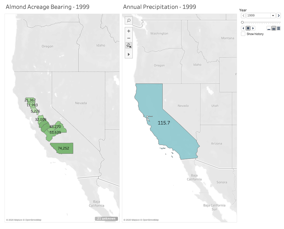
I was inspired when learning from our readings how mapping software can provide those extra layers of important context to users in animated maps, so I wanted to challenge myself to build one this week. I chose to use Tableau Desktop to do this because it automatically gives suggestions for how to display your data, is relatively easy to use with drag and drop functionality, and is free for students.
I’m passionate about sustainable farming and am curious about the role climate change continues to play on agriculture, so I chose to look for data in the state that annually generates the most revenue from agricultural production: California. Specifically, I wanted to see what the state’s annual precipitation levels are, and how those levels impact the amount of land that’s actually bearing crops. A lot of acreage is reserved for farming and planted heavily each season, but how much product is actually generated on that land in each growing season. With wildfire seasons getting stronger each year, and a severe drought that spanned from 2011 to 2019, there’s no doubt that climate change is affecting food growth in the state. As these changes continue to occur and grow in severity, the crops in California believed to be most impacted are fruit and nuts.
Given that growing almonds specifically requires much more water than fruits and vegetables, and considering how trendy almond milk is right now, I chose to focus on this crop in particular when measuring its bearing acreage in the state against average annual rainfall. Fortunately, California farmers have kept meticulous records since 1980 of not just how much of their land is reserved for the nuts, but also their yield. I chose to focus on 10 counties that had the highest amount of reserved acreage for planting almonds in 1980. But to narrow it down a little, I set a 20-year timeline to span from 1999 to 2019.
I definitely found that the most challenging part of this activity was finding the data I needed and formatting it correctly for Tableau to digest. While I easily found the data I needed for the almonds, I had a much harder time finding free and historical counts for average annual precipitation across the entire state. I found many government resources that listed measurements by month and by region, but I knew I wouldn’t have time to dedicate crunching out the averages I needed. I also ran into paywalls when I wanted to locate state-wide figures I needed for the 20 year-timeline I set for myself. I ended up settling on an easy list of annual rainfall in inches over the past 20 years in Los Angeles county alone. This data doesn’t exactly help me see what I want to at the state level, and Los Angeles isn’t one of those 10 counties in my list with almond growth. But I wanted to have something to experiment with and display for the purpose of this mapping project.
After reformatting my columns and rows a couple of times in excel, I finally worked out how Tableau would best intake my data in a way it would recognize. For example, rather than having a row for each county with the acreage listed out beneath columns for each year, it made more sense to have a single county column, a single year column, and a single acreage column in which they all corresponded by row. It took me around 3 attempts with importing the data to learn that this would work best.
Once I worked out these data formatting kinks, Tableau really did all the heavy lifting. I watched one YouTube video to see how an expert built a basic, non-animated geographic map. This helped me learn how I wanted to use color and shading in my display. The next video I watched gave a tutorial on how to use the year as a profile that gave the animation its power. Building the animated map wasn’t immediately obvious to me, so I’m grateful there are resources out there to follow along with. Despite reading how to manually set longitudes and latitudes for areas that Tableau didn’t recognize in the dataset, I couldn’t get Butte county to appear on my map. So rather than showing 10 counties as I intended, the final result has 9. I’ll have to dig more into what I was doing wrong there.
After some experimenting and playing with shading and color, I built two successful animated maps across the same 20-year span: one measuring the almond-bearing acreage and the other measuring annual precipitation in inches. In my head I was envisioning a single animated map that layered the acreage of these counties underneath the larger, state-wide precipitation layer. After experimenting with the tool and my data, I couldn’t figure out how to layer it all together with the visual effect I wanted. But maybe that end result would have been too busy for the user? I think if I continue learning from the many Tableau resources out there I could eventually figure it out and decide how to best present my data.
After the initial data mining and formatting challenges, I ultimately had success using Tableau and would recommend it for any geographic mapping needs. I really only touched the surface of what the tool can do, so I’m curious to see how else it can absorb and display information in engaging ways.
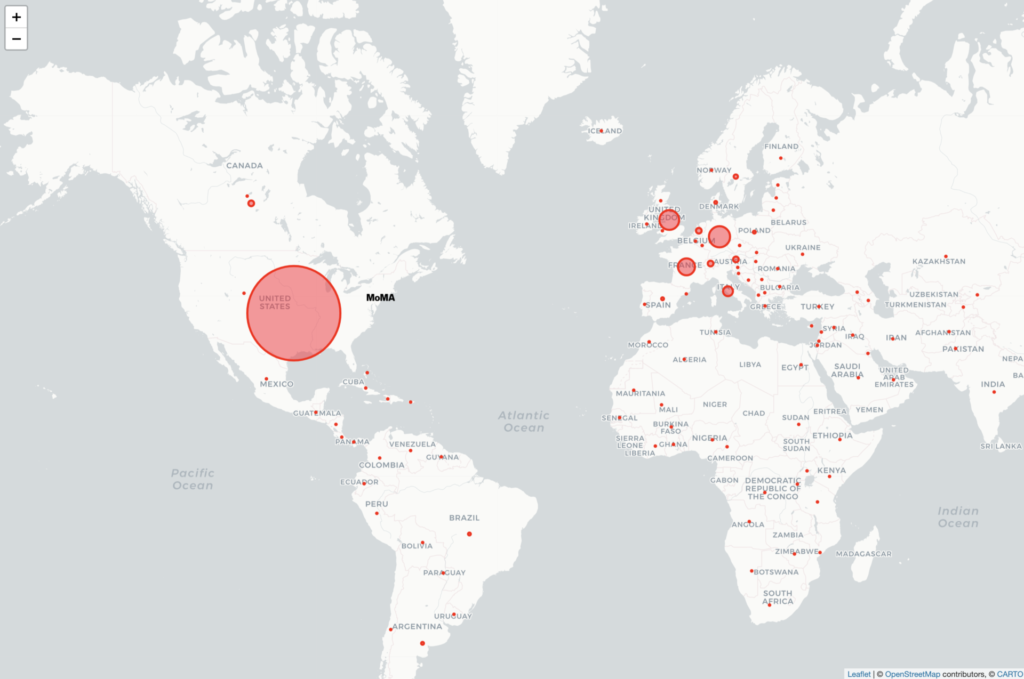
Despite my map’s inherent flaws, it was a good exercise to experiment with mapping tools and test out the theories and ideas we’ve been reading about recently. From the beginning, I was interested in doing a map related to the arts. Luckily, the Museum of Modern Art in New York has provided open access to a dataset of artists and artworks in the collection: “The Artists dataset contains 15,236 records, representing all the artists who have work in MoMA’s collection and have been cataloged in our database. It includes basic metadata for each artist, including name, nationality, gender, birth year, death year, Wiki QID, and Getty ULAN ID.” After reviewing the data, I concluded nationality would be the focal point of my map; plotting the countries to visualize the artists’ nationalities.
Plotting 15,000+ points was not an option for several reasons: 1) too data-intensive for a simple map; 2) most of the artists are American so most plot points would be on this area (cities and states are not provided because “nationality” refers to country) 3) 3,000+ do not have nationality listed or it is listed as “various”, referring to artist collectives or other entities. I scrubbed the data to remove the information I could not use and added latitude and longitude for each country. Additionally, I added a column for # of artists for each country which allowed me to have one row per country, culminating in a spreadsheet with 100+ rows of data – much more map-friendly.
Using Leaflet
All of the recommended mapping tools are fascinating but I have some experience writing javascript code so I chose to do the map in Leaflet. I did some quick tutorials to familiarize myself with the tool and then Googled some different ways of handling this data. The simplest option was using JSON arrays for each plot point, rather than connecting the map to a .csv file. So, back to my spreadsheet, I converted # of artists per nationality to a percentage of the whole and added a column to concatenate the columns. This last column was copied/pasted into javascript. Finally, in my code, I created a formula for the plot point “circles” to convert the percentage of each nationality to a radius in meters. This needed some trial and error as I wanted the plot points to be big enough to be seen at a specific map zoom, while also maintaining the proportions of the data. The resulting map shows plot points of nationality tied to countries, which are clickable to see the # of artists belonging to that nationality.
Conclusion
Arguably, MoMA has been the international gatekeeper of modern and contemporary art since its founding in 1929. Situated in New York City, it is no surprise that most artists in MoMA’s collection are American and European. British, German, and French artists are well represented. From the map, it’s clear to see MoMA artists have many nationalities but there are also nations that are not represented at all in MoMA’s collection.
Flaws (there are many)
How recent is the data set provided by MoMA? Although github says the files were updated “27 days ago”, it’s not clear what was updated.
How accurate is the data set provided by MoMA? Are they modifying the data to tell a story which suits the institution?
Issues of nationality vs. race vs. citizenship vs. ethnicity. I found myself questioning the meaning of these terms through this process. Additionally, a nationality is not only tied to a country – artists are Native American, Palestine, Catalan and Canadian Inuit, for example. These are not not countries included on the map so I had to use artistic license to plot these places. Also, as I mentioned previously, 3,000+ artists do not have nationality in the dataset.
Latitude and longitude coordinates are placed at the centers of countries which do not fully represent “nationality”.
The sizes of my plot points are subjective, based on what I think would be a good visual representation of proportional size.
Art collecting by an institution is intrinsically related to colonization and my map compounds this issue by using a tool of colonization – the map itself.
Possibilities for Improvements
An interactive map that allows a view of the data over time to reveal collecting habits of the museum. When were European artists most collected? What is the nationality of artists collected in recent years? Do the collecting habits change based on the curators at the time? Do the collecting habits reflect concurrent events such as wars or social movements?
I was incredibly excited about this project when it was introduced in our first class, but as the due date kept getting closer, I was at a total loss as to what I could possibly want to map, having both too many ideas and not enough ideas at the same time. I took a deep breath, and I thought, it’s almost Halloween (my favorite time of year), let’s draw some inspiration there. And that’s how I settled on cemeteries. Call it a morbid curiosity, but they’re some of my favorite places to visit. There’s a tension between remembering and forgetting, especially in older cemeteries. If there is no one living with memories of a person, is their headstone doing the remembering for us? Is that really the same thing as remembering, and is it enough? The headstones themselves are already reducing a whole life into a few data points: name, birth and death dates, and maybe a title/relationship, quote, or a decorative symbol. And what happens when even those data points are eroded away and are no longer readable by visitors? Is it enough to be in a dedicated place of the dead and know that its inhabitants once lived? What do I even mean by “enough”? What is the responsibility of the living to the dead?
Initial Premise and Data Search
I live in Queens very close to Calvary Cemetery, which claims the largest number of interments (about 3 million) in the United States, and it’s an incredibly massive feature in my daily landscape. So first and foremost, I was curious to know how much physical space cemeteries are taking up in New York City. Many of them must be full, or close to it; indeed, many of the cemeteries in Queens and Brooklyn were established when Manhattan burial grounds were facing a severe shortage of space, exacerbated by a cholera outbreak in 1847. What happens when the cemeteries in the outer boroughs fill up? Is the current land usage sustainable? In addition to urban planning concerns, there are also many environmental concerns about some of the more popular death rituals (burial and cremation), but I wasn’t sure how to include that here. I mostly was hoping to see the relationship between the space allotted for the dead and the rest of the city—the space allotted for the living (though admittedly cemeteries are perhaps more for the living than they are for the dead).
Based on the suggestion in class, I initially tried to find data on cemeteries from NYC Open Data; there were no search results. So I googled “cemeteries in NYC.” Most of the results feature a selection of the oldest, or forgotten/hidden, or most unique, or most notable dead. There are also websites like Find a Grave, where you can search for specific headstones in their database. But I wasn’t seeing any datasets showing all of the cemeteries in the city. So I decided I should start to make my own dataset from a Wikipedia listing and searching in Google maps (admittedly a problematic start). This quickly proved time-consuming and frustrating as many of the cemeteries listed don’t have entries in Wikipedia, and even cemeteries that have their own entries don’t always include information about area, or they contain measurements that are vague (e.g., qualified by “nearly,” “about,” “more than”). Not to mention I’m not sure who accumulated this list and how complete it is. From a cursory search, I know that there are cemeteries in Manhattan that have been built atop of (again see the 6sqft article “What lies below: NYC’s forgotten and hidden graveyards”)—sometimes with bodies relocated, and sometimes not. Should these count as cemeteries on my map? (I’m inclined to think yes.) I was also curious to see when the cemeteries were established, but even that proved to be a tricky data point. Does that mean when the land was purchased for the purpose? Or when it was incorporated? Or when the first bodies were interred?
From the outset, I’m already seeing that there is no neutrality in the data I’m collecting—a la Johanna Drucker’s “Humanities Approaches to Graphical Display”—and it’s time-consuming even to just find a list of cemeteries. So I immediately scaled back to just focus on Queens, and then I added in Brooklyn when I realized there are several cemeteries that span both boroughs.
Choosing a Mapping Tool and Creating My Map
I assumed that a static map rather than an interactive map would be easier to start with, having no experience in using mapping tools. I wanted to try to use an open access tool, so I immediately nixed ArcGIS and started with QGIS, but I realized that neither of the all-in-one release versions are compatible with my Mac setup. From the interactive map tools, I didn’t want to wait for approval access with Carto, so I opted to sign up for a free license of Tableau Desktop.
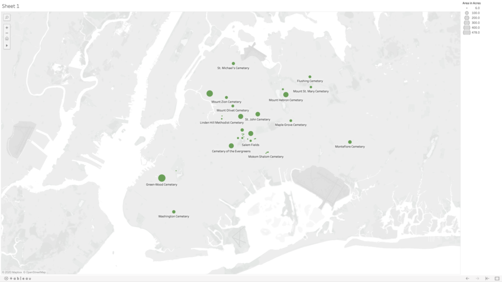
Very quickly, I was uploading my dataset, consisting of five columns—name, borough, geo coordinates, area in acres, and year established—and tried to make a map. I was dragging and dropping each of the columns into different fields in the Tableau workspace, but I was only able to get it to create graphs. I soon learned that the mapping would work better if I separate my geo coordinates into two separate categories for latitude and longitude (using the decimal values). After some trial and error, I figured out that you need to put longitudinal values into the columns category (y axis) and latitudinal values into the rows category (x axis), and finally I was seeing my cemetery dots. My original dataset had about 10 cemeteries in it, and my map was frankly looking really sad, so I decided to dig a little deeper and generate some more names and see if I could find info for the cemeteries without entries in Wikipedia. Thankfully I found the New York City Cemetery Project by Mary French. Through her research, I was able to fill my dataset out to 33 cemeteries in Queens and Brooklyn—there are very likely more as her project also includes historical information about potter’s fields and family burial grounds.
I used the area in acres category to be the scale, so that the dots appeared on my map on a size scale in relation to each other. Ideally, I would love this scale to relate to the scale of the map of the city in the background, but I could not figure out how to do this. Adjusting the scale is a matter of sliding a button up and down on a linear scale without any numbers, so I just picked a size scale that I found aesthetically pleasing. I’m also not 100% confident in my values for latitude and longitude as most of them were derived from my searching for the cemetery name in Google maps, and then right clicking “What’s Here?” for the values—and in doing so sometimes my mouse was clicking somewhere slightly different than where Google had placed it’s pin, and also Google sometimes seemed to have multiple pins for the same cemeteries, so I had to choose which to use, and sometimes it was placing pins near entrances and sometimes in the middle of the spaces. I also noticed there are many cemeteries that appear grouped together on the map, and there are instances where Google seems to be placing two pins in the same spot for two adjoining but different cemeteries.
Going back to NYC Open Data, I was able to find a dataset with information on all of the city parks, including area in acres. However, when I was trying to import this data to my map, I couldn’t figure out if the parks were in the correct location as that dataset was using different coordinates than I had used in my own dataset. Also, the acres column was coming through as a string rather than numbers—I cannot for the life of me figure out why—and so I have no confidence that what I was mapping for the parks was comparable in scale to what I had generated for the cemeteries, so I ultimately decided to scrap their data and just present my data on cemeteries in Queens and Brooklyn.
Map of cemeteries in the boroughs of Queens and Brooklyn shown in relative acreage to each other (not to scale with the map of New York City in the background).
Ideas for Future Expansion
The first area of expansion would be to expand my map to all of the boroughs. Given the importance of having access to outdoor spaces—especially during the current pandemic—and knowing that picnicking in cemeteries was at one time a common practice, I would like to further dig into the visiting practices at each of these cemeteries (e.g., are visitors allowed, are visitations limited, have visitor policies changed during COVID-19?). And also find out how to map the cemetery spaces in comparison with other green spaces in the city. I’d also be curious to see the density in each of the cemeteries (number of interments compared with acreage) and average cost of burial.
In addition to urban planning and environmental concerns, I think cemeteries are a great starting point for discussions about access, community building, and even broader ideas of what it means to be human (and which people are “worthy” of remembering). Burials are expensive, and those without means have generally been buried differently—both in ceremony and location. And access to different cemeteries has been restricted based on other factors like race, ethnicity, and religion. A prime example is the African Burial Ground National Monument, whose original grounds included the remains an estimated 15,000 Black people—both enslaved and free. The original cemetery was closed and slated for redevelopment in 1794, later to be “rediscovered” and “re-remembered” when the land was being excavated for the proposed construction of a federal building in 1991. What does this purposeful forgetting of a cemetery mean for that group, and how do cemeteries contribute to our understanding/claims of belonging to certain communities and specific locations?
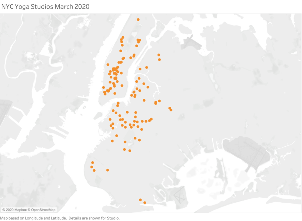
The title of this entry is exactly what this map is of, all of the New York City boutique yoga studios that were open prior to the government mandated closure due to the Covid-19 pandemic instituted on March 16, 2020. Only on August 24th, more than 5 months after their doors closed were fitness facilities in NYC able to re-open and studio classrooms were sadly not included in that re-opening. Upon building this visualization, it brought tears to my eyes and many questions, some of which I already knew the answer to, but some remain unclear – including my very own involvement in this line of work. Without going into unemployment statistics directly (I don’t have that data, yet!), I wondered where everyone is physically located at this present time since we’re not all at work and not necessarily confined in our homes as much, what businesses were still somehow paying their leases, if the studio moved it’s platform online and if they had attempted to use their space alternatively as a way to produce income outside of holding group fitness classes.
As you hover over each studio you can see the name of the studio, as well as the latitude and longitude location. My plan is to add more useful information to the tool tip data, as to which I have already started to collect and just mentioned in my questioning, but I decided to stop with the additional data after spending many hours collecting the latitude and longitude of 125+ locations and truly just wanted to make sure what I was doing would function on a map. However, I am so inspired to continue to build on this map because I know that it can tell a story of a moment in time that is now for sure what would be lost or is in the process of disappearing. Boutique fitness had skyrocketed in popularity so much over the last decade that you could walk by a yoga studio on almost every block (see the village area below Union Square). Even more fascinating to discover is down the line, which institutions will remain and how does that relate to the strength of the studio’s ties with ancient knowledge and year of establishment. Yoga has always been a word of mouth based type of practice and teaching, with knowledge being transmitted from teacher to student verbally, just like in an old classroom, but hardly any note taking happens in a fitness class, if ever. If I can be honest here, some of these places barely had a functioning computer if one at all to take attendance on and it was only in 2001 that the company MindBody, the reservation and sales software that the majority of the studios use had been incorporated.
It’s only a matter of time until the major news headlines start to report on just how extensive the damage is to the wellness industry due to covid-19, but here was a start. What major news sources might not have direct access to is the exact timeline of these permanent business closures (at least easily) and if individuals who were formerly employed have re-located to a different state for residency. The independent contractor lifestyle that group fitness is, is a very risky path to take in our expensive city, a risk that I myself continue to take. There are no sick days, no paid time off, and most of the time we have to work for multiple venues to earn enough regular income and we definitely pay our taxes all at the end of the year which can be painful if not well planned. I myself worked for at least 12 of these studios, some of which went out of business as soon as April 1st, so it really would not surprise me if there was a mass exodus of group fitness instructors from NYC during this time. For my next visualization, I wish I could make a map that draws a line from a teacher’s residence in NYC to their new one if they moved, and if any given studio has moved spaces, but all of that data is yet to be known and my skill yet undeveloped. For now, I will look to add on to this for our next assignment (if that is acceptable), to compare studios that have taken their platform online, have already closed for good, and if they held outdoor group fitness classes. It may also be noted if google maps has been updated with the business’ current information, which I’ve absolutely noticed to be highly inconsistent for all of the studios.
For someone who has no experience with many of the technologies introduced in our coursework, it has already been tremendously helpful to attend some of the workshops available through this program. I began by attending the GC Digital Scholarship Lab Virtual Open House; which was an introduction to GC Digital Initiatives, the people, and their upcoming programs. If you were unable to join the open house, you can still find the information covered during the event here, and look for upcoming workshops directly on the Calendar page.
I am particularly interested in any programs that can help with my research process, so I plan to attend several workshops offered by the Library. You can find upcoming Libray workshops on their Events page. We receive notifications for many of these workshops, but I find it useful to plan looking at the calendars. For the purposes of this blog post, I will write about the three workshops I have attended so far, and how they have helped with my coursework and academic goals.
The command line can be very intimidating to someone without programming experience. When I came across issues with the installation path (working on a Python project for my Methods of Text Analysis course) all possible solutions involved using the terminal, or command line. Because I was not confident enough I had to re-install Python, which was very time consuming.
The reason I signed up for this workshop, was not just related to this specific class assignment. I think the command line is a great starting point for anyone looking to learning programming, and having more access and control over each task performed by the computer. The workshop topics included how to navigate the filesystem, manipulate the environment, execute useful commands, and communicate between programs.
As someone who plans to pursue a PhD and archival work, I am especially interested in any workshop that can help with my research. Introduction to Archival Research was the first such Library workshop I attended. I found it most useful as an overview of how to approach archives, and to gain specific information about the layout of major digital archives.
I set up a Zotero account at the beginning of the semester, but I had not looked closely at the program yet. During this workshop we followed along to collect, organize, and create citations. This program is a fantastic resource; not only because it eliminates the need for the most tedious work of creating citations, but also to organzie and share resources for larger projects. It was very helpful to go through it with a person available to ask questions to.
In the last decade, important articles by Lev Manovich (2010) and Johanna Drucker (2011), among others, have called attention to the constructed parameters of visualizations of information, including the tendency to reduce and spatialize data detrimentally (Manovich) and to accept the implicit arguments of a data document uncritically (Drucker), without recognizing the assumptions or biases brought to the image by makers and viewers alike. A closer examination of a particular data document, discussed by Giuliano and Heitman in their 2019 “Difficult Heritage and the Complexities of Indigenous Data,” allows a further consideration of what questions might be asked of visualisation in the current moment and how visualisation might be held even more accountable for its effects.
Giuliano and Heitman point out that an important “buffalo hide document” in the Smithsonian known as “Lone Dog’s Winter Count (Yanktonais Nakota)” and dated 1870 would be better labeled “Yanktonai (Ihanktonwana/Hunkpatina) Band of the Great Sioux Nation, . . . Smithsonian National Museum of the American Indian, Compiled by Shunka Ishnala (Lone Dog),” and dated 1800-1871. Among the other corrected understandings of what and how the document represents information, they demonstrate that the work is not, as colonial-centric cataloguing has assumed, “a singular data; rather it is a plurality of data points that the Museum elected to present as a singular artifact” (11), collected not by a single author but by communal action and participation over time. While the article does not emphasize this aspect of the piece, Winter Counts still function in certain communities as mean of representing temporality and thus constitute an active practice of data visualisation that might importantly be considered in present discussions of how to plot data over time.1
The example raises questions for Manovich’s and Drucker’s discussions, in particular. In its concentration of broad temporal periods into single data points displayed in a spiral, does the Yanktonai document participate in Manovich’s definition of “infovis,” as based on “two key principles . . . data reduction and privileging of spatial variables . . . [that] give infovis its unique identity – the identity which remained remarkably consistent for almost 300 years” but that began to give way to newer methods in the 1990s? Manovich (almost?) exclusively uses European and Anglo-American examples to make his claims. What would the inclusion of this document do for his historical argument or to his suggestion of a somatic predisposition to the “mapping of most important data dimensions into spatial variables” which infovis now might profitably leave behind?
In turn, Drucker asks the reader to reimagine their understanding of temporality and the concomitant mapping of time in data visualization as a direct result of what she understands to be the basic principles of humanities: “first, that the humanities are committed to the concept of knowledge as interpretation, and, second, that the apprehension of the phenomena of the physical, social, cultural world is through constructed and constitutive acts.” While she doesn’t explicitly ground her discussion of temporal understanding in European metaphysical and phenomenological philosophies of time, her examples strikingly invoke Western genre and psychological terms (the novel, the individual, the biological family unit), even as she seeks to complicate traditional methods of temporal thinking and plotting. The Yanktonai document suggests that temporality can be marked equally productively, not by including “subjective information” from individual time experiences in its graphical rendering, but as the potential representations of cultural differences or contact zones housed within a document. Giuliano and Heitman explicate the particular means and purpose of temporal data mapping in the Yanktonai example, but elide its representation of how time passing is understood in relation to their focus on the document’s correspondence with Common Era (Christian) calendar years.2 What does the choice of spiral tell us about understandings of temporality in the Yanktonai communities of that era? Is this a composite graphic representation or production of multiple intersecting cultural ideologies of time, much as the authors show the Curtis prints of the Piikani Nation of the Blackfoot Confederacy to be?
Finally, does the material or “ground” of data visualization matter and, if so, how? 3 Certainly the choice of buffalo hide for the plotting field of the document is culturally significant, but does it also dictate something about how this data is specifically mapped and why it takes this form? Notably, the spiral begins on the axis created by the buffalo’s spine visible on the skin. Is this a deliberate choice of a horizontal axis for the anchoring of the spiral, a recognition of the buffalo’s own movement through space and time as a standing, grazing, running—living—being that thus embodies time passing itself in its positioning? If not, what does this mean for the possibilities of simultaneous mapping on multiple axes as a different, richer form of employing spacial variables than is recognized by Manovich in his championing of emergent forms of visualization (i.e. direct representation) over what he suggests should be now seen as residual historical conventions? Once one acknowledges Guiliano’s and Heitman’s fundamental point that the Yanktonai document marks “a plurality of data points” and that such a data representation functions as a current example of data visualisation, one can begin to explore how such documents also challenge the inherent notions that both the Manovich and Drucker articles dismantle, and furthermore reveal ones they continue to deploy.
1.Burke, C. E. (2007a). Waniyetu wo´wapi: An introduction to the Lakota winter count tradition.In C. S. Greene & R. Thornton (Eds.), The year the stars fell: Lakota winter counts at the Smithsonian (pp. 1–11). Lincoln: University of Nebraska Press.]
2. Jenny Tone-Pah-Hote (2004, http://www.ipevolunteers.org/wp-content/uploads/2015/09/Lakota-Winter-Count-Additional-Information.pdf) describes the episode of time depicted as the time from first snowfall to first snowfall, citing James Howard, “Yanktonai Ethnohistory and the John K. Bear Winter Count,” Plains Anthropologist 21 no. 73 pt. 2, (1976), 2.]
3. For another example of making meaning out of the material ground on which data points are placed, see Jeannie Wilkening@jvwilkening “When 6 months of being stuck at home and delays on my actual hydrology projects turn into a craft project – finally finished knitting 125 years of California precipitation data into a blanket!” https://twitter.com/jvwilkening/status/1307735629497729029]
Articles cited:
Johanna Drucker, “Humanities Approaches to Graphical Display,” Digital Humanities Quarterly. 2011.5.1
Jennifer Guiliano and Carolyn Heitman, “Difficult Heritage and the Complexities of Indigenous Data,” Journal of Cultural Analytics. August 13, 2019.
My focus for this week’s blog is Cottom’s arguments about the political-economic and cultural implication of big data. I planned to center this in relation to my observation of the NYC public charter school system’s questionable deployment of data to govern educational decisions for vulnerable k-12 children.
However, in light of the Class-D felony indictment of one of three officers involved in the killing of Breonna Taylor (at the time of this entry), I feel Cottom’s argument is even more pronounced as we look at the role of big data in the case of Taylor.
For those unfamiliar, Breonna Taylor was a former EMT, lover of life, and constituent of Louisville, Kentucky killed in her home during a violent police raid.
Much like the 2015 death of Sandra Bland in police custody, the optics of Taylor’s death was rapidly reduced to a social media trend from desperately monetizable media accounts and private companies who saturated our pandemic-economy with seed grants in attempt to profit from her death and protests. The digital consumption of her death gave returns along the lines of clout, rebranding, and likely unreported income for certain companies and personalities that attach her likeliness to their digital profiles in a time of quarantine.
The largely hurtful trends I’ve seen include microscopic texts on random body-parts and objects, that when enlarged reiterate the fact she is dead, or playfully call for the ‘arrest’ of the officers involved. Other examples include clickbait captions and threads on Twitter, inappropriatelycopied from fandom accounts (‘stans’) who originally leveraged it to visibilize Taylor and dozens of related petitions across the country in the vain of justice. The popular application, Tik Tok, was also a hub for what can be perceived as deleterious to her case and mourning.
But among the most disturbing include the seemingly unauthorized use of Taylor’s image to make murals and BLM merchandise that yet again, generate profit, and subtract from a path toward healing and the state naming its agent (and itself) as the transgressor. This is especially symbolic in an instance where a Black woman is the deceased in a potential case against the state (of Kentucky).
Around the same time of Bland’s death, a critical hashtag, #SayHerName, emerged across social media, inspired from philosopher and legal Black feminist , Dr. Kimberlé Crenshaw’s Say Her Name campaign. It highlights the cases and nominal information that substantiate how Black women, girls, and femmes have and currently experience violence and fatality at alarming rates, in and from the state. It also unpacks how their stories become ambiguated in justice work with the priority on cismale counterparts by media.
As I consider this, and Cottom’s discussion on the de-prioritization of power-relations in the push for big data (and how that depreciates analysis), I see how terrifyingly connected it is to the indictment and treatment of Taylor’s life — and death — from the inception. Even in passing, Taylor is not appreciated as a person, but instead consumed as a unit of information for power and profit.
Rest in peace to Breonna Taylor, her life and legacy are not #trends.
Need help with the Commons?
Email us at [email protected] so we can respond to your questions and requests. Please email from your CUNY email address if possible. Or visit our help site for more information: