Author Archives: Bianca F.-C. Calabresi

Mining for de Erauso

Text mining exercise DH70000

I chose to use Voyant as I had played around with it for a classroom exercise earlier in the term (plotting different animal imagery in Aeschylus’ Orestaia).  I hadn’t loved the tool but it had confirmed my fundamental close-reading conclusions and added material to them, as well as surprising me by demonstrating sometimes the absence of what I expected to find.  The results were pretty rough, as I had to rely on a collected volume in order to use the translation I was teaching for my corpus and clean up the data by narrowing it to the small relevant section that treated the trilogy specifically.  I learned enough to make me decide to try it again, however.

This time, I added three texts to the Voyant search: Spanish, French, and English versions of La Monja Alférez; aka the early-seventeenth-century trans memoir of Catalina/Antonio de Erauso.  The earliest edition extant remains an eighteenth-century manuscript, but the work was printed throughout the nineteenth centuries in multiple editions. 

Again, I was hampered by what was available to download, but, for the English, I settled on Thomas de Quincey’s The Spanish Nun published 1853—a paraphrase or retelling, in which “Catalina” becomes a Shakespearean “Kate.” For the French I chose a late 19th-century French edition, La Nonne Alferez, and for the Spanish the Historia de la Monja Alférez, both of which remain fairly faithful to recent scholarly versions and the early manuscript.

As the Spanish versions of the work show de Erauso shifting from feminine to masculine terms when s/he travel to New Spain, originally I wanted to search for the use of masculine and feminine personal pronouns and adjectival endings in the texts.  That proved too complicated for an initial run.  But when I discovered that de Quincey had Anglicized de Erauso to fit a very different nationalized gender narrative, I became interested in the extent to which the works identified the author by different names and terms and where those identifiers appeared most respectively.

Results:

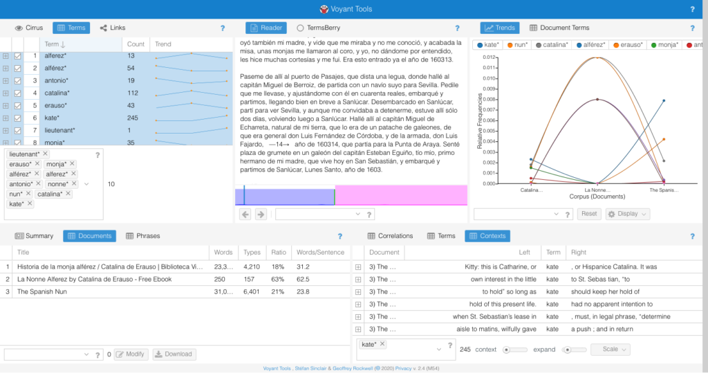
I found the comparison of equivalent terms in each of the works to be the most interesting information. 

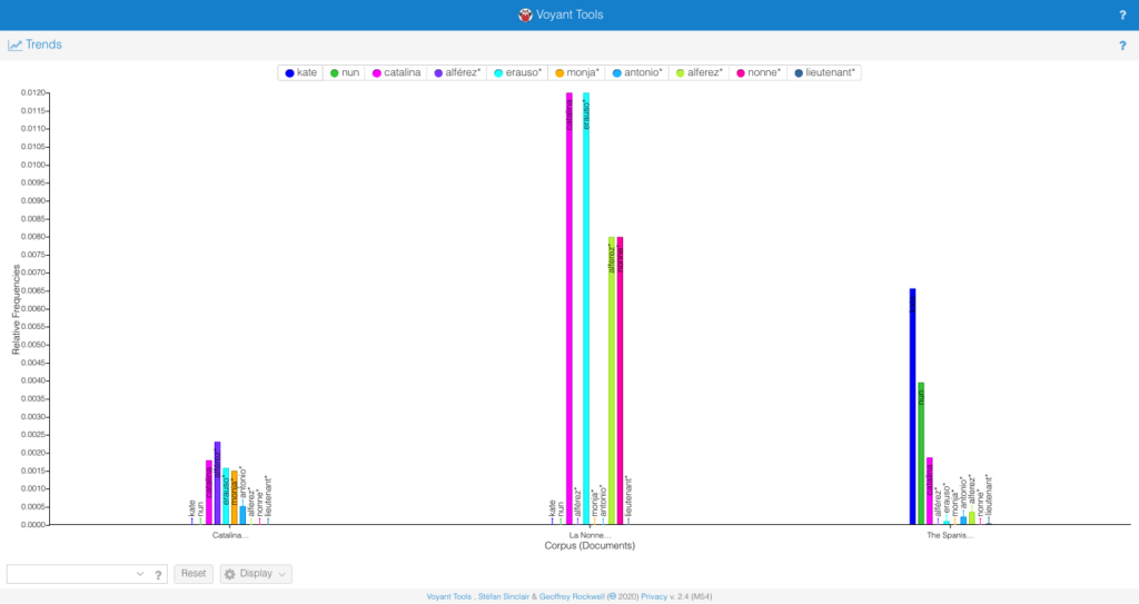
In the Spanish, “alferez” or “lieutenant” appears more frequently than any proper name or the alternative subject position “monja” i.e. “nun”; it is associated most often with “Catalina” and then with “Erauso.”  This suggests an inherent gender clash or ambiguity in the characterization of the protagonist, who appears identified most often with a feminine name linked to a masculine profession.

In the French, both professional identities (“alferez” and “nonne”) are secondary and yet equal to eachother in frequency.  Rather, the protagonist is identified by their first and last names and the use of alternate or masculine identifiers other than “alferez” is non-existent.  It’s striking that the text uses an archaic term for nun—“nonne”—rather than the more common (and already normative from the time of Diderot’s infamous novel of the same name) “religieuse.”  Equally suggestive, the text opts for the Spanish term “alferez” rather than using the more common “lieutenant.”  It would be worth exploring the appearance of those terms in other novels of the period to see if this is an attempt to distance de Erauso’s character from the French associations of each term or to emphasize their status as outlandish, foreign, or other.

Lastly, de Quincey’s fairly absurd revision of the narrative not surprisingly uses “Kate” far more than “Catalina” to identify the “heroine”: I use the term intentionally as the English text pairs “Kate” with “nun” and hardly uses any masculine indicators, or even the gender fluid “Erauso” that they maintain throughout their life.

In short, the exercise was useful for identifying the extent to which the French and English translations erased the gender ambiguity of the original Spanish account, making it that much harder to recognize La Monja Alférez as an important early modern instance of a trans text.

The vanishing map/the map of the vanishing: Ferrara’s Jewish deportees 1943-44.

The Stories:

I toyed around with various ideas, including one I’ll probably use for a final project on Lepanto 1571, but decided to make use of a very rich database available for download (or so I thought) through the Italian Fondazione Centro di Documentazione Ebraica Contemporanea—dati.CDEC.it. 

The plan was to use their detailed historical information about the fate of the Ferrarese Jewish community during 1943 and 1944 to assess the frame of Giorgio Bassani’s Il Giardino dei Finzi-Contini which brackets the story of that elite family with the terse account of their arrest and deportation to Auschwitz in in the fall of 1943.  As one of the first generation of works addressing the Shoah in Italy, Bassani’s novel established for many an influential historical-seeming narrative of Italian Jewish experience under Fascism and Nazi occupation.   In fact, “[t]he result [is] an incredible pastiche” as Bassani writes of the family tomb (trans. Weaver 1977, 12) and as he would have been the first to acknowledge. 

By mapping the details of the deportees born in Ferrara, specifically where they were captured and sent, I wanted to understand better the intersection of historical truth and fictional veracity in the work.  Does Bassani center that event in the city itself to emphasize further the hermetic, self-imposed myopia and hubris of the isolated characters who alternately attract and repel the novel’s protagonist, or does this detail function more as a small stone of historical reality placed on the fictional mausoleum that is the text?

The results surprised me (which is always a good sign).  Of the 67 deportees documented as having been born in Ferrara, 30 of them were captured in the city itself.  5 more were captured in luogo ignoto—place unknown—and the remaining 32 were arrested elsewhere.  So Bassani’s ending opts for one of two equally plausible fates, not simply shaping the one that will accord best with the novel’s argument, but choosing one that occurred in the majority of cases, given the implication of the data at large.  A powerful twin narrative of Ferrarese Jewish departure emerges from the (putative) map, whether for reasons of marriage, work, political exile, or in flight and hiding.  But, no single place seemed to be as perilous as Ferrara turned out to be: the greatest number of Ferrarese Jews rounded up outside of that city in this period happens in Milan (4).  The range and location of the other deportees I find frankly startling—2 in Bologna, Florence, Rome, but also in Selvetta di Viggiù (a place not even on the map as such); 3 in relatively unknown Monsummano Terme and Montefiorino, yet only 1 in Turin and 1 in Verona.  The data is hugely suggestive to me: does this say something about those who left, as Bassani’s novel may imply?  Or were other places simply safer, especially per capita (hard to believe given the numbers deported from Rome for instance)? Or again does this merely show a stark historical version of the appointment at Samarra, where the place and the choice makes little difference in aggregate, whether it be an obscure hamlet in Piedmont (Succinto Canavese), or a venerable university center (Padova), or one’s beloved hometown?

The Map:

https://prod-useast-a.online.tableau.com/t/calabresibianca/views/Thosewhostayedandthosewholeft/Sheet4?:iid=1&:embed=y#1

I found the process of collecting and analyzing the data extremely exciting and fulfilling, in particular the tasks of getting the coordinates and seeing the possible arguments that the map might be making in response to my questions. 

The attempt to make the digital map, however, was frustrating and humbling beyond belief.  First, my OS was too old to use on my regular laptop and I didn’t want to risk disrupting my current research and teaching by updating it (i.e. so many open browser tabs!), thus I borrowed my daughter’s newer computer, as she has her school-issued one at home right now.  I opted for Tableau as the only program that had been recommended for beginners, but found its instructional manuals and sample databases–with their focus on hypothetical rising and falling sales of office equipment in the northern vs southern hemisphere–alienating and depressing.  At every turn I was reminded, a) I’m so analog and b) AI tools serve global capitalism and are ill-suited for the kind of research and data viz I want to do. 

Nevertheless, I got Tableau installed and proceeded to download the dataset from http://dati.cdec.it/ only to find that I had no app to open it, nor could I find one (still can’t).  Oh, well, it was only 30+ data points, so I put them into a pdf in 4 columns.  Tableau could make a table from the data but it seemed frozen and I couldn’t manipulate it.  Ok, let’s try a spreadsheet: much better, now how do I get a map?  Blend datasets: I got it.  Sort of.  But the map doesn’t come up.  It’s two in the morning so I can’t ask anyone but, hey Bri is writing about entering in coordinates—wow that’s so useful, thank you Bri!  Now it seems to be working . . . .  Ok—the end is in sight: I’m going to get my coordinates on the map, hope that the measure function shows enough difference between 1 and 4 (the extreme of 32 is wayyyyy over to the right of the chart but should show up nicely on a symbol map).  Tomorrow I can play with color and intensity the way I’ve been planning!  Woohoo

Good morning. My daughter has spilt tea on her school laptop at breakfast and it has died (see b above—may go into selling office furniture to cover the cost.).  She absolutely needs hers back for her High School zoom day: I can have it again when she’s finished her chemistry homework.  Still waiting.

As I finish writing this blog, a GIS/mapping co-working session announcement has come in: Reader, I’ve signed up . . . .  Now looking for jobs in sales.

Coda: returning to Tableau, I found that I had a bit more distance and was less afraid to click on small icons I hadn’t noticed before.  By shifting from string to number and location (city) and, finally somehow changing the default to Italy not U.S.A., I was able to get the data to load as a map automatically: turns out I didn’t need to enter latitude and longitude by hand into Excel.  Whereas before I had a single satellite image with Milan, Texas, registered, I now had the data scaled to an adjustable regional map of Northern Italy.  There were still a lot of fiddly details to manipulate: color contrast, typeface, and crucially making the data not too small or large so as to be distinguishable.  And I wish I would have had the time and skill to layer it further with places of detention and ultimate destinations in Nazi concentration camps of the 67 Ferraresi; but—it’s a map!

“Time passes”: temporality made material.

In the last decade, important articles by Lev Manovich (2010) and Johanna Drucker (2011), among others, have called attention to the constructed parameters of visualizations of information, including the tendency to reduce and spatialize data detrimentally (Manovich) and to accept the implicit arguments of a data document uncritically (Drucker), without recognizing the assumptions or biases brought to the image by makers and viewers alike. A closer examination of a particular data document, discussed by Giuliano and Heitman in their 2019 “Difficult Heritage and the Complexities of Indigenous Data,” allows a further consideration of what questions might be asked of visualisation in the current moment and how visualisation might be held even more accountable for its effects.

Giuliano and Heitman point out that an important “buffalo hide document” in the Smithsonian known as  “Lone Dog’s Winter Count (Yanktonais Nakota)” and dated 1870 would be better labeled “Yanktonai (Ihanktonwana/Hunkpatina) Band of the Great Sioux Nation, . . .  Smithsonian National Museum of the American Indian, Compiled by Shunka Ishnala (Lone Dog),” and dated 1800-1871. Among the other corrected understandings of what and how the document represents information, they demonstrate that the work is not, as colonial-centric cataloguing has assumed, “a singular data; rather it is a plurality of data points that the Museum elected to present as a singular artifact” (11), collected not by a single author but by communal action and participation over time. While the article does not emphasize this aspect of the piece, Winter Counts still function in certain communities as mean of representing temporality and thus constitute an active practice of data visualisation that might importantly be considered in present discussions of how to plot data over time.1

The example raises questions for Manovich’s and Drucker’s discussions, in particular.  In its concentration of broad temporal periods into single data points displayed in a spiral, does the Yanktonai document participate in Manovich’s definition of “infovis,” as based on “two key principles . . . data reduction and privileging of spatial variables . . .  [that] give infovis its unique identity – the identity which remained remarkably consistent for almost 300 years” but that began to give way to newer methods in the 1990s? Manovich (almost?) exclusively uses European and Anglo-American examples to make his claims.  What would the inclusion of this document do for his historical argument or to his suggestion of a somatic predisposition to the “mapping of most important data dimensions into spatial variables” which infovis now might profitably leave behind?

In turn, Drucker asks the reader to reimagine their understanding of temporality and the concomitant mapping of time in data visualization as a direct result of what she understands to be the basic principles of humanities: “first, that the humanities are committed to the concept of knowledge as interpretation, and, second, that the apprehension of the phenomena of the physical, social, cultural world is through constructed and constitutive acts.”  While she doesn’t explicitly ground her discussion of temporal understanding in European metaphysical and phenomenological philosophies of time, her examples strikingly invoke Western genre and psychological terms (the novel, the individual, the biological family unit), even as she seeks to complicate traditional methods of temporal thinking and plotting.  The Yanktonai document suggests that temporality can be marked equally productively, not by including “subjective information” from individual time experiences in its graphical rendering, but as the potential representations of cultural differences or contact zones housed within a document.   Giuliano and Heitman explicate the particular means and purpose of temporal data mapping in the Yanktonai example, but elide its representation of how time passing is understood in relation to their focus on the document’s correspondence with Common Era (Christian) calendar years.2 What does the choice of spiral tell us about understandings of temporality in the Yanktonai communities of that era?  Is this a composite graphic representation or production of multiple intersecting cultural ideologies of time, much as the authors show the Curtis prints of the Piikani Nation of the Blackfoot Confederacy to be?

Finally, does the material or “ground” of data visualization matter and, if so, how? 3 Certainly the choice of buffalo hide for the plotting field of the document is culturally significant, but does it also dictate something about how this data is specifically mapped and why it takes this form?  Notably, the spiral begins on the axis created by the buffalo’s spine visible on the skin.  Is this a deliberate choice of a horizontal axis for the anchoring of the spiral, a recognition of the buffalo’s own movement through space and time as a standing, grazing, running—living—being that thus embodies time passing itself in its positioning? If not, what does this mean for the possibilities of simultaneous mapping on multiple axes as a different, richer form of employing spacial variables than is recognized by Manovich in his championing of emergent forms of visualization (i.e. direct representation) over what he suggests should be now seen as residual historical conventions? Once one acknowledges Guiliano’s and Heitman’s fundamental point that the Yanktonai document marks “a plurality of data points” and that such a data representation functions as a current example of data visualisation, one can begin to explore how such documents also challenge the inherent notions that both the Manovich and Drucker articles dismantle, and furthermore reveal ones they continue to deploy.

1.Burke, C. E. (2007a). Waniyetu wo´wapi: An introduction to the Lakota winter count tradition.In C. S. Greene & R. Thornton (Eds.), The year the stars fell: Lakota winter counts at the Smithsonian (pp. 1–11). Lincoln: University of Nebraska Press.]

2. Jenny Tone-Pah-Hote (2004, http://www.ipevolunteers.org/wp-content/uploads/2015/09/Lakota-Winter-Count-Additional-Information.pdf) describes the episode of time depicted as the time from first snowfall to first snowfall, citing James Howard, “Yanktonai Ethnohistory and the John K. Bear Winter Count,” Plains Anthropologist 21 no. 73 pt. 2, (1976), 2.]

3. For another example of making meaning out of the material ground on which data points are placed, see Jeannie Wilkening@jvwilkening “When 6 months of being stuck at home and delays on my actual hydrology projects turn into a craft project – finally finished knitting 125 years of California precipitation data into a blanket!” https://twitter.com/jvwilkening/status/1307735629497729029]

Articles cited:

Johanna Drucker, “Humanities Approaches to Graphical Display,” Digital Humanities Quarterly. 2011.5.1

Jennifer Guiliano and Carolyn Heitman, “Difficult Heritage and the Complexities of Indigenous Data,” Journal of Cultural Analytics. August 13, 2019.

Lev Manovich, “What is Visualisation?” (2010) http://manovich.net/content/04-projects/064-what-is-visualization/61_article_2010.pdf

“Hovering, Listening, Reading”

The readings from Matthew K. Gold’s and Lauren F. Klein’s “Introduction: A DH That Matters” to Debates in the Digital Humanities 2019 and Kelly Baker Josephs’ and Roopika Risam’s “Introduction” to The Digital Black Atlantic led me to two sites, one on the recommended list—the Early Caribbean Digital Archive (https://ecda.northeastern.edu/) — and one that followed from the list and the reading combined—Musical Passage: A Voyage to 1688 Jamaica (http://www.musicalpassage.org).   These two sites, in turn, reinforced and recast the questions and projects of the two Introductions in multiple ways.  Here I focus on three areas of particular interest to me as an academic scholar: the potentially changing relation of digital humanities to the academy as epitomized by Gold’s and Klein’s statement that “the expanded field model may still work, but it must more clearly account for work outside of digital humanities and outside of the academy”(1); Josephs’ and Risam’s interest in the role of canon-building and “the practice of citation”(4) for the digital Black Atlantic and digital humanities more generally; and the potential for the digital Black Atlantic to challenge the assumptions “within digital humanities . . . that the epistemology of white, dominant, English-speaking cultures of the Global North is a ‘universal,’ . . . by virtue of the transnational and multilingual dimensions of this work” (5).

            Both the ECDA and Musical Passage depend on academic institutional support as well as external funding and resources for their knowledge production.  ECDA is primarily a product of scholars and students at Northeastern and their archive is based in part on texts from and partnerships with academic libraries.  At the same time, the archive is reliant to a great extent on early Google digitization of library books with the limits to imaging, accuracy, and completeness that are symptomatic of that resource.  Using the archive can be unproductive if one hopes to search through traditional methods and categories: bibliographic printing details or female authorship for example.  The archive’s strength, however, lies precisely in the way that it reconceives of the archive as a tool as well as a body of K/knowledge: seeing “new possibilities for re-archiving (remixing and reassembling) materials from existing archives as well as archiving new materials”( https://ecda.northeastern.edu/home/about/decolonizing-the-archive/).  As Brandy K. Williams states in a recent conference paper, “when Knowledge with a capital K is about possession or ownership it becomes a colonial project” (“Technologies of resistance: towards feminist futures” GCWS 8/27/20).  Thus, by “remapping the lines between knowledge and non-knowledge” through its project to “disrupt, review, question, and revise the colonial knowledge regime that informs the archives from which [they] draw most of [their] materials” (https://ecda.northeastern.edu/home/about/decolonizing-the-archive/), the ECDA doubly decolonizes the archive, foregrounding other accounts of authorship and identity (through the recovery and juxtaposition of embedded narratives) while actively restructuring the kinds of questions the archive itself provokes and encourages.  The placing of the archive’s scholarly home predominantly in one institution and, indeed, one department, however, limits the range of languages and cultural production that the archive can provide.  Ultimately, the archive functions in English, both linguistically and in terms of the sources of textual publication.  By being predominantly book based, its resources for visual culture depend on print and are imbricated with traditional Knowledge forms even as its recontextualization invites us to deploy those materials in new interventions. 

Interestingly, the ECDA demonstrates how “in scholarship, particularly on marginalized communities, the practice of citation is key to building and reinforcing a recognized (and recognizable) canon that confers status on an area of study” (Josephs and Risam, 4).  Josephs and Risam emphasize the importance of looking to “the hard-won canons of black and postcolonial studies’ as crucial to the process of the “breaking and claiming of . . . interstitial space between recognized academic disciplines” as well as acknowledging that “the structure of current academic systems means that [the] ability to publish this volume is dependent on its legibility to these traditions” including the “white predominant perception of digital humanities” (12).  Their Introduction both offers a multinational/multilingual corpus of theory based on earlier critics like Gilroy, Glissant, Morrison, Brathwaite, and Du Bois, and provides links to other sites of knowledge production like AADHum and Musical Passage: Jamaica 1688.  Similarly, the “Projects We Love” section of ECDA, points visitors to such “additive” archives as Musical Passage, which itself embodies some of the disruptions of national and disciplinary boundaries within which ECDA remains constrained, through material circumstances if not in its methodology and aspirations. 

            Rather than an archive, Musical Passage presents itself as a careful interpretation of a “single rare artifact.”  Like the participants in the digital [B]lack Atlantic and ECDA, it is “motivated to make audible what otherwise falls silent in the historical record” (www.musicalpassage.org/#about); in this case literally the sounds and performances of the early modern/middle period African diaspora.  It also models new methods and modes of interacting with a core text of colonial Knowledge, even as it invites its visitors to participate in the “experience of closely engaging with the rich, although mediated and multilayered information on the page” (“About the Site Design”) that characterizes traditional textual scholarship, albeit providing hypertext and multisensory material to its layers and imagining a non-specialized audience (“Sloane published the results of his research in a very large, leather-bound volume, about four times the size of an average modern book [http://www.musicalpassage.org/#read]).  The site offers an unusually balanced intercultural understanding of the document, thanks in part to the wide range of university, departmental, and disciplinary homes of its primary creators –Laurent Dubois, David Garner, and Mary Caton Lingold—but also thanks to its recognition of and engagement with repositories of scholarly knowledge not often seen as relevant to the academy (i.e. Jamaican Musicians Respond March 17 2017).  Moreover, Musical Passage builds on the polyglot and Black Atlantic parameters of its singular text to suggest a shared knowledge that is made possible by “hovering, listening, and reading” not only to/in this particular document but as a call to a “slow” digital praxis.