Category Archives: Posts

Visually Comparing Difficult Histories

I kept going back to the Two Plantations project this weekend, thinking I was missing a larger abstract that would answer the many growing questions I had each time I interacted with it— questions about the project itself, its methods of visualization, its authors, and its intent. In my most generous interpretation I concluded that my main reason for coming back to this project was that I was not given enough context about the process, its original goals and how it met them or where it met its failures. In previous projects we’ve examined such as the Caribbean Digital Archive or the Colored Conventions Project, I was able to interpret a bit more about the results given the analysis of the methods, intent, team, and the process used, but the Two Plantations project offered very little on the site beyond an introductory paragraph or two.

We have discussed that Digital Humanities projects can reveal more during the process of synthesis rather than at the conclusion, and in this sense I was ultimately frustrated with the site and the visualization qua visualization. I believe the narrative and information that could have been given to me with a more robust datavis design is likely lost to the book about the larger project (link in the biography of the Principal Investigator, Richard Dunn). In speaking about what visual data is and isn’t, what does it say about the website itself (not the interactive family tree visualization and its choices) that the one full color high resolution picture of a person is of the scholar themselves, and that the names of the subjects are limited to abstract squares and circles on a screen (or in a different artifact, the database of names/pivot table)? I was unfortunately too distracted by this question, as well as the question that seemed obvious and mean to me: did Dunn ask why the racialized names were so different on each plantation, if his data about these names were correct, and either way if also it were correct to expose his audience to it without context? (Should I just read the book?)

When reading Jessica Marie Johnson’s review of the Two Plantations project and her opinion that the site was as “gorgeous” I resisted, but I now interpret this to be in line with my analysis as well: the high gloss presentation of the design of the website can be distracting from the design of the content itself. As Johnson points out, was a family tree the best visualization for this analysis? It does serve to illustrate the short lifespan and difficult “family ties,” but does this represent the overarching statement that “both plantations suffered?”

More questions: Is bloodline archival research inherently colonist and is that OK for this project? What is meant when Dunn says “did interracial sex affect the meaning of relationships” during the 1800s here, and is this a “thorny question” or wildly inaccurate? Benign in comparison, is this type of representation the best format with which to compare two data sets of any kind? I found it distracting to flip back and forth between the two tabs (even with more Dixons in the Mount Airy data!).

At some point either reading about this or “Difficult Heritage and the Complexities of Indigenous Data” I was reminded of W.E.B. Du Bois’s Data Visualizations, which I recently became aware of. Some of these visualizations are so original in their representations that I also like asking “Is this the best way to show this data?” frequently when viewing them, but unlike Two Plantations it is clear to me that this question had been carefully considered, even in the most experimental or even unsuccessful images. In considering data visualizations as a whole this week, I am considering how similarly to maps, they often must tread the line between 1:1 representation and and an abstraction that communicates implicit information.

Covid-19 Visualizer

While browsing the Tableau page: Data is Beautiful and seeing the work of the OFFC, Selfiecity, examining selfies, and even Disney films categorize by the percentage of dialogue spoken by the gender, I decided to find a visualization of data and information on Covid-19. When looking for information, I usually prefer simple graphics and charts. I find the more “beautiful” yet complex information and data visualization to be misleading, confusing and have a higher potential for misinterpretation and exaggeration. However, once I clicked over to covidvisualizer, I began to understand the power of interactive visualization and the work it must have taken to create a beautiful and elegant design that also showcases hard data and information (of course this elegance is taken away by the bombardment of advertisements popping up on screen after spending a minute on the site).

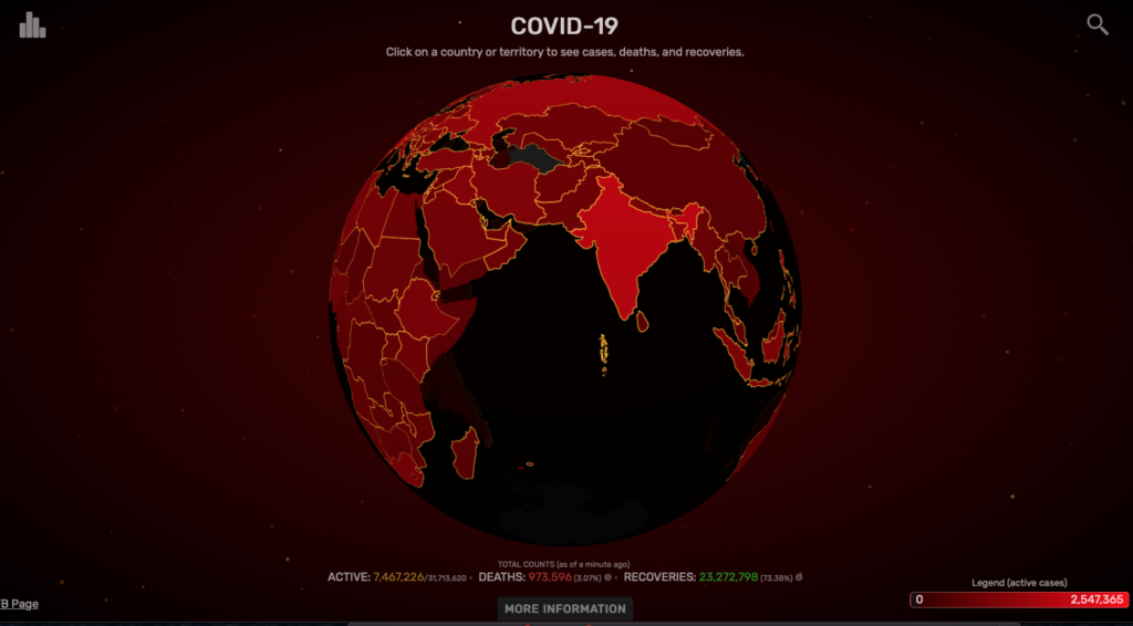
Developed by two students at Carnegie Mellon University, the site reads: “We wanted people to be able to see this as something that brings us all together. It’s not one country or another country; it’s one planet – and this is what our planet looks like today”. The site pulls data from Worldometer every 2 minutes, and it allows you to visualize Covid-19 around the world. You are presented first with a red globe. The key indicates that the darker the hue, the denser in concentration are the deaths due to this virus.

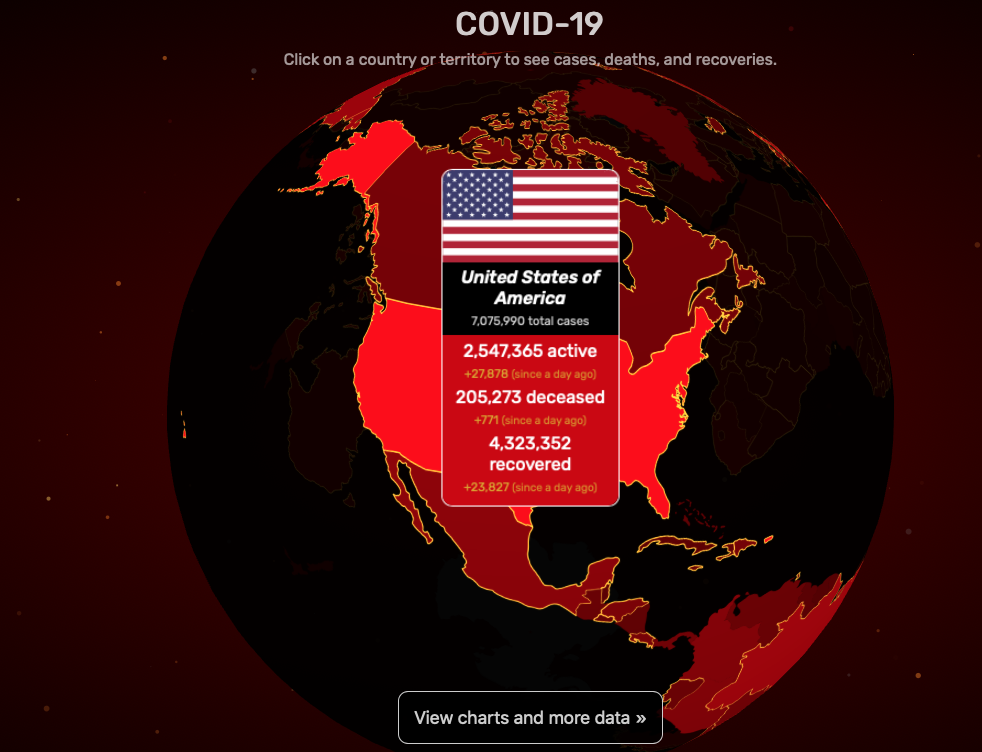
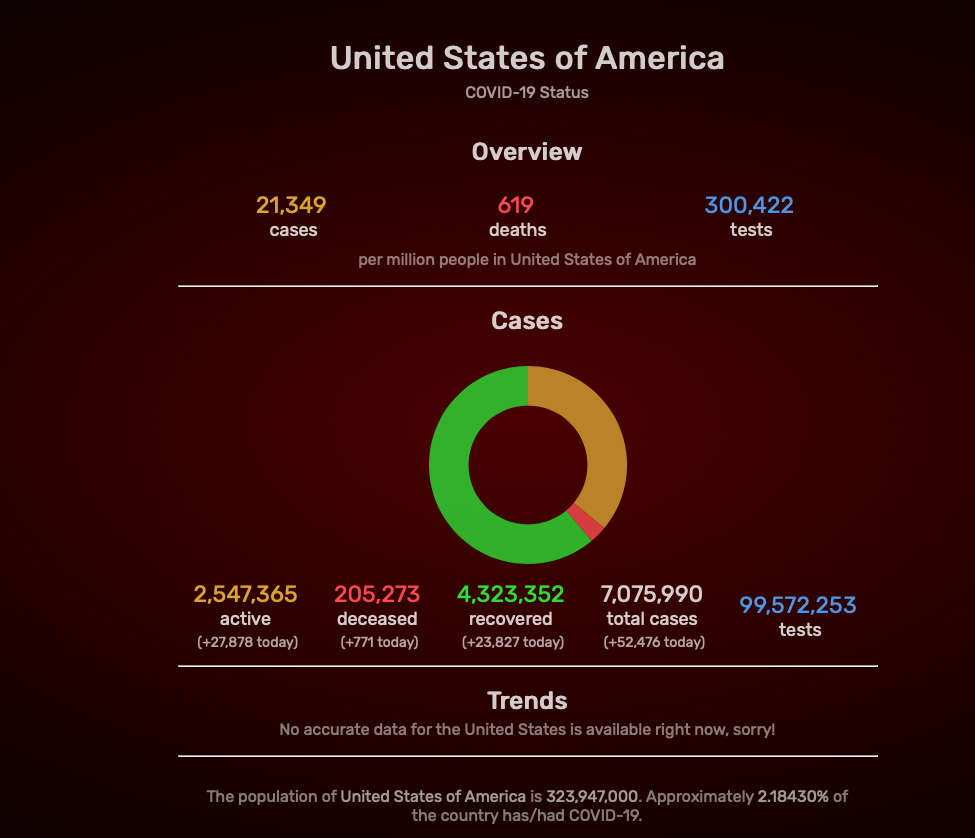
Once you click on a point on the map, it displays raw numbers on deaths, active cases, and recovered patients. Another click allows you to see more detailed information like the number of cases, deaths, and tests per million people in the United States (or country/territory of your choosing). Lastly, the line graph displays the trends in the number of cases each month. While exploring, I was reminded of The Shape of History site and Elizabeth Palmer’s quote, “By emphasizing interaction, she places the source of knowledge in the interplay between viewer, text, and image.” Interacting with the globe, actually rotating it around and around, allowed me to have control over not just the information I wanted to see, but also how much of it I was willing to investigate. While zooming in and out of the globe and the various hues of red, I also thought about Bruno Latour’s definition of visualization, ” Whole’ is now nothing more than a provisional visualization which can be modified and reversed at will, by moving back to the individual components, and then looking for yet other tools to regroup the same elements into alternative assemblages,” (Lev Manovich, “What Is Visualization?“). The globe presented in this infoviz already looks like a great puzzle. Thus, essentially, the authors/designers of this visualization could add another aspect to this project that allows the users to rearrange/ reassemble the pieces (countries/territories) depending on the density of Covid-19 cases.

While covidvisualizer showcases complex information into small digestible bites in a colorful and interactive way, it fails to provide local details about the situation. I saw the information on a global scale, now I wanted to see what was happening locally and how is that information displayed.

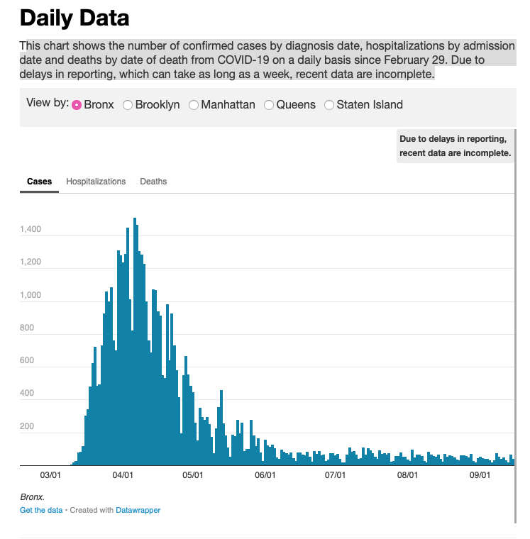
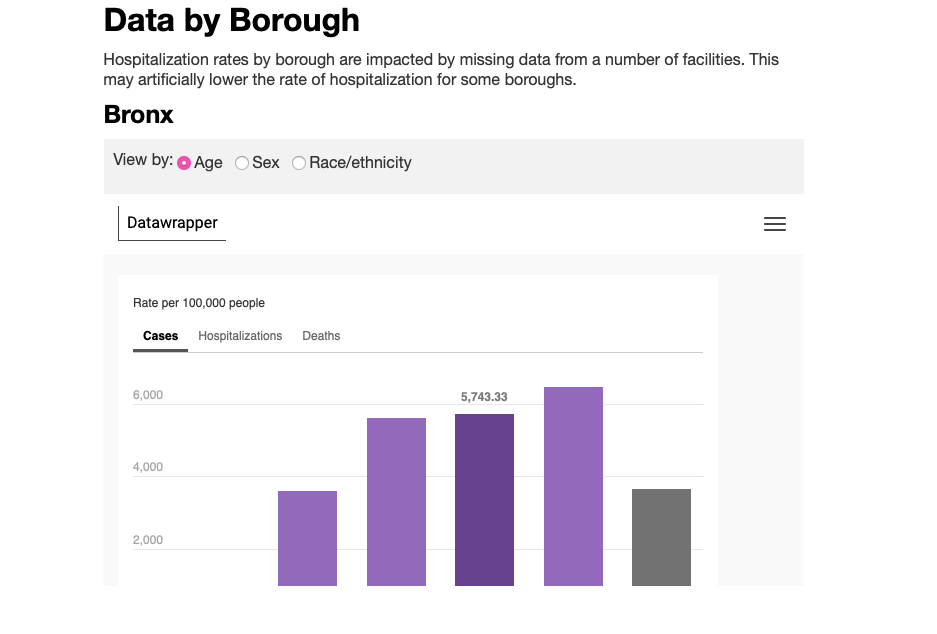
While exploring the NYC1 site, which features city news, I came across simple yet powerful graphs that showcase the virus’s activity near me. The site showcases various graphs with purple and light green pastel colors. It divides the data by borough and further categorizes it by general cases, hospitalizations, sex, gender, and age. What’s interesting about this simple display is that at first glance, the information doesn’t seem detailed, but with a click of the mouse, you can zoom into the graphic and explore more detailed data like cases per day. The site reads, “This chart shows the number of confirmed cases by diagnosis date, hospitalizations by admission date and deaths by date of death from COVID-19 daily since February 29. Due to delays in reporting, which can take as long as a week, recent data are incomplete” it’s powered by Datawrapper. It displays this message when clicked: We have updated our Privacy Policy to reflect the new EU regulations. Please give it a read(it is written with the goal of clarity) and click here to accept it. 

Though not always the case, I can see how, as Lev Manovich puts it, “A different way to express this is to say that information design works with information, while information visualization works with data.” The shire number of information collected for a site like Covidvisualizer can be visually convoluted and hard to read in a simple line or bar graph. Therefore, it makes sense to have this data, these numbers, explored in a much more convenient and accessible way. Specifics are not needed here since we are looking at an overview of the world and the virus’s activity. When looking at local information and data, the user’s interest informs the graph and visualization. Therefore, working with smaller numerical values, the data displayed on NYC1 has space and formation. It needs to display overviews and more specific categorized information such as COVID-19 cases by age in Bronx, NY.

While exploring both sites, I’m also noticing the effect the colors, word density, and site navigation have on the actual visualization and graphics. Having black and red hues sets a different narrative tone and mood than pastel colors, for example.

Take a look at Covidvisualizer, what do you think?

Of models, measurement, the multi-interpretive, and the plurinational

The diverse range of concerns reflected in discussions pertaining to data and visualization speak to the importance of humanistic reasoning which in the best case scenario forms an integral part of the practices of producing data sourced and digitally mediated understanding. Whether the concerns relate to the material consequences of data and visualization for specific audiences and populations or to more abstract implications of data and representation, humanistic reasoning takes us further along the continuum toward data and visualization literacy. While the notion of literacy is not without risks and dangers, such as socially divided in-groups and out-groups, the tremendous consequences of different levels of awareness and understanding of the hidden implications and life-altering consequences of data and digital representation argue for dedicated and specialized education and research.

Johanna Drucker’s powerful proposal for the development of interpretive expressions based on “information about subjective user-dependent metrics, subjective displays of information, and subjective methods of graphical expression” builds on Lev Manovich’s descriptive analysis of the reductive nature of graphic primitives. Tressie McMillan Cottom’s cautionary critique of the myriad constraints, farfetched analytical frameworks, and “the power relations of financial actors or the social construction of race in computational models or analytical frameworks” embedded in big data underscores Drucker’s theory of the observer co-dependent nature of value-laden data and phenomena. Jennifer Guiliano and Carolyn Heitman’s conceptualization of “difficult heritage” helps to contextualize the consequences of colonialist harm in relation to both indigenous data and the representations of enslaved peoples’ experiences in digital story telling.

Are there unaddressed implications of the roles of models and measurement in Drucker’s systematization of factors and functions in interpretative analysis? To the extent indigenous nations and communities favor plurinational states (now built into the Bolivian and Ecuadorean constitutions), multi-interpretive approaches might include a variety of models of time and space, such as cyclical views of history developed by indigenous cultures. What are the limits of the use and display of measurements and counting and can old-fashioned narrative and textual explication play a critical role in the exposition and explanation of what might be inherently difficult and troubled data and visualization in and of themselves? Fundamental to any understanding are the questions about who originates and creates data and visualization, for whom, for what purpose, and who ultimately benefits.

Visualization and an Ethics of Opacity

From trying to connect the dots of this week’s readings, I keep coming back to Cottom’s allusion to Posner when attempting to articulate the conundrum of power in distant reading/quantitative textual analysis. Specifically, Posner asks, “What would maps and data visualizations look like if they were built to show us categories like race as they have been experienced, not as they have been captured and advanced by businesses and governments?”

In “What is Visualization?” Manovich walks us through a brief history of information visualization, noting reduction and spatiality as key tenets of the practice. According to Manovich, information visualization’s emphasis of the former “parallels the reductionist trajectory of modern science in the 19th century” that emphasized a simplified and building-block-like view of human and natural systems. But with the advent of new media and advancements in technology in general, Manovich denotes a shift in infovis practice characterized by the potential of visualization without reduction. In a very different way but with similar goals, Drucker’s “Humanities Approaches to Graphical Display” counters reductive attempts/practices of information visualization that ignore the nature of data itself as constructed from subjective capture, observation, and interpretation. In refusing realist conceptions and data and visualization, Drucker poses that “all data have to be understood as capta and the conventions created to express observer-independent models of knowledge need to be radically reworked to express humanistic interpretation.” As such, Drucker invokes a “humanistic approach” to re-imagine information visualizations as “expressive metrics and graphics” that communicate “the subjective expression of perceived phenomena.” By re-considering infovis as phenomenological experiences that necessitate reckonings of time and space, Drucker attempts to refuse the reductive conception of data (and visualization) as (instantiations of) objective fact. I enjoyed the images that Drucker provided that articulated the ways in which affect distorts individual perceptions of time and space, highlighting the “co-dependent relation between observer and experience.” I also applaud her refusal to “simply introduce a quantitative analysis of qualitative experience into our data sets,” and to instead “[shift] its terms from certainty to ambiguity,” marking her approach as less an alternative than a disruption. This approach does what Jess Marie Johnson claims as necessary to good visualization, in that it “asks provocative questions that leave users with more questions than answers.”

However, while Drucker considers how visualizations that index gender are grounded in assumptions of gender itself, she (perhaps necessarily) leaves out articulations of how categories of race, gender, and sexuality orient subjective experience, and how that might be visualized. This is a bit disappointing, for as Cottom makes clear, it’s imperative that the power relations these categories undergird are thought through. From reading her piece, I assume that if given this task, Drucker would articulate these categories as animating the affective, and thus spatio-temporal, experiences of certain individuals differently, given how one may encompass intersections of these categories, thus highlighting the subjectivity of these experiences—to which I would argue that such an analysis is not enough. To aptly illustrate how the minoritized move through the world, visualization must also interrogate how these categories determine (claims to) relationality itself, which I don’t think Drucker, nor Manovich, reckon with enough.

As philosopher Axelle Karera posits in “Blackness and the Pitfalls of Anthropocene Ethics,“ relationality is “inherently not only a position that the black cannot afford or even claim. The structure of relationality is essentially the condition for the possibility of their enslavement.” In this vein, I would argue that Drucker’s inability to articulate/elision of race into her approach is due to humanism’s dependence on the subject-object dichotomy; for, as Drucker states, “the humanistic concept of knowledge depends upon the interplay between a situated and circumstantial viewer and the objects or experiences under examination and interpretation. That is the basic definition of humanistic knowledge, and its graphical display must be specific to this definition in its very foundational principles.” However, there is no interrogation of who has historically been deemed subject or object. Indeed—in thinking through Karera and other scholars like Calvin Warren and Saidiya Hartman—if you’re considering the history of the Black, then you must recognize its entanglement of existence with the category of “the object” or “the thing” to begin with. It’s impossible, then, for visualization to assume a humanist approach that includes the Black, and articulates an alternative to (racial-hierarchical) relationality, when it cannot presume the Black as subject in the first place. A humanist approach that centers subjective experience cannot elide the force of race as [Human]ism’s orienting principle.

In fact, a humanist-phenomenological approach to the Black may not be an accurate one at all: In discussing her book Wayward Lives, Beautiful Experiments with fellow Black studies scholar Rivzana Bradley, Saidiya Hartman elaborates that her piece considers “ways to think about collective life outside of the subject-object distinction by attending to the deep, shared embodiment of promiscuous sociality, to be situated in the urban sensorium in a way that exceeds and undoes the very notion of subjective interiority… to think about these forms of intimacy and sociality, as opposed to the experience of an individual in the world.” As opposed to Druckers, Hartman, in her work, displays an acute awareness of how co-dependence/entanglements are shaped by categories of representation and Human hierarchies. Thus, if we are to take up Johnson’s question—if “multidimensional data visualizations or polysingular… renderings of the Thurston or Affir family trees better capture the dense networks of kin, mutuality, and precarity at play in bondage”—then perhaps we need to think whether there can be a humanist approach to visualization that can take up networked formations, yet refuse the subject-object dichotomy—and whether that can be called a humanist approach at all.

The subject-object dilemma also becomes apparent in Guiliano and Heitman’s piece as they critique the open-source data movement and the susceptibility of Native images “to infinite and unanticipated refraction…the endless internet remix and/or misuse.” In their interrogation of the 2013 project “Performing Archive: Curtis + The Vanishing Race,” the authors note how the project’s team ironically reproduces the very (colonial) acts of de-historicization/contextualization that they claimed to counter, by re-centering the archive for their own gain. The authors articulate the problem of the project—and of open access writ large—as its refusal to engage with the objects’ producers (here Native Americans) and contexts of production, while treating their objects/knowledge as a commons—effectively reproducing colonial logics that degrade “Native people as “prop” or an object upon which history and historical actors act” (italics added). The Native person as object and white person as subject, in this way, highlights humanism’s subject-object dichotomy as oriented by categories of representation: Questions of who uses (or visualizes) the commons and who is the commons are answered by racialized economies of dispossession, historically upheld by centuries of white violence.

Overall, what Guiliano and Heitman’s piece reveals to me, when understood in tandem with my reading of Drucker, is that perhaps questions of race in regards to data acquisition, mapping, and/or visualization necessitate an ethics of opacity and non-relationality—the option to refuse vis-/ibility/ualization that does not sufficiently articulate under whose terms information will be deployed. While an acknowledgement of data’s subjective construction is indeed necessary, an ethics of opacity troubles why visualization is necessary in the first place, and who the ones doing the visualizing are.

Zotero Workshop

Zotero has been suggested as a tool and resource in the orientation meeting for the MA in Digital Humanities, as well as being mentioned in passing in class and in workshops. But my initial, limited understanding of it was as a tool for creating reference lists and managing citations, and that seemed like something that would be useful at some point in a somewhat distant future, so I put it in the back of my mind.

When I saw last week that the Mina Rees Library was doing a Zotero introductory workshop during my lunch hour, I thought, why not? And I’m so glad I did. Jill Cirasella, associate librarian for scholarly communication and digital scholarship, led the workshop, and you could tell right from the start that Zotero is a tool she is passionate about using and helping others to use as well. She took a few moments to ask all of the participants what programs we were in and our research interests to tailor her introduction workshop for each of us.

For me, she said it was great to start using Zotero now, early in the master’s program, so that I could start building my own personal library for future referencing. Articles I add to my Zotero account now could be useful for research several years later, and beyond. Which, yes, of course. How did I not think of that? Future references lists don’t appear out of thin air; they are the result of prior and present research.

Zotero is a free, open access tool used to gather and organize research. Through Zotero, you can create a personalized library from which you can easily cite articles and generate reference lists in papers. Most of the main referencing styles (e.g., APA, Chicago, MLA) are stored as templates, and you can easily toggle between different styles if you are submitting articles for different purposes with different styling preferences.

Essentially Zotero exists in three parts that are all in communication with each other: a website with cloud storage, a desktop application with word processor plugin, and a search engine extension. Once you create your account online and download the appropriate applications and plugins for your setup, most of your work with Zotero will likely happen through your search engine extension and your desktop application and word processing plugin. Jill strongly suggested we set up the Zotero application to automatically sync to the website, where personal libraries are almost instantly backed up to cloud storage, both as a failsafe in case something happens and also so that you can work on your library from anywhere. Zotero saves the content you are interested in remembering, including all of the metadata, links, and associated files (e.g., PDFs). Zotero is free to use, but the amount of cloud data available for free is limited, so Jill suggested not including associated files in your automatic syncs as this could quickly use up all of your free storage.

The thing that has me most excited for Zotero is the ability to create group libraries. In these blog posts and in our class discussions, people have been bringing up new materials to check out. I think a class library in Zotero could be a great way for us to put all of those sources into one place for all of us to easily access. What does everyone else think about using this as a group tool for class?

For anyone interested, I highly recommend attending a future Zotero introduction workshop. The next one on the library workshop calendar is on September 23 from 2:00 to 3:00PM. The library has also written up a guide on how to use Zotero.

Do you have a flag?

I had not planned to write a post this week, but I feel that I need to highlight something very central to the way I approached these readings that I could not organically insert in a comment, and also share this important video.

As someone interested in nationalism and how national identity is created, I am forever investigating the idea of a “national government” or “nation state”, how borders are drawn, by whom, and how they define and change the group(s) contained within or those excluded. The questions I continued to ask as I was reading Mapping the Caribbean were: Whose sovereignty? What do we mean by sovereignty here? 

The project “seeks to foreground the analytical importance and predominance of nonindependent societies while also rethinking how sovereignty itself can be imagined, conceptualized, theorized, and visualized beyond the constraints of Western cartography”, but it only directly addresses sovereignty in the end, as part of the challenges of this process. This is not by accident. The authors’ aim is to represent sovereignty as a “historically contingent claim” and not as an ontological value, but this is not really possible to present on a map that must rely on independence as a “solid and equivalent state.” 

One of the most satisfying moments in the piece was reading that “In her previous research about Guadeloupe, Yarimar found that local activists viewed the search for sovereignty not as the attainment of nation-state status but as the ability to exert control over elements that impacted daily life…”This reminded me of conversations had in this course about the open and experimental nature of DH projects, and how much is learned from failure during experimentation. This bit of information speaks to the historic and cultural nature of sovereignty, that challenges the frame of the nation state, in a way that the outcome of the project (the map) cannot (for now).

The map is a tremendous tool, and it helped me acquire a general understanding of the political timeline of a region I know very little about, but also to realize the potential that this and similar projects hold in challenging and enriching a conversation about nationalism and national identity.

The Capacity for Truth and Counter Cartographies

I love maps. I’ve always been interested in them–for travel (customizing google maps for myself before I take a trip), for art (there are several hanging in my apartment; even my shower curtain is a colorful ol’ Mercator projection), for symbolism (I wrote a collection of poems in undergrad around maps). And I know that the size of countries and the standard presentation of them is problematic–I remember this coming up in geography courses maybe even as early as middle school, though once addressed we just kept moving forward with the basic world maps most of us are familiar with.

Until reading the first two chapters of How to Lie with Maps by Mark Monmonier (edition unknown), I never considered what other elements of a map need to be carefully analyzed and considered–the scale and the symbolization, and even more broadly recognizing what is being left out. Maps are as much about what is absent as what is present. I admit that’s not something I always readily recognize. And I found this quote to be especially poignant: “In the sense that all maps tell white lies about the planet, small-scale maps have a smaller capacity for truth than large-scale maps” (Monmonier, 6-7). I’ve never thought about maps in terms of their “capacity for truth.”

We also have to consider whose truths are being told in maps, which is further explored by Yarimar Bonilla and Max Hantel in their article “Visualizing Sovereignty: Cartographic Queries for the Digital Age” (published by sx archipelagos). Colonial powers created and used maps in order to possess these spaces. Bonilla and Hantel argue “the map reifies the truth of what it represents, promising and delivering virgin lands and nonsovereign territories in need of discovery, settlement, borders, and territorial authority.” But how do we move beyond these limited maps? Can we? I found it very interesting to literally watch them attempt to overcome this through the many iterations of maps of the Caribbean they created over the years to better represent these places and their complex relationships with colonial powers. And ultimately I do think they offer some hope as to the broader possibilities of maps: “Yet, the landscape of possibility always exceeds the limits of representation. Moreover, the map is itself a function of a foundational set of codes concerning who controls visual representation and what counts as representable in the first place. Attending to those codes themselves, rather than to simply the maps they generate, profoundly disrupts the cartographic gaze and its imposed limits.”

In scoping out the many suggested websites for this week, I admit I am feeling excited about what is possible with maps, but also incredibly overwhelmed given the vast amounts of data and years of research that went into all of them. I do love how Slave Revolt in Jamaica, 1760-1761, is framed as “a cartographic narrative” and how Vincent Brown has included so much text, providing the background and accompanying each action on the interactive map.

I was also very drawn to the Renewing Inequality project and their use of maps within maps and a range of visual assets (starting with The People & the Program and scrolling through, I’m just so impressed by this user experience). I knew about some of these “urban renewal” projects but not most of them. For instance, I had no idea that NYU/Bellevue was one such project. Bellevue champions itself as the premier hospital in a public hospital system that provides care to the most underserved populations, but what does it mean that its current physical space came into being by literally displacing those same populations?

The idea of counter cartographies came up in last week’s readings and again this week. Aside from the appealing alliteration, I find myself wanting to know more about this, and I found some interesting links that I wanted to share with the group:

In “Counter-mapping: cartography that lets the powerless speak” (published in The Guardian, Mar 6, 2018), Laurence O’Dwyer discusses alternative mapping projects that promote the stories of people are who usually ignored and maps that try to chart psychological spaces as well as physical ones.

In “Counter Mapping” (published by Emergence Magazine, I’m unsure on the date, but several of the footnotes reference sources from 2018), Adam Loften and Emmanual Vaughan-Lee explore a mapping project undertaken by Zuni artists to create maps, counter to the straight lines of government-drawn reservation areas, that are rooted in memories and experiences of the community.

This Is Not an Atlas, which started out as a collective book project and has expanded into an online version, brings together critical geographers and activists to “collectively learn how to read space and how to initiate emancipatory processes from below.”

Maps as Technologies of Possession

Before this week, most of what I had come across regarding mapping had primarily focused on cartography in relation to global geography, landscapes, and even soundscapes. Never on the forefront were considerations around the ontological implications—whose bodies are allowed to move freely across these maps, whose bodies are allowed to be human in relation to the space(s) they occupy. But one thing that is always certain is that the limitations and intentional erasures produced by colonial mapping will always beget counter-maps.

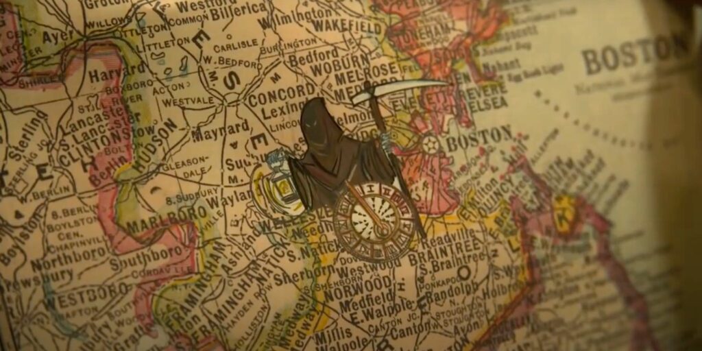
If you haven’t already, please do yourselves a favor and check out the powerful sci-fi series, Lovecraft Country on HBO. It’s f*cking bananas on so many levels! Anyway, in the first episode, we are introduced to George Freeman. This character is loosely based on Victor Hugo Green, the man who wrote and assembled, The Negro Travelers’ Green Book (we’ll pretend that problematic movie doesn’t exist for 5 minutes, k?). Green went on cross-country trips in order to create a catalog for Back travelers where he, “listed hotels, restaurants, beauty salons, nightclubs, bars, gas stations, etc…” (nypl.org). While Green’s journeys are not the focus of this series, the catalog becomes the navigational tool used to counter-map America’s very segregated and violent landscape. I am unsure if Green’s book was a collaboration, but in this episode, George Freeman’s daughter, Diana, illustrates map symbols onto her father’s traditional map based on his catalog and her own artistic and prophetic intuition. This made me think about Yarimar Bonilla’s notion of “prophetic cartographies”. Though Bonilla’s concept is much more complex, Diana focuses on the silences of the map in order to indicate where her father’s body would be vulnerable or free:

While delving further into Victor Hugo Green’s work, I found a digital archive of his text on the Schomburg’s website. To my surprise, they have also extracted the data from his book and created an interactive digital map!  They even provided a tool where you can map a trip for either the year 1947 or 1956. The differences are interesting and provide a wealth of information.

Yarimar Bonilla references the idea that “the map is a technology of possession” and it becomes more evident that it is not only the possession of land, but of all things inherent to one’s humanity. Victor Hugo Green used his body as a barometer for the racial climate in each town and state he courageously visited in search of safe-havens for Black folks to just live, just be. This reminded me Asma’s comment last week about how technological tools can be used for community care. How do folks hold one another when the word diaspora opens a door to everywhere and nowhere simultaneously? Victor Hugo Green’s, The Negro Travelers’ Green Book, was a counter-map, a shield, and reclamation of time and space for his people.

Can Google Earth be beneficial?

Being an individual culturally linked to South Asia I am going to be completely transparent and say that I most definitely have a favored bias with a particular reading that was assigned to us this week. The reading in question is Mayukh Sen’s “Dividing Lines”- an analytical take on how the Hollywood produced movie “Lion” glorifies the use of Google Earth to tell the story of how an Indian boy who accidentally gets separated from his family when he was young, uses the tool to help find his way back home and reunite him with his loved ones. Although the movie is based upon true events in “Dividing Lines” Sen critiques the film on how it handles the almost seamless relationship between man and technology. In his own words he describes the use of Google Earth in the movie as a “one-way transaction between an error-prone, sleepless human and an intelligent device, rather than as a human’s struggle to overcome a potentially useful technology’s limitations and biases”.

Sen backs his statement by mentioning Saroo Brierley’s (movie was based on him) memoir “A Long Way Home” where he describes the arduous process he had to endure to meet his end goal. This is in contrast to the movie where his plight is only seen as a small added factor. In addition to this Sen also details his own use of Google Earth where he experiments in finding the village his mother was born and raised in. The experiment proved fruitless as external factors undeniably came in the way. For one Sen’s mother did not know the anglicized spelling and the exact address of the location. The main thing Sen had to work with were visual cues drawn from distant memory. We find out that this didn’t even end up serving a purpose as hazy and unclear images resulted in their search. It is clear that faults of the user of the application are a definite component in a failed search. However Sen does not shy away in lamenting that past Colonial rule and interference are key factors in addressing the inconsistencies that those part of the South Asian diaspora face when trying to investigate the past.

With that in mind I decided to use Google Earth for my own experimental purposes and decided to try the same method in attempting to find the area my father grew up in in Bangladesh. As a disclaimer I would like to inform everyone that this is my first time using the application so a lot of the time used in this process was me trying to figure out how to use it properly. Once I got the basics down I typed in the neighborhood’s name and to my surprise it confirmed an actual result. I didn’t know the address of my father’s childhood home so finding the exact house was near impossible. However through the images that were provided to me I most definitely recognized some of the architecture and can confirm that I was in the correct general area. This exercise has without a doubt peaked my interest and I’m curious as to how much of a deep dive I can perform once I have more information from my father. Perhaps then I can formulate an potential idea for a final project. My father moved around quite a bit during the Bangladesh War of Liberation against Pakistan. With his help in tow along with the inspiration I have gained into looking at other cultural specific maps that have been designed , I was possibly thinking of creating a map pinpointing areas that he lived in. To expand on this I also want to add in places he frequented while living in these areas. Given Sen’s criticism of the application along with critiques of maps in general that I learned from the other readings we had this week I expect to encounter issues along the way. With that being said I believe a task to this degree can still be beneficial. Not only will it help me discover more aspects of my father’s life but it will also help me discern the realities of my cultural past through a non euro-centric lens.

The biases in history and map making

Considering how easy to place your own biases when constructing maps, borders, and visualizing countries, it is still surprising to see how much we can still get wrong in today’s modern day where everyone has access to a vast well of knowledge in the palm of their hand. You would expect the use of the hundreds of satellites out in space to accurately display the earth and the individual countries but it is still up to us, not the computers or programs, to map out these places accurately with precision and careful consideration. Mayukh Sen points out how western colonialism still exists within Google’s programs even though the company itself seems to try its best to be transparent as much as possible. While these corporations may have the best interest in heart, Sen describes how these tech companies are not just enriching the lives of the natives but are so out of touch that “they can sometimes risk working off hazy assumptions ripped from colonial-era playbooks regarding this ‘new,’ ‘unexplored’ market and its people’s imagined desires without bothering to consult them.” And how “Google Earth’s capabilities falter for some of those who may need the platform, its stories must be rendered with precision, without a glib sentimentality that covers over political divisions and geographical inequalities.” Which resonates the most with me considering how we are making strides to spread the truth about the past regarding western colonization. It is still up to us to acknowledge the past and how that may influence us now in the present day.

Yarimar Bonilla and Max Hantel’s piece about “Visualizing Sovereignty: Cartographic Queries for the Digital Age” taps into the last point on how “the map is itself a function of a foundational set of codes concerning who controls visual representation and what counts as representable in the first place.” So much has been lost but also recovered in history and this reminded me of my history professor while in undergrad where he stated that history is not just archives and papers but an argument of what truly happened in the past. These people who had the tools to shape and label a countries borders, routes, cities, and states had more power than they realized and had a duty to be as accurate as possible. It may take a while until we can truly let go of those biases but I believe that with more people reading and tapping in to history and going into academia for these subjects that it is now only a matter of time before we can build a concise model of  history and cartography.