Our readings on design and infrastructure, especially the interventions of Bethany Nowviskie regarding a DH feminist ethic and praxis care and of Steven Jackson regarding broken world repair, carry far-reaching and hopeful (if not therapeutic and exhilarating) implications for the necessity and possibility of an ongoing recovery from Walter Benjamin’s “wreckages” of “progress”. In highlighting these two interventions, one could consider Susan Star’s ethnography of infrastructure, Miriam Posner’s archeology of supply chain management, and Ernesto Oroza’s technologies of disobedience as clear and concrete applications of an enveloping theory and practice of care and repair. They also offer the solid grounding needed to address the increasingly urgent need to contextualize the untenable implications of the Anthropocene. In re-appropriating design and infrastructure through a theory and practice of care and repair, might one possible outcome be a radical reconceptualization of value and growth, whose spectacular commodifications have long fueled the cosmologies and cults of the entrepreneur, the tech innovator, and the securities speculator?
Instead of representing the instrumentalising product of extraction and exhaustion, value becomes a measure of “context, interdependence, and vulnerability”. Instead of representing an unsustainable increase in the output of waste, goods, and services, growth becomes a measure of the recuperative homeostasis relative to biospheric metabolisis. In just twenty-six years Amazon, Inc.’s revenue has gone from $0.00 to $88.912 billion and its gross profits in the last ten years have gone from $6.0 billion to $129.6 billion. Even more astounding is the growth of Amazon’s information technology and computing infrastructure services, Amazon Web Services (AWS), which since launching a mere 14 years ago in 2006, have reached $35.0 billion in revenue. The infrastructure powering this so-called “growth” can only be compared to industrialization itself, with the profound difference being that never-ending growth has now exhausted the capacity to absorb the consequences of older notions value and growth.
In reflecting on Maggi’s comments on the benefit and importance of transparency, perhaps now is as good a time as ever to extend Marx’s call for a “ruthless criticism of everything existing” to a “ruthless transparency of everything existing”. Technology and infrastructure can become disobediently “smart” and “transparent” when they are fully backwards compatible and adaptive. (Instead of innovating for planned obsolescence, “smart” technology works on the oldest devices, with the oldest infrastructures, in the least technological environments, and with the availability of all of its versioned interfaces and affordances.)
I have been thinking a lot since last week’s class discussion about decolonization versus democratization. Can we have both? Are they really in opposition to one another? These questions came up in regards to Marlene Daut’s article Haiti @ the Digital Crossroads: Archiving Black Sovereignty (Sx Archipelagos, 2019, no. 3, July). Daut says, “Confronting how we contextualize the archive from the perspective of decolonization rather than democratization allows us to acknowledge both the opportunities and limitations of what is contained in archives and to reveal our own privilege in being able to access and interpret the documents.”
Democracy feels like an unassailable lofty bar to which we all must strive, but just saying or assuming everyone is equal doesn’t make it true. Approaching an archive or other digital humanities (DH) project from a perspective of democratization ignores the power structures all around as some voices have taken more power for themselves—power to speak (and know others will listen), power to access, power to analyze—which necessarily limits what the project can achieve.
I’m wondering if Ernesto Oroza’s concept of “technological disobedience” could be useful to help foreground decolonization over democratization in DH work. In the YouTube video “Cuba’s Inventions from 30 Years of Isolation,” Oroza discusses many of the different ways people in Cuba took apart existing machines, technologies, and everyday objects to create new ones to suit their families’ needs, e.g., taking the motor out of broken driers to create fans or power other machines, using metal food trays to create antennae, and creating beef steak from grapefruit rinds. Oroza says, “People think beyond the normal capabilities of an object, and try to surpass the limitations it imposes on itself….This kind of object imposes a limit on the user, because it comes with an established technological code, which hardly ever satisfies all of the user’s needs, and sometimes he exceeds these needs. He manages to go beyond the object’s capabilities.” This is “technological disobedience,” where people reject and disregard the “authority” held by objects.
I admit I’ve never really thought of objects and technologies in this way. I’ve always thought in terms of what can this object do for me rather than what does this object limit me to doing. Is there such a thing as a technologically disobedient mapping project or archive—or more broadly a technologically disobedient DH? I’m not sure what that would look like, but I’m very excited to find out.
The See No Evil article by Miriam Posner reminded me of my first few “adult” jobs right out of college. You see, when you’re an intern, apparently you can ask as many questions as you want, but as an employee, you’ll be reprimanded for peeking behind the curtain. I won’t mention where, but while working at a large-scale media company, I made the mistake of asking too many questions about “how the sauce is made.” The company, as many do, employs a modular system. I was only supposed to know the details of my own work and the tasks it entails. Therefore asking about the responsibilities of other departments or who makes certain decisions was seen as intrusive. I later understood that maybe I was not reprimanded because of my curiosity but because even people like my supervisor, who “should have known” the answers to these questions, was not privy to this information. Besides this incident, during a horrible New York City snowstorm, we were all stuck in the office because the one person who knew how to operate and had access to a particular database couldn’t come in. No one question why couldn’t someone else touch this program or at least manage to operate it enough to allow the rest of us to continue with our work. Since then, I have faced many” on a need to know ” jobs, but I always feel incomplete and as if I might not know who exactly am I servicing or how I fit into the larger “making” process.
“One doesn’t need to know what’s in the box, just where it needs to go. ” (Posner, See No Evil)
However, though I’m a huge proponent of transparency and, therefore, blockchain, I can’t help but think back to when I first learn how many Victoria Secret bras and HM t-shirts were made! Not everyone is ready to “assimilating a lot of information that companies have become very good at disavowing (Posner, See No Evil).” After catching up on the technology of surveillance and privacy in my Digital Pedagogy course, I can see how, as helpful and eye-opening this technology could be, it can also be super problematic. Just as we are employing tracking systems in consumer goods development, we are also tracking, more closely than ever, humans! Another problem that I can ascertain from this proposed technology is the increase in automation and AI taking over more of the handling process, displacing countless workers. I do share Jackson’s thoughts on repair (Rethinking Repair), and the blockchain technology seems to be a way to improve upon a system of accountability, tracking, and outdated infrastructure. However, when proposing improvements, we must also employ a level of care and engrossment (Bethany Nowviskie, Capacity Through Care), looking at each component and each group of people with great detail, subjectivity, and compassion.
Speaking of tracking, surveillance, and technology, Apple is set to implement airtags – a Bluetooth powered small tracking device that helps you find lost or misplaced items (probably other items as well). But thinking as DH scholar, how can this technology be socially useful? And how can it be misused?Is it being done with care?
“Archives are the records created by people and organizations as they lived and worked. Collections can range in size from a single letter or diary to thousands of boxes of institutional records. They can contain drafts of literary works, financial records, meeting minutes, reports, memorabilia, as well as sound recordings, videos, film, databases, and software.” – NYPL
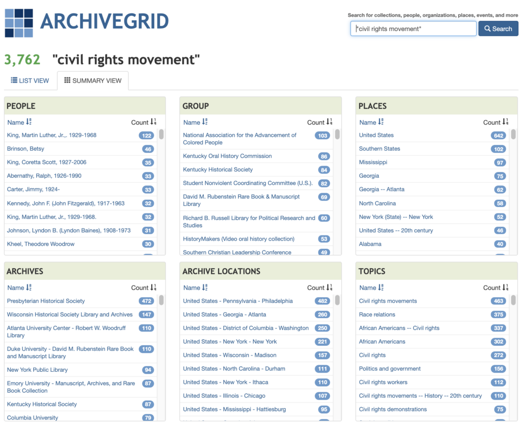
The Introduction to Archival Research Workshop was conducted by Donna Davey, adjunct reference librarian at GC. As someone new to archival research, it was interesting to learn the various methods and websites for archives, relevant to our recent readings on “History and the Archive”.
WordCat: We used the advanced search feature for “civil rights movement”. On the results page, you can refine the results to only show “archival material” or a particular author. Clicking on an item gives you a detailed record. From here, you can click “Finding Aid”. This particular collection of Brotherhood of Sleeping Car Porters records, 1920-1968 is found in the Library of Congress. The Finding Aid provides an overview, bio/organizational/historical notes, scope and contents of the boxes, types of materials, arrangement, copyright uses, and much more. Most finding aids follow this format.
ArchiveGrid: We did the same search using ArchiveGrid. Their results page has a useful “Summary” view that categorizes the results by “Places”, “Topics”, “People”, “Archives” in a neat grid.
NYPL: The Archives & Manuscripts collections are a good resource. We searched “James Baldwin” as an example and took a closer look at the variety of items included in the James Baldwin papers 1936-1992.
An important takeaway from this workshop is to always talk to a librarian about your project or before visiting a repository. They are extremely knowledgeable about the resources available. Since CUNY libraries are closed, they have online services, including a 24/7 chat. Lastly, the workshop emphasized that research is not linear, it is circular – you will always find new people and ideas to research so you may feel like you’re moving in a circle instead of a straight line.
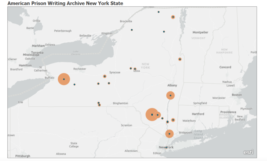
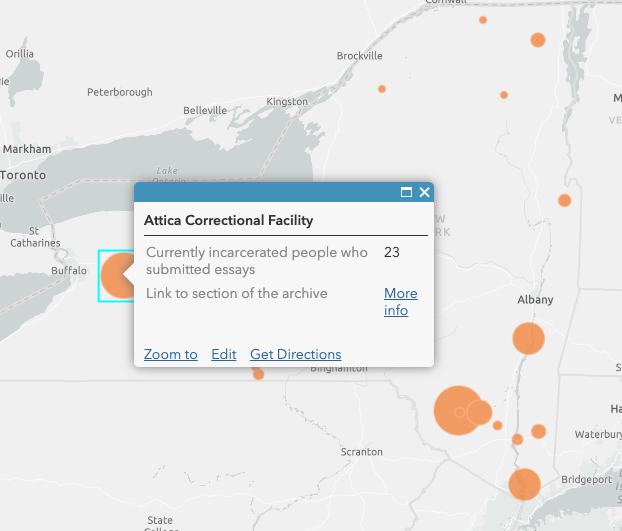
For my praxis assignment, I wanted to create a map that visualized data I am using for my own research, which is working with the American Prison Writing Archive (an open source database that currently hosts over 2,100 essays submitted by incarcerated people about their experiences in prison). I decided to map all the prisons in New York State in which currently incarcerated people have submitted essays to the archive. As you hover over each prison, you can see the name of the facility, the number of submitted essays, and a link that directs you to the particular section of the archive.
This was the first time that I used a mapping software, so I decided to sign up for Learn ArcGIS. The site offers constructive lesson galleries on various capabilities to choose from which was really helpful; I could go through every step of the mapping lesson gallery beforehand and made use of it during the completion of the assignment. First, I created the cvs file of the data provided by the archive, adding columns of longitude, latitude, the link to the archive section, and then uploaded it to the map. The software displays the data so you can immediately see patterns by creating different-sized circles and a legend that tells you the circles represent the number of submitted essays. In a next step, I configured pop-ups to only display the name of the prison, the number of incarcerated people who submitted essays as well as the link to the archive as this is the information I am using for my research project. In terms of future improvements, it would be great to display the data as an interactive map that not only shows the location/the number of submitted essays but also categories of subject matters the essays address (the project team of the APW archive is currently working on categorizing its collection to improve the search options/filters).
I really enjoyed working with ArcGIS Online. This mapping assignment inspired me to continue to explore how spatial and non-spatial data can be modeled for my social justice research projects.
I’ve always thought of annotations as another form of marginalia. Annotating a text with insightful comparisons and word definitions was, at least for me, part of the private and intimate reading feeling. Though sometimes I would share these observations and findings with others, for the most part, it was a practice done on my own; it was part of my learning process. However, I’m learning now that this process is something to be shared; done in conjunction with others. Especially during distance learning, these digital annotations can be a social activity that has the potential to create and maintain lively discussions.
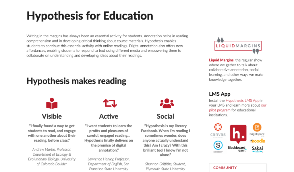
On September 29th, I attended the ITP Skills Lab session on the use of Hypothes.is: Doing Collaborative Text Annotation Online with Hypothes.is with Julie Fuller. During the workshop, Fuller shared with everyone how this tool, if used effectively, could be used as part of every teacher’s pedagogical technique. Hypothes.is whose mission statement is “to enable a conversation over the world’s knowledge”, was founded by Dan Whaley, is a free, open-source, digital tool that allows you to annotate almost anything on the web. Through this mission, Hypothes.is has become a great way to not only read but also learn collaboratively in a virtual environment. I was surprised by the examples presented during the workshops of students communicating openly, critically, and organically, just through the process of annotating a piece of text for school.
Host Fuller and an experienced educator who uses Hypothes.is explained that this tool can be a low stake way for students to participate in class. Those who are particularly shy in the classroom can still voice their opinions by adding an insightful annotation or replying to others. However, they also emphasized the importance of not using this tool or other pieces of technology just for the sake of it. In order to be effective, educators must always keep the learning objectives in the forefront.
Educators wanting to model the usefulness of the tool and its easy to use interface may do so first by creating a group. The group will host all of the students’ annotations, and the search function will serve well when the educator wants to take note of everyone’s participation for grading purposes. The instructor might need to scaffold this technique by first explaining the purpose of annotations, setting clear expectations, and showing examples. The host method that a great method for getting started with Hypothes.is is for educators to pre-populate the text with questions and prompts like asking students “gloss” over new vocabulary. Through this method, students learn and understand that annotations can serve as a way to help each other to digest difficult texts.
After this workshop, I was able to meet and speak with Hypothes.is ‘s VP of education, Jeremy Dean, during my Doing This with Novel course by professor Jeff Allred. During his visit, Dean emphasized the importance of defining Hypothes.is as a digital tool instead of a platform like Facebook. We also spoke on annotating on the web and fact-checking fake news, how the team is working on annotating videos on Youtube through transcription, and the constant struggle of public knowledge and ownership.
I’m excited to use this tool not just as a student here but also as an educator.
For my mapping assignment, I went somewhat off the rails, both in terms of subject matter, and in the sense that I integrated an element of comparing data on my map. My map, created with QGIS, displays 25 relatively-eastern US states, shows which of them I’ve dreamt about, and how many of my digitally-written pieces mention them.
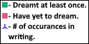
The completed map. Important note: for Illinois, I actually found 0 instances of it in my writing – the number I recorded is the number of instances of “Chicago.”
Why Did I Do This? I know this idea sounds at the very least unusual, if not entirely unfounded, or even unreasonably arbitrary. However, I find myself thinking a lot about two topics more as of late: the content of my dreams, and my old writing. I think the cause of this is almost certainly related to the fact that the COVID-19 pandemic restricts my ability to interact with others, and so I often find myself thinking about more self-centered matters like these. I took inspiration of the project’s offered second and fourth prompts for this map: dreams, at least in most mainstream schools of thought, are not traditionally able to be mapped, and while even I doubt it sometimes, I can’t deny that I am, at least to some degree, an author, and I have works to my name.
I chose these 25 mostly-eastern states for two reasons: first, sadly, due to the constraints of QGIS, and I know this goes against the project’s first offered prompt. I had some difficulties getting the entirety of the US to render well when I set up a print layout. Second, due to constraints I wanted to set myself. 25 is half the states in the US, and the eastern side covers my home, and most of the places in the country I’ve traveled to physically.
Something that surprises me, looking back, is that this was my initial idea for the project, once I had determined what tool I’d use. I had a feeling that I’d come up with something more substantial or more pertinent to current events, but I suppose this must have spoken to me on some level. Maybe I was partially inspired by some of the work I’ve done in another course, Methods of Text Analysis, where I’ve been using Python to examine aspects of texts such as the number of times words appear in or across them, or the context of those words being used.
The Method
This was my first time working with QGIS, but not my first time mapping something. To be sure, in my line of work, making maps of places that don’t exist is something I have to do very often, and when I first started thinking about this project at all, I thought about doing something along those lines – maybe using one of the mapping tools to create a map of a fictional nation. I quickly realized that this was rather outside my abilities, and I started thinking smaller.
When I first started with QGIS, I mostly experimented with what sorts of files it could take – I thought perhaps I’d have a file lying around my computer somewhere that it could read by chance. After realizing this wasn’t the case, I looked up some tutorials, and went from there, deciding to focus on using a print layout at first. The first challenge I ran into was cutting down on the number of titles, subtitles, markers, errant lines, and names of places from world map I was using. Eventually though, with trial, error, and some guidance from the tutorial, I eventually managed to be successful in this regard.
To gather data, I looked back through personal notes and my own memory to find places I’d dreamt about. Then, I checked through each of the pieces in my collection for mentions of the states I was mapping. I limited my searching to Word document that I’d written entirely myself. The main functions in QGIS I used were pretty simple – I added primarily pictures and text to the map to convey the data I wanted to show. I did encounter a bizarre issue that occurred when attempt to scale certain images, where the images would scale vertically when I was adjusting them horizontally (and vice versa), but with some fiddling, I could usually get them back to normal and then scale them again. Barring that, deleting them and replacing them with an identical image always fixed the problem.
A glimpse into how things looked in QGIS around this point.
The largest challenge came when trying to add a legend to my map. Maybe I let myself get discouraged too easily, but the built-in function to add a legend was fairly unintuitive to the point where I really wasn’t making much headway at all in trying to get it to convey the information I wanted it to. Thus, I ended up caving, and I created the legend in my image editing software. I then added it as its own image.
The legend, in its lone glory.
Findings – I’ve dreamt about 12 out of the 25 states I mapped, or roughly half of them. – The number of pieces the average state was mentioned in: 4.84. – The number of pieces the average state I’ve dreamt about was mentioned in: 8.25. – The number of pieces the average state I’ve yet to dream was mentioned in: roughly 1.77. – In other words, states I’ve dreamt of appear in significantly more of my writing than those that I’ve yet to dream of. – I’ve mentioned my home state of New York with significantly more frequency than the next most mentioned state – over 4 times more. – The most common number of mentions was 1. – There doesn’t appear to be a strong correlational between the size of a state and the number of mentions it’s received: however, very generally, the very smallest states had some of the fewest mentions. – Similarly, there doesn’t seem to be a strong correlation between the size of a state and whether or not I’ve dreamt of it. However, I’ve dreamt about many of the largest states I mapped.
Closing Words I’m a little disappointed in myself for choosing such a self-centered project. It might have been more fitting to choose a more relevant or accessible topic than the one I chose. However, in the end, I got to experience QGIS for myself, I ended up with a map that I’m rather proud and fond of, and I enjoyed myself overall. I’m happy to say that I think this won’t be the last time I use QGIS.
I toyed around with various ideas, including one I’ll probably use for a final project on Lepanto 1571, but decided to make use of a very rich database available for download (or so I thought) through the Italian Fondazione Centro di Documentazione Ebraica Contemporanea—dati.CDEC.it.
The plan was to use their detailed historical information about the fate of the Ferrarese Jewish community during 1943 and 1944 to assess the frame of Giorgio Bassani’s Il Giardino dei Finzi-Contini which brackets the story of that elite family with the terse account of their arrest and deportation to Auschwitz in in the fall of 1943. As one of the first generation of works addressing the Shoah in Italy, Bassani’s novel established for many an influential historical-seeming narrative of Italian Jewish experience under Fascism and Nazi occupation. In fact, “[t]he result [is] an incredible pastiche” as Bassani writes of the family tomb (trans. Weaver 1977, 12) and as he would have been the first to acknowledge.
By mapping the details of the deportees born in Ferrara, specifically where they were captured and sent, I wanted to understand better the intersection of historical truth and fictional veracity in the work. Does Bassani center that event in the city itself to emphasize further the hermetic, self-imposed myopia and hubris of the isolated characters who alternately attract and repel the novel’s protagonist, or does this detail function more as a small stone of historical reality placed on the fictional mausoleum that is the text?
The results surprised me (which is always a good sign). Of the 67 deportees documented as having been born in Ferrara, 30 of them were captured in the city itself. 5 more were captured in luogo ignoto—place unknown—and the remaining 32 were arrested elsewhere. So Bassani’s ending opts for one of two equally plausible fates, not simply shaping the one that will accord best with the novel’s argument, but choosing one that occurred in the majority of cases, given the implication of the data at large. A powerful twin narrative of Ferrarese Jewish departure emerges from the (putative) map, whether for reasons of marriage, work, political exile, or in flight and hiding. But, no single place seemed to be as perilous as Ferrara turned out to be: the greatest number of Ferrarese Jews rounded up outside of that city in this period happens in Milan (4). The range and location of the other deportees I find frankly startling—2 in Bologna, Florence, Rome, but also in Selvetta di Viggiù (a place not even on the map as such); 3 in relatively unknown Monsummano Terme and Montefiorino, yet only 1 in Turin and 1 in Verona. The data is hugely suggestive to me: does this say something about those who left, as Bassani’s novel may imply? Or were other places simply safer, especially per capita (hard to believe given the numbers deported from Rome for instance)? Or again does this merely show a stark historical version of the appointment at Samarra, where the place and the choice makes little difference in aggregate, whether it be an obscure hamlet in Piedmont (Succinto Canavese), or a venerable university center (Padova), or one’s beloved hometown?
I found the process of collecting and analyzing the data extremely exciting and fulfilling, in particular the tasks of getting the coordinates and seeing the possible arguments that the map might be making in response to my questions.
The attempt to make the digital map, however, was frustrating and humbling beyond belief. First, my OS was too old to use on my regular laptop and I didn’t want to risk disrupting my current research and teaching by updating it (i.e. so many open browser tabs!), thus I borrowed my daughter’s newer computer, as she has her school-issued one at home right now. I opted for Tableau as the only program that had been recommended for beginners, but found its instructional manuals and sample databases–with their focus on hypothetical rising and falling sales of office equipment in the northern vs southern hemisphere–alienating and depressing. At every turn I was reminded, a) I’m so analog and b) AI tools serve global capitalism and are ill-suited for the kind of research and data viz I want to do.
Nevertheless, I got Tableau installed and proceeded to download the dataset from http://dati.cdec.it/ only to find that I had no app to open it, nor could I find one (still can’t). Oh, well, it was only 30+ data points, so I put them into a pdf in 4 columns. Tableau could make a table from the data but it seemed frozen and I couldn’t manipulate it. Ok, let’s try a spreadsheet: much better, now how do I get a map? Blend datasets: I got it. Sort of. But the map doesn’t come up. It’s two in the morning so I can’t ask anyone but, hey Bri is writing about entering in coordinates—wow that’s so useful, thank you Bri! Now it seems to be working . . . . Ok—the end is in sight: I’m going to get my coordinates on the map, hope that the measure function shows enough difference between 1 and 4 (the extreme of 32 is wayyyyy over to the right of the chart but should show up nicely on a symbol map). Tomorrow I can play with color and intensity the way I’ve been planning! Woohoo
Good morning. My daughter has spilt tea on her school laptop at breakfast and it has died (see b above—may go into selling office furniture to cover the cost.). She absolutely needs hers back for her High School zoom day: I can have it again when she’s finished her chemistry homework. Still waiting.
As I finish writing this blog, a GIS/mapping co-working session announcement has come in: Reader, I’ve signed up . . . . Now looking for jobs in sales.
Coda: returning to Tableau, I found that I had a bit more distance and was less afraid to click on small icons I hadn’t noticed before. By shifting from string to number and location (city) and, finally somehow changing the default to Italy not U.S.A., I was able to get the data to load as a map automatically: turns out I didn’t need to enter latitude and longitude by hand into Excel. Whereas before I had a single satellite image with Milan, Texas, registered, I now had the data scaled to an adjustable regional map of Northern Italy. There were still a lot of fiddly details to manipulate: color contrast, typeface, and crucially making the data not too small or large so as to be distinguishable. And I wish I would have had the time and skill to layer it further with places of detention and ultimate destinations in Nazi concentration camps of the 67 Ferraresi; but—it’s a map!
Depending on which event we choose as the starting point, the Internet and its associated technologies have been around for approximately forty to fifty years. Given that we are still in the Internet epoch’s early stages, it is not surprising that with the severity of the consequences we witness angst, questioning, and debate as the flying debris and dust storms take their time to settle (if they ever will settle). When combined with the Internet’s socio-economic consequences, digital technologies have rightly unsettled higher education and in some respects provoked an identity crisis. For those who see disturbances and identity crises as a setback, the inclination understandably arises to fight for the primacy of older traditions. For those who question many of the assumptions of both the role of the university in the past and in the present or who simply see the causal relationships between the activities of the academy and social inequities and harms, the new technologies present opportunities for re-inventing higher learning along the lines that more closely align with the best values of the human being as a species. It would thus seem to be a reasonable and arguably healthy outcome for higher education to experience an increase in the level of polemical discourse and scholarship especially during a time of social upheaval.
Without sufficient polemic debate, currents of thought turn into stagnant doldrums. Polemic discourse in the best case scenario reflects commitment, concerns, and the notion that there is something at stake. On the other hand, too much polemic discourse results in debate that loses sight of larger issues and questions. (One wonders if the failure of professors and researchers in higher education to organize to create one big union that can take power back from administrators and non-academic interests is not to some extent a reflection of the adverse consequences of polemics). The impact of new technologies on research and scholarship present opportunities to polemically interrogate the role of the archive and archival work.
To some extent Cameron Blevins’ plea for “argument-driven” scholarship might appear to be a call to revive an older orthodoxy, which at the risk of exaggeration sees the university as safe haven where experts, having dedicated the bulk of their productive lives to specialized topics, fight out their battles in journals that maintain the cycles of thesis assertions, claims, defenses, disputations, and refutations. Both Jessica Marie Johnson and Marlene L. Daut propose important programs for archival work that could be interpreted as “argument-driven” scholarship depending on how we understand what we mean by “argument”. Their polemics raise the issue of which arguments are the most valuable to make and which arguments lead higher education down the path to its irrelevancy or still worse its active and passive roles in abetting systems of genocide, oppression, and exploitation.
It would seem that the “newness” of information technologies masks the fact that similar questions and debates about the archive and archival work have been part of intellectual and academic labor for centuries. One example that comes to mind is the critique of archival interpretation in the seventh chapter of The Making of the English Working Class, in which the historian E.P. Thompson takes his colleague, fellow historian Sir John Clapham, to task for fallaciously arguing that workers were not affected by the enclosures that pushed them into immiseration and the cruelties of the urban factory systems. Thompson published his book in 1963, six years before the delivery of information over the first interconnected computers at UCLA and Stanford University and twenty-six years before Tim Berners Lee designed the protocol and language for interconnecting electronic documents. Thompson writes:
Throughout this painstaking investigation, the great empiricist eschews all generalisations except for one–the pursuit of the mythical “average”. In his discussion of agriculture we encounter the “average farm”, the “average small-holding”, the “average” ratio of labourers to employers–notions which often obscure more than they reveal, since they are arrived at by lumping together evidence from Welsh mountains and Norfolk corn-lands which Clapham himself has been at pains to distinguish. We go on to encounter “the average cottager an area affected by enclosure” the “average” loss to rural earnings from industrial by-employments, the gross earning of “that rather vague figure, the average English (with Welsh) labourer”, and so on. We have already seen that this “averaging” can give us very odd results: the 60% of the labourers who, in 1830, were in low-wage counties which fell below the “average” line.
…
Now what is being averaged? The first part of this statement might be of some value if it could be shown that in the same villages where cottage gardens were lost potato patches come in (although we should also examine relative rents). But the second part, which has already passed into comfortable tradition, is not an example of averaging but of statistical dilution. We are being invited to dilute the figure for those parts of Britain where enclosure did take place with those where it did not, divide the sum of this weak solution by the number of counties, and come up with an “average” loss in well-being “due to enclosures”. But this is nonsense. One may not take an average of unlike quantities; nor may one divide quantities by counties to arrive at an average of value. This is what Clapham had done.
What he was really doing, of course, was to offer a tentative value judgement as to that elusive quality, “well-being”, in the period of maximum enclosure. But to do this, very many more factors–cultural as well as material–should have been brought to bear upon the judgement. Since the judgement springs like an oak out of such a thicket of circumstantial detail–and since it is itself disguised as an “average”–it is easily mistake as a statement of fact (Thompson 214-15).
Questions about the accurate meaning of the archive and the effective use of the archive to advance claims have been a part of academic work long before the Internet arrived. Public archival work has also been a part of the landscape for a significantly long time as is evidenced by the more than 10,000 historical societies in the US alone. Argument-driven digital scholarship is surfacing more and more as can be seen by the debates surrounding the online digital essay The 1619 Project (2019). In this case, an older generation of historians were inspired to dispute claims that the struggle for the independence of the British colonies in North America represented significantly enough an effort to protect the institution of slavery. To some extent it is up to argument-driven scholars to engage with claims conveyed through digital technologies. As more and more scholars become internet literate, new digital spaces along with older journals will serve as forums for debate. In the meantime, archival scholars are taking advantage of the capabilities new technologies offer in facilitating the wider and more open dissemination of historical information.
In support of Blevins’ argument, it is the explanatory power of argument-driven historical research and writing that perhaps offers the most important contribution to higher education, culture, and society. Much of the continuing injustices and social ills can be traced to institutions that have roots in events and developments many centuries ago. If we look only to the current moment for explanations we are likely to miss the deeper regimes that enforce the patterns shaping and determining the world we live in. Explanatory power derives from both careful and critical arguments, balanced polemics, and careful and critical publication of digitally reproduced primary sources.
Works Cited
Project, The 1619. 2019. “The 1619 Project” in The New York Times. New York: The New York Times Company.
Thompson, E.P. 1966. The Making of the English Working Class. New York: Vintage Books.
For our mapping assignment I created a map of the major vacation locations during the 12 seasons of the Bravo reality television series The Real Housewives of New York.
What Is This? One of the main tropes of the series that acts as a narrative arc for the film editors who have to cobble together a narrative from hours of footage on such television shows has been to send the cast away from the location that the franchise is usually located in. This contrivance provided an interesting dataset to play with while I learned more about mapping tools.
What It Isn’t and Why This was my third attempt at a mapping assignment. This is not my original dataset of misdemeanor drug incarcerations by state overlayed with states that recently legalized marijuana and by which degree. That data is available and was easy(ish) to clean but I kept hitting a wall in thinking about how to display the data. This is an issue I feel very passionate about but as with many issues right now it was exhausting to consider. Frankly I know the wall I ran into was abject despair. So, I scrapped it.
Instead, over the past weekend I started to work on something with a much smaller scope, as I have many looking at available open data regarding entertainment, another passion. I began to work with a map that completed the bare minimum requirements of “making a map” of the theater institutions in Times Square, but I could see how that didn’t offer me an opportunity to discover new information as much as I had hoped. However, when someone asked me if I would be watching the presidential debates I answered “I will be doing whatever the opposite of that is.” This is what I thought at the time would be the most oppositional feeling project and it frankly lifted me from said despair.
Some Decisions& Tools I had to collect and clean a lot of this data from the web as it does not exist in one place. I used fan culture, blogs, and imdb to cross reference, as well as Google Maps search for location data. I added this information to a Google sheet which I connected to then geocode in Carto.
For the dataset, I did not include trips with the following criteria: in-state trips (upstate/Catskills/Hamptons), visits with fewer than 2/3 of the cast, or work trips that were not obvious parts of this narrative story lines.
I considered the “total number of episodes in the season” to be the number of filmed and edited “reality” episodes, and not the number of meta/reunion/seated episodes (the episodes about the episodes), as a trip would not be possible or likely. To consider the potent reunion episodes as well would require a different analysis, and is unlikely to be useful in this case. Another time.
Surprises I didn’t think I set out to learn anything about the data but I was wrong. It was interesting to me that the trips are generally set at the end of the season with a two or three episode arc, which conclude in the penultimate episode (a la the Red Wedding in Game of Thrones). This became more interesting as the seasons went on when there were interruptions to this pattern. For example, in 2016, a dramatic season ends during a vacation trip (dénouement from the suitcase). In the most recent season, there is a double arc, with a small trip to Newport at the beginning of the season, and a longer trip to Tulum at the end of the season. Was this due to the change in production from home in 2020? Is this season two seasons? How much vacation footage is always left on the cutting room floor in non-pandemic years? I was surprised that the more I dug into the map, the more questions I had about nonlinear narrative structures. I was unsurprised that this project reinforced my utmost respect for film, sound, and television editors.
Disappointments None of this data exists anywhere in one place as I mentioned. In 12 seasons and multiple locations, many of the hotels have switched ownership as well. Some of the properties were private rentals, and as such I had to guess at their general area based on their proximity to landmarks. I of course wished I had more time to create deeper data with information about the hotels or more details about the episodes/seasons.
Need help with the Commons?
Email us at [email protected] so we can respond to your questions and requests. Please email from your CUNY email address if possible. Or visit our help site for more information: